1.222 FAQ-972 Can I modify the tooltips that appear when I hover on data plots in my graph?modify-tooltips-on-data-plots-in-graph
Last Update: 9/5/2021
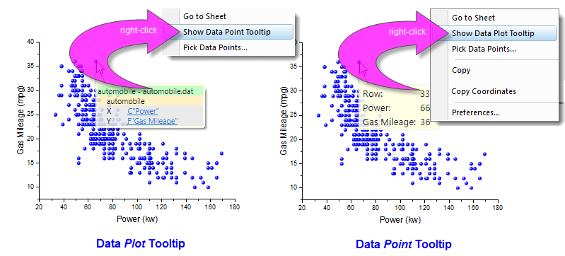
Origin 2017 introduced a Data Plot Tooltip that appears when you hover on a data plot in the graph window. The Plot tooltip is fairly basic, reporting source book, sheet and coordinate datasets. It is not customizable.
Beginning with Origin 2019, there is a second tooltip that shows, by default, for many 2D plot types, 3D Scatter, XYY Bar and XYZ Bar plots . This we refer to as the Data Point Tooltip to distinguish it from the Plot tooltip. The Data Point Tooltip is highly-customizable.
In 2D plots that support both types of tooltips, you can switch between the two by right-clicking on the tooltip and choosing from the shortcut menu.
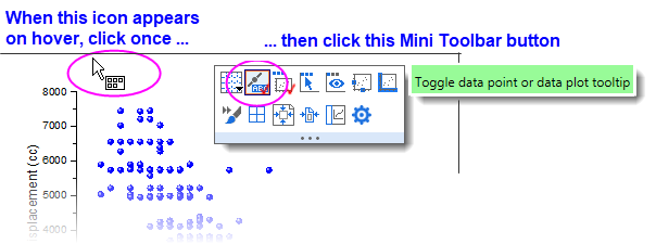
 | Beginning with Origin 2021, you can toggle between tooltip types by clicking this page-level Mini Toolbar button.
|
Enabling or Disabling Tooltips
To turn Data Point and Data Plot tooltips on or off, change the values of LabTalk system variables @PT and @PTI.
@PT=0; //Disable both data plot and data point tooltips
@PT=1; //Enable data plot tooltips for 2D graph
@PT=3; //Enable data plot tooltips for both 2D graph and 3D OpenGL graph  (default)
@PTI=0; //Disable only data point tooltips
@PTI=1; //Enable data point tooltips (default)
Modifying Tooltip Transparency
You can also modify the degree of transparency of the tooltip using the system variable @TDT. You may want to do this if, for instance, you have modified your Data Point Tooltip to display imagery. @TDT is set to 220, by default. Lower the value to increase transparency or set it to 255 to disable transparency.
Keywords:data point, data reader, data info, exploratory, transparent, transparency,
|