Origin and OriginPro
Introduction
Origin is the data analysis and graphing software of choice for over a million scientists and engineers in commercial industries, academia, and government laboratories worldwide. Origin offers an easy-to-use interface for beginners, combined with the ability to perform advanced customization as you become more familiar with the application.
Origin graphs and analysis results can automatically update on data or parameter change, allowing you to create templates for repetitive tasks or to perform batch operations from the user interface, without the need for programming. Extend the capabilities in Origin by installing free Apps available from our website. Connect with other applications such as MATLAB™, LabVIEW™ or Microsoft© Excel, or create custom routines within Origin using our scripting and C languages, embedded Python, or the R console.
Take your data analysis to the next level with OriginPro. In addition to all of Origin's features, OriginPro offers advanced analysis tools and Apps for Peak Fitting, Surface Fitting, Statistics and Signal Processing. Features specific to OriginPro are marked with the PRO icon in this page. Visit the Origin v.s. OriginPro page to view a comparison table.
If you are upgrading from a previous version, visit our Top Features page to see what's new in the latest version, or browse our Key Features by Version page.
Browse the sections below to learn more about Origin and OriginPro. Features available only in OriginPro are marked as PRO.
Graphing
With over 100 built-in and extended graph types and point-and-click customization of all elements, Origin makes it easy to create and customize publication-quality graphs. You can add additional axes and panels, add, remove plots, etc. to suit your needs. Batch plot new graphs with similar data structure, or save the customized graph as a graph template or save customized elements as graph themes for future use.
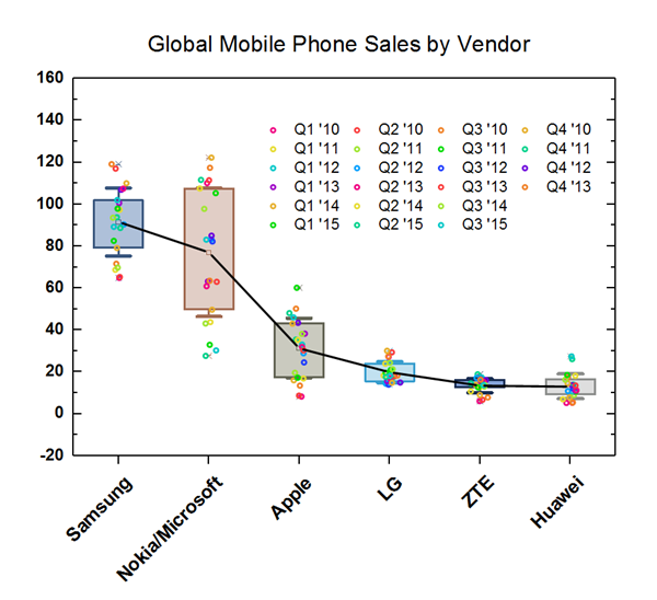
This is a box plot with mean points connected. The user can also connect median points, data points or other percentiles, using controls on the Connect Lines tab of the Plot Details dialog.
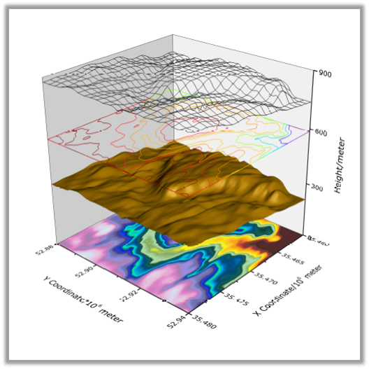
A 3D OpenGL Surface Plot with multiple surfaces stacked in one graph layer. The graph has been customized by assigning a unique plot style and a custom Z offset to each surface. Some surfaces are also rendered as flat.
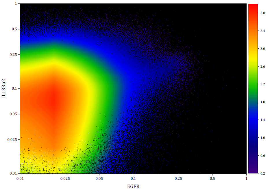
Density Dots plot of 2 million data points. Colormap represents data density computed using a fast algorithm.
Graph Gallery>>
Graph Types
- Column & Bar Charts: Basic, Stacked, Grouped
- Floating Column & Bar Charts
- Bridge Plot
- 2D Pie and Doughnut Chart
- Line Plot
- Scatter Plot (with X,Y Error Bar, Column Scatter, Drop Lines, Color Map, Size Map)
- Line + Symbol Plot
- Lollipop Plot
- Density Dots Plot
- Area Plot (Area, Stacked Area, Fill Area)
- Multi-Axis & Multi-Panel Plots
- Trellis Plot
- Cluster Plot
- Kite Diagram
- Ternary & Piper Plots
Over 100+ graph types are available from the Plot Menu.
- Polar Plot
- Radial Plot
- Waterfall Plot
- Contour & Heatmap
- Vector Plot
- Streamline Plot
- Wind Rose Plot (Binned/Raw Data)
- Spiral Bar Chart
- Spider Plot/Radar Chart
- Smith Charts
- Stiff Diagram
- Durov Plot
- Zoom Plot
- Stock Plots
- Profile Plot
- Image Plot
- Box Chart, Grouped Box Chart
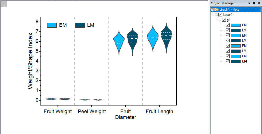
- Violin Plot
- Histogram, Stacked Histograms
- Marginal Box/ Histogram Chart
- Grouped Marginal Plot
- Histogram + Probabilities Plot
- Scatter Matrix Plot
- CDF Plot
- 2D Kernel Density Plot
- Probability & Q-Q Plots
- Control Charts
- Variability Chart
- Multi-Vari Chart
- Dot Plot
- Pareto Chart
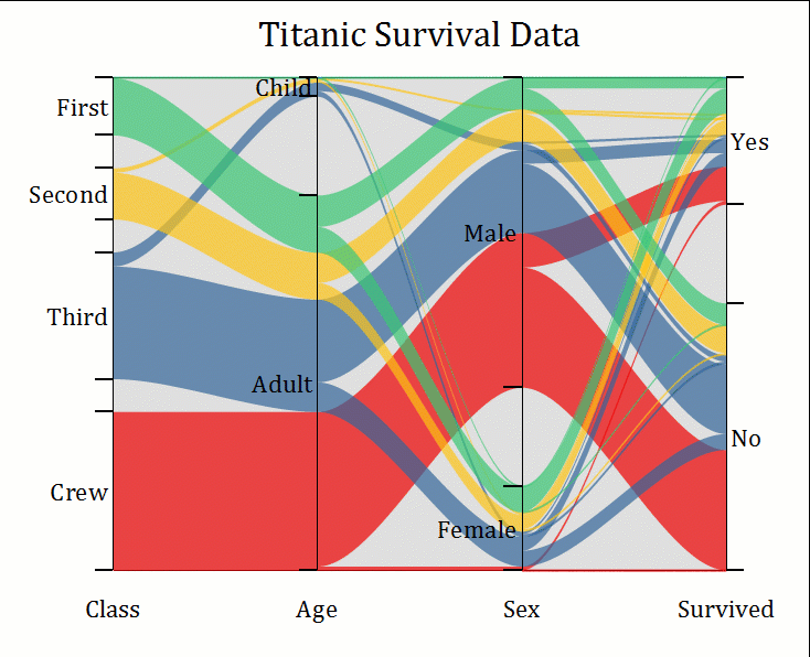
- Parallel Plot
- Sankey and Alluvial Diagrams
- Chord Diagram
- Network Plot
- Ribbon Chart
- Population Pyramid
- Before-After Plot
- Bland-Altman Plot
- Bullet Chart
- Forest Plot
- Polar/Ternary Kernel Density Plot
- Poincare Plot
- Pie/Bar Map
- Stacked/100% Stacked Bar Map
- Sankey Map
- Contour with Streamline/Gradient Vectors
- Polar Quiver Plot
- 3D Symbol/Trajectory/Line/Vector Plot
- 3D Bar Plot
- 3D Surface Plot
- 3D Function & Parametric Function Plots
- 3D Ribbons/Walls Plot
- 3D Waterfall Plot
- 3D Pie Chart
- 3D Column Chart
- 3D XYZ Floating Bar
- Stacked 3D Heatmap/Surface
- 3D Ternary Plot (Scatter or Colormap Surface)
- Tetrahedral Scatters/Lines/Line+Symbols
- Voronoi Diagram
- Correlation Plot
- Paired Comparison Plot
- Tile Grid Map Plot
- Split Heatmap Plot
- Polar Heatmap
- Ridgeline Plot
- Ternary Vector
- 2D Function & Parametric Function Plots
- Means Plot
- Venn Diagram
- Andrews Plot
- Manhattan Plot for GWAS
- 3D Stacked Histograms
- 3D Wall Profile
- Zoomed Inset
- Treemap Plot
- Polyline Profile
- Heat Map with Dendrogram
- Marginal Abatement Cost Curve
- Soil and Rocks Classification Diagrams
- Piper Diagram
- 3D Wind Rose
- Isosurface Plot
- Sunburst Plot
- Circular Packing Graph
- Hierarchical Edge Bundling
- Treemap
- Heatmap with Dendrogram
- Interaction Plot
- Main Effects Plot
- Run Chart
- Symmetry Plot
Read More>>
Extended Templates from OriginLab Website
In addition to built-in graph types, Origin also provides extended templates which can be found and installed from the OriginLab Website using the Template Center.
- 2Ys StackedColumn-Line
- 3D Histogram
- 3D XRD Waterfall
- Arrow Plot
- Bar with Connected Lines
- Climate
- Correlation Network Plot
- Gantt Chart
- XRD with PDF
- Double-Y Before-After Plot
- Pie Chart from Categorical Data
- Colormap Sunburst
- Double-Y Stacked Columns
- Ellipse Plot
- Time Series Explorer
- Circular Radar Chart
- Heatmap with Group
- Grouped Circular Bars
- Grouped Pyramid Plot
- Energy Diagram
- Speedometer Chart
- Split Violin with Separate Interval
- Before-After Bar Chart
- Gradient Filled 3D Colormap Bars
- Heatmap with Significant Mark
- Log-Log Plot
- Matrix Bubble
- Polar Colormapped Line
- Raincloud Plots
- Contour without Contour Lines
- X Offset Scatter
- Distribution + Box + Data
- Wind Vector Stick Chart
- Variable Bin Width Histogram
- Gradient Filled Colormap Bars
- Bridge Charts in Multiple Panels
- Correlation Chord Diagram
- Schoeller Diagram
- Stacked Area by Y Offset
- Tripartite Plot
- Waterfall with Inset
- XPS Area and XPS Line
- Delaunay Triangulation
- 3D Surface Map
- Radial Bubble
- Ternary Density Dots
- Polar Heatmap
- 3D Horizontal Floating Bar
- Wafer Map
- Y-Shared Double-X Plot
- Color Mapped Line
- Bar with Stick
- Gradient Sunburst Chart
- 3D Stacked Line & Symbol Graphs
- Grouped 3D Stacked Bars
- Double-Y Stacked Columns
- Multiple Panels with XXXY Data
- Sparkline Chart
- Multiple Plots from XXXY Data
- Double-Y Waterfall
- Double-Z 3D Bars
- Histogram with Range X Tick Labels
- Periodic Table
- Clustered Scatter Plot
- Stacked Columns with Multiple Panels
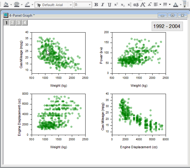
Multiple Axes and Panels
Multi-axis and Multi-panel Tempates
- Built-in multi-axis and multi-panel templates, such as Double Y, Multiple-Y, 4-Panel, Vertical and Horizontal Stack Panels
- 3D Double-Y/Z
- Create your own multi-axes or multi-layer graphs and save as template for repeat use
Add, Arrange, Resize and Link Layers
- Set layer units by percentage of page or in absolute units
- Resize, align, switch, move, link, and re-order panels
- Link layer position and dimension by ratio
- Link axis in different layers by straight 1:1, formula or align at specified values
- Use common axis scale in one direction for multi-panel graphs.
- Evenly distribute layers
- Customize Properties Across Graph Layers
Merge and Extract
- Merge multiple independent graph windows into one graph
- Extract multi-panel graphs into separate windows
- Extract plots from a single layer into multiple layers
Double-Y graph in single layer, it is easy to assign or switch plots to be associated with left or right Y axis.
When merging individual graphs, check Treat Each Source Graph as a Unit to maintain the proper relationship of layers in individual graphs. In this example, each inset graph remains with its parent layer. An add labels option is also available to facilitate adding labels to each unit in the merged graph.
Options in Plot Details Layer tab enable users to automatically apply Layer, Plot, or Axis customizations made to one graph layer, to other layers on the page.
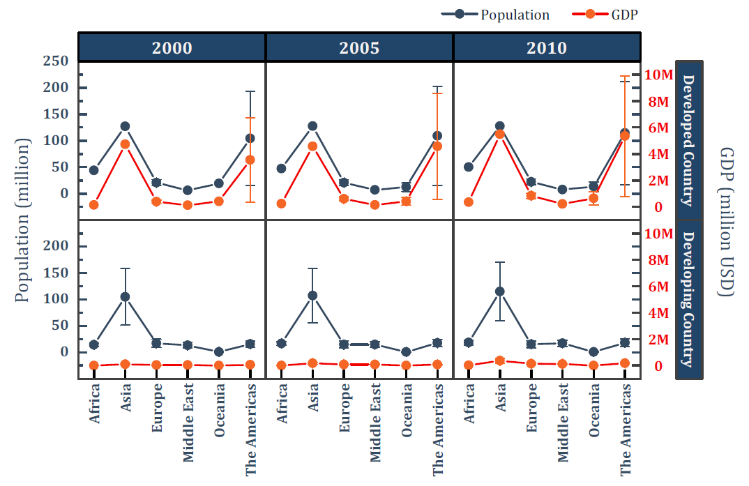
A multi-Y (3Y-YY) graph with three overlapping layers sharing a common X axis. Note that the Y axis line and label color matches the data plot.
Origin's Graph toolbar lets you add layers to your graph, merge selected graphs, or extract data plots to separate layers or layers to separate graph windows, with the click of a button.
With multiple layers selected (pressing Ctrl key to select), Origin's Object Edit toolbar enables you to align or evenly distribute the layers with the click of a button.
A multi-panel graph combining several layers of contour and line plots arranged flexibly. Note the inset layer on the bottom right panel. The top panel displays stacked lines by y offset allowing for easy comparison of multiple data plots.
Grouped Data Plot
Using grouped data, you can easily create multi-panelled graphs in Origin with a single click on the plot menu:
- Cluster Plot (Line, Scatter and Column)
- Grouped Box Plot
- Grouped Column/Scatter Plot
- Various Types of Trellis Plots
- > Scatter
- > Line and Symbol
- > Bridge Chart
- > Box
- > Double - Y
- > Column/Bar
- > Stacked Column/ Bar
- > 100% Stacked Column/ Bars
- > Floating Bar
Flexible configuration and customization options:
- Control the style increments between or within the groups
- Customize the gap between, or within the groups.
- Add Gap between panels
- Wrap panels
- Overlap panels
- Uniform or Independent X/Y Scale
- By Drag-and-Drop Column Assignments (with Pre-installed App - Graph Maker)
Read More>>
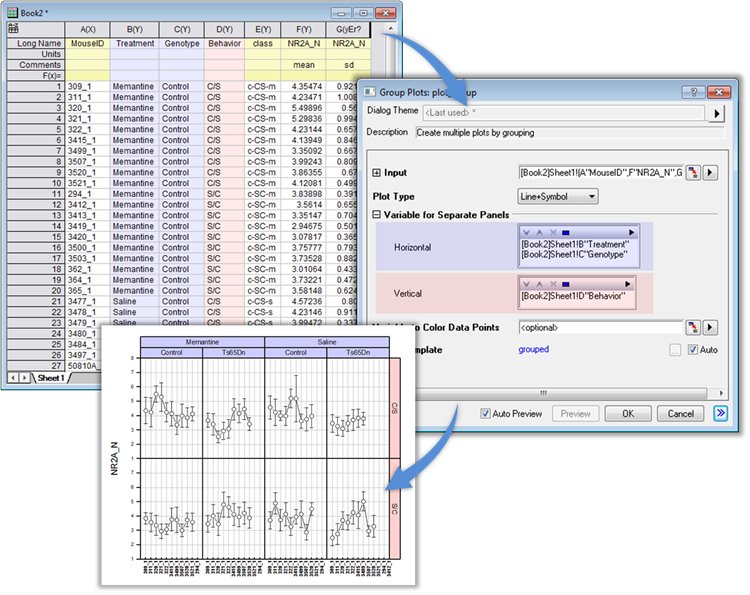
The user can easily create multi-panel graphs from grouped data with the Trellis plot.
Multi-layer Cluster Plot with option for independent X and Y scales. Easily change formatting of plots and other attributes in all layers by editing properties in one layer.
Grouped plots now support scatter plot with subgroup spacing. Scatter can then be combined with other plot types such as the column plot in this example.
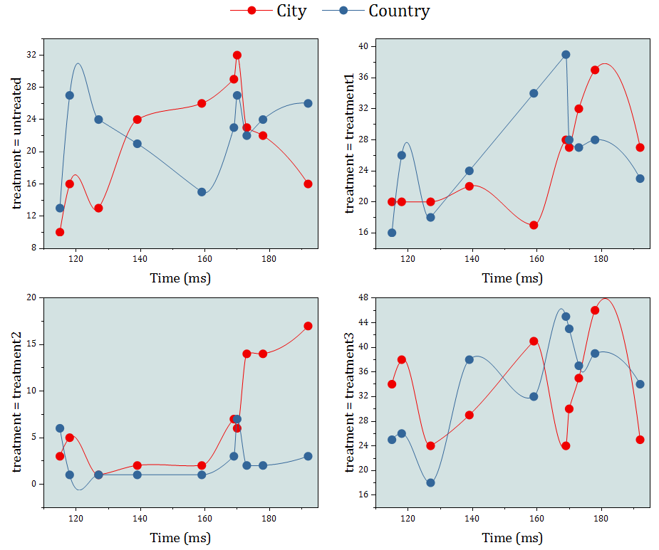
Double-Y Trellis plot with two independent Y axes, each with its own scale settings.
The interactive, multi-panel Plot Details dialog box allows for quick editing of many important properties of your Origin graph.
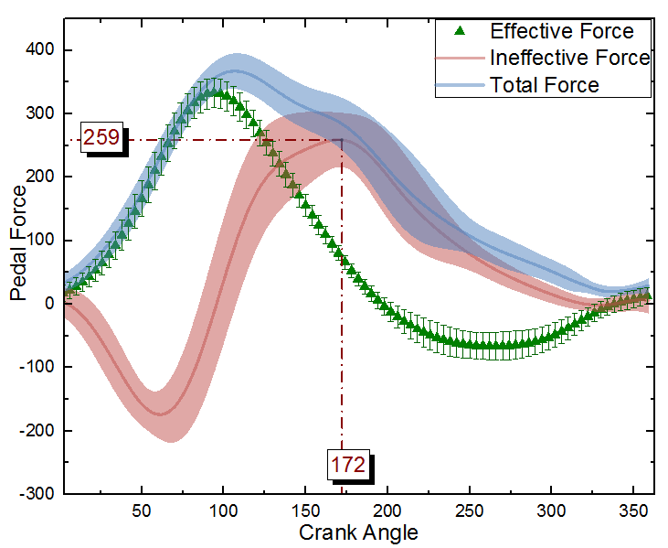
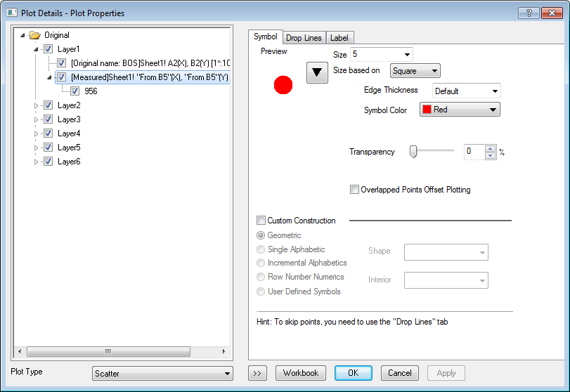
In this graph, one dataset is plotted as a scatter graph + error bars. Because the data is dense, every other point is skipped using the Skip Points settings in Plot Details.
The other two datasets are plotted as grouped line plots for easy customization. Their corresponding error bars are drawn as transparent bands. Vertical and Horizontal drop lines are drawn from a point to the axes, with the x and y values labeled.
Skip symbols while maintaining overall data features
General
- Based on plot type, customize plot attributes such as symbol shape and size, line style and width, column and area pattern, transparency, etc.
- Change exist plot type and mix different plot types in one graph
- Change X or Y of the plot, drag to add new plot, remove plot, and change plot orders
- Show or hide plot, all plots of same name, all plots in a layer
- Connect lines across axis break or missing data, etc.
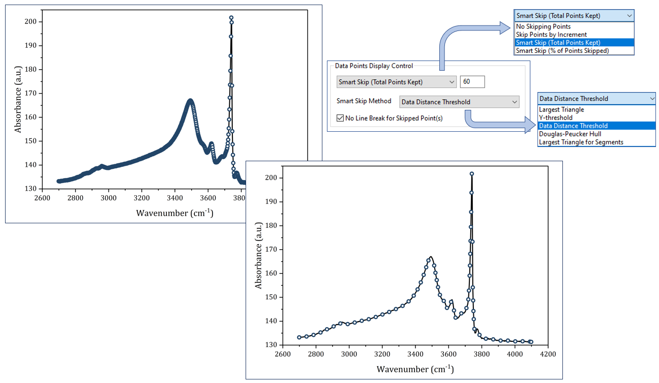
- Skip points with option to maintain overall data features
- Projection of plot to planes in 3D graph
Symbols
- Over 100 built-in symbols and option to add unicode symbols or user-defined shapes
- Add drop lines for 2D plots and 3D graphs
Line
- Over 10 line connection styles such as linear, segment line, step horizontal/vertical, various spline, etc.
- 8 built-in line styles such as solid, dash, dot, etc., where dash can be defined
Fill Patterns
- Over 100 build-in fill pattern types, including standard USGS geology patterns
- Option to add user-defined fill patterns using emf files
Data Labels 
- Add data labeling to plot or a single point
- Label as x, y coordinates, row indexing, column metadata, or data/text from other columns
- Align Left, Center, or Right option for multi-line labeling
- Auto-positioning of labels to avoid overlapping
- Leader line from label to data points
Error Bar
- Show error bar as bands with filled colors
- Support asymmetric error bar
- Allow skip point
Single Point and Multiple Plots Customization
- Customize a single point.
- Group multiple plots for easy customization
- Offset plots in X and Y directions
Origin supports offsetting plots in the X and Y directions with no change in data values. Offset options include auto, cumulative, incremental, constant, and individual. In this graph we stacked curves with a pattern such as 0 -100 so each data pair stayed together. The color and style were customized to use repeated patterns. For such graphs, you can also drag a single curve to reposition it for comparison with another curve. The Legend is arranged in two columns and placed beside each plot pair.
Plot Modifiers
- Customize plot attributes by modifier columns in the worksheet to create 3, 4, 5 dimensional plot.
- Symbol color, shape, size, and interior
- Line color, style, and thickness
- Fill color and pattern
- Centroid and subset
- Data label color
- Angle and Magnitude of 2D Vector
- Column and box chart width, box chart position
- For 3D colormap surface, set the color map by values of another matrix
- Use indexing, color map of arbitrary values, or specific RGB values to assign color
- Define the color, shape, style, pattern increment list
- Legend can be customized to indicate such information
- Save Match Modifier by column index, name, or other metadata properties in graph template
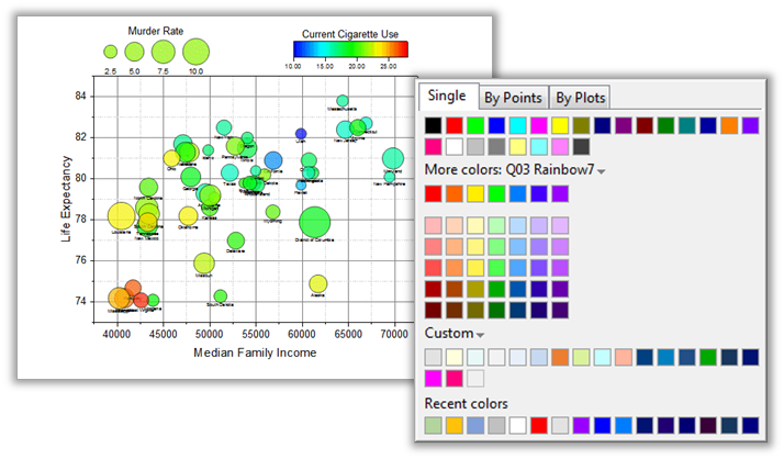
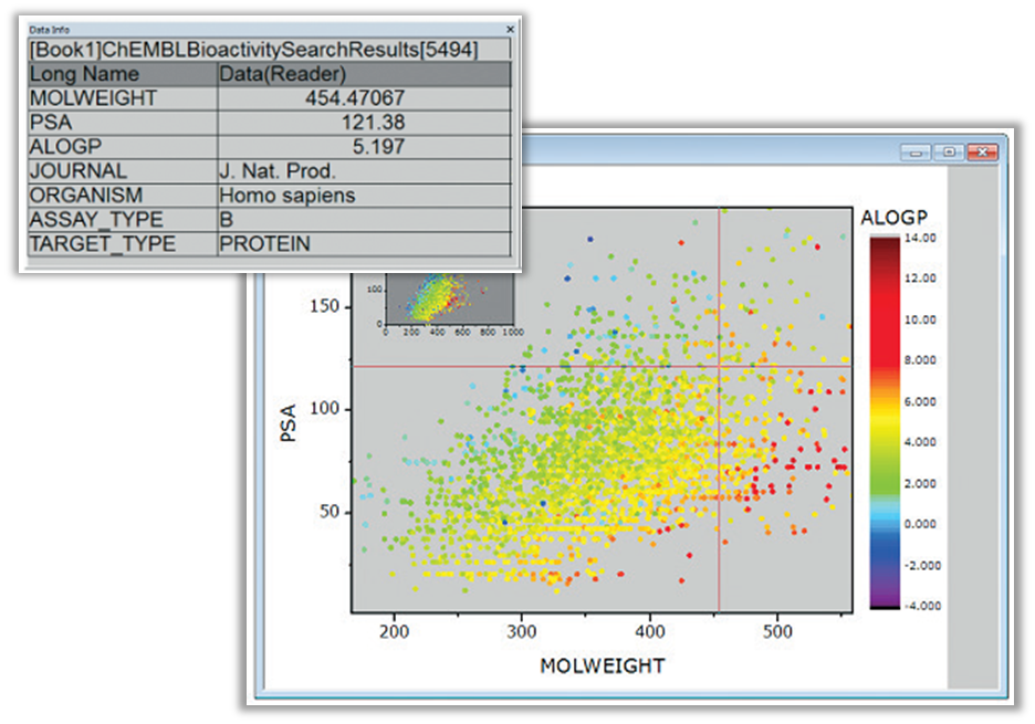
A color mapped bubble chart. This is essentially a scatter plot with modifiers for symbol size and color, set using other data columns. Notice the bubble legend on the top left of the graph. This unique feature in Origin allows for various configurations for this legend. The powerful Color Chooser dialog is displayed on the right side. This dialog has several options including the ability to load a list of pre-defined colors.
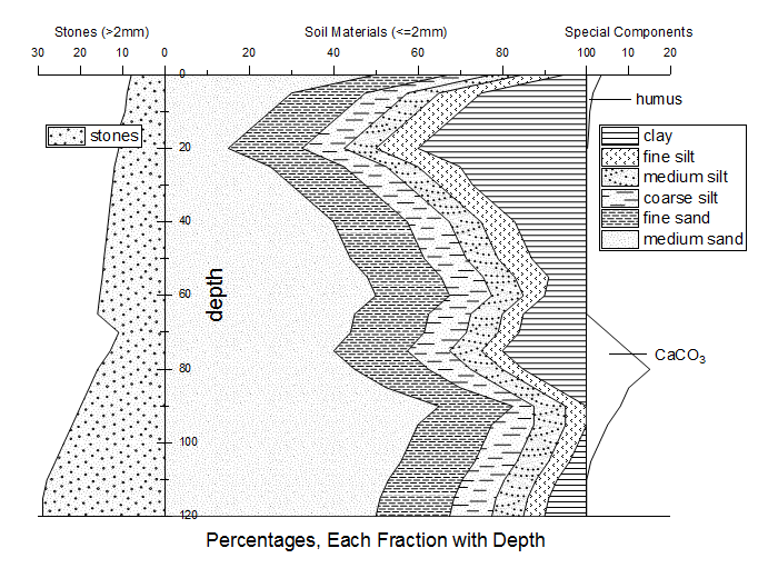
This graph displays the relative quantities of size fractions of unconsolidated sedimentary materials with depth below the ground surface. Hatch (Fill) pattern selection has been enhanced for Origin 2017, including the addition of entirely new "Geology" fill patterns.
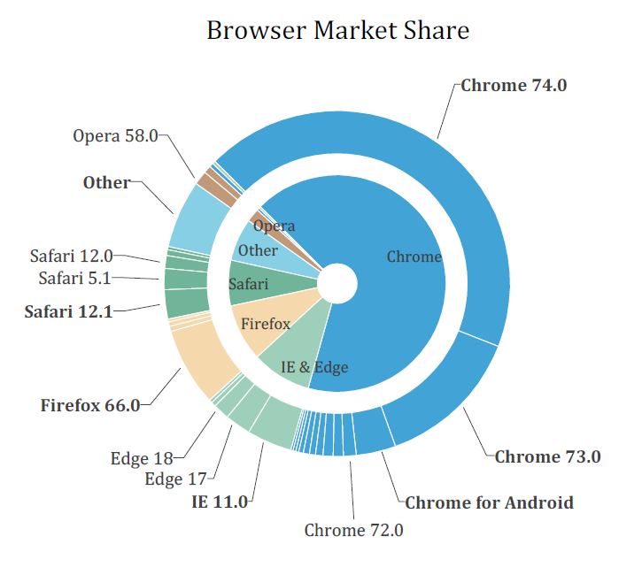
The graph is an example of a sunburst chart. A sunburst has multiple levels (represented by different rings), across which you can see how a category is split into contributing sub-categories. The color-indexing of the rings is done by values from the same "Browser" column in the worksheet.
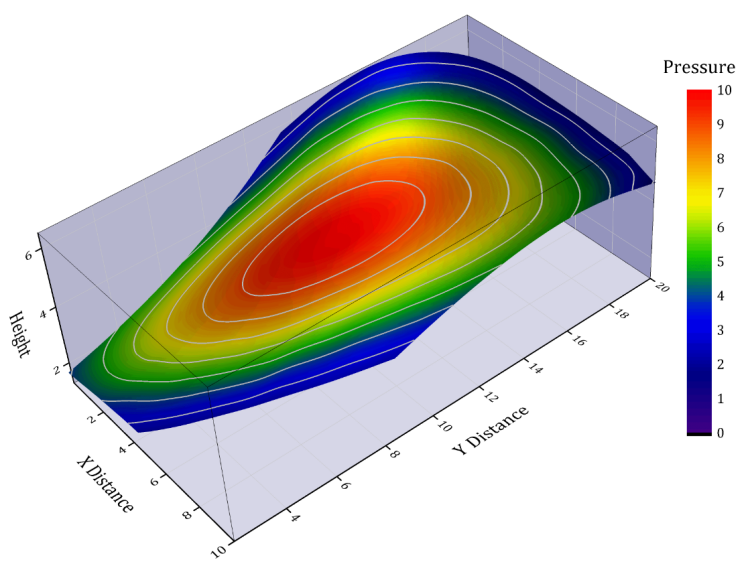
A surface plot created from XYZ data where the color map was based on a 4th data column. A custom XY boundary has also been applied to the plot.
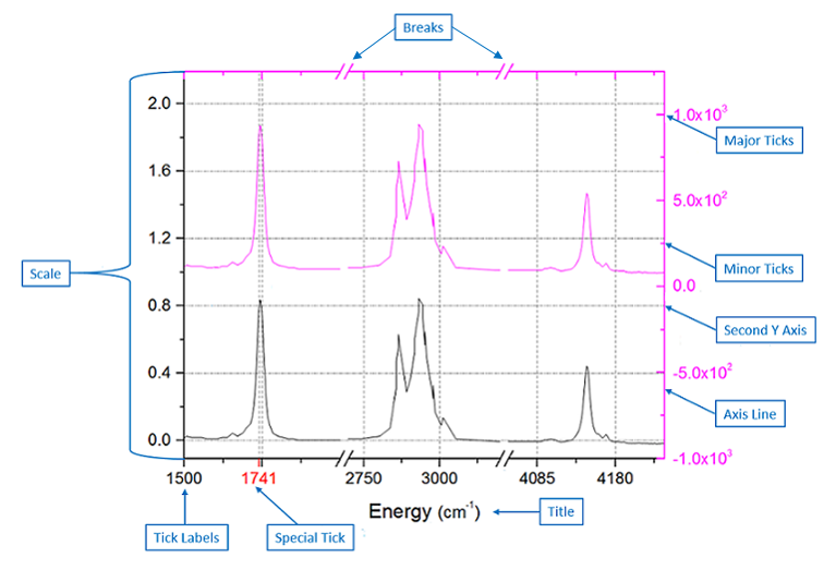
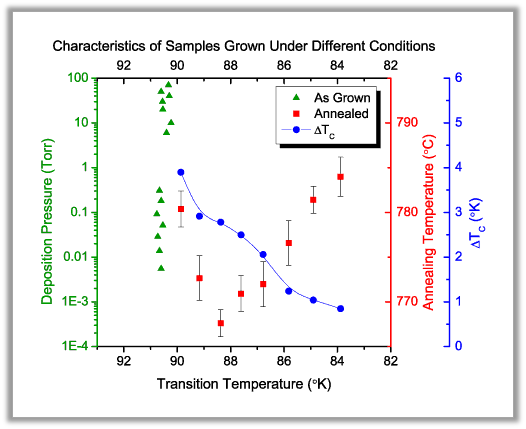
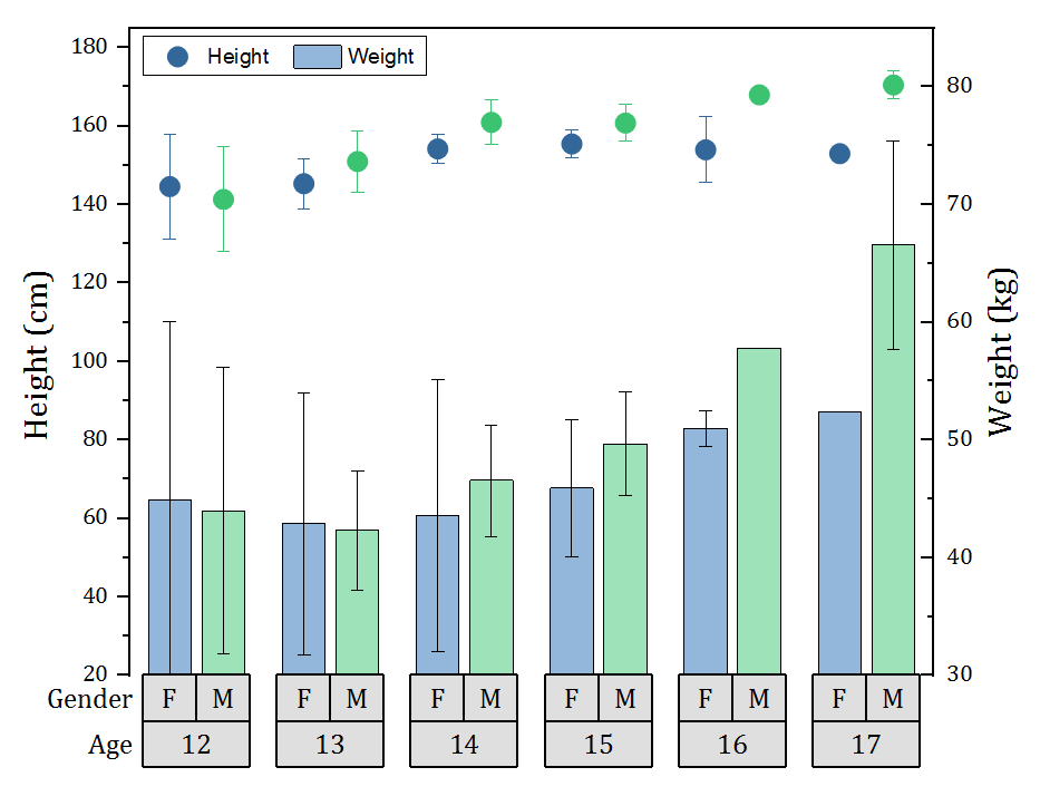
A Double-Y plot allowing for easy comparison of two datasets. Note that the Y axes ticks and labels have the same color as the data plot they represent. Other features include scientific notation for labels in the right Y axis, special tick labels at user-specified axis positions, and an axis break in the X axis. Origin supports multiple special ticks and axes breaks.
In addition to support for multiple axis scale types such as linear, log10, and reciprocal, Origin supports creating scales using a custom formula. In this graph, the X axis scale was set using sqrt(x).
Positive and Negative Symmetrical Log Scale
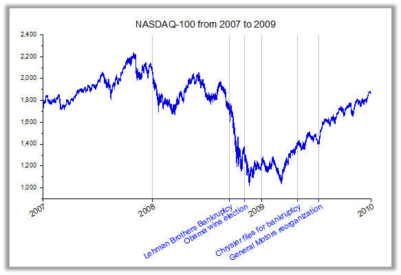
This graph displays the NASDAQ composite index over a period of several years. Notice the X axis where in addition to the yearly tick marks, special ticks and labels have been placed to mark significant events during that time period. Each special tick label can be individually formatted.
Scale
- Support multiple scale types such as linear, log10, Probability, Reciprocal, etc
- Positive and negative symmetrical log scale
- User-defined axis scale type using formulas
- Discrete scale type for skipping rows without data (e.g., exclude weekends and holidays for financial data)
Major/ Minor / Special Ticks
- Major and minor ticks can be set by increment, counts, from a dataset, from column label row, or at user-specified positions
- Multiple Special Ticks with detailed tick and label formatting for each tick
- Leader lines for special ticks
Axis Lines and Grid Lines
- Independent control axis line, major ticks, and minor ticks
- Additional axis line at any position to be used as baseline for column/bar plots and drop lines
- Option to show axis and grids on top of data
Reference Lines
- Multiple reference lines and shading between, in 2D graphs
- Use statistical functions on plotted data, such as mean and standard deviation
- Show linear fit curve, confidence band, etc.
- Functions can be combined, such as mean+1.5*sd
- Use custom equations or expressions to add lines based on axis scale values
- Lines are saved in graph template for repeated use
- Lines update when data changes
Tick Labels
- Many tick label types from numeric, text, date, time, month, week, etc., with various display control
- Tick labels can be from a column of values or a combination of column labels
- Wrap, rotate tick labels, position it at tick, position next to tick, or position between two ticks
- Tick labels displayed as table, with flexible customization of table grid lines, text orientation, and positioning
- Flexible Minor Tick Label Display Format, separate from major ticks
- Remove exponential notation common to all tick labels and add to end of axis
Title
- Read title from metadata from plot
- Customize axis title, including units for different conventions (e.g., curly brackets, square brackets, etc.)
Breaks
- Supported axis break customization: break styles, define gap, break region, break position along axis, scale type, and increment before/after break
- Multiple Axis Breaks with customization of scale and tick labels of each individual segment, and control of break gaps
Multiple Axes Customization
- Customize one axis at a time or multiple axes together
- Copy axis format to other layer or graphs
Further Axes Customization
- Isometric layer scaling to link axes length to scale by X/Y ratio (2D plots) and X/Y/Z ratio (3D plots)
- Set Y axis color to follow plot color in multi-Y plots
- Exchange X and Y axes
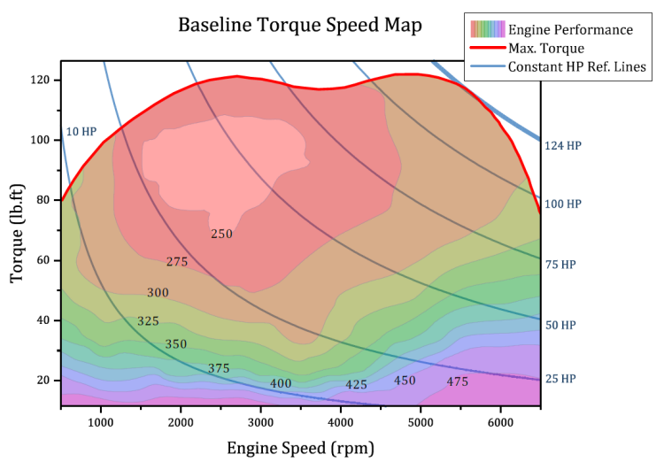
Engine torque speed map where performance is plotted as a contour plot with custom boundary defined by maximum torque line. Reference lines for various horse power values have been added using the expression: Torque=HP*5252/RPM
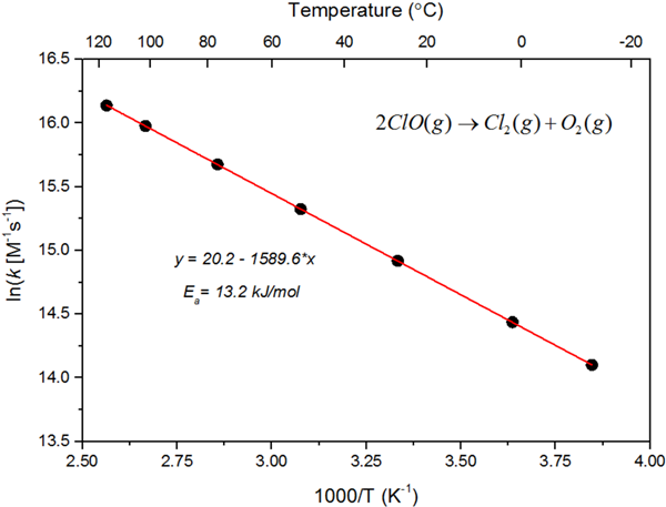
An Arrhenius plot of ln(k) versus 1/T. A linear regression on the Arrhenius plot will solve the intercept which corresponds to ln(A), and the slope which corresponds to -Ea/R. A linked secondary top axis is added to display temperature in degrees Celsius, using the formula: Xtop = (1 / Xbottom) – 273.15. The axis type is also set to non-linear with a custom formula.
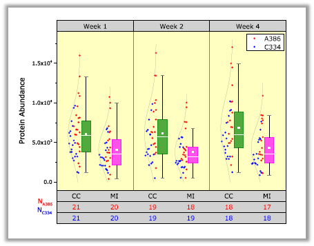
In this grouped box chart, labels representing the group variables have been created using a table format. Options for customizing the table include placement above and below the layer, merging labels between subgroups, flexible border options, ticks, and fill colors.
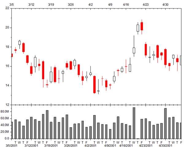
By setting Axis type to Discrete, weekends and holidays are excluded in this Open-High-Low-Close-Volume Stock Chart. Minor tick labels are customized to show the first letter of the weekday while major tick labels show the date as M/d/yyyy.
Graph Legends and Color Scales
Update/Reconstruct Legend
Origin grants you the possibility to simply update or construct the legend for data plots. Some commonly used options:
- Reverse the order of the legend(s)
- Wrap Text
- Create one combined legend or separated legends for data plots in multi-layer graph
- Hide or show plot from legend(s)
- Full control of legend entries customization
- Add custom symbol and/or line
- Customize properties such as size and thickness
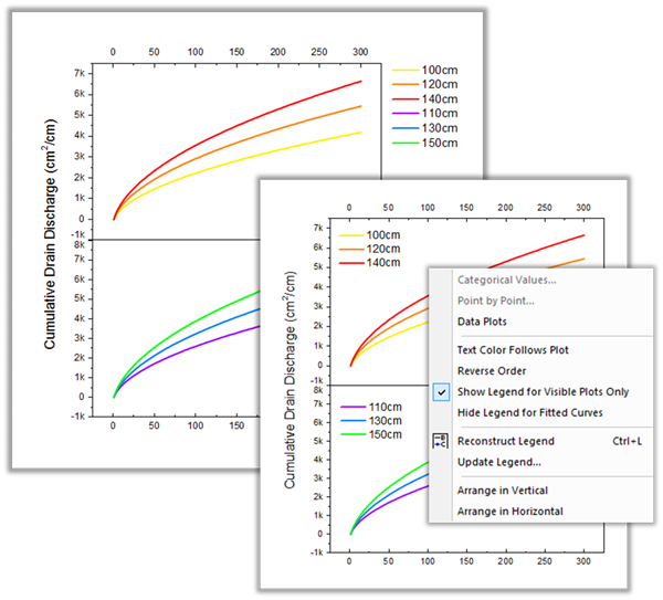
Create one combined legend or separate legends for each set of data plots in a multi-layer graph. In addition, there are shortcut menu options to rearrange, reorder, or further customize the data plot legend.
Special Legends and Scales
Origin also has several special legends used with certain graph types. These legends and scales can be customized and updated similarly with a dialog:
- Categorical Values
- Legend for Box Chart Components
- Point by Point Legend
- Color Scale
- Linear or Nested Bubble Scale
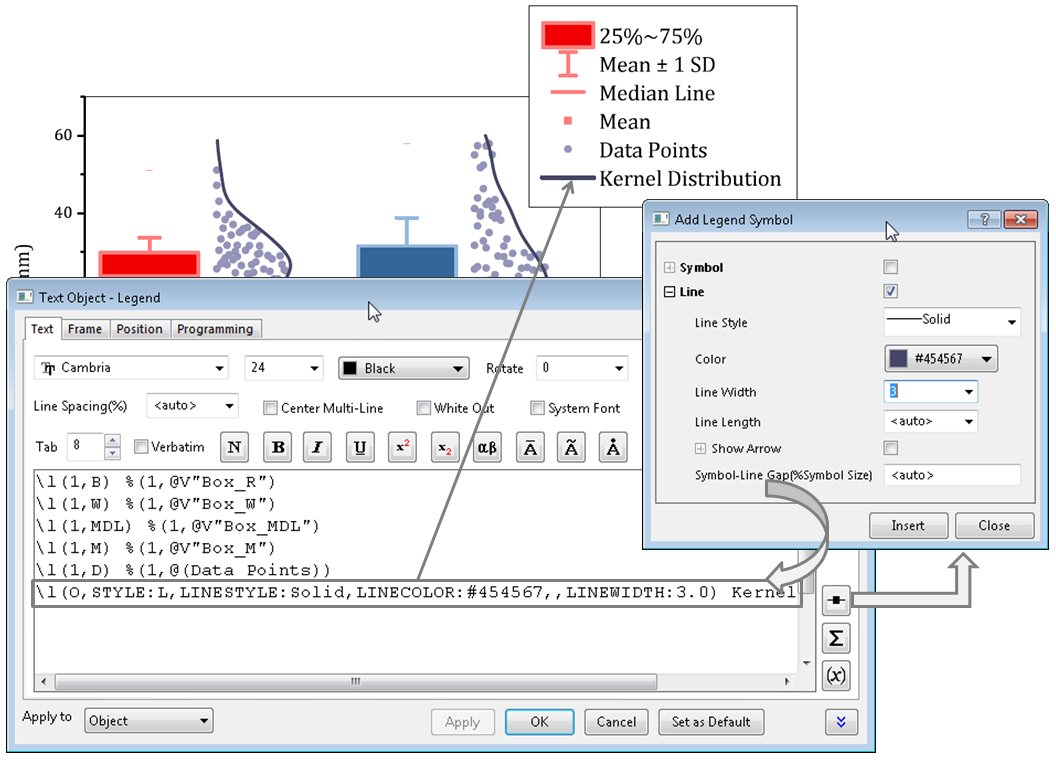
This box chart includes a special box chart legend. This legend is auto-generated for box charts. Each legend entry refers to a box plot component: the box, whiskers, median or mean lines, percentiles, etc. In addition, the Legend Properties dialog lets you add custom entries to your legend for symbols and lines, by building the desired syntax using a dialog.
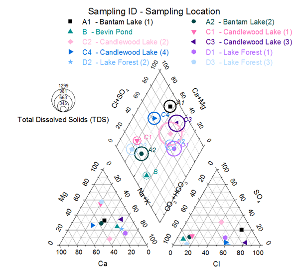
The Piper diagram (or Trilinear diagram) is used to plot chemistry of water samples for hydro-geological studies. Scatter point shape and color change for each sample. Sample ID is displayed next to each point and its color is matched to the sample point. A colorblind-safe color list is used (Origin includes two such built-in color lists). A bubble scale relates bubble size to total dissolved solids. A point-by-point legend identifies each sample point.
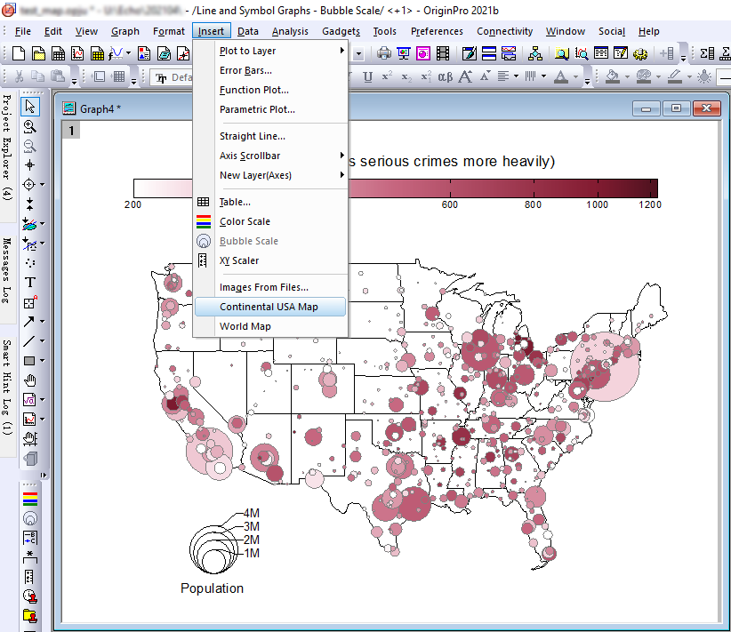
A scatter plot with modifiers for color and size, set using other data columns. Note the nested bubble scale legend at bottom left. The map of the continental USA was added to the graph using the Insert: Continental USA Map menu entry (The menu entry will be shown when the scale matches the range of the map's latitude and longitude)
Annotation
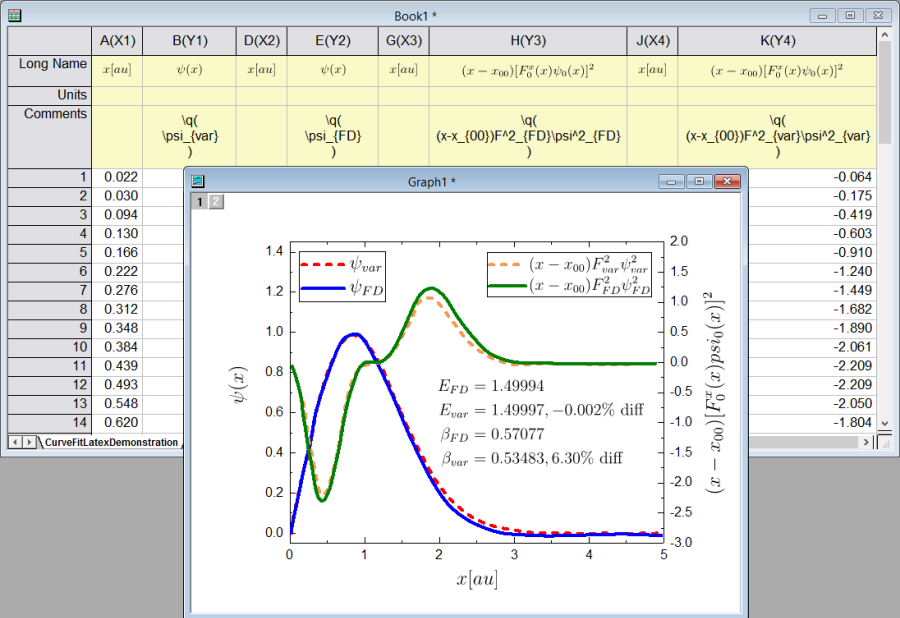
Directly type or copy-paste LaTeX expression into worksheet label rows such as Long Name or Comments using the \q(LaTeX-expression) syntax. Mini Toolbar button also available to bring up dialog with preview, to enter expression and insert into cell. When graph is created from such worksheet, equation is automatically rendered in graph axes titles and legends
Origin also provides a simplified Symbol Map dialog, with multiple tabs with commonly used and popular symbols, to enable users to find and insert symbols quickly when editing text labels.
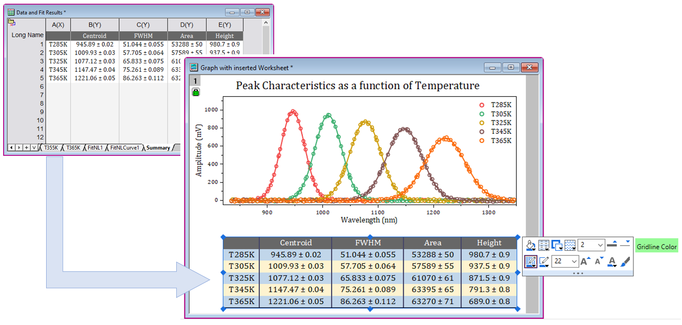
Insert worksheet in graphs or layout pages and further customize object to create custom reports
Graph Annotations
- Add text, including plain text or text from data or metadata with rich text format
- Add page/layer title
- Add graphic objects such as line, polyline, freehand draw tool, curve, arrows, distance annotation, angle annotation, circle, oval, square, rectangle, polygon, freehand region, etc.
- Add special characters, superscript, and subscript notation
- Add equations to your graph (built-in LaTeX support)
- Add an image from external file or web
- Add and format tables
- Add XY Scaler, asterisk brackets with different shapes, date/time stamp, and project path
Insert Image to Graphs
- Insert image from web or disk, support file types include SVG, TIFF, PNG, JPEG, etc.
- Insert as floating image or as layer background
- Crop, clip, or rotate inserted images
- Set inserted image scale or co-ordinates, then match graph when inserting
Insert Worksheets in Graph
- Nice sheet object with hidden column & row header and no margin
- Mini Toolbar to customize band colors, grid style, frame & grid color, and thickness
- Increasing/decreasing font size automatically adjusts table cell size
- Grid and frame customization kept when retrieving other updates from worksheet
Editing the Objects
- Align objects with each other or with graph layers
- Distribute the objects evenly
- Group multiple objects
- CTRL+Drag to create duplicate object(s) at new location
- Edit Points to change Polyline, Curve, Polygon, and Region shapes
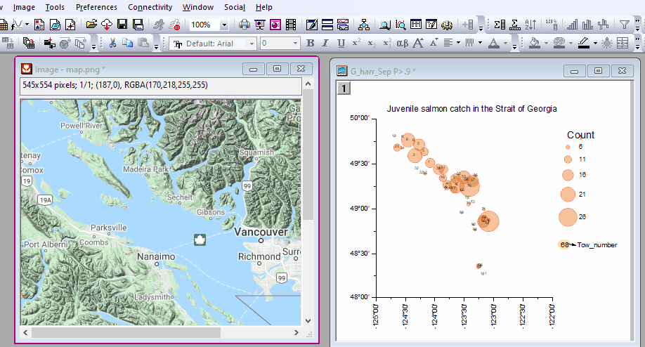
Drag and drop a map image to Origin, set co-ordinate and then insert it in graph as background
Graph Styles
Quickly and easily change the look of your default graph by applying a graph style:
- Multiple graph styles shipped with Origin
- Easily edit/customize to create new styles
- Apply to active graph or multiple graphs in folder or project
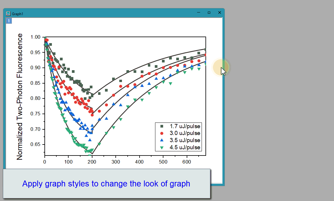
Quickly and easily change the look of your default graph by applying a graph style
Setting Graph Defaults
The Graph Options features enable users to define common settings for graphs:
- Common settings for axis, font, layout, and legend
- Apply to active graph, graphs in folder, or all graphs in project
- Set as default for future new graphs
3D Graphs
Origin supports plotting 3D graphs from XYZ data, XYY data, matrix data, and virtual matrix. The OpenGL graphic technology brings ultrafast performance and more flexibility to customize your 3D graphs.
- Rotate, resize, and skew
- Projection and dropline
- Flatten and/or shift in Z direction
- Lightening
- Transparency
- Turn on/off planes, and show 4th plane
- Scatter plots with X, Y, Z error bars
- Plot from virtual matrix
- 3D Basic and Stacked Bar Plot with error and labels
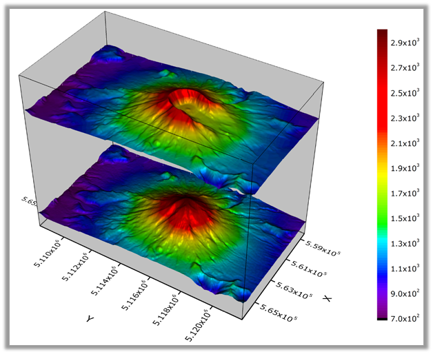
This graph displays the topology of Mount St. Helens before and after the volcanic eruption in 1980. The data are plotted as two color map surface plots in the same OpenGL graph layer, with the top surface offset along the Z axis. A light source has been added to illuminate the surface. Isometric scaling has been applied so that the X, Y and Z axis lengths reflect true relative distances.
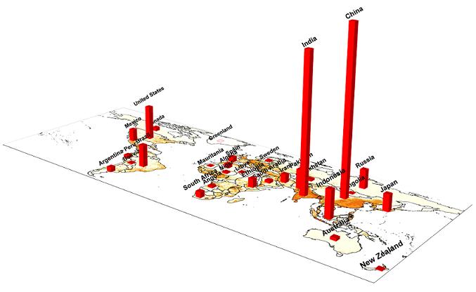
This graph displays the population of different counties by fetching map data from a new WMS server and then plotting 3D bars on top of the map plane. The Maps Online app offers a few built-in map data sources for users to choose from. You can also add your own map source. With Origin, it is very easy to place 3D bars on a map using the Layer Contents dialog.
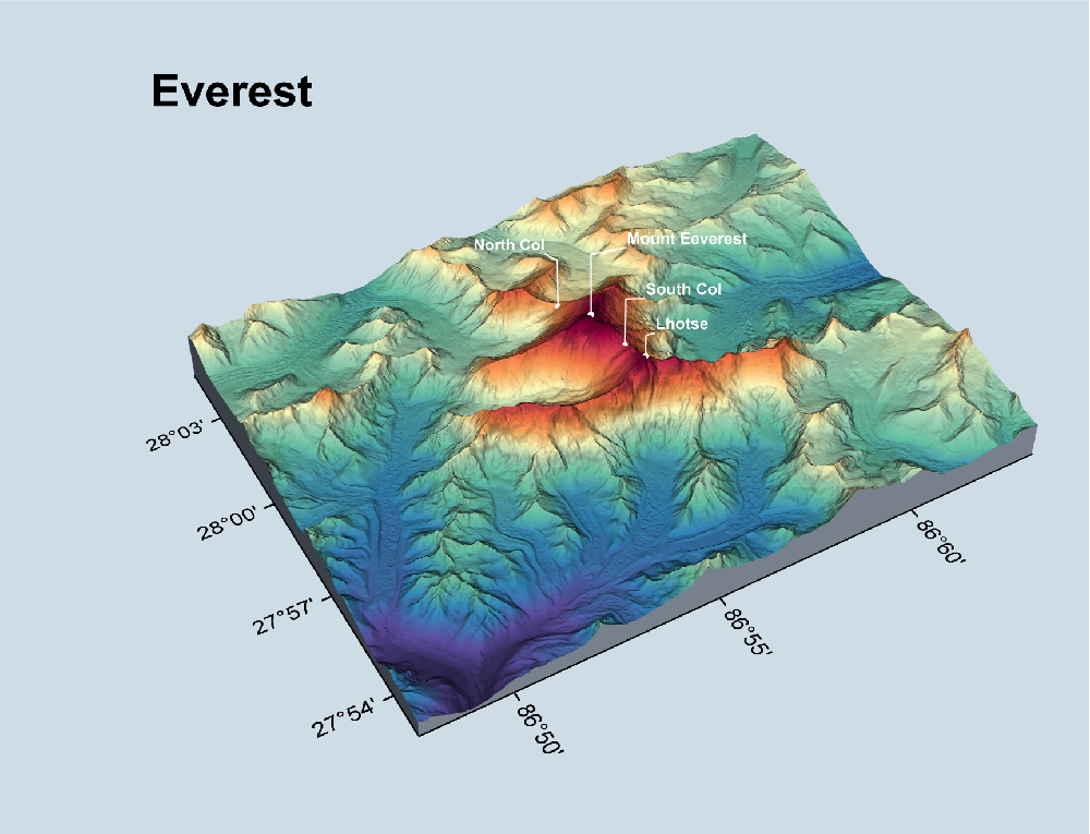
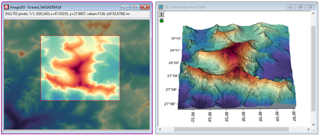
This graph displays a 3D color map surface plot of Mount Everest region. The surface is overlaid by a 3D scatter plot with label to highlight the peaks. Origin supports free rotation of OpenGL graphs by simply holding down the R key and using the mouse. Additional options for rotating, resizing, stretching and skewing are available when the 3D graph layer is selected. The graph can be created from an online template, 3D Surface Map
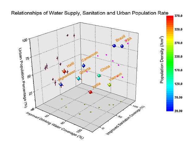
This plot shows a 3D scatter plot with x, y, z errors, and projections on three axis planes. The 3D scatter symbol is colormapped to another data column (population density). Symbols and error bars in each projection can be customized independently.
This is a 3D Colormap Surface with Projection, made possible by plotting the data twice: once as a 3D surface plot and a second time as a flat surface. The flat surface can be offset arbitrarily in the Z direction. The additional red and yellow curves in the XZ plane were added using XYZ datasets having a constant Y value.
The Polynomial Surface Fit app is a great tool for fitting XYZ data with polynomial equations of specified/maximum degree in X and Y, and ranking equations to determine best fit. Using a transparent surface and drop lines to surface instead of the bottom plane, you can show distances between the points and the surface.
User-friendly Interface
Dark Mode
Enable users to quickly turn Origin interface to dark style to provide a comfortable viewing for low-light environments.
- Multiple built-in dark themes
- Dark Mode toolbar to toggle dark mode
- Toggle dark mode on individual windows
- Customizable background color for graphs
- Customizable color mapping for color reversal
- Copy or export graph with or without dark mode effect
Mini Toolbar
Origin supports Mini Toolbar for quick and easy operations on graphs and worksheet/matrix.
These toolbars are sensitive to the type of object selected. The buttons in the pop-up provide access to all common customization options, which allow you to perform quick changes without opening complex dialogs.
Float Windows outside of Origin Interface
Float one or more child windows outside of main interface to take full advantage of desktop space and multiple monitors:
- Floating windows have their own customizable menus and toolbar buttons
- Object Manager panel available inside each floating window
- Access other menus and Apps on floating window by pressing the F1 key to bring up Start Menu
- Keep floating windows pinned and visible when switching folders in Project Explorer
- Drag floating window to active folder to easily move location within folder structure
- Menu and hotkey to retract all floating windows to their respective folder locations
Search
- Search box on top of the interface
- Perform tasks such as plotting and analysis by keyword search and then click to execute
- Find results in various areas such as menus, toolbars, Apps, samples, FAQs etc.
Redo and Undo
Redo and Undo to make your work experience smoother:
- Redo (Ctrl+Y) step by step
- Undo (Ctrl+Z) support
- Undo Window Positioning (Ctrl+Shift+Z) such as minimizing, resizing, moving, etc.
Customizable Report Style
Generate tailored professional reports of your analysis and findings in Origin:
- Select from pre-shipped report styles, or create your own
- Easily apply a new style to all report sheets in a project
- A Report Styles dialog is accessible from the Preferences menu
- Customize report sheet graph size and arrangement
Importing
Impressive Import Speed for Large Data
Importing large text files is easy and fast in Origin.
Import speed in Origin is a factor of 10 or more compared to Excel 2016, and compared to older versions of Origin. The gain in speed has been achieved by making full use of the processor's multi-core architecture.
Importing Files
Origin supports more than 30 data formats: ASCII, CSV, EXCEL, Binary, PCLAMP, CDF, DCF, HPF, EPA, EDF, BDF, REC, HYP, DAT, MDF, DAT, RAW, H5, HE5, HDF5, DAT, PXP, IBW, , DX, DX1, JDX, JCM, QDA, MAT, MTW, MPJ, mzData, mzXML, mzML, imzML, NC, DAT, TDM, TDMS, ABF, DAT, AB, SPE, PZFX, XML, JNB, SIE, WAV, SAV, SPC, CGM, BRUKER OPUS, ISF, and SAS7BDAT
- ASCII import options include specifying delimiter, parsing header lines to extract metadata, partial import, and support for date and time data
- Many import formats support drag-and-drop import, re-import of file to update data, and the option to execute a script at the end of import for post-processing
- Save import settings as a theme file or save theme in worksheet for future import
- Customize the Import menu to only display formats of interest to you
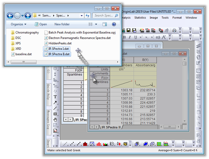
You can drag-and-drop data files onto the Origin interface to import them. Drag-and-drop is supported for most common file types, and can be further customized for additional or custom file types.
Data Connectors
- Connect to a web file, to a file on your local PC or network, to a cloud drive, or to a database
- File types supported: CSV, Excel, ASCII/Binary (using Import Wizard filters), HTML, JSON, MATLAB, Origin Projects etc
- Select data to be imported, such as specific node in XML, table in HTML, or Sheet in Origin Project
- Data Navigator panel in worksheet to view and change subset of data to be imported
- Connection and data selection information is saved in worksheet/workbook
- Add connectors of same type to multiple worksheets in a workbook, and different connector types to multiple workbooks
- When saving an Origin project, you can opt to leave out the imported data associated with all connectors, or specific connectors, which can help reduce project file size (all calculated results and graphs from results will not be cleared)
- Re-import data from the source file at any time, and make changes to source or to data selection at any time
- The Database Connector dialog enables various options for connecting to a database
- More data connectors available for download from the App Center or from the Data menu
Read More>>
Working with Excel
You can copy and paste data from Excel to Origin with full precision.
You can import XLS, XLSX & XLSM files into Origin. Starting with Origin 2017, you no longer need to have MS Excel installed to import these file types. Origin provides the following options for Excel file import:
- Specify rows for column name, units, comments and other metadata, and apply same settings for multiple sheets
- Import specified columns/rows
- Keep cell formatting (except cell formulas)
- Re-import data quickly when external file has been updated
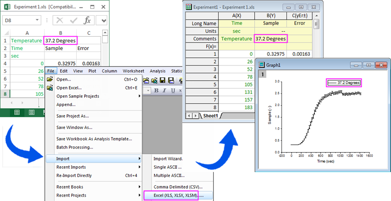
You can import Excel files or open them directly in Origin (by launching an OLE instance of Excel). We recommend importing your Excel data, so that you have full access to Origin's powerful graphing and analysis environment.
Database Import
Origin supports importing data from a database using Database Connector, with the following options:
- Connect to databases such as Access, SQLite, SQL, Oracle, and MySQL
- Save connection information to file
- Save query in the Origin worksheet or as external file for quick re-import or repeat use
- Use LabTalk variables in SQL script to further customize a query
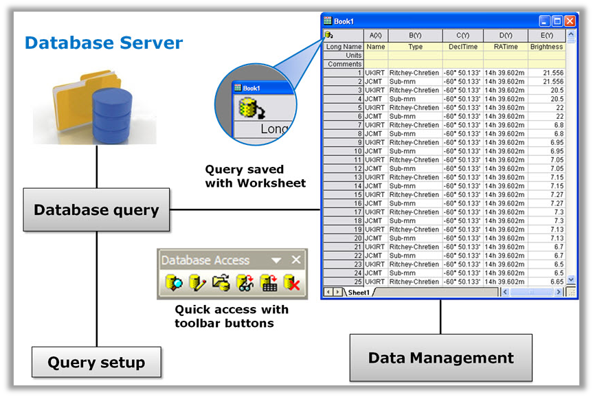
Origin supports importing from a database, and then saving the query in the worksheet for easy editing and re-importing. The Database Connector provides both ADO and ODBC support for typical databases such as Oracle®, Microsoft SQL Server® and MySQL®
Digitizer
The Digitizer tool in Origin allows you to perform manual or semi-automated digitizing of graph images, with the following features:
- Work with an image file or image in clipboard
- Rotation to correct for alignment of axes
- Support for Cartesian, Polar, and Ternary coordinates
- Linear and Log axes scales
- Pick points manually or auto trace specific lines, by area, or by specifying vertical/horizontal grids
- Digitize multiple data into separate datasets
- Edit/delete or reorder digitized points
- Graph and view digitized data
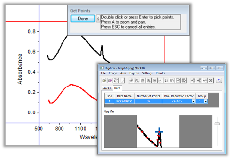
The Digitizer tool in Origin lets you generate data from images of graphs. Cartesian, ternary, and polar coordinates are supported. Digitizing methods include manual or semi-automated operations. Multiple curves can be digitized, and points can be reordered and visualized in the result graphing and data worksheet.
Data Exploration
Zoom and Pan
- Magnify a region of the graph
- Easily zoom and pan to desired X/Y scale
- Drag and change axis scale on graphs
- Zoom in region of interest and display details in second layer
- Enlarge a region of overlapped multi-layer graphs in a second graph (use Scale-In tool while holding CTRL key)
Alter or Remove Data Points
- Use masking tools to exclude data points from analysis or hide points from display
- Alter or remove data points
In a Zoom graph, a zoomed portion of a larger graph is added to explore a region of interest. Moving the cyan rectangle updates that portion of the graph shown by the inset.
Select the axis and drag the red point to change axis scale on graphs.
Or you can also press the Z or X keys and scroll the mouse wheel to quickly and interactively zoom and pan data in graph layers.
Press Ctrl+R to rescale graph axes to show all data.
Examine Data Points and Related Data
- Use Data Reader to read data plot's coordinates, row index, or corresponding information in other columns
- Use Screen Reader to read coordinates of any position in graph
- Use the Vertical Cursor Gadget for exploring data in stacked graphs
- Data Highlighting
- Data Point Tooltip
- Plot Highlighting
- Highlight column in worksheet when highlighting a data plot in a graph
- Conditional Formatting for Worksheets
Highlight a particular data plot in a graph. Also works with complex graph types such as Parallel plot.
The Data Reader tool and the Data Info Window in Origin allow you to explore your data graphically. You can customize the display to include information from other columns of the worksheet, including images embedded in worksheet cells.
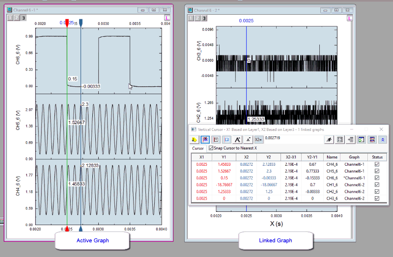
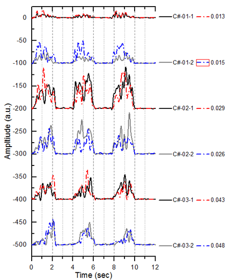
Use Vertical Cursor for exploring data in stacked graphs in multiple graph windows simultaneously. You can find information of one cursor or compare two cursors such as the distance
ROI-based Data Extraction from Graph
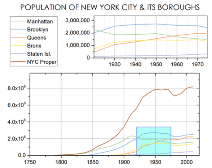
It is now possible to select data interactively on a graph, then extract the data to a separate worksheet:
- Different ROI shapes supported: Rectangle, Oval, and Arbitrary shape
- Multiple ROI supported
- Specify which plot(s) to extract data from
- Extract data in active or all ROIs to a new sheet, append rows, or append columns
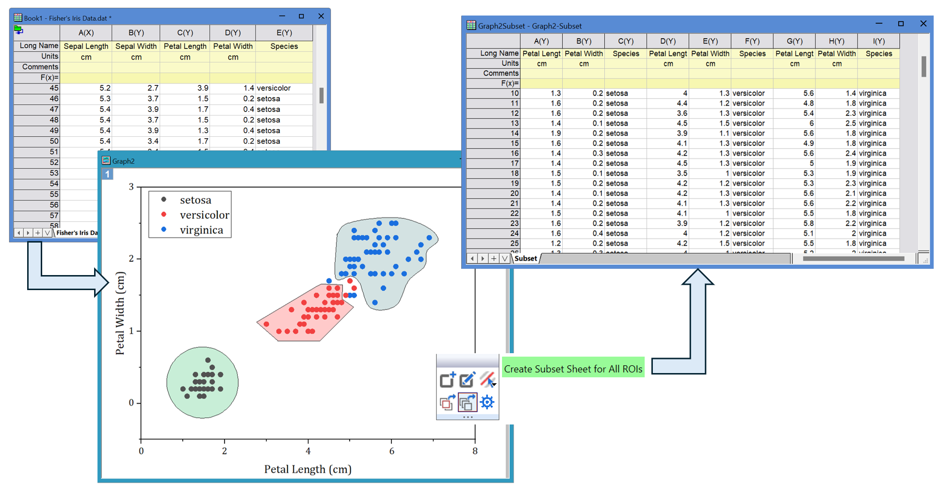
Example of extracting data using multiple ROIs on graph
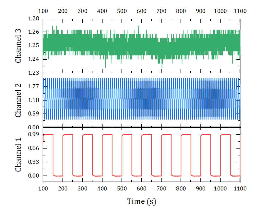
Browser Graph for Multichannel Data Exploration
Browser Graph templates allow user to explore multi-column or multi-sheet data quickly and easily:
- Allow quick selection of columns to plot, such as by picking every Nth column
- Allow changing all plots to data from a different sheet
- Choice of line, histogram, stacked lines, or stacked graphs
- Interactively turn selected plots on/off to explore
- Sort plots using any metadata value
- Flip through plots in browser graph
- Options to add data from current sheet or other sheets or books
- Turn Browser Panel on for regular graphs
- Spawn a new graph with selected plots
Slicer: Graph-based Data Filtering
This feature provides an easy way to explore and compare data by applying filters directly on graphs, without changing the source data in the worksheet:
- All data in the graph must be from the same worksheet
- Filters can be added to the Page, Layer, or Plot level of the graph
- Filters can be controlled from the left Slicer panel for easy manipulation
- Analysis tools and gadgets are updated upon filtering data in the graph
Change Parameter and Recalculate
A unique feature in Origin is the ability to change analysis parameters or perform recalculation:
- Set up your graphs and analysis for current data
- Change analysis parameters by re-opening dialog and changing settings any time, without having to repeat the analysis
- Change input data (e.g., by importing another file) to automatically trigger recalculation of results and updating of graphs and reports.
Data Analysis and Statistics
Origin and OriginPro provide a rich set of tools for performing exploratory and advanced analysis of your data. Please view the following sections for details.
Exploratory Analysis
Origin provides several gadgets to perform exploratory analysis by interacting with data plotted in a graph:
- Select data range interactively using a Region-of-Interest (ROI) box
- View immediate results as you move or resize the ROI
- Generate detailed reports from the analysis
- Options for customizing visual results and report settings
- Save settings as a Theme for repeat use
- Repeat the analysis on all data plots in graph layer or page
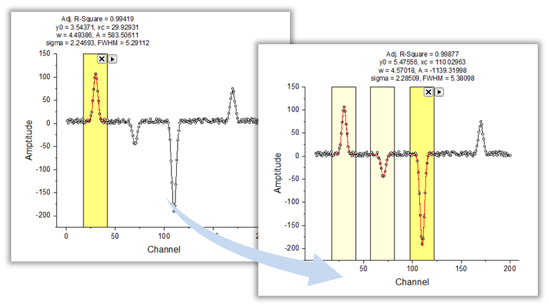
Origin provides a selection of Gadgets to perform exploratory analysis of data from a graph. A region of interest (ROI) control allows you to interactively specify the subset of data to be analyzed. Results from the analysis are dynamically updated on top of the ROI as it is resized or moved. This image shows peak fitting being performed using the Quick Fit gadget.
- Same or different gadgets can be applied multiple times in same graph
- Hide ROI box temporarily for printing and export
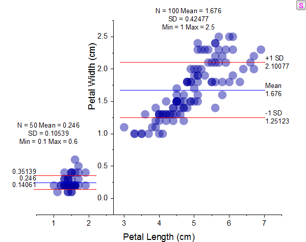
Two statistics gadgets are applied to this graph to report statistics in two regions of interest (ROI). Mean and 1st SD lines and corresponding values are are displayed in each ROI. The Y axis is moved to separate the two regions. Yellow ROI boxes are hidden so that they do not show in printouts. The "S" button on upper-right corner re-displays the ROI boxes when clicked.
Gadgets in Origin and OriginPro:
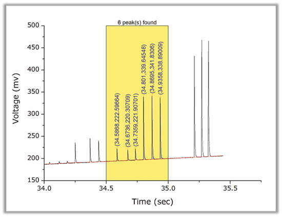
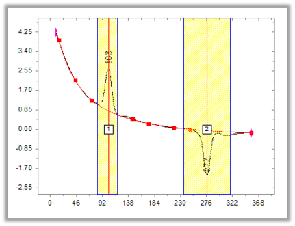
Use the Quick Peak Gadget to interactively perform peak finding, baseline subtraction, and peak integration of data from a graph.
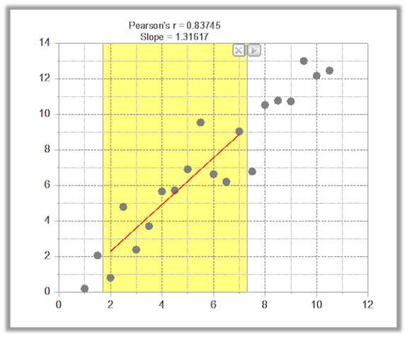
The Quick Fit Gadget lets you perform linear, polynomial, or nonlinear curve fitting on data plots in a graph. Notice the label on top of the ROI displaying the slope and Pearson's r from a linear fit . The label updates dynamically as the ROI is moved or resized.
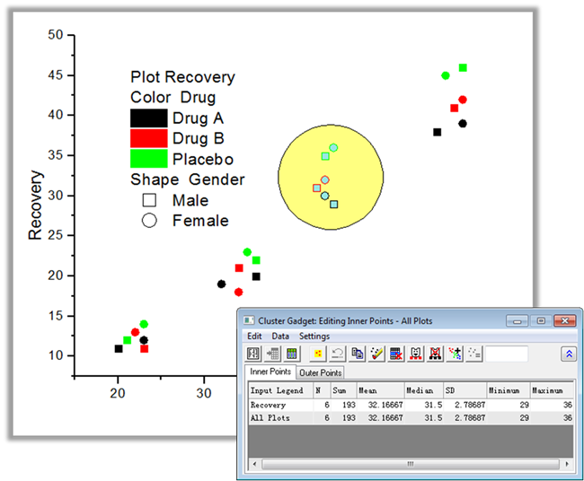
The Cluster Gadget available in OriginPro lets you interact with data in a graph within a region of interest (ROI). The ROI can be rectangular, elliptical, polygon or arbitrary hand-draw shape. The tool provides statistics on data inside and outside the ROI, and also lets you copy, clear, mask or delete selected data.
Curve and Surface Fitting
Origin provides various tools for linear, polynomial, and nonlinear curve and surface fitting. Fitting routines use state-of-the-art algorithms. The sections below provide a summary of key features.
Read More>>
Options and Controls
- Flexible data input: select from worksheet or graph
- Specify sub-range of data graphically or by numeric begin and end values
- Fit multiple datasets independently, globally, or in concatenate/replicate mode
- Global fitting allows sharing of parameters across datasets
- Select from close to 200 built-in fitting functions arranged in categories
- Create your own fitting function using our Fitting Function Builder, including using Python Script
- Fit with explicit and implicit functions
- Specify bounds and constraints to limit parameter space
- Control the fitting process by performing step-wise iterations
- Detailed report sheet include fit statistics, parameters and ANOVA tables, and residuals analysis
- Calculate Y/X values for new set of X/Y values based on the fit curve
- Iteration Algorithms for nonlinear regression: Levenberg-Marquardt and Orthogonal Distance Regression (Pro)
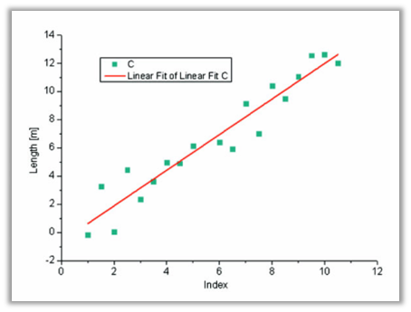
Graph displaying result of linear regression. Options for linear regression include fixing intercept or slope, finding new X/Y values from known Y/X values using the fit line, goodness of fit results including significance of slope, and fitting with both X and Y errors.
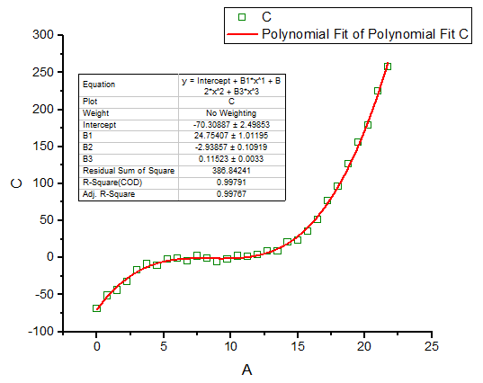
Graph displaying result of polynomial regression. Options include fitting up to 9th order polynomial, fixing intercept, finding new X/Y values from known Y/X values using the fit line, and fitting with Y errors.
Origin supports Global Fitting with Parameter Sharing, where you can simultaneously fit multiple datasets with the same function and optionally share one or more fitting parameters across all datasets. The report sheet will provide a summary table with all parameter values and errors, and a single set of fit statistics from the global fit.
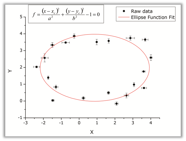
OriginPro supports fitting with implicit functions using the Orthogonal Distance Regression algorithm which minimizes the orthogonal distance from data to the fit curve. Errors and weighting for both X and Y data are supported. Implicit functions can have two or more variables.
Perform Weighted Fitting using either Levenberg-Marquardt or Orthogonal Distance Regression algorithms. The latter supports weights for both X and Y data. Select from over 12 weighting methods including instrumental, statistical, direct, arbitrary dataset, and variance.
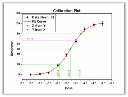
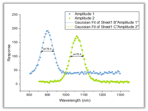
When working with replicate data, Origin can perform a Concatenated Fit where the replicates are combined internally to a single dataset. The graph included in the report sheet can either represent the data in replicate form, or as mean values with SD or SE error bars. A Quick Sigmoidal Fit Gadget is also available.
Comparing Models and Datasets PRO
OriginPro provides the following tools for fit comparison:
- Compare two fitting models with one dataset
- Compare one fitting model with two datasets
- Fit one dataset with multiple models, and rank fit results using F-test or Akaike (AIC)/Bayesian(BIC) Information Criterion
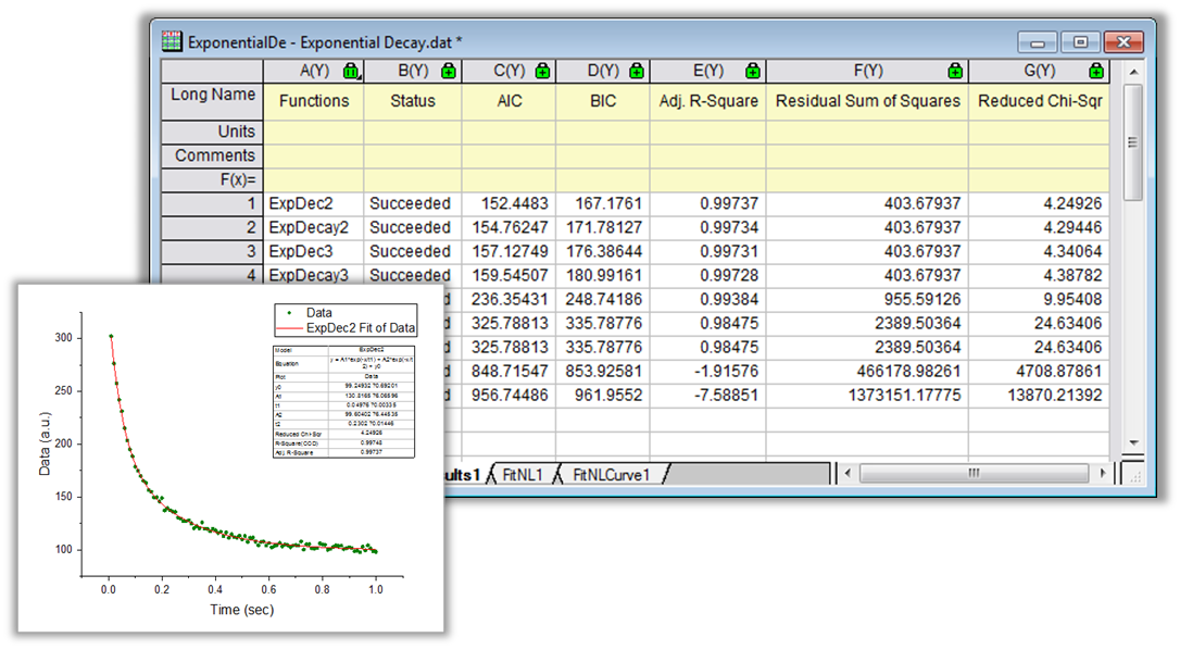
The Rank Models tool in OriginPro can fit and rank multiple functions to a dataset. The fit results can be ranked by either Akaike (AIC) or Bayesian (BIC) Information Criterion, to determine the best fitting model for your data.
Surface Fitting PRO
Perform 3D surface fitting on XYZ worksheet data or matrix data:
- Over 20 built-in fitting functions
- Create your own fitting function
- Fit multiple peaks
- Automatically find peaks using several methods
- Calculate Z values for new set of XY values based on the fit surface
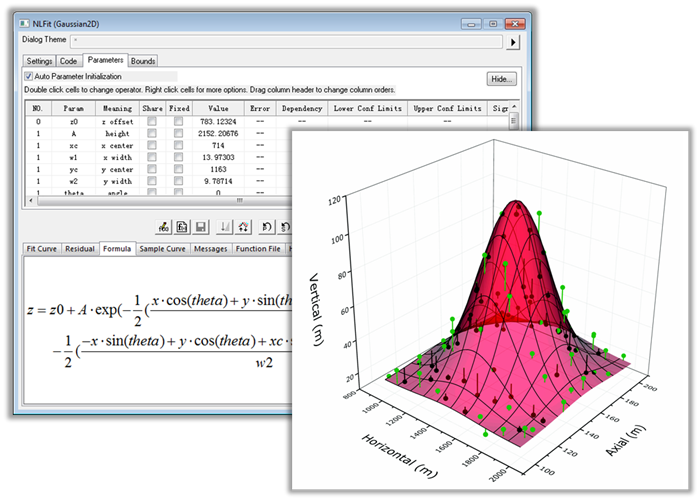
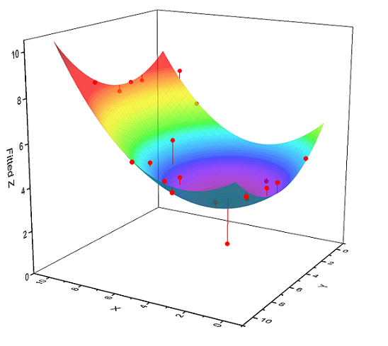
Use OriginPro to perform nonlinear surface fitting of data organized in XYZ worksheet columns, a matrix, or a virtual matrix. Select from over 20 surface functions or create your own function. For peak functions, find peaks using local maximum, partial derivative, or contour consolidation.
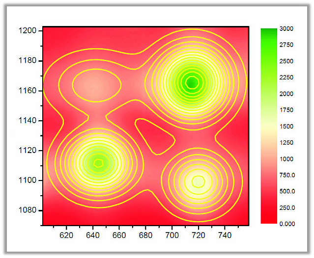
Results from fitting a 2D Gaussian function to four peaks, using the Surface Fitting tool in OriginPro. The raw data is plotted as a color-filled contour plot, and the fit results are plotted as contour lines.
Implicit Fitting PRO
Do you need to fit an implicit function to your data? Origin's NLFit tool supports implicit fitting using the Orthogonal Distance Regression (ODR) algorithm, including fitting with X and/or Y error data.
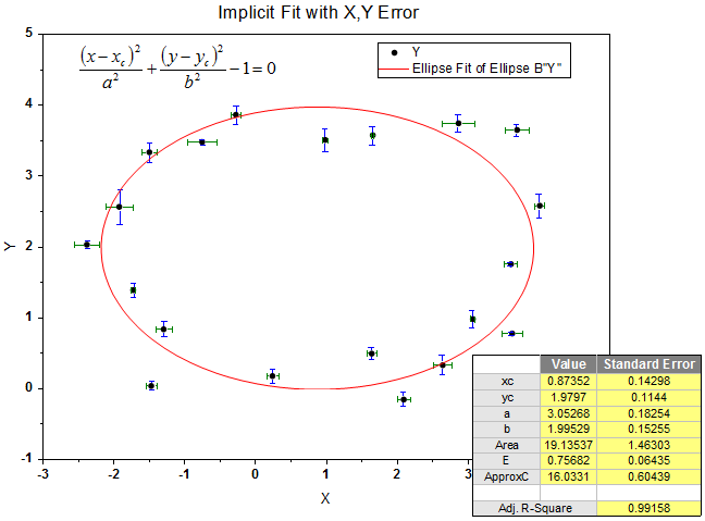
Implicit Fitting uses the Orthogonal Distance Regression algorithm to find optimal values for the fit parameters. Errors or weights are supported for both X and Y data.
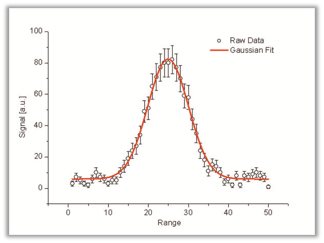
Peak Analysis
Origin provides several features for peak analysis, from baseline correction to peak finding, peak integration, peak deconvolution, and fitting. The following sections list the key features for peak analysis.
Read More>>
Baseline Detection
- Automatic and manual options to find baseline, or use existing dataset
- Methods include 2nd Derivative, XPS, and Asymmetric Least Squares
- Interactively add/modify anchor points
- Interpolate or fit baseline points with nonlinear functions
- Subtract baseline, or include baseline fitting as part of final peak fit
Read More>>
Peak Integration
- Automatic or user-specified integration window width
- Graphically adjust width for individual peaks
- Integrate from baseline or from y=0
- Report quantities including height, area, percent area, centroid, FWHM, and left/right half widths
Read More>>
This is a preview graph for performing peak integration using the Peak Analyzer tool. The integration range can be applied for all peaks, or modified individually and interactively for each peak.
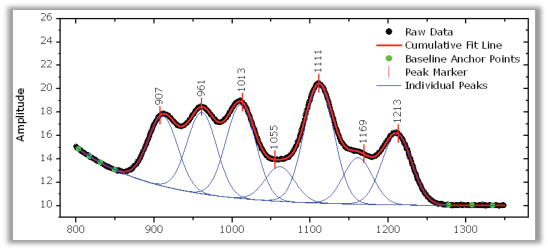
Peak Fitting PRO
Once you have performed baseline detection and peak finding, Origin provides several options for peak fitting:
- Select from over 25 built-in peak functions, or create your own peak function
- Fit all peaks with same function form, or assign different functions to specific peaks
- Peak deconvolution to resolve overlapping or hidden peaks
- Fix peak centers or allow them to vary by a set percentage or within a set range of values
- Specify bounds and constraints on peak parameters
- Share parameters across peaks
- Full control of fitting process including step-by-step iterations
- Detailed report including fit statistics, residuals, and graph of individual and cumulative fit lines
- Over 25 peak properties for reporting, including peak area by percentage, variance, skewness, and peak excess
- Fit summary graph with customizable peak properties table
Read More>>
Peak Finding
- Automatic and manual options to find and add peaks
- Methods include Local Maximum, Window Search, Residuals, and 1st/2nd Derivative to locate hidden peaks
- Load peaks from a predefined data list or theme
- Smooth data or derivative to locate peaks in noisy data
- Filter peaks by threshold or number of peaks
- Find positive and/or negative peaks
- Add, modify, or remove peaks interactively
- Label peaks using x, y, or row index of peak location in data
Read More>>
Batch Peak Analysis
There are several options for batch peak analysis of multiple datasets in Origin:
- Use integration and peak gadgets to analyze multiple curves in a graph within or across layers
- Use a predefined peak analysis theme to analyze multiple datasets or files
- Output a custom report table with peak parameters from each dataset or file
Read More>>
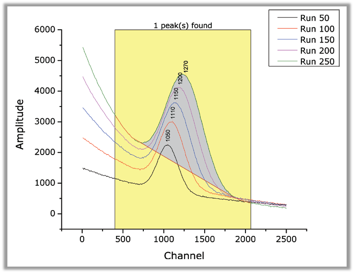
The Quick Peaks Gadget provides a quick and interactive way to perform peak analysis from a graph, using a region of interest (ROI) control. Batch operations such as integration of multiple curves over a desired range are also possible from this gadget.
The Peak Analyzer tool in Origin supports baseline detection, peak picking, and peak integration. In OriginPro, this tool also supports fitting multiple peaks. Peak detection methods include 2nd derivative search to detect overlapping or hidden peaks. The interface guides you step-by-step, allowing you to customize settings at each stage, and then save the settings as a theme for repeat use on similar data.
Statistics
Origin provides a wide array of tools for statistical analysis.
In addition, Origin provides the Stats Advisor App, which helps users interactively choose the appropriate statistical test, analysis tool, or App.
Read More>>
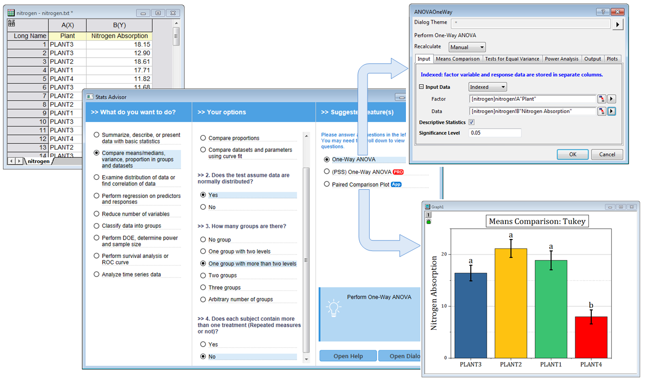
The Stats Advisor App asks a series of questions and then suggests the appropriate tool or App to analyze your data.
Descriptive Statistics
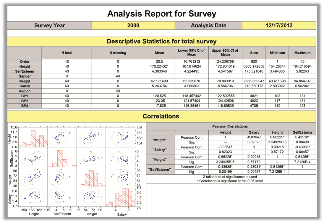
The graph shows a Custom Report of numerical and graphical results from multiple statistical tools, created from Origin's flexible worksheet. Once created, such reports can be automatically generated, greatly simplifying your statistical analysis tasks.
Origin provides several tools for summarizing your continuous and discrete data:
- Statistics on columns or rows
- Cross tabulation PRO
- 1D and 2D frequency counts
- Discrete frequency
- Normality test
- Distribution Fit including normal, Weibull, exponential, and gamma PRO
- Correlation coefficient PRO and Partial correlation coefficient PRO to detect relationship between datasets
- Outlier tests: Grubbs and Dixon's Q tests
Read More>>
Parametric Tests
- One-Sample t-Test
- Two-Sample t-Test and Welch's test
- Pair-Sample t-Test
- Two-Sample t-Test on Rows PRO
- Pair-Sample t-Test on Rows PRO
- One-Sample Test for Variance PRO
- Two-Sample Test for Variance PRO
- One-Sample Proportion Test PRO
- Two-Sample Proportion Test PRO
Read More>>
Non-parametric Tests
- One-Sample Wilcoxon Signed Rank PRO
- Paired-Sample Sign PRO
- Paired-Sample Wilcoxon Signed Rank PRO
- Two-Sample Kolmogorov-Smirnov PRO
- Mann-Whitney PRO
- Kruskal-Wallis ANOVA PRO
- Mood’s Median PRO
- Friedman ANOVA PRO
Read More>>
ANOVA
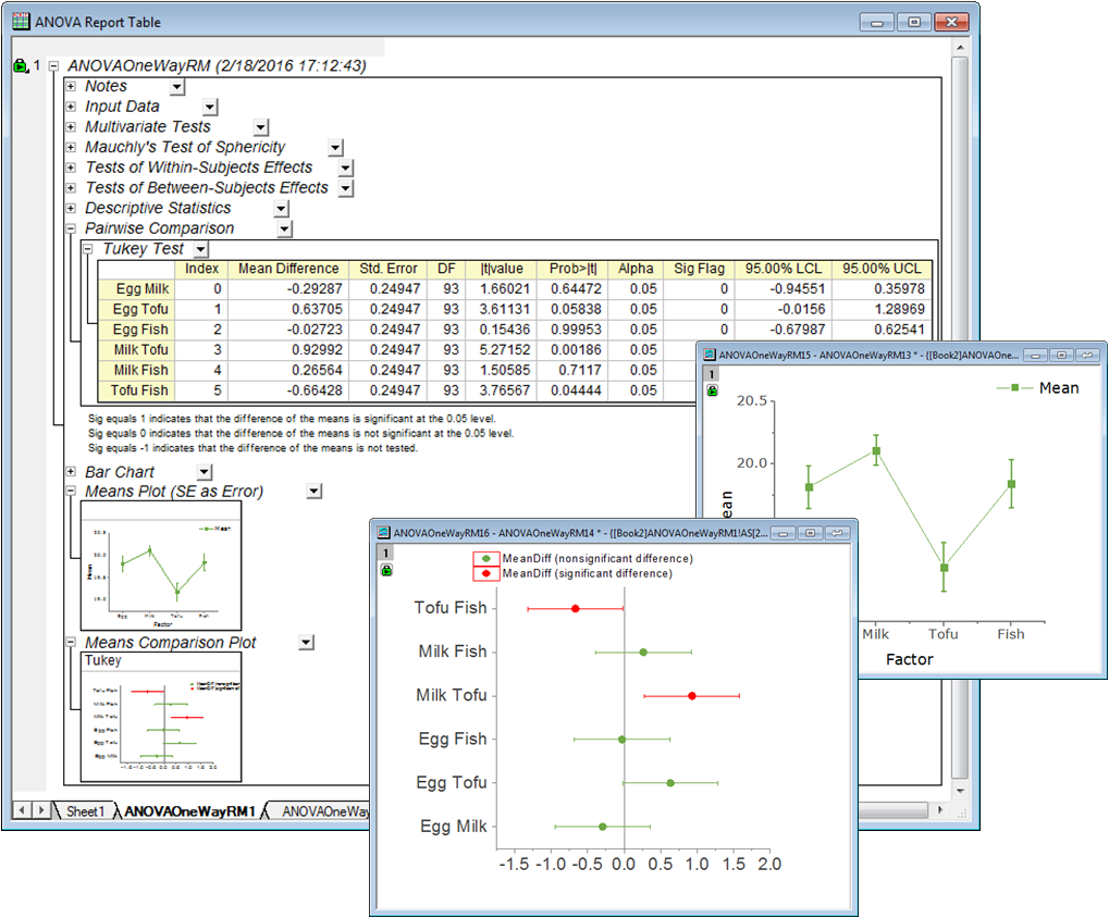
An Origin Analysis Report Sheet, this one created by the One-way Repeated Measures ANOVA tool. The image shows two of the embedded graphs opened for further editing. Edit an embedded graph by double-clicking on the thumbnail image in the report. Once customizations are made, put the graphs back into the report and see your modifications.
Origin provides 5 ANOVA tools to examine the differences between group means:
- One-way and Two-way ANOVA
- Three-way ANOVA PRO
- One- and Two-way Repeated-Measures ANOVA PRO
- Means comparison methods:
- Tukey and Bonferroni
- Dunn-Sidak and Fisher LSD
- Scheffe and Holm-Bonferroni
- Holm-Sidak
Read More>>
Multivariate Analysis
Five commonly used multivariate tools are available:
- Principal Component Analysis PRO
- K-Means Cluster PRO
- Hierarchical Cluster PRO
- Discriminant Analysis PRO
Read More>>
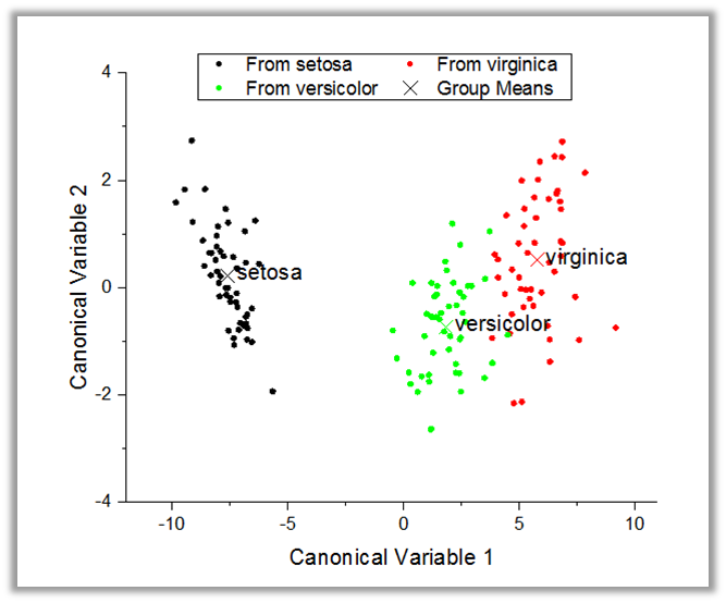
A Canonical Score Plot created by the Discriminant Analysis tool in OriginPro. This plot can be used to classify observations across groups.
Quality Control and Improvement
OriginPro provides the following key tools for quality control and Improvement:
- Statistical Process Control (SPC) PRO
- Measurement System Analysis (MSA) PRO
- Tolerance Intervals PRO
- Design of Experiments (DOE) PRO
Read More>>
Time Series Exploration and Analysis
Origin supports a variety of graph types to visualize time series data, and a selection of tools for processing and analyzing such data:
- Time Series Explorer
- Time Series Pivot
- Time Series Processing: Unstack, Filtering, Moving average
- Time Series Analysis: Trend, Decomposition, Correlation, Smooth, ARIMA Model, Stationary Test, etc
Read More>>
Additional Analyses
Other statistical tools available in OriginPro:
- Survival and Reliability Analysis
- Machine Learning Tools
Read More>>
Signal Processing
Origin provides a wide array of tools for signal processing.
Read More>>
Transforms
- Fast Fourier Transform and Inverse Fast Fourier Transform (FFT/IFFT)
- Short-time Fourier Transform (STFT) PRO
- 2D FFT/2D IFFT PRO
- Hilbert Transform PRO
Read More>>
Smoothing
- Savitzky-Golay
- Adjacent-Averaging
- FFT Filter
- Percentile Filter
- Lowess and Loess
Read More>>
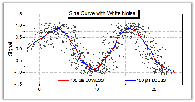
The Smooth tool in Origin provides several methods to remove noise, including Adjacent Averaging, Savitzky-Golay, Percentile Filter, FFT Filter, LOWESS, LOESS, and Binomial Method. The graph shows results from LOWESS and LOESS smoothing, which are particularly useful for detecting trends in noisy data.
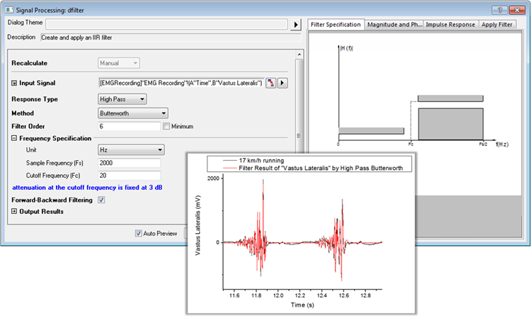
The IIR Filter tool in OriginPro can be used to design, analyze, and implement Infinite Impulse Response digital filters. Filter methods include Butterworth, Chebyshev Type I and II, and Elliptic filters. A preview panel is provided to enable real-time visualization of specified parameters and corresponding results.
Wavelet Analysis
- Continuous Wavelet Transform PRO
- Discrete Wavelet Transform (Decomposition) PRO
- Inverse Discrete Wavelet Transform (Reconstruction) PRO
- Multi-Scale Wavelet Decomposition PRO
- Smoothing PRO
- Noise Removal PRO
- 2D Wavelet Decomposition PRO
- 2D Wavelet Reconstruction PRO
Read More>>
Additional Tools
- Coherence PRO
- Envelope Curves PRO
- Decimation PRO
- Rise Time Gadget PRO
Read More>>
Mathematics
From simple column calculations to interpolation, calculus and integration, Origin provides a wide range of tools for mathematical analysis of worksheet and matrix data.
Read More>>
Column and Cell Calculations
- Column Formula:
- Simple column formula notation which is similar to Excel or Google Sheets
- Calculations can involve columns from other worksheets
- Over 500 functions in categories such as math, engineering, statistics, date-and-time, and string processing
- Before Formula Script to pre-process data prior to calculating results
- Auto-complete in cell or column formulas
- Cell Formula:
- Works for both Data and User-defined Label Row Cells
- Define cell formula with interactive cell or range referencing
- Stretch and extend formula vertically/horizontally
- Fixed cell referencing is supported
- Assign name to a range and then use in cell or column formula for calculations
- Use script-accessible functions and/or custom expressions
- Results update when source cells change, or with other changes such as data filter
- Normalization
- Average Multiple Curves in Worksheets or Graphs
- Math tool for simple column math
Read More>>
Define cell formula with interactive cell or range referencing
The F(x) Column Formula row in Origin worksheet lets you directly type expressions to calculate column values based on data in other columns and metadata elements. The expression can be further edited in the Set Values dialog which provides a lower panel to execute Before Formula scripts for pre-processing data. The Set Values dialog also provides a search button to quickly find and insert functions from over 500 built-in functions. User-defined functions can also be added for custom transforms.
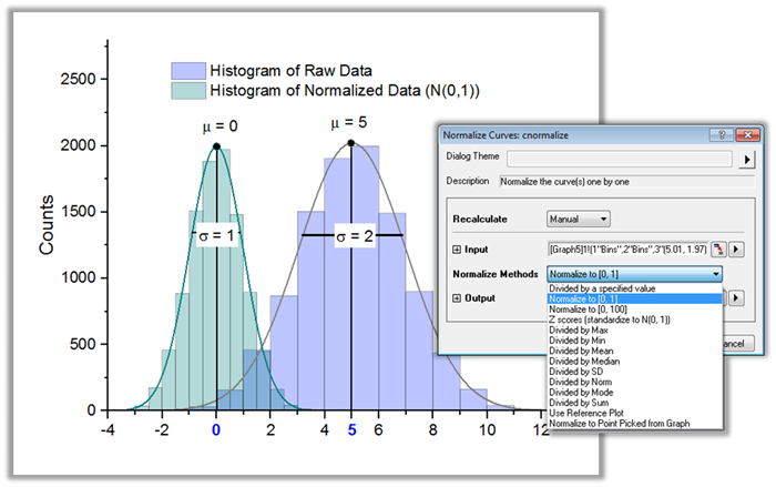
Use the Normalize tool to normalize data in a worksheet or a graph.
Interpolation and Extrapolation
- 1D Interpolation/Extrapolation
- 1D Trace Interpolation
- Interpolate/Extrapolate Y at Specific X
- 2D Interpolation/Extrapolation
- 2D Trace Interpolation
- Interpolate/Extrapolate Z at Specific X,Y
- 3D Interpolation
- Interpolation methods: Linear, Spline, B-Spline, Akima, Kriging, Renka-Cline, Shepard, TPS , Triangle, and Weighted Average
Read More>>
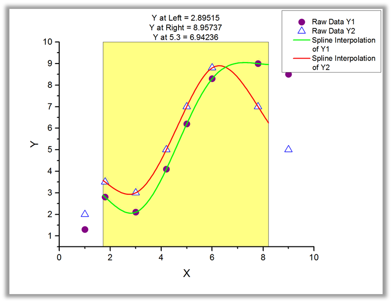
Use Origin's Interpolation Gadget to perform interpolation and extrapolation on one or more data plots in a graph. You can interactively select the data range using a region-of-interest (ROI) control. Interpolation methods include linear, spline and Akima spline.
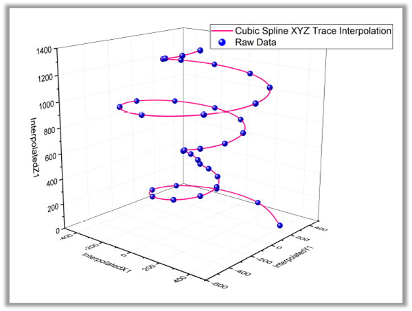
Use the XYZ Trace Interpolation tool to perform interpolation on a set of XYZ data points, preserving the sequential aspect of the data.
Differentiation and Integration
- Numeric Differentiation
- Numeric Integration
- Polygon Area Calculation
- Surface Area Calculation PRO
- 2D Volume Integration PRO
Read More>>
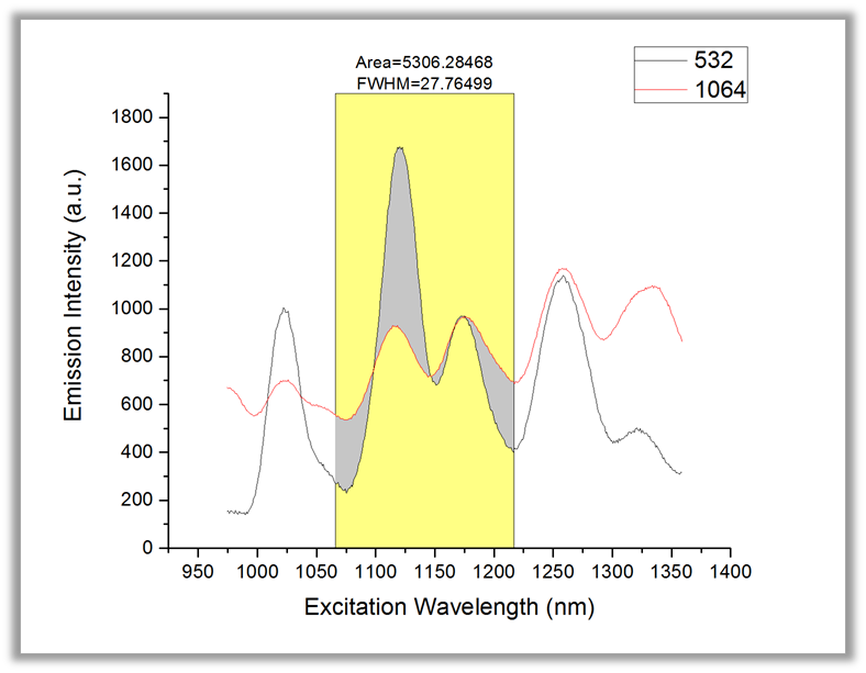
Use the Integrate Gadget to perform integration of data curves in a graph. A region-of-interest (ROI) control is provided to interactively select the desired data range. Baseline methods include selecting an existing data plot as a baseline to determine the area between two curves, as displayed in this graph. Batch integration of multiple curves is also supported.
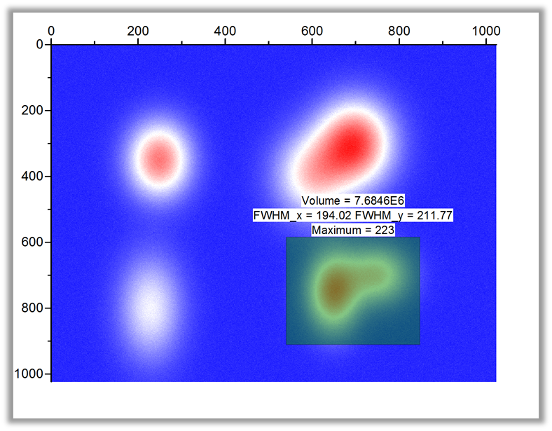
Use the 2D Surface Integration Gadget in OriginPro to calculate volume under a 3D surface plot, by interactively moving a region of interest (ROI). The volume, FWHM, minimum, maximum, and other quantities are dynamically updated as the ROI selector is moved or resized.
Data Processing
Origin provides multiple powerful data-manipulation tools which can be used for pre-analysis data processing. The pre-analysis data processing can be carried out right after importing data into Origin, and can help to get the data into a desired form for analysis in a quick and intuitive way.
Read More>>
Reorganization
- Sort data at column or worksheet level
- Stack and Unstack columns to transform data
- Split or Append Worksheets
- Transpose Worksheet, including Metadata Rows
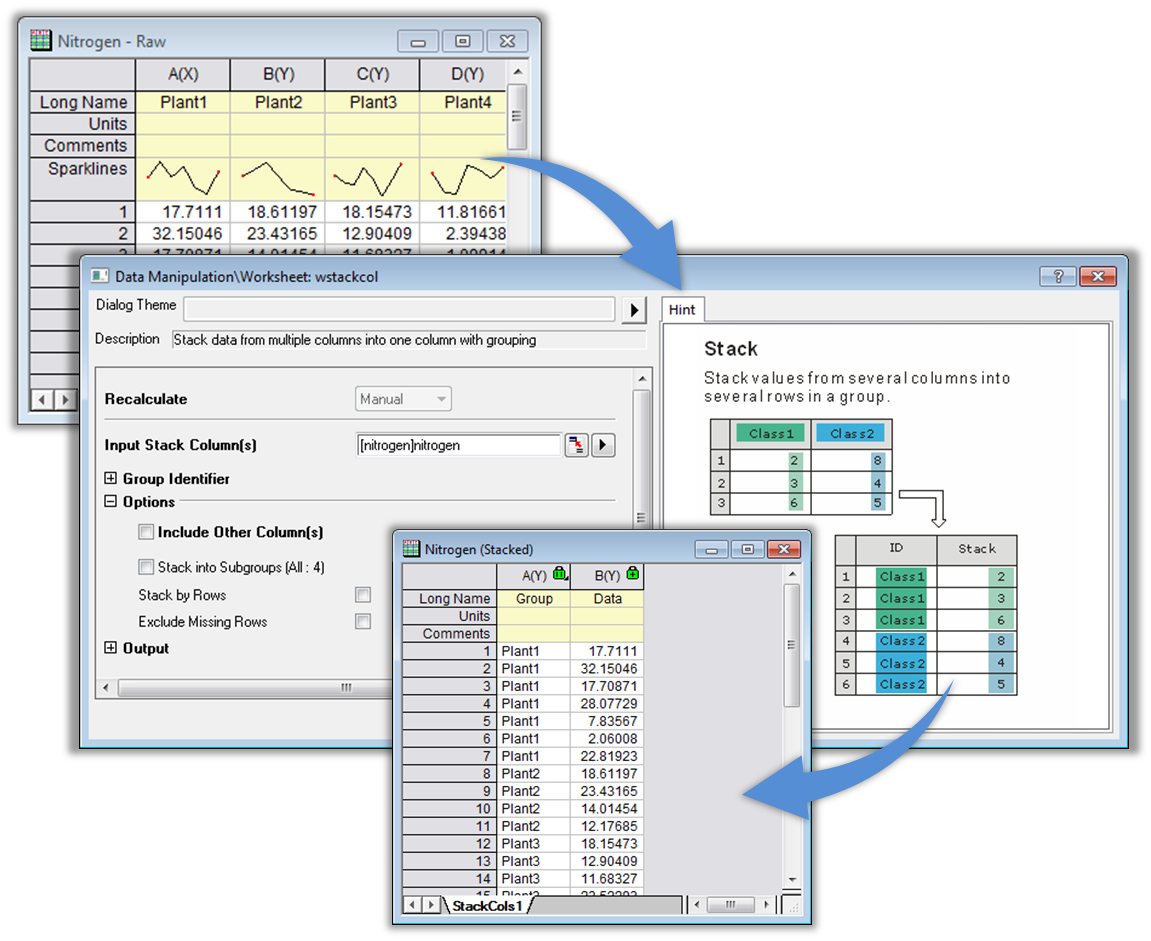
Origin provides several tools for reorganizing your data, such as stacking and unstacking columns, and splitting or appending worksheets. With the Stack Columns tool displayed here, you can specify a row label such as Long Name or Comments to act as group identifier. The tool also provides options for stacking into subgroups or stacking by rows.
Extraction and Reduction
- Filter your data using conditions on one or more worksheet columns, and all associated graphs and analysis results will automatically update
- Use Pivot Table to reduce and summarize your data
- Reduce data using multiple methods: Evenly Spaced X, Duplicate X, Reduce by Rows, or *Reduce by Group
- Fill data automatically in worksheet cells
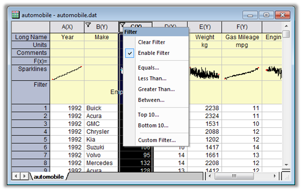
The Data Filter feature in Origin lets you specify numeric, string, or date-time filters on one or more worksheet columns to quickly reduce data. Custom filter conditions are also supported. Hidden rows are excluded from graphing and analysis. All graphs and analysis results can automatically update when filter conditions are changed or when the filter is enabled/disabled.
RS and GIS Data Processing
NetCDF
- Calculate average from the NetCDF file during Importing
- Pick out a specific time period from a NetCDF file
- Shift or flip a NetCDF file during Importing
GeoTIFF
- Import GeoTIFF as an image
- Import DEM data from a GeoTIFF file for further analysis
- Import multiple GeoTIFF images as stacked matrices
- Apply color palettes to a GeoTIFF image
- Fine tune a gray-scale display range of the image
- Export processed image or analysis result as GeoTIFF images
Data Processing and Analysis
- Extract pixel values from stacked matrices by selecting points or specifying coordinates
- Extract a region-of-interest (including shapefile-based) from stacked matrices or images
- Finding mean, min, max, and coordinates of min and max, etc., on a region-of-interest from a matrix stack
- Matrix stats, subtraction, simple math, and linear fit along time axis
- Resample or interpolation on stacked matrices
Visualization and Graphing
- Browser Graph for contour and image plots from a matrix stack
- Set GeoTIFF as background of a graph (Pie map, Bar map, Bubble)
- Plot raster data as Contour, Surface, etc.
Blog...
NetCDF videos on YouTube
Add one or more ROIs on your imported GeoTIFF image, and extract to analyze further or create graphs such as 3D surface plot. Moving or resizing the ROI will automatically update the analysis results and graphs
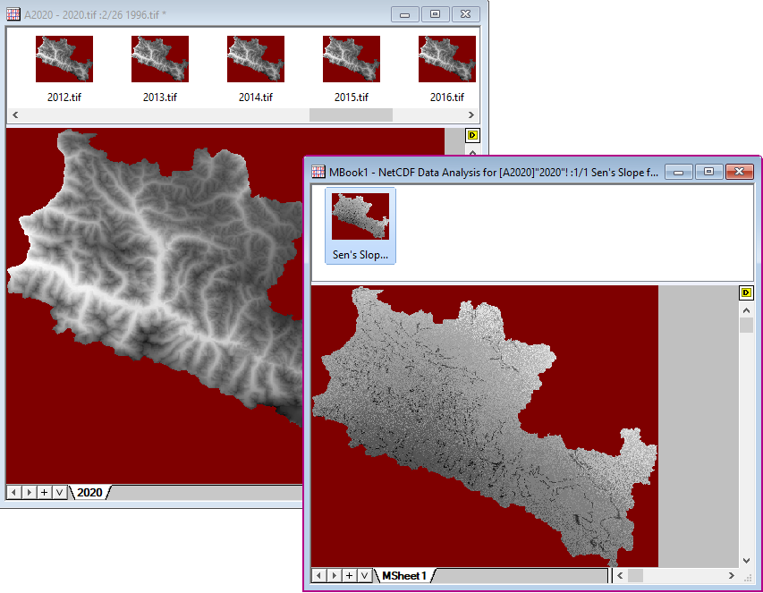
Perform Theil–Sen regression on multiple years of GeoTIFF data and get the rate of change (slope value)
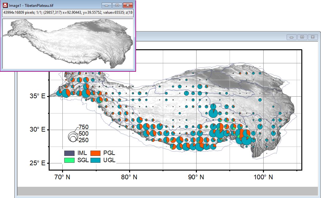
GeoTIFF image as background in graph, with pie map and shapefile overlaid
Exporting and Presentation
Origin provides many options for exporting and presentation, from sending graphs to PowerPoint to creating movies.
Resize Graph for Publishing
Journals typically require a specific width for the graph image, such as 86mm for single column and 178mm for double column. In addition, at the scaled size, they may require text labels to be above a particular font size and lines to be above a certain thickness.
In this version, we offer the following key features for preparing the Origin graph with the exact width specification:
- Resize a graph page by specifying desired width, while maintaining aspect ratio (auto scale height when width is changed)
- Scale all elements on the page when resizing in order to maintain proportional balance in the graph
- Conversely, set element scale to some fixed factor when you want to maintain an absolute size of elements
- Fit all graph layers to the available page area using user-specified margins, while maintaining layer relationships, relative size, and object scale
Once the graph has been scaled to the desired width, it can be exported in a vector or raster format for submission to the journal.
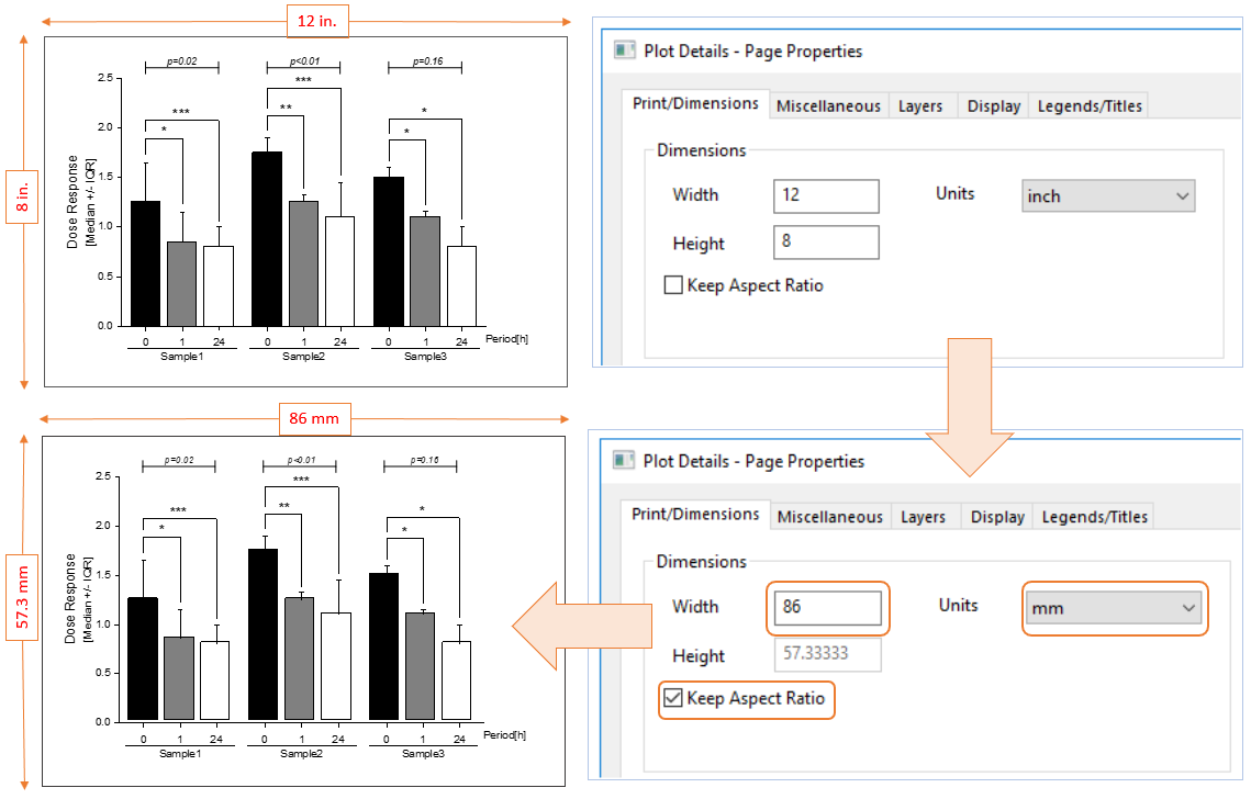
Specify desired width and units to match requirements of the journal. The page height will be proportionally scaled while maintaining aspect ratio. Relative dimensions of all objects in graph will be maintained.
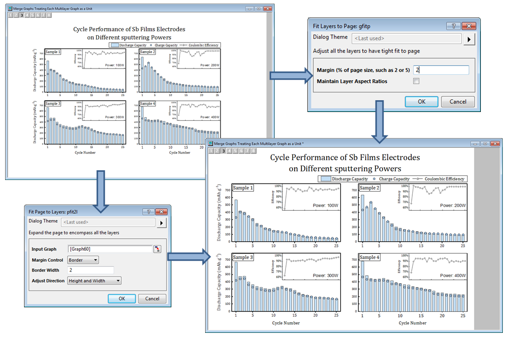
Reduce white space in your graph page by either expanding all layers to occupy available space (Fit Layers to Page) or by reducing page size (Fit Page to Layers).
Exporting Graphs
- Export graphs and layout pages to over 15 file formats: SVG, EPS, PDF, EMF, TIFF, PNG, JPEG, BMP, and several more
- Specify export settings, such as export width, height, and DPI
- Export User-defined Area of Graph Page
- Option to trim white space around the graph
- Save settings for repeat use
Pasting and Embedding
- Simply copy and paste graphs into other applications: Microsoft Word, PowerPoint, etc
- Paste as image, html, or as Origin Graph (OLE)
- If pasted as Origin graph, double-click to edit graph in Origin and make quick changes
Give your published graphs a consistent look using a Master Page or System Theme™. In the GIF, we used the Master Page feature to add a company logo and date stamp of identical style and position in graphs
Send Graphs to PowerPoint or Word
- Send single or multiple graphs from anywhere in the project
- For PowerPoint (Pre-install App):
- Send to an existing file
- Attach to an opened file
- Specify slide number to be repeated for each graph insertion
- Specify slide margins
- Place as a picture or as a graph object (OLE)
- For Word (Pre-install App):
- Send to an existing file
- Attach to an opened file
- Place graphs at bookmark locations by name
- Place as picture or as a graph object (OLE)
Copy and Paste HTML or EMF Tables
Copy formatted worksheet cells or tables from Origin's report sheets as HTML. Then paste to other applications such as Microsoft word and edit further. Worksheet cells can also be copied as EMF.
Slide Show
Perform a slide show right within Origin:
- All graphs from active folder in the project
- Slide order by graph name, slide index, or by last modified/created
- Option for continuous loop until Esc
- Switch to graph window from current slide
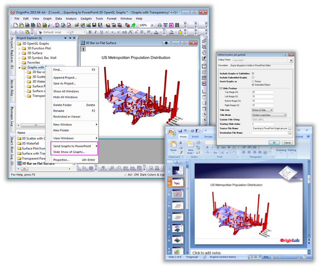
Send graphs to Microsoft® PowerPoint directly from Origin. You can send graphs individually by name, by Project Explorer folder, or send all graphs from the entire project. Options include specifying slide margins and using a pre-existing slide as a template, allowing you to add a common set of elements to your published slides.
A Send Graphs to Word App, available from the OriginLab File Exchange, exports your Origin graphs as embedded objects or pictures and inserts them into a Word document, with the option to insert them at specific bookmarked positions.
Creating Movies
- Specify width, height, alignment, and frame rate
- Optionally compress file using available options on your computer
- Manually or programmatically add graphs as frames to a movie
- Export image stack in matrix as video
Use the Video Builder tool in Origin to create a video file from Origin graphs. Manually or programmatically add frames to the video from any graph in your project. This animation displays the evolution of data values mapped onto a 3D surface.
Creating Reports
Origin provides multiple ways to create nice reports. With any of the available methods, you can format the appearance of the report as needed, adding graphs, images, and analysis results as links, thus creating a custom report.
Your custom report sheets can become templates for repeated tasks. Simply import new raw data and watch your custom report automatically update. When your report is ready, export it as a PDF file or as an image file by choosing a popular image format such as EPS or JPEG.
- Notes Window
- Worksheet
- Layout / Graph Page
Read More>>
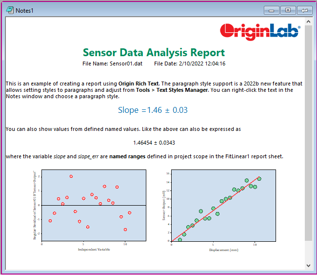
Use Origin Rich Text in a standalone Notes Window or Notes Sheet added to a workbook. Format text using various built-in, customizable styles, and add graph images and images from the project or from the web. Link to result values in report sheets to create a final report, all within Origin.
Batch Processing
Origin provides multiple ways to handle repetitive graphing, importing, and data analysis tasks. Batch operations can be performed directly from the GUI, without the need for any programming.
Read More>>
For Graphing
Copy and Paste Data Plot
- Copy and paste data plots from one graph layer to another with custom formatting
Save Graph Settings
- Save graph template
- Save graph theme
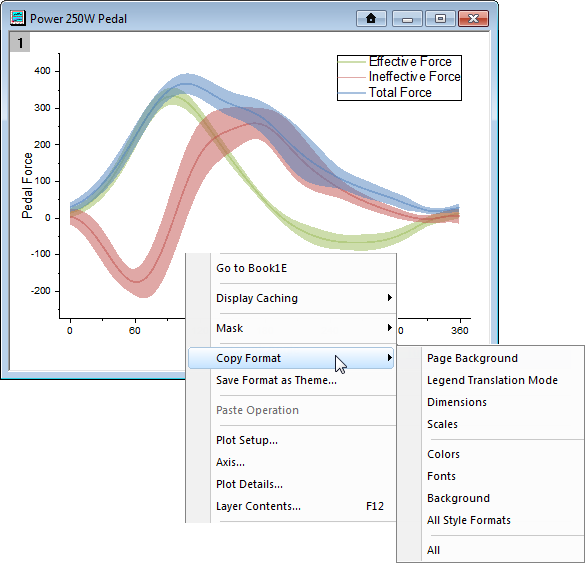
- Copy format and apply to other graphs
Batch Plotting
- Create desired graph from one column or from multiple columns in the worksheet
- Repeat graph for all columns, or for all worksheets with a similar data structure
- Create new graphs with meaningful names
Smart Plotting with Cloneable Templates
- Create graphs from multiple worksheet columns, specifying column name or position in the worksheet
- Save as Cloneable Template, where column names/positions are saved
- Origin marks all templates that are compatible with active sheet
- Create new graph with similar data structure with one click
- Template Library for organizing templates and filtering templates compatible with the active sheet
Read More>>
One of the many time-saving features in Origin is batch plotting: Create a graph involving multiple columns from a worksheet/workbook, and then have Origin duplicate that graph for all other worksheets/workbooks in the project with the same data structure.
As an alternative to Graph Templates, Graph Themes provide a means to save graph customizations and apply them to different types of graphs across your projects.
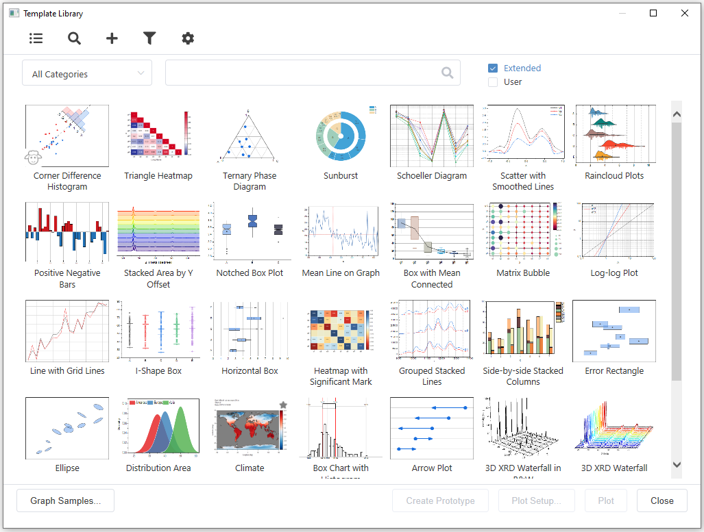
The Template Library helps you organize and utilize Graph Templates you have created. Graph Templates are a great way to apply the customizations you have made to one graph, to additional graphs you make from similar data. Starting from Origin 2021b, Origin provides a set of extended graph templates in the template library.
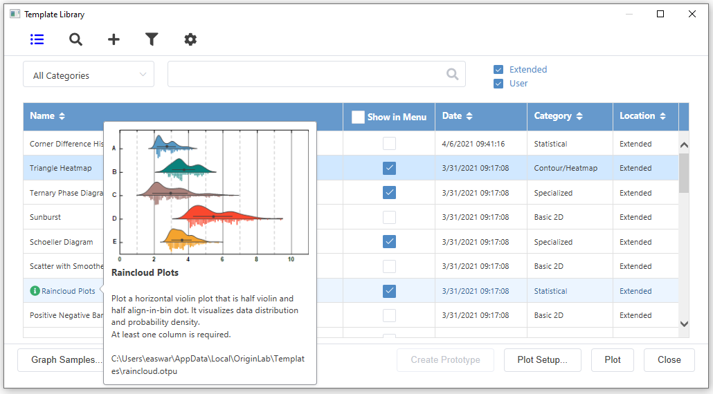
Graph Template Library dialog shown in List View mode. It enable to select Graph Template to appear in Plot > My Template menu
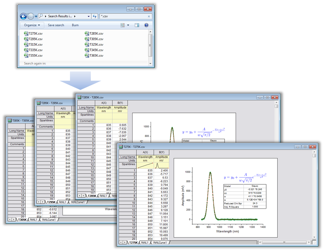
Set up desired graphs and analysis operations on data in the current workbook. Set the operations to automatically update. Then simply import multiple files, having Origin clone the current workbook for each file. All graphs and analysis results in the new books will be updated based on the data from each file.
Save Import Settings
- Save import settings as a dialog theme file
- Save import settings as a filter file
- Allow LabTalk script to execute after import
- Save import settings together with worksheet
Batch Import by Cloning Workbook
Origin provides a quick yet powerful way for users to perform batch graphing and analysis when importing multiple files.
- Import one file and set up your workbook with desired analysis and graphs, all contained within the book
- During import, choose <clone> to use active book as temporary template for each new file
Clone an Origin Project
Clone an Origin project to easily replicate graphing and analysis tasks with new data.
- Set up a Master Origin project with your desired data, graphs, and analysis, using multiple windows such as workbooks graphs, reports, etc, as needed
- Save your master project, then from File menu, select Clone current Project...
- Import new data into the data sheets of the cloned project to update all of your graphs and analysis results in the project
- Optionally add a Data Connector link to the master project data sheets, in the cloned project
Read More>>
For Analysis
Recalculation and Analysis Template
Origin supports automatic or manual recalculation of results from most analysis and data processing operations, which is the foundation of batch processing and automation.
- Update results when input data changes
- Modify dialog settings by Change parameters without need to start from scratch
- Output of one operation can be used as input for another to form a chain of operations
- Save dialog settings as a dialog theme file
- Last used theme is saved automatically for quick access
- Create Analysis template to automate analysis and custom report creation
- Use whole project as analysis template
Repeating Operations on All Plots or Columns
- Perform an operation on one worksheet column or one data plot in a graph
- Repeat the operation for all other columns or data plots
Copying & Pasting Fitting Operations
- Perform curve fitting on one data plot in a graph
- Copy and paste the operation to other selected curves in the same graph or other graphs
Use Gadgets to Analyze Multiple Curves
- Plot all datasets in single or multiple layers in a graph
- Place gadget on one curve, then customize settings
- Output results from the gadget for all curves in a layer or all curves in a graph page
Batch Analysis
- Set up an Analysis Template™ workbook by performing a desired set of operations on data
- Use the Batch Processing tool to process data from multiple files or worksheet columns
- Generate report table with desired metadata and parameters listed for each processed file or dataset
- Generate custom reports, combining graphs and numeric results, using Origin's worksheet
- Optionally link an Analysis Template™ to a Microsoft Word Template and create polished multi-page reports
- Execute LabTalk script before or after each file, or at the end of the batch process, for further customization
- Batch peak analysis with dialog theme
Read More>>
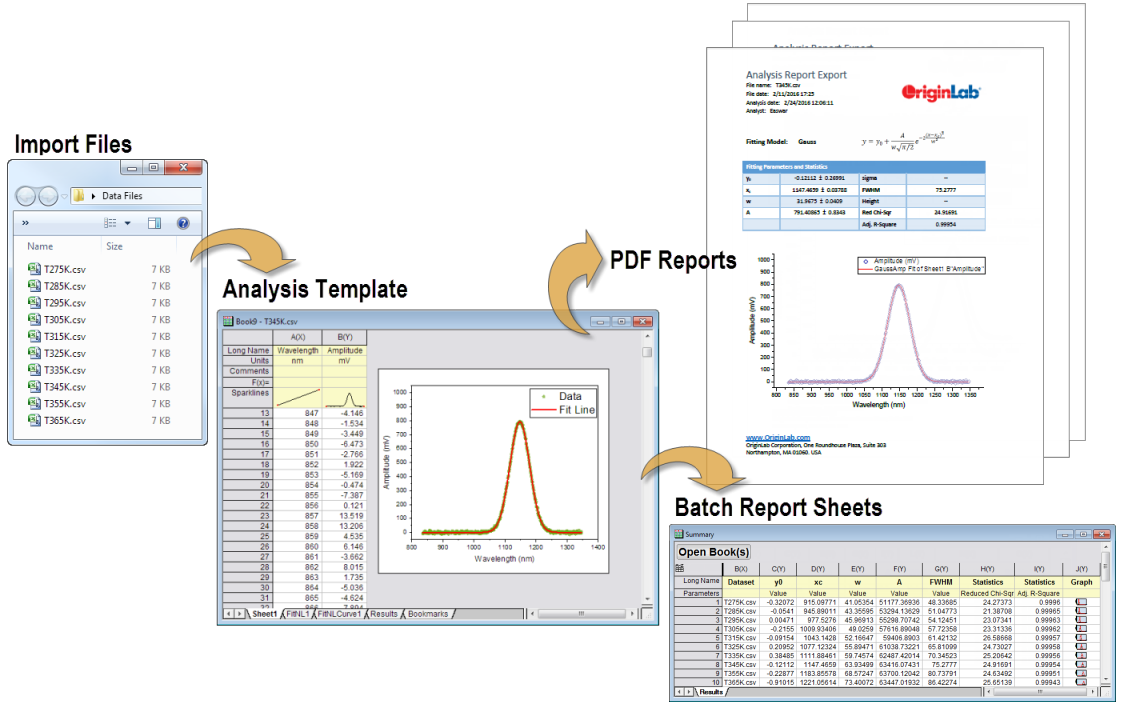
The Batch Processing tool in Origin lets you process multiple data files or datasets using an Analysis Template. The template can include a summary sheet for collecting relevant results for each file in a summary table. The analysis template can also be linked to a Microsoft Word template using bookmarks, to create custom multi-page Word or PDF reports for each data file.
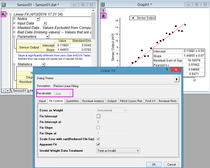
Most analysis tools support recalculation of results upon changes to data. The green "lock" that you will see in result sheets and graph windows indicates that recalculation is set to "auto"; so, for instance, if you made changes to your input data, your linear regression analysis would update automatically. Left-click on the green lock to open the linear fit dialog, make adjustments to your analysis, then recalculate.
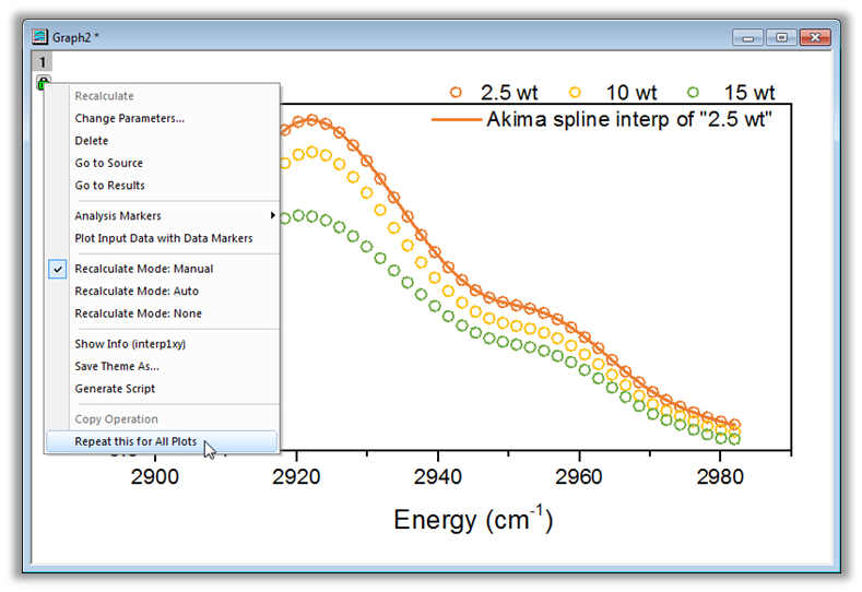
Once you perform an operation on a data plot or a worksheet column, Origin allows you to repeat the operation for all other plots in the graph, or all other columns in the worksheet.
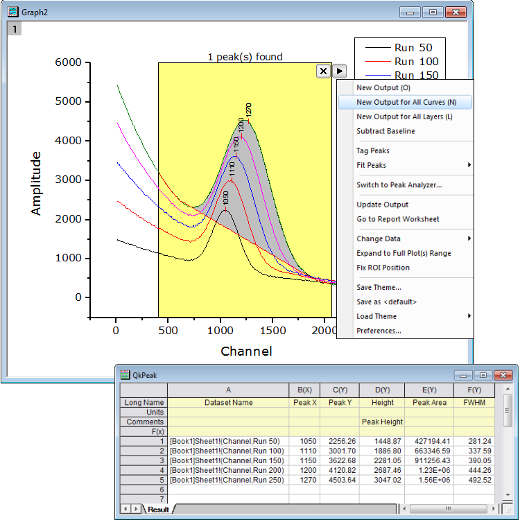
You can use New Output for All Curves or New Output for All Layers to apply the same analysis on all plots.
Project and Data Management
The following are some of the key features related to data management in Origin.
Origin Project (OPJ, OPJU) File
- Store data, metadata, notes, graphs, analysis operations, and results in one document
- Arrange content in a flexible, user-specified folder structure
- Add comments to sheet, window, and folders
- Support internally saved Microsoft Excel files or links to external Excel files
- Include LabTalk Script, Origin C code files, and other third-party files as attachments
- Highly portable: Colleagues who do not have Origin can view data and graphs from OPJ/OPJU files using the free Origin Viewerapplication (Windows or Mac)
- Save a subfolder as a new project file, and append multiple project files from disk to current project
- Copy/Paste folders and workbooks across Origin sessions
- Individual windows, such as workbook, graph, matrix, and notes can be saved to disk and opened in a new project file
- OPJU File enables users to easily identify an Origin project visually in Windows Explorer
Navigating Your Data
- Project Explorer window with two panels to show folder and windows
- Show graphs/worksheets from different folders
- Detailed, list, small icon, large icon, and extra large icon view mode for graph, workbook, and matrix preview
- Useful tooltips, such as graph or workbook preview, and folder notes
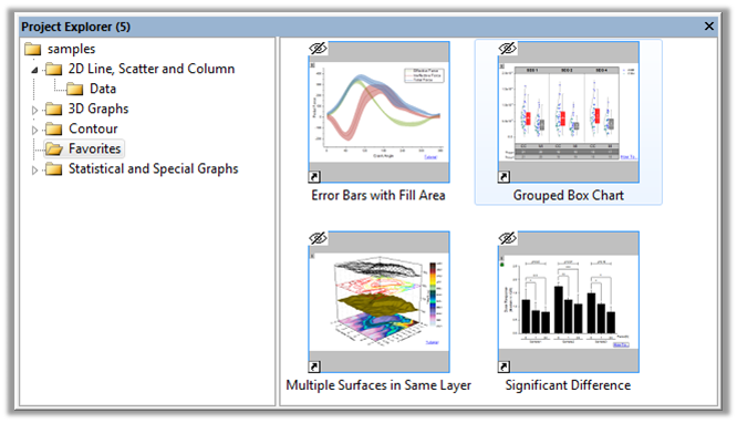
- Favorites folder with shortcuts to collect key information, such as all graphs ready for publication
- Show graphs as slideshow, adjust slideshow orders, and skip or not in Project Explorer
- Project Browser to search and bulk edit contents of current project
- Recent Files Button to quickly load recent Origin files
Window Management
- Seesaw between folders to quickly switch folder
- Pin a window to keep it visible when switching folders
- Float windows outside of Origin Interface
- Snap windows allow users to efficiently arrange and resize multiple windows
- Window Switcher for quickly switching windows
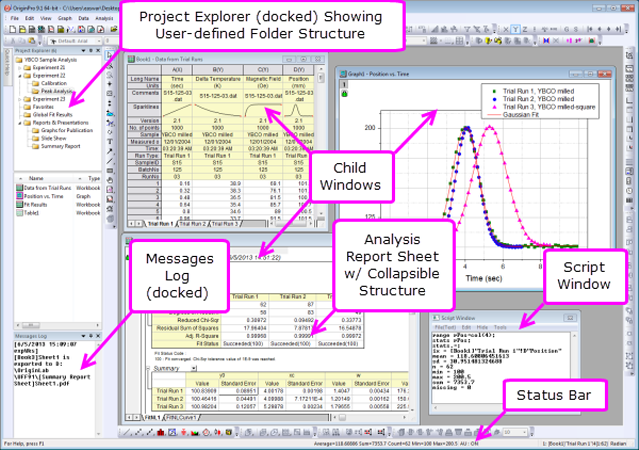
The Origin Project file (.OPJ) combines data, notes, graphs, and analysis results into one document with a user-defined folder structure.
The dockable Project Explorer window lets you organize the contents of your Origin project with a flexible user-defined folder structure. Simply drag-and-drop windows and subfolders to rearrange. Right-click on one or more graphs and choose Add Shortcut to Favorites and collect shortcuts in a Favorites folder, allowing for efficient presentation and/or export of select graphs. Choose Project Explorer's extra large icons view for graphs, for easy identification.
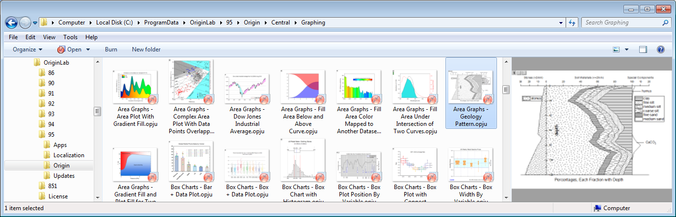
Origin Project files(OPJU) viewed in Windows Explorer. Middle panel shows large icons with image of last visited graph when project was saved. Right side panel shows larger image of graphs with vertical scroll bar to view all graphs contained in the project.
Workbooks and Worksheets
- Multi-sheet workbooks with capability to handle larger number of columns and rows compared to Excel
- Support for arbitrary number of metadata labels at the column level, and for hierarchical metadata structures at book and sheet levels
- Support freezing or splitting panes to lock rows or columns
- Sparklines for quick graphical view of a worksheet column of data
- Insert comments and notes to a cell
- Statistics, such as min, max, mean, etc., of selection cells, columns, or range on Status bar
- Place graphs as floating or embedded objects in worksheets
- Create custom report sheets by arbitrarily arranging data, graphs, and images, such as logos, on the page
- Wide array of data-processing tools, including data reduction, filtering, and pivot tables
- Data protection by disable editing
- Save import settings, format, and operations in workbook and sheets
- Column List View for worksheet to display only a column list
- Treat missing values as blank in worksheet
- New Workbook dialog with many build-in templates, plus ability to add user-template and set as default template
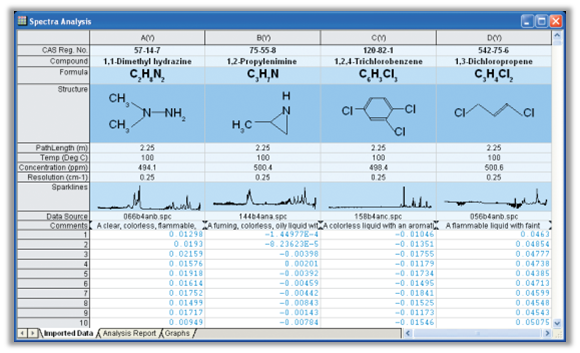
The Origin Worksheet lets you store relevant metadata in Column Label Rows on top of the columns. Default rows include Long Name, Units, Comments, F(x) for Column Formula, and Sparklines that display a miniature graph of the data in the column. Users can further customize label rows for including other metadata elements. This image shows custom rows with rich text formatting for super-subscript, and images inserted from external files.
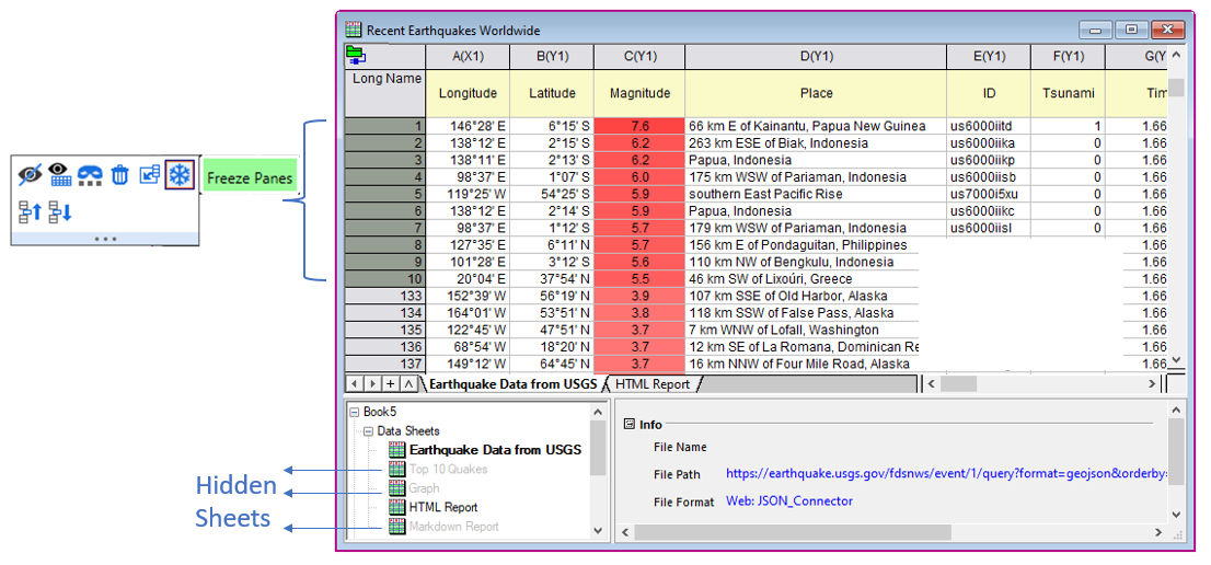
Freeze first n rows or columns. Hide sheets to reduce clutter.
Matrix books, Sheet and Objects
- Multi-sheet matrices for image or numeric data
- Multiple matrix objects in one sheet
- Thumbnails for quick image preview
- Data and Image Mode of Matrix
- Show XY values or row column index of Matrix
- Save import settings, format, and operations in matrix books and sheets
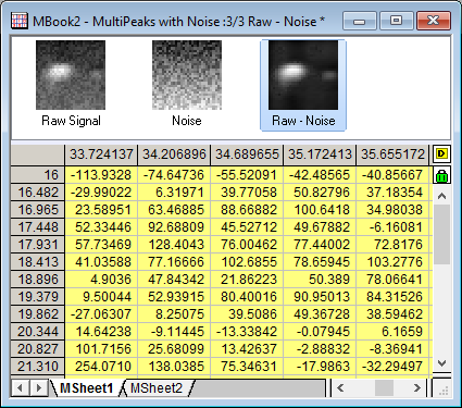
Matrix book in Origin. Image Thumbnails Panel is turned on on the top to for quick preview of data. There are 3 matrix objects in current sheet, where the 3rd matrix is a subtraction of first two matrix objects. XY values of matrix show in column and row headers instead of column and row indices.
Password Protection
- Protect entire Origin Project (OPJ, OPJU) file with a password
- Optionally turn on Audit Log for project file saving, including separate password for log
- Providing option to turn on automatic addition of audit log for all newly created projects
- Password protection can be used to implement procedures for compliance with Title 21 CFR Part 11 regulations
- Protect workbook and worksheet with a password
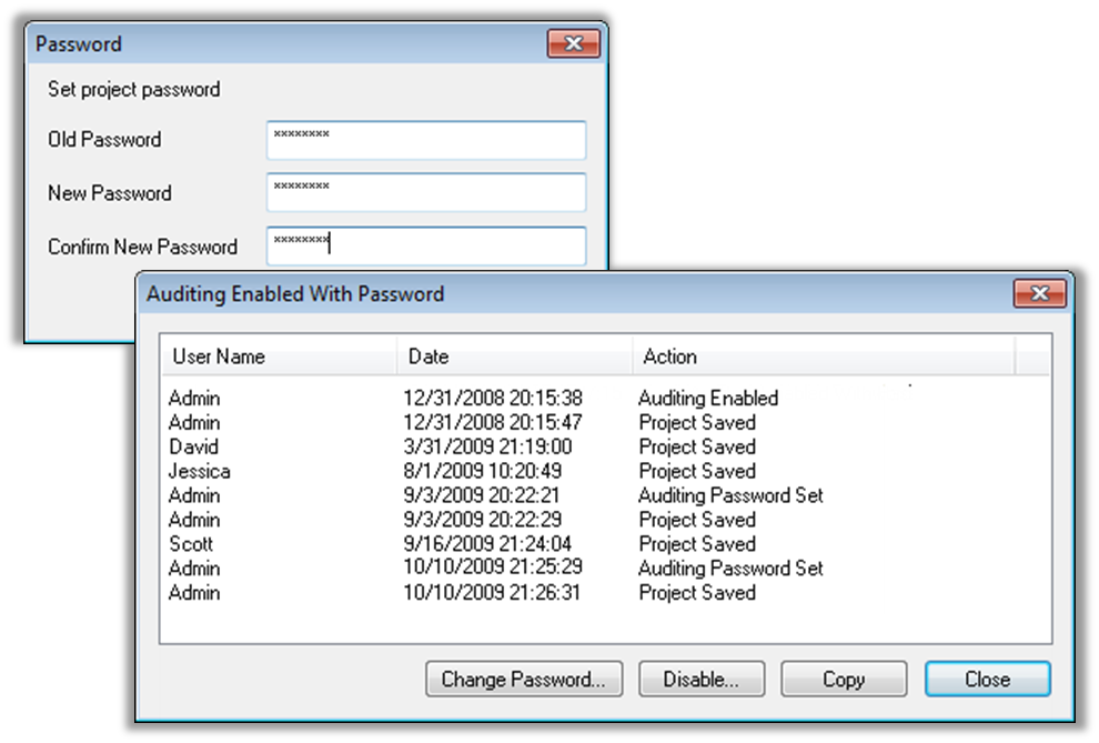
Origin provides password protection of the entire project, or at the workbook/worksheet level. An audit log feature is also available, to maintain a record of date, time and user name for changes made to the project file. These protection features can facilitate compliance with CFR Title 21 Part 11.
Programming and Connectivity
As your Origin use expands, you may want to programmatically access existing features in Origin, add your own custom routines and tools, or communicate with Origin from other applications. To facilitate such customizations, Origin provides the following options.
Read More>>
Python
Origin provides an embedded Python environment, which allows you to run Python code in Origin.
- An OriginPro package with easy, high-level access to Origin objects and data from Python
- Intellisense support in Python Console
- Use Python functions in Set Column Values
- Define nonlinear fitting functions using Python
- Define Python functions in Fitting Function Builder and Peak Analyzer
- Support for Python code in the Import Wizard
- Support for Python script in Buttons
- Access to Python functions from LabTalk and Origin C
- Several sample projects and workbook templates using Python, plus extended collection of code samples
Read More>>
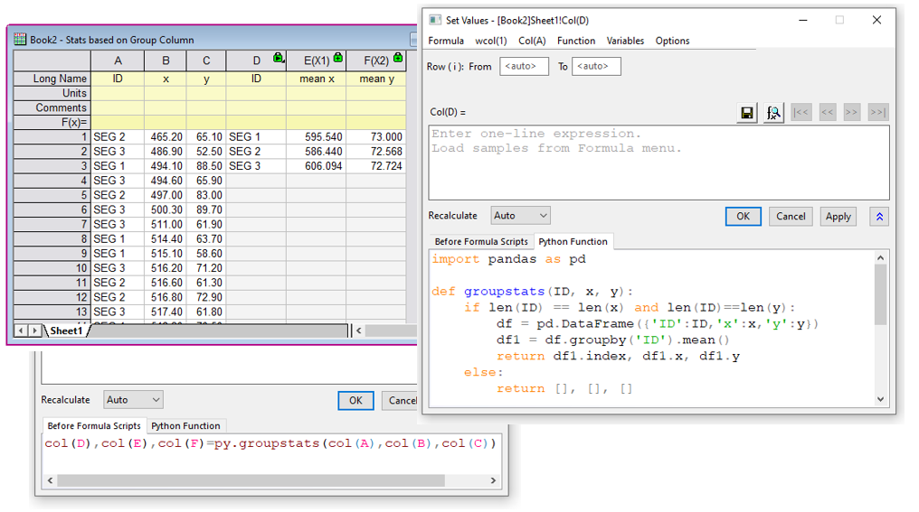
Set Column Values is one of several places where Python functions can be used to perform calculations and data transforms. The Python function, Before Formula Script, and the expression can all be saved together as a formula for future use.
LabTalk
LabTalk is a scripting language native to Origin. For simple operations such as manipulating data and automating tasks, LabTalk is a good place to start. You can access a rich set of script commands and functions, including a large collection of X-Functions, to create scripts for your specific needs. Your custom script code can be easily assigned to buttons on graphs or worksheets, new toolbar buttons, or custom menu items.
Read More>>
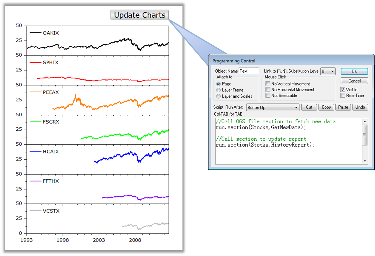
LabTalk script can be stored in OGS files, and organized by "sections". Scripts can be executed in many ways in Origin, including from button objects added to graphs and worksheet windows.
Origin C
Origin C is a programming language based on ANSI C, including additional support for C++ and C# features.
With Origin C, you can:
- Create and access properties of all Origin objects such as worksheets, matrices, and graphs
- Automate your data-analysis and graphing tasks
- Build HTML Dialog with JavaScript
- Link to external dynamic link libraries (DLL)
- Call C or Fortran library routines, such as the NAG library functions included with Origin or other public-domain libraries
Origin provides a state-of-the-art integrated development environment called Code Builder for managing your Origin C projects.
Read More>>
MATLAB Console
In addition to support for importing MATLAB (.mat) files, Origin also provides a MATLAB Console tool for interacting with MATLAB installed to the same computer. You can transfer data between the two applications, and also issue MATLAB commands from the tool.
Read More>>
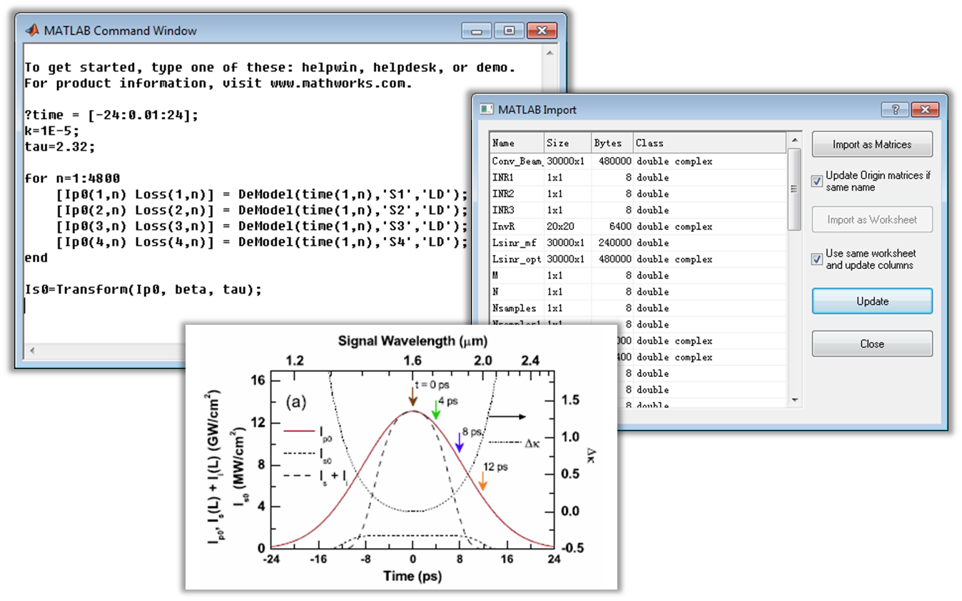
The MATLAB Console tool in Origin lets you connect with the MATLAB workspace to transfer data between the two applications. Transfer selected variables from MATLAB to Origin to create your final publication-quality graphs.
R and Rserve Console
The R Console dialog in Origin allows you to access R if it is installed on the same computer. You can issue R commands from within Origin, and transfer data between Origin and R. The Rserve Console dialog allows you to access a server installation of R in a similar manner.
Read More>>
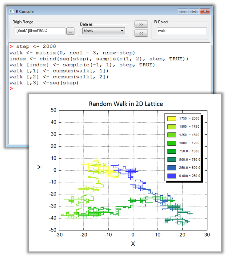
The R and Rserve Consoles in Origin allow you to issue R commands within the Origin environment, and transfer data between the two applications either using a dialog interface, or by using commands. This example shows simulation of a random walk in a 2D lattice computed in R, with the route displayed as an Origin line plot. The step number has been used a modifier for the line color.
Mathematica Link
The Mathematica Link tool provides access to the Mathematica kernel from within Origin for Mathematica if it is installed on the same computer. The tool allows exchange of data, and to evaluate Mathematica expressions.
Read More>>
LabVIEW SubVIs
Origin provides a collection of subVIs to facilitate communication with LabVIEW. These subVIs can be used for operations such as opening communication with Origin, exchanging data, and issuing commands to Origin from LabVIEW.
Read More>>
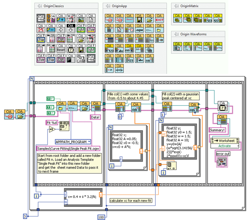
The Origin installation includes a collection of custom VIs for LabVIEW. The Vis are organized in three palettes, as shown in this image. The VIs provide various methods to connect, and send data and commands, to Origin from LabVIEW. The image also shows a LabVIEW VI that includes several of the VIs from these palettes.
Apps in Origin
Extend the graphing and analysis functionality of Origin by installing free Apps from our File Exchange site.
A selection of recently published Apps:
To view the Apps in action, visit our YouTube channel and select the Apps in the Origin playlist.
Read More>>