1.11 FAQ-122 How do I format the axis tick labels?Format-Axis-Tick-Labels
Last Update: 9/17/2021
Change Numeric Tick Label Display
- Double click on the axis tick labels or select Format: Axes: X/Y/Z Axis... menu go to Tick Labels tab
- On Display sub-tab, pick desired display in Display dropdown box, such as Scientific, Engineering, etc.
- To set decimal places, select Decimal in Display dropdown list.
- Check Set Decimal Places checkbox and enter demical place number.
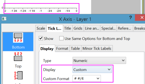
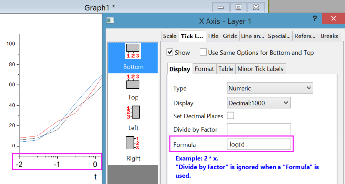
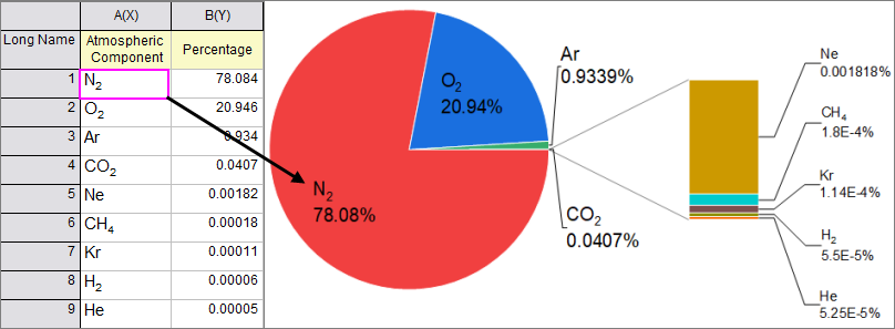
- For numeric tick label, you can also use Divide by Factor, Formula, and Prefix/Suffix together to customize tick labels. E.g.
- If you want to show tick label as percent, see See Display my axis label as percentage. Basically in Origin 2018b,
 - If you are using Origin 2018 or older versions, set Divide by Factor as 0.01 and set Suffix as %.
- If you want to show tick label as fractions, it's supported in Origin 2018b.
-
- If you want to show logarithmic notation -2,-1,0,1,2 in log scale instead of scientific notation e.g. 10^-2, 10^-1, 10^0,... or 1E-2, 1E-1, 1E0, ...,
-
- Go to Format subtab to customize font, size, color, rotation, etc.
Note: Custom in Display dropdown list gives you full control of numeric display. E.g.
- *3 means 3 significant digits
- .2 means two decimal places
- .2* means two decimal places and drop trailing zeros. e.g. 10, 10.2 will not show as 10.00 and 10.20
 | When creating a Formula for axis labels, use "x" to refer to the current axis, whether it is an X, Y or Z axis.
|
Change Date/Time Tick Label Display
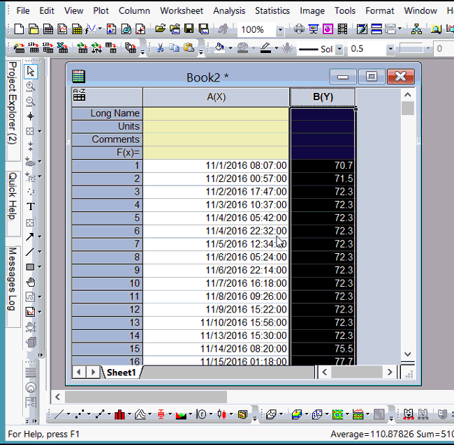
If X data is date/time, date/time tick labels will show. To customize the display of it
- Double click on the axis tick labels or select Format: Axes: X/Y/Z Axis... menu go to Tick Labels tab
- On Display sub-tab, pick desired display in Display dropdown box
- If what you want isn't listed, choose Custom Display in Display dropdown list and define your own date/time display.
- If tick label is too long, wrap text on Format sub-tab.
Show Muti-Line Tick Labels
Use Tick Label Table
Using bottom x axis as an example, if your x data is text or categorical. After plotting, if you want to show two rows of tick labels, you can
- Double click tick label to open Axis dialog.
- Under Tick Labels tab, select Table subset.
- Enable it and set Number of Rows to 2.
- Then Bottom1 and Bottom2 will show on left panel.
- Select Bottom1 and on Display tab. Specify what to show in 1st row (outer row).
- Select Bottom2 and on Display tab. Specify what to show in 2nd row (inner row).
Use Multi-line Text from Worksheet
If there are multi-line text in X column, when plotting data, the tick label will show in multi-lines.
Note: When directly selecting cells in worksheet to format, e.g., italicize text, color text, and subsequently make a plot using the formatted text as tick labels or text labels, the formatting will be missing in the graph. To make the text formatting passing to graphs, you will need to turn on Rich Text mode before editing cells.
For example, if you want to type multi-line text in X column as follows
| A(X)
|
B(Y)
|
red
apple
|
1
|
orange
orange
|
2
|
green
banana
|
3
|
- Right click column A header and choose Format Cells... context menu. Check Rich Text and click OK.
- In 1st cell of column A, type red and then press Ctrl+Enter to start new line. Enter apple.
- Highlight the word red and then choose red color from the Font Color
 button on Format toolbar. button on Format toolbar.
- Repeat the above step to enter other text in column A.
- Highlight the Y column and select the plot type of your choice.
Wrap Text
For text tick labels that's too long, use Wrap Text control on Format sub-tab of Tick Labels tab in Axis dialog.
See this quick help for details.
Use Subscripts and Superscripts in Tick Labels
The key here is to set Rich Text in the worksheet cells that contain tick labels, then use the Format toolbar buttons to apply subcripting (or other special formattting) to the selected text.
- Select the column that you intend to use for your chemical formulae, etc., right-click and choose Format Cells from the shortcut menu.
- Check the Rich Text box and click OK.
- Enter your strings (e.g. "H2SO4") into the worksheet cells, highlighting your subscript text and clicking the Subscript button
 on the Format toolbar, as needed. on the Format toolbar, as needed.
- Create the plot.
Customize Minor Tick Labels
You can turn on minor tick labels at each minor tick mark or or at specified minor tick mark only. And the minor tick label can have its own Display format. It's very useful for log scale and date/time axis.
E.g. for log scale, there are always 8 minor ticks. If besides showing tick labels at 0.1 1 10 100 1000, you also want to show tick labels at some minor tick marks, such as every 2nd and 5th tick mark, you can
- Double click Tick Labels to open Axis dialog.
- Go to Minor Tick Labels sub-tab.
- Check Show at Specified Indices Only checkbox.
- Enter space separated indices.
See Also Customize Tick Label at Specific Values
Keywords:individual, format, color, font, rich text, italic, bold, edit, text label, superscript, subscript, wrap, date, decimal, significant digits, log
Minimum Origin Version Required: 2015 SR0
|