1.116 FAQ-669 How to plot 2D and 3D error bars?errbar-display-in-plot
Last Update: 3/4/2020
Plot Y Error Bar
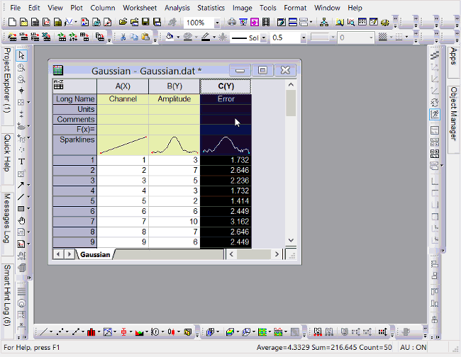
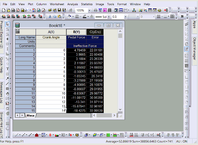
Each column has plot designations such as X, Y, Z, Y Error, Label, etc. If you set a column as Y Error, and then select Y column on the left and YErr column together to plot them, the YErr column will be plotted as Y error bars. You can double click the error bars in graph to further customize them in Plot Details dialog.
Plot Different Positive and Negative Y Error Bars
If you have different positive and negative error bars, there are two ways:
- Use Plot Setup dialog
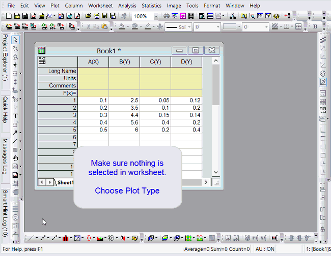
- Make sure nothing is selected in worksheet and choose your plot type.
- In the Plot Setup dialog, right click in middle panel to turn on YErr+ and YErr- columns.
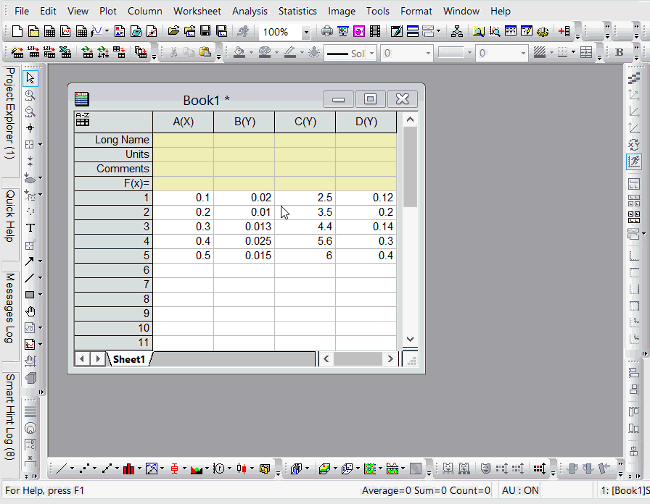
- Specify X, Y, YErr+, YErr- data to plot.
- Plot two Y Error bars and then hide part of it.
- Set both error data column as Y Error. Highlight Y data and both error data columns to plot them.
- Double click the plot to open Plot Details dialog.
- Select corresponding error bar entry on the left panel and uncheck Minus or Plus checkboxes on Error Bar tab.
Plot X Error Bar
Same as plotting Y Error Bar, if a column is set as X Error, it will be plotted as X error bars.
Add Y Error Bars from Dataset Statistics
If there is no error data column, you can add statistics error by calculating simple dataset statistics.
With Graph window active, choose Insert: Error Bars.
Plot Error Bar as Filled Band
Sometimes when data is very dense, it's hard to see all error bars. You may want to show error bars as a filled band.
Here is how to do it.
- On graph with error bar, double click any error bar.
- With error data selected on the left, set Connect as Straight, Spline, etc.
- Check Fill Area Under Curve checkbox.
- On Pattern tab, set fill color and pattern as you like.
Plot Error Bar in 3D Graph
If you plot 3D scatter plot from XYZ columns, you can open Plot Details dialog and specify any other column in worksheet as error bar. Origin supports error bar in X, Y, and Z directions in 3D graph.
If you plot 3D scatter plot from Matrixbook, the error bar data must be put to a matrix object in same matrixsheet.
E.g. Click the D icon in upper-right corner of Matrixsheet and choose Add. In new Matrix object created, enter error bar data. Then choose Plot: 3D Line+Scatter: 3D Scatter + Error Bar
 | While useful under certain conditions to display error information in this fashion, you should be aware that Linear Fit and Nonlinear Curve Fit tools will only use one Y Error dataset when fitting and an error is treated as a single value offset - both positive and negative. This means that any “X Error bar” is ignored, any “Minus Y Error Bar” is ignored and a “Plus Y Error Bar” is treated the same as a “Plus and Minus Y Error Bar”.
To do linear fit with X Error, you should use Fit Linear with X Error tool, while for nonlinear fitting with X Error, Nonlinear Implict Curve Fit should be chosen. Please refer to here for details.
|
Keywords:error bar
|