10 GraphingGraphing
Creating a Graph
Graphs can be created from both hard data and from mathematical functions. With Origin, you can create over 100 graph types using Origin's built-in graph templates. Each of these graphs has been specifically chosen for its applications in various technical fields.
All graph types are accessible from the Plot menu. Note that while most graph types also have a corresponding 2D Graphs or 3D and Contour Graphs toolbar button, some do not. Until you've had time to familiarize yourself with available toolbar buttons, the Plot menu should be your "go to" place for creating graphs.
Creating most graphs involves just two steps.
- Select your data.
- Select the plot type.
Some Origin graph types have very specific data requirements. Other graphs can be created from multiple data arrangements. See the Origin Graph Types section for specific requirements.
Creating Graphs from Worksheet Data
Graphs, Creating
Origin's most generic graph types -- line, column/bar, pie -- plus a lot of the more specialized types, are created from worksheet data. The following quick tutorial demonstrates importing an ASCII data file and creating a simple graph.

|
Tutorial: One click to create graph with selected data
- Open a new workbook and select Data: Import from File: Single ASCII... from the main menu.
- Choose the file Samples/Curve Fitting/Multiple Gaussians.dat and click Open.
- Now highlight columns B(Y), C(Y), D(Y) and E(Y) by clicking and dragging across the four column headings.
- Click Plot > Basic 2D: Line & Symbol: Line & Symbol. A graph window is created with four line and symbol plots. Note that the plots differ by line color and by symbol type.
- Return to the worksheet, and again select columns B(Y), C(Y), D(Y) and E(Y).
- This time, select the Plot > Multi-Panel/Axis: 4 Panel menu item. Note that a very different plot is created using the same datasets.
|
We were able to quickly create two different graphs using the same data. The chapter Customizing Graphs discusses customizing graphs and saving templates in more depth.
We are also able to create 3D plot types from worksheet data. The following tutorial demonstrates creating a 3D surface plot, then overlaying it with a 3D scatter plot.
|
|
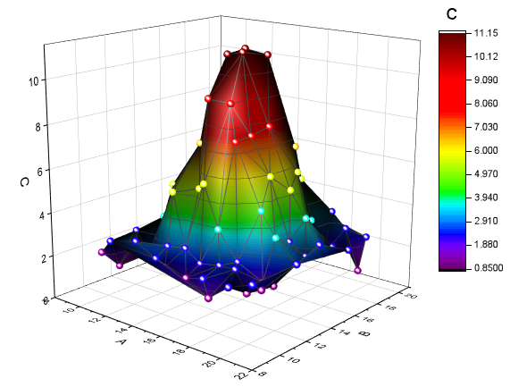
Tutorial: 3D Surface Plot from XYZ Data
- Create a new, empty workbook window and import the file \Samples\Matrix Conversion and Gridding\XYZ Random Gaussian.dat.
- Highlight column C and right click. Select Set As: Z from the fly-out menu.
- Select Plot > 3D: 3D Colormap Surface to create a 3D Colormap Surface plot.
- Select the Graph: Layer Contents... menu item or right click the layer icon on the left-top of the graph to open the Layer Contents dialog. In this dialog, click on drop-down next to the
 button and select 3D Scatter/Trajectory/Vector from the fly-out menu. button and select 3D Scatter/Trajectory/Vector from the fly-out menu.
- Select column C from the left panel and click on the Add Plot
 button to add the 3D scatter plot to the graph. Click OK to close the dialog. button to add the 3D scatter plot to the graph. Click OK to close the dialog.
- Double-click on the plot to open the Plot Details dialog. In the left panel, expand the Layer1 node and then expand the 2nd node which represents the scatter plot. Click and select the branch named Original. Be sure to leave the node-level check box selected, otherwise this plot will be hidden.
- In the Symbol tab on the right side, set Shape to Ball, Size to 12 and Color to Color Mapping: Col(C).
- In the Drop Lines tab, clear the Parallel to Z Axis check box.
- Select Layer1 from the left panel of the Plot Details dialog. In the Lighting tab, under Mode, select Directional. Click OK to close the dialog.
- Click on the scatter plot in the graph to select this plot, then in the Style toolbar, click on the
 button and select the Rainbow palette. button and select the Rainbow palette.
Your graph should look like this:
:
|
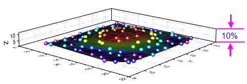
 | You can hold down the R key on your keyboard and use the mouse to freely rotate the 3D surface. With the pointer tool active, click on the layer for additional controls to move, stretch and rotate the surface.
|
| The minimum Z axis length of 3D graph is 10% (Plot Details layer level, Axis tab).
|
Worksheet Column Plot Designations
Worksheet Plot DesignationsColumn Plot DesignationsPlot Designation
The labels (X), (Y), (Z), etc. in column headings are referred to as the Column Plot Designation. Columns can also be designated as Label, Disregard, Y Error or X Error. Each plot type has certain data requirements (e.g. a simple line plot requires one X and one Y dataset) and column plot designations work in concert with settings saved in the graph template, to allow you to quickly create a graph.
To set the Column Plot Designation, select a column or multiple columns, then from the menu choose Column: Set as:<option>; or right-click and choose an option from the Set As: context menu.
In the 1st tutorial above, we plotted 2D graphs, which require Y data from one or more worksheet columns. The Y data were automatically plotted against the X column data to their left. In 2nd tutorial, we plotted a 3D graph using Z data. The Z data were plotted against X and Y data columns to the left of the Z data column.
Selecting Worksheet Data
Selecting Data, WorksheetRange, Worksheet DataData RangeSelecting Data, for PlottingGraphing Worksheet DataPlotting Worksheet Data
Various ways to select data for plotting:
- Single column: Click on the column heading, e.g. B(Y)
- Multiple columns: To select a small number of contiguous columns, click on the first column heading and drag the pointer to the last column heading. To select a large number of contiguous columns, click on the first column heading, use the scroll bar at the bottom of the worksheet to locate the last column, then press the SHIFT key and click on the last column heading. To select non-contiguous columns, press the CTRL key while clicking on the desired column heading.
- A range in a column: Click on the first cell of the range and drag to the last cell of the range.
- Multiple ranges within a column: Select one range. Press the CTRL key while selecting each range. When plotting, each range will be treated as a separate data plot in a plot group.
- Ranges across multiple columns: If cells are contiguous, click on the first cell and drag to the last cell. If cells are not contiguous, press the CTRL key while selecting each range. Each range selection will be treated as a separate data plot in a plot group.
- Range(s) across all columns: Click on the first row heading and drag to the last row heading, to select multiple rows. This will select data in all columns in the worksheet. Press the CTRL key while selecting row headings for non-contiguous rows. Each range selection will be treated as a separate data plot in a plot group.
- Entire worksheet: Press CTRL+A to select the entire worksheet; or mouse over the bottom-right corner of the blank cell in the upper-left corner of the worksheet. When the pointer becomes a downward-pointing arrow, click to select the entire worksheet.
- Specific columns: To select columns by data in column label rows (header rows); or to select columns using a pattern, choose Edit: Select.
| As noted in the Worksheet Column Plot Designations section just above, if you select Y or Z columns, Origin defaults to plotting the Y column against the nearest X column to the left; or plots the Z column against the nearest X and Y columns to the left. But in the case of simple XY 2D plots (line, line + symbol, etc.), you can ignore this rule and plot by selecting XY columns whether or not the selected X is to the left or right of Y.
|
Creating a Graph from Matrix Data
Plotting Matrix DataGraphing Matrix Data
As discussed in the Matrixbook, Matrixsheets and Matrix Objects chapter, a matrix is a dataset of Z values arranged as an array of columns and rows which are linearly mapped to X (column) and Y (row) values. Matrix data is used to create 3D, contour and heatmap graphs -- all of which require require "3D" data. In earlier versions of Origin you had to have your data in a matrix to create such plot types but this is no longer the case (see discussion of the Virtual Matrix below). A few graph types such as a color-filled surface with error bars still require matrix data.
There are still many situations in which you will be creating 3D plots from matrix data. If data are stored in a worksheet and for one reason or another, you need to convert it into a matrix form, see Converting Worksheets to Matrixes.
Once your data are in a matrix form, plotting matrix data is simple: activate the matrix window then select your plot type using a Plot menu command or corresponding 3D and Contour Graphs toolbar button. Since you cannot plot only a portion of the matrix, data selection isn't necessary. You can, however, choose a subset of the data plot to display once the graph is created. See Editing Plot Range, below.
The Virtual Matrix
The Virtual Matrix concept was covered in the Matrixbook, Matrixsheet and Matrix Object chapter of this Guide. To recap, a virtual matrix is a block of worksheet cells which contain Z values, with X and Y coordinates in the first row or column label row, and first column. X and Y coordinates don't have to be evenly spaced and can even contain text or date/time data. Graphing Virtual Matrix DataPlotting Virtual Matrix Data
When selecting and plotting virtual matrix data to 3D, Contour and Heatmap graph types, the worksheet's Column Plot Designations are ignored. Instead, a dialog box is opened where you designate your X and Y coordinates. The intersecting data points are then treated as Z values.
|
|
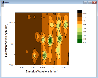
Tutorial: Contour Plot from Virtual Matrix
- With a new workbook active, use the Data: Import from File: Import Wizard... menu to open the Import Wizard dialog.
- Press the browse button in the dialog and select the file Waterfall.dat from the Samples\Graphing subfolder.
- This file has an import filter already associated with it. Press the Finish button to import the file.
- With the workbook active, press CTRL+A to select the entire sheet.
- Now select the Plot > Contour: Contour - Color Fill menu item. The plotvm dialog will open.
- In the dialog, set the Y Values in drop-down to Column Label, and then set the Column Label drop-down to Excitation Wavelength(nm).
- Set the X Values in drop-down to 1st column in selection, then press OK to close this dialog.
- The contour plot will be created.
- Use the Graph: Speed Mode... menu item, then in the dialog that opens, set the Speed Mode drop-down to Off and press OK. This will turn off speed mode so that all data points are plotted (see the discussion of Speed Mode, below).
- Click on the contour plot to select this data plot, then from the Style toolbar, click the Palette button and then select the Pumpkin Patch palette. Your graph should look similar to the image below:
|
| Once you customize your contour levels and colors, you can save your settings as a Theme, or simply copy-paste your customizations from one graph to another. To save a Theme, right-click on the graph and choose Save Format as Theme; or use the Colormap Theme controls on the Colormap/Contours tab of the Plot Details dialog box.
|
2D and 3D Function Plots
Graphs, Function
Plotting FunctionsGraphing, Functions
Function Plots, 2D and 3D
Parametric Function Plots, 2D and 3D
Unlike plots from worksheet data or plots from matrix data, parametric plots are not plots of actual data. Instead, they are plots of mathematical functions.
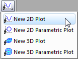
To create function plots and parametric function plots, select File: New: Function Plot menu. There are four options to choose from:
| Type
|
Function Form
|
| 2D Function Plot
|
y = f(x)
|
| 2D Parametric Function Plot
|
x = f1(t)
y = f2(t)
|
| 3D Function Plot
|
z = f(x, y)
|
| 3D Parametric Function Plot
|
x = f1(u, v)
y = f2(u, v)
z = f3(u, v)
|
These plot types are also accessible from the function plot buttons on the Standard toolbar.
|
|
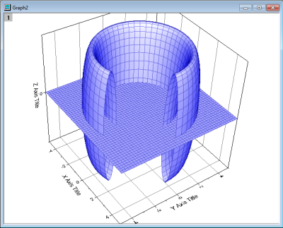
Tutorial: 3D Function and 3D Parametric Function in Same Layer
- From the menu, choose File: New: Function Plot: 3D Parametric Function Plot...
- In the dialog that opens, click on the arrow button at the top right side of the dialog, and from the fly-out menu select the built-in example Partial Torus (System) and press OK to close the dialog. The function plot will be created.
- With the function plot window active, invoke the menu File: New: Function Plot: 3D Function Plot....
- In the dialog that opens, enter -5 and 5 for the From and To edit boxes for x and y scale.
- In the Z(x,y) edit box, enter 0.
- Set the drop-down at the bottom left corner of the dialog to Add to Active Graph and press OK to close dialog.
- The Z=0 plane will be added to the graph, and the plane will properly intersect the parametric surface plot. You can hold down the R key and use the mouse to freely rotate the plot.
|
- Some function plot dialogs provide sample formulas. Click the arrow button beside Theme at the top of the dialog box to access them. You can download more examples at http://originlab.com/3dfunctions.
- For 2D parametric, 3D, and 3D parametric function plots, data is generated when the function plot is created. To create data for 2D function plots, right-click the plot and choose Make dataset copy of Function or if on the Function tab in Plot Details, click the Workbook button.
- You can exclude function plots from the graph legend by right-clicking on the selected legend object and placing a check mark beside Legend: Hide Legend for Function Plots (To add them back to the legend, clear the check mark).
- Besides function plots, you can also create graphs with all built-in and user-defined nonlinear curve-fitting or surface-fitting functions. From the menu, choose Analysis: Fitting: Simulate Curve... or Simulate Surface.... You can even add noise to the plot. Corresponding data is created as well.
Adding Function Plots to Existing Graphs
You can add function plots to existing graph windows containing other plot types. See FAQ-171, specifically the section entitled Add Function Plot to an Existing Graph.
Plotting without Using Column Plot Designations
Column Plot DesignationsPlot DesignationWorksheet Plot Designations
While worksheet Column Plot Designations are always used when creating graphs from the Plot menu or one of the graph toolbars, the Plot Setup dialog box does not make use of them. With Plot Setup, you assign column designations on an ad hoc basis, allowing you to overcome some of the restrictions of template-based plotting.
However, to make use of the Plot Setup dialog box, you need to have some familiarity with the hierarchy of objects contained in the Origin graph window.
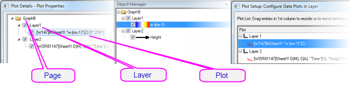
Graph Page
Graph Layer
Graph Layer Frame
Layers, Graph
Page, Graph
Pages, Layers, Plots and the Active Plot
Graph PageGraph LayerActive LayerLayer Icon, Graph
Each Origin graph window is comprised of a single, editable graph page. The graph page is defined by the white area inside the graph window. Anything that lies outside the page is not printed or exported. By default, the dimensions of the graph page are defined by the printable area of your default printer driver; without adjusting settings, a printed graph should fill the printed page.
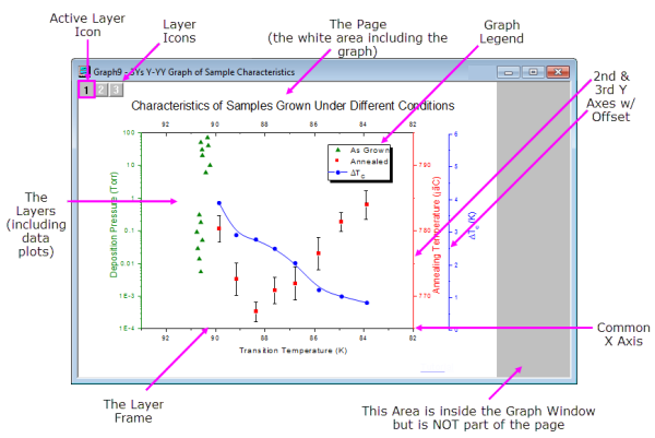
- The graph page must contain at least one, and may contain as many as 1024, graph layers.
- Each graph layer generally contains one or more data plots (graphical depictions of datasets). Note that the graph in the image above contains three graph layers, represented by the three non-printing layer icons in the upper-left corner of the graph page. Note that there is one layer icon which is highlighted, indicating that this is the active layer.
- Just as there is only one active layer, there is only one active plot in a graph. Usually, the active plot is the first plot in the active layer. To verify which plot is active, click on the Data menu while the graph is active. The active plot will have a check mark beside it.
The hierarchical structure of the graph page can be seen in these places:
- The Plot Details Dialog Box (Format: Page ...)Plot Details Dialog Box
- The Object Manager (View: Object Manager)Object Manager
- The Plot Setup Dialog Box (Graph: Plot Setup...)Plot Setup Dialog Box
The Plot Setup Dialog Box
The Plot Setup dialog box is a flexible all-in-one plotting tool for creating graphs and manipulating the data plots in an existing graph.Plot Setup Dialog Box
- Creating graphs without regard to Column Plot Designations
- Creating graphs from a combination of data sources: multiple worksheets, workbooks, matrixbooks, loose datasets, etc.
- Creating graphs combining multiple plot types.
- Adding, removing, replacing data plots.
- Grouping or ungrouping data plots.
- Reordering data plots in a layer or moving data plots to another layer.
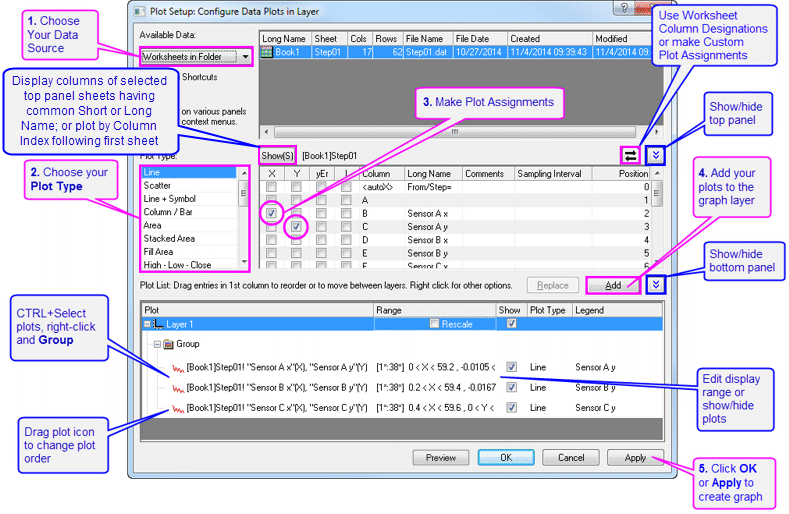
To create a graph with the Plot Setup dialog, make sure no data is selected in the active worksheet and choose the plot type that you want to create (from the Plot menu or by clicking on a toolbar button).
To open the Plot Setup dialog for an existing graph window, right-click on any layer icon in the upper left corner of the graph window and select Plot Setup..., or choose menu Graph: Plot Setup....
|
|
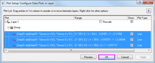
Tutorial: Creating a Simple Line Plot with the Plot Setup Dialog Box
- Click the New Workbook button on the Standard toolbar.
- Click Data: Import From File: Single ASCII, browse to the Origin installation folder and import the file \Samples\Curve Fitting\Step01.dat. Starting from column B, columns are actually paired - X data and Y data -- but by default all columns are assigned a "Y" Column Plot Designation on import.
- Without selecting any data, click Plot > Basic 2D: Line. This opens the Plot Setup dialog box.
- Click the two "double-arrow" buttons to show all three dialog box panels.
- In the middle panel, select the "X" box for Column B (Sensor Ax) and the "Y" box for Column C (Sensor Ay), then click the Add button to add the plot to Layer 1 in the bottom panel.
- Select the "X" box for column D (Sensor Bx) and the "Y" box for Column E (Sensor By), then click Add.
- Select the "X" box for column F (Sensor Cx) and the "Y" box for Column G (Sensor Cy), then click Add. Three plots are added to Layer 1.
- Press CTRL and click on each plot in the bottom panel to select all three, then right-click and choose Group.
- Click OK to create a grouped line plot.
|
|
|
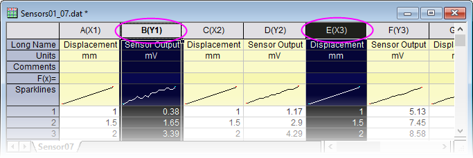
Tutorial: Creating a Graph with Data from Multiple Worksheets
- Click the New Workbook button on the Standard toolbar.
- Click Data: Import From File: Multiple ASCII, browse to the Origin installation folder and select Sensor01.dat, Sensor02.dat and Sensor03.dat under \Samples\Curve Fitting\ to import. After Import, 3 workbooks are created.
- Without selecting any data, click Plot > Basic 2D: Line+Symbol. This opens the Plot Setup dialog box.
- Expand the top panel if it is hidden. From the Available Data list, choose Worksheets in Folder.
- Select Sensor01, Sensor02 and Sensor03 sheets in the top panel.
- In the middle panel, select the "X" box for Column A (Displacement) and the "Y" box for Column B (Sensor Output), then click the Add button.
- Click OK to create a grouped Line+Symbol plot using Sensor Output columns from 3 worksheets.
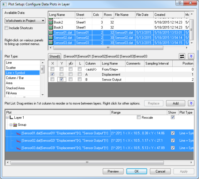
|
- The Plot Setup middle panel only allows choosing one X column at a time.
- If your worksheet is set up with the correct Column Plot Designations (e.g. XYXY) but you only want columns with same Long Name, click the toggle in the upper-right corner of middle panel so that only plottable columns show (e.g. for 2D plot types, X columns are not shown). Then you can sort the columns and select all columns with same Long Name and plot them together. The Y columns will be plotted against corresponding X columns.
- To change a data plot's type, choose the corresponding plot in bottom panel. Corresponding X and Y columns will show in middle panel. Choose a new plot type in middle panel and click the Replace button.
- All data plots in a group share the same plot type. If you want to change the plot type of a single plot in a group, right-click the Group node in bottom panel and Ungroup first.
- Drag and drop data plots in the bottom panel to move them to different layers.
- If the bottom panel is hidden and you have selected columns in the middle panel, you can directly click the OK button to create your graph.
Manipulating Data Plots
The following sections discuss higher level modifications to existing graphs such as changing plot type, adding or removing plots from the layer and controlling the density of plotted points (Speed Mode). For more detailed plot customizations, including those involving such things as changing plot symbols, colors, and legend customizations, see the Customizing Graphs chapter.
Changing Plot Type
Plot Type, ChangingPlots, Exchanging
Some Origin plot types (e.g. scatter, line, line+symbol) allow you to interchange the plot type of an existing plot with a few other select plot types. Some examples:
- Scatter, line, line+symbol, column/bar are interchangeable.
- 3D scatter/trajectory/vector, 3D bars, 3D surface are interchangeable.
To change the plot type of an existing plot:
- Right-click on the data plot and choose Change Plot to: Graph Type from the shortcut menu.
- Click on the data plot and choose Format: Plot... and in Plot Details choose from the Plot Type drop-down list.
- Click on the data plot, then click one of the supported graph toolbar buttons.
Note that if you switch plot types and the selected plot is part of a plot group, all plots in the group are switched.
 | A word of caution: This is an old Origin feature, and for a quick change of common plot types in a single-layer graph it works well. Changing plot types in a multi-panel, multi-layer graph can lead to unwanted outcomes. When working with more complex graphs, it is better to create a graph directly using the specified Plot menu command or toolbar button .
|
Exchanging Data Plots
Plots, Adding/Removing/HidingPlot DesignationWorksheet Plot DesignationsColumn Plot Designations
You can quickly change the data source (X, Y, or worksheet) of a plot using these context menu commands. Right-click on a data plot, then select one of these options:
- Change X/Y/Z. These menu items allow you to swap the current X,Y or Z data with data from any column in the project.
- Select Columns. This opens the Column Browser where you can select another column in the Current Folder, in the Current Folder (recursive) (includes subfolders) or in Current Project.
- Change Worksheet. This menu item allows you to replace both X and Y with data from another worksheet. The selected worksheet must have the same Short Names, the same Column Plot Designations and the same row index range as the current worksheet.
|
|
Tutorial: Changing X and Y assignment of a data plot
- Start with a new workbook and import the file automobile.dat from the Samples\Statistics sub-folder of the Origin installation folder.
- Select the Gas Mileage column and select the Plot: Basic 2D: Scatter menu item. The Gas Mileage column is plotted against the default X column Year.
- Right-click on the data plot and select Change X: Engine Displacement. The Gas Mileage column is now plotted against Engine Displacement.
|
| Note: If new data is significantly outside of the current range for X or Y axes, you will be asked if the graph should be rescaled. If data are not significantly different, you may want to manually rescale the graph (Hot key: CTRL+R).
|
| If you have performed some analysis on the data plot (e.g. linear regression with Recalculate set to Auto), the fit results will automatically update when you change X/Y or the worksheet.
|
Adding, Removing and Hiding Data Plots
Graphs, Adding or Removing Plots
Use the following methods to add or remove data plots from a graph.
Adding Data by Drag and Drop
Graphs, Add Data by Drag and DropDrag and Drop Plotting
You can add data to a graph by drag and drop. When using this method, Origin relies on worksheet Column Plot Designations to create the plot.
- Select the worksheet data (one or more columns or a range of one or more columns).
- Move the mouse over the left or right edge of the selected range.
- When the pointer looks like this
 , hold down the left mouse button and drag the data to the graph window. Release the mouse. , hold down the left mouse button and drag the data to the graph window. Release the mouse.
- If there are multiple layers in the graph, drag the data to the desired layer, then release the mouse.
| Usually the current plot type is used when plotting by drag-and-drop. To change the global plot type to use when drag and drop, choose Preferences: Options... from the main menu. Go to the Graph tab and change the Drag and drop plot type.
|
Adding Data with Insert: Plot to Layer
Graphs, Add Data by Insert Plot to Layer
Use the Insert menu to insert some types of plots to the active graph layer. Choice of plot type depends on the active graph window and the last-activated data source (worksheet or matrix). For instance, if you create a 2D graph, select data in a workbook window, then return to graph window and click Insert: Plot to Layer, your insert choices will be Line, Scatter, Line + Symbol, Column..., Area and Contour....
To use the Insert menu command, you should have an existing graph window:
- Go to the worksheet or matrix window and select your dataset(s).
- Return to the graph window, make sure that the target layer is active layer, then choose Insert: Plot to Layer: Plot Type.
Adding and Removing Data with the Layer Contents Dialog Box
Graphs, Layer Contents Dialog Box Layer Contents Dialog Box
Open the Layer Contents dialog box by double-clicking or right-clicking on the layer icon(s) in the top left corner of the graph page. Controls in the left panel can be used to filter and list available datasets. The right panel lists datasets that are plotted in the active layer.
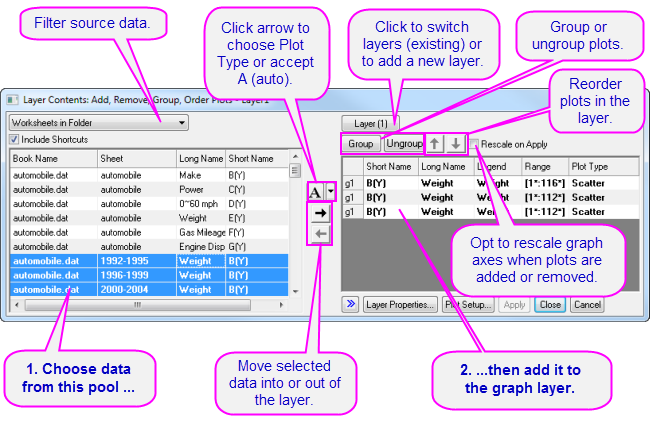
Controls in the center of the dialog box allow you to add or remove plots from the active graph layer. When adding data to the graph, click the list button (downward-pointing arrow) to pre-select the plot type before adding data to the layer. Use controls in the right panel to group or ungroup plots, or re-order plots in the layer.
Adding, Removing, Replacing or Hiding Data Plots with the Plot Setup Dialog Box
Plots, Adding/Removing/HidingPlot Setup Dialog Box
Among other things, the Plot Setup dialog box can be used to add or remove data plots from the graph.
- To add plots to the graph, use the top panel of Plot Setup to identify your source data.
- Use the controls in the middle panel to specify the plot type and how the data selection should be treated (as X, Y, yError or Label).
- In the bottom panel, choose the Layer to which you want to add plots, then click the Add button.
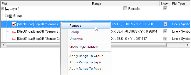
- To remove a plot from the layer, select the plot in the bottom panel, then right-click and choose Remove.
- To hide a plot, uncheck the Show check box for the plot.
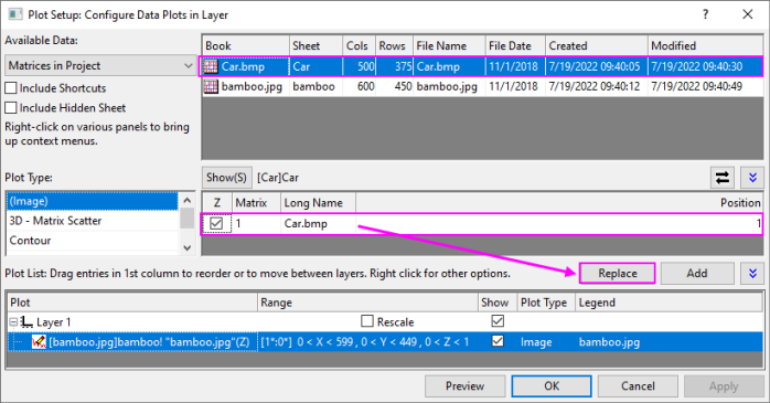
- To replace a plot, select the plot in bottom panel, then change the X and Y selection and plot type in middle panel and click the Replace button. Note that replacing one 3D/Contour Plot/Image matrix with another is also supported.
Adding Data by Direct ASCII Import
Graphs, Direct ASCII ImportASCII Data, Import to Graph
You can import ASCII files directly into the active graph window using the the Import ASCII toolbar button. Note that this method works only with files having a simple structure and it supports only the simplest of graph types - Line, Scatter, Line + Symbol, Column and Bar charts.
- Click the Import ASCII
 button. This opens the Import ASCII dialog box. button. This opens the Import ASCII dialog box.
- Choose a file.
- Click Open.
The file is imported and plotted in the active graph window.
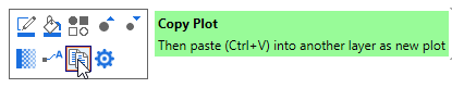
Adding Data by Copying and Pasting a Plot
With many Basic 2D graphs (e.g. Scatter, Line, Line + Symbol, Bubble, etc.), you can copy a plot from an existing graph layer and paste it to another layer in the same window or into a separate graph window. Prior to Origin 2020, this would only produce a black line plot. Origin 2020 expanded copy-paste of plots to other plot types, while preserving plot properties (symbol size, color, etc.).
- Click on the plot to select it and press CTRL+C.
- Click on the target graph and press CTRL+V.
You can also copy a plot by selecting the plot in the graph and clicking on the Copy Plot button on the Mini Toolbar.
| Previous versions also allowed you to select and copy a simple plot (Line, Scatter, Line + Symbol, 2D Column/Bar) and paste underlying data into a worksheet. The default settings no longer support this but you can reverse this by setting LabTalk system variable @CPNP=1.
|
Removing or Hiding Plots with the Object Manager
Object Manager
The Object Manager is a dockable panel that allows for easy manipulation of graph layers and data plots. See the section on The Object Manager in this Guide.
To hide or remove plots, right-click on a plot and choose from the shortcut menu:
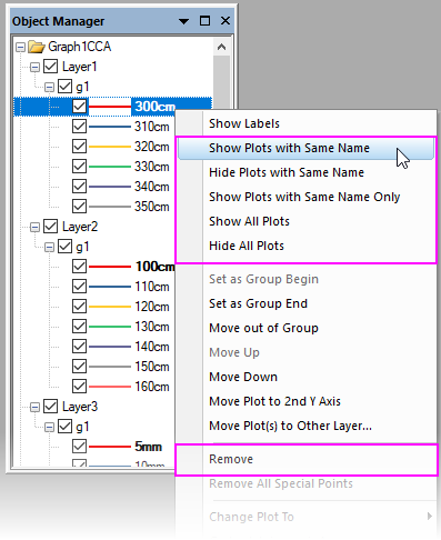
- Show or hide plots of the same Long Name.
- Show all plots.
- Remove a plot from the graph window (hidden plots can be quickly shown again; removed plots must be added back using one of the above methods).
- If the plot is part of a group, you can right-click on an individual plot and remove just that plot or you can right-click on the group icon and remove the entire plot group.
- When you right-click on a plot, you can use Hide Plots with Same Name and Hide All Plots shortcut menu items to quickly hide selected plots in the window without removing them entirely (restore plots by enabling their display in the Object Manager or in Plot Details).
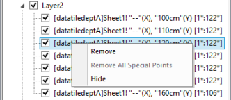
Removing or Hiding Data with Plot Details
In the left panel of the Plot Details dialog box (Format: Plot...), right-click on a plot and choose Remove or Hide from the context menu. Remove will delete the data plot from the graph so if you just want to temporarily hide a plot, choose Hide. Neither of them will delete data from worksheet or matrix.
Deleting Plots using the Delete Key
Click on a data plot (either in the graph window or Object Manager) and press the Delete key. If the selected plot is part of a group, the entire group is deleted.
Note that this is more sweeping than the Remove shortcut menu command in that it will remove an entire plot group from the graph window. This action does not delete worksheet or matrix data.
To restore the deleted plots, choose Edit: Undo Remove Plot from the main menu.
Editing Plot Range
Once a graph is made, you can edit the plot display range, specifying only a portion of the plotted data:
- Right-click on the plot and choose the Edit Range... shortcut menu command. Edit the From and To values.
- In the right panel of the Layer Contents dialog box (Graph: Layer Contents), turn on the Range column by right-clicking on the column headings and choosing Range. Click on a plot's range values, then click the ... button that appears to the right side of that column.
- In the bottom panel of Plot Setup (Graph: Plot Setup), click on the plot range in the Range column and click the ... button that appears to the right side of that column.
Rescaling after Adding/Removing Data Plots
Adding or removing data plots from a 2D or 3D graph may result in the need to rescale axes.
- Origin will generally ask the user how to handle rescaling.
- Some dialog boxes that are used to add or remove datasets from a plot (e.g. Layer Contents) typically have a rescale check box.
- You can also select the layer beforehand, then click the Mini Toolbar Auto Rescale button, to automatically rescale. This is equivalent to opening the Axis dialog box Scale tab and setting Rescale = Auto.
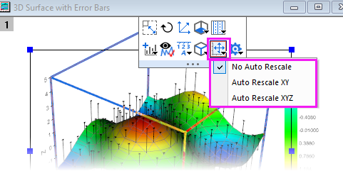
- Choose Graph: Rescale to Show All to rescale the graph after editing the plot range.
Grouping Data Plots
Graphs, Grouping PlotsGrouping Plots
When you make multiple range or column selections, then create a graph, Origin groups the resulting data plots in the graph layer. This applies to most 1D (statistical) and 2D graphs, plus 3D XYY (XYY 3D bar, 3D ribbon, 3D wall, and 3D waterfall plots) and 3D XYZ (3D scatter, 3D bar) graphs.
Grouping provides for quick creation of presentation-ready graphs because each plot in the group is assigned a differentiating set of plot attributes (line color = black, red, green...; symbol shape = square, circle, triangle...; etc.). Assignments are made by cycling through a pre-determined (user-modifiable) increment list of styles. For instance, the first plot of a grouped line plots might be denoted by a black line; the second plot might be denoted by a red line (the second color in the color list), the third plot by a green line (the third color in the color list), and so on.
|
|
Tutorial: Grouping (or ungrouping) plots manually
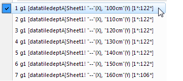
- Via the Layer Contents dialog boxLayer Contents Dialog Box
- To open the Layer Contents dialog box, double-click on the layer n icon in upper-left corner of the graph window.
- To create a group, select the desired data sets from the Layer Contents list (use CTRL + select, SHIFT + select, or simply drag the mouse to select multiple data sets).
- Click Group. Note that each plot in Layer Contents is now preceded by a gn (for "group1", "group2", etc.).
- To ungroup, click on one of the grouped data plots in the Layer Contents list and click Ungroup.
- Via the Plot Setup dialog boxPlot Setup Dialog Box
- To open the Plot Setup dialog box, ALT + double-click on the layer n icon in upper-left corner of the graph window.
- To create a group, select the desired plots from the Plot List (use the CTRL or SHIFT keys to select multiple data sets).
- Right-click and select Group. Note that a Group icon now precedes the selected plots in the Plot List.
- To ungroup, right-click on the Group icon and choose Ungroup from the shortcut menu.
|
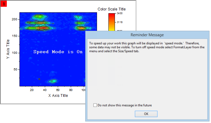
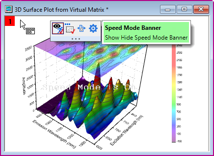
Speed Mode
Graphs, Speed Mode Speed ModeData Reduction, Graphs
With Speed Mode, you can control the number of data points displayed in a graph layer. This option is most used when working with large data sets, though note that there have been improvements in this area and Origin now has Density Dots and Color Dots graph templates specifically for creating scatter plots of large datasets.
Speed Mode can be turned on for any 2D or 3D graph. When Speed Mode is enabled, the layer icon displays in red and a Speed Mode is On banner appears in the layer. The banner is not included when printing, copying, or exporting the graph.
To adjust Speed Mode settings:
- With your graph active, select Format: Layer... from the Origin menu.
- Select the Display/Speed tab.
- For plots created from worksheet data, Select the Worksheet Data, Maximum Points Per Curve check box to enable Speed Mode for all the data plots in the layer that are created from worksheet data. Type the desired value (n) in the associated text box. If the number of data points in a data plot exceeds n, Origin displays a subset of the data plot containing n points, drawn by extracting values at regular intervals from the data set.
- For 3D data plots created from a matrix or for contour data in the layer, Select the Matrix Data, Maximum Points Per Dimension check box to enable Speed Mode. Type the desired value (n, m) in the X and Y text boxes. If the number of data points in a data plot exceeds n or m, Origin displays a subset of the data plot composed of -- at maximum -- n by m points. This subset is drawn by extracting values at regular intervals from the matrix columns (X) and rows (Y).
For broad control, you can select Speed Mode from the Graph menu. This opens the speedmode X-Functiondialog. The dialog lets you specify which windows the settings should apply to ( Target ) and also, offers several levels of data plot thinning from Off to High, plus Custom.
| Click the Enable/Disable Speed Mode  button on the Graph toolbar, to toggle Speed Mode on/off for all layers in the graph window. button on the Graph toolbar, to toggle Speed Mode on/off for all layers in the graph window.
|
To turn off the Speed Mode is On banner for all graphs:
- Select Preferences: Options to open the Options dialog box.
- Select the Graph tab and clear the Speed Mode Show Watermark check box and refresh the graph, if needed. Note that this only disables the banner across the graph; it does not disable Speed Mode.
| There is a page-level Mini Toolbar button to toggle the Speed Mode Banner off or on, at the individual graph level.
|
Notes on Speed Mode
- Besides Speed Mode, Origin has another generalized data reduction mechanism for plots with scatter points (e.g line & symbol). The Plot Details's plot-level Display tab has a Data Points Display Control drop-down so that you can systematically skip plotting of points by one of several methods (e.g. Skip Points by Increment).
- LabTalk control of where to begin skipping (e.g. layer.plot1.symbol.skipstart=10, will start skipping at row 10).
- Skip Points and Speed Mode plot the last data point, by default, but this is controlled by system variable @SMEP.
- The Speed Mode controls on the Display/Speed tab of the layer's Plot Details only apply to what you see on screen. They do not apply to graphs that are printed or exported, by default.
- If you wish to skip points in printouts, use controls in the Print dialog. See the discussion of the Skip Points feature as it applies to some graph windows in the Origin Help file.
- If you wish to apply Speed Mode settings to graphic export, please see this discussion of Performance Group controls on the Miscellaneous tab of the Plot Details dialog box or use controls under the Export Settings node in the Graph Export dialog.
- Speed Mode settings are saved with the graph template. If you make changes to Speed Mode settings for a particular graph type, you will have to resave the graph template to make those changes permanent.
- Always exercise judgement when using Speed Mode. Since Speed Mode systematically weeds out a portion of your data points, any graph in which Speed Mode is turned on, may -- or may not -- accurately represent your data, to your satisfaction. Always familiarize yourself with your data and adjust and compare Speed Mode settings to ensure that trends in your data are accurately depicted.
Publishing Your Graph: Copy/Paste, Image Export, Slide Shows and Printing
There are a number of ways to present your finished graph.
- Copy a graph page and paste it in other applications such as Word, Powerpoint, etc.
- Export the graph page as an image file (raster or vector).
- Send Graphs to PowerPoint.
- Printout.
- Slideshow within Origin.
- Create Movies.
Please read details in the Publishing and Export chapter of this User Guide and the "Topics for Further Reading" there.
Origin Graph Types
Graph Types
Origin supports over 100 plot types. Origin's 2D graphs are plotted from Worksheet data. Origin's 3D graph are plotted from Worksheet data (XYY, XYZ), a worksheet arrangement we refer to as a Virtual Matrix or from Matrix data.
| Origin Graph Samples of most 2D and 3D graph types are included with your Origin software. To view graphs, supporting data and guidelines for making the graphs, choose Help: Learning Center(F11).
|
The tables below list all Origin graph types, grouped by Plot menu category:
- The Plot menu icon for each graph type precedes the graph name.
- The Notes column provides basic information on data requirements. For more specific data requirements, click on the graph name beside the Plot menu icon.
Plot Menu Graphs by Category
| Plot menu templates display basic data requirements on hover.
When the cursor hovers over a plot icon, pressing F1 key will pop up the help documentation for that plot, including the plot created by Extended Template and Apps.
|
Basic 2D
Graphs, Listed by Type
| Graph Types
|
Notes
|
|
 Scatter Scatter
 Scatter Central Scatter Central
 Column Scatter Column Scatter
 Y Error Y Error
 XY Error XY Error
 Error Band Error Band
 Scatter + Rug Scatter + Rug
 Bubble Bubble
 Color Mapped Color Mapped
 Bubble + Color Mapped Bubble + Color Mapped
|
- Start with a Worksheet.
- If there is an associated X column, X column supplies X values; otherwise, Y sampling interval or row number is used.
- For specific data requirements, follow links in the Graph Types column.
|
|
 Line Line
 Horizontal Step Horizontal Step
 Vertical Step Vertical Step
 Spline Spline
|
- Start with a Worksheet.
- Select one or more Y columns or at least a portion of one Y column.
- Multiple Y columns are grouped in layer.
- If there is an associated X column, X column supplies X values; otherwise, Y sampling interval or row number is used.
- For specific data requirements, follow links in the Graph Types column.
|
|
 Line + Symbol Line + Symbol
 Line Series Line Series
 Before and After Graph Before and After Graph
 2 Point Segment 2 Point Segment
 3 Point Segment 3 Point Segment
 Spline Connected Spline Connected
|
- Start with a Worksheet.
- Select one or more Y columns or at least a portion of one Y column.
- Multiple Y columns are grouped in the graph layer (except Line Series).
- For Line Series graph, select 2 or 3 Y columns.
- If there is an associated X column, X column supplies X values; otherwise, Y sampling interval or row number is used.
- For specific data requirements, follow links in the Graph Types column.
|
|
 Lollipop Plot Lollipop Plot
 Vertical Drop Line Vertical Drop Line
|
- Start with a Worksheet.
- For Bar, Column or Column + Label, select one or more Y columns (multiple Y columns are grouped in layer).
- For Floating Bar/Column, select two Y columns.
- For Stack graphs and Lollipop plots, select two or more Y columns.
- If there is an associated X column, X column supplies X values; otherwise, Y sampling interval or row number is used.
- For specific data requirements, follow links in the Graph Types column.
|
|
 Density Dots Density Dots
 Color Dots Color Dots
|
- Start with a Worksheet.
- Select one Y (Density Dots) or two Y (Color Dots) columns.
- For more information, follow links in the Graph Types column.
|
|
 Colormapped Line Series Colormapped Line Series
 Stacked Lines by Y Offsets Stacked Lines by Y Offsets
 Row-wise Row-wise
|
- Start with a Worksheet.
- If there is an associated X column, X column supplies X values; otherwise, Y sampling interval or row number is used.
- For specific data requirements, follow links in the Graph Types column.
|
Bar, Pie, Area
| Graph Types
|
Notes
|
|
 Column Column
 Column + Label Column + Label
 Bar Bar
 Stacked Column Stacked Column
 Stacked Bar Stacked Bar
 100% Stacked Column 100% Stacked Column
 100% Stacked Bar 100% Stacked Bar
 Floating Column Floating Column
 Floating Bar Floating Bar
 Kite Diagram Kite Diagram
|
- Start with a Worksheet.
- For Bar, Column or Column + Label, select one or more Y columns (multiple Y columns are grouped in layer).
- For Floating Bar/Column, select two Y columns.
- For Stack graphs and Lollipop plots, select two or more Y columns.
- If there is an associated X column, X column supplies X values; otherwise, Y sampling interval or row number is used.
- For specific data requirements, follow links in the Graph Types column.
|
|
 3D Color Pie Chart 3D Color Pie Chart
 2D Color Pie Chart 2D Color Pie Chart
 Doughnut Plot Doughnut Plot
 Pie of Pie Pie of Pie
 Bar of Pie Bar of Pie
 Doughnut of Pie Doughnut of Pie
 Doughnut with Total Doughnut with Total
 Pie with Different Radius Pie with Different Radius
 Doughnut with Different Radius Doughnut with Different Radius
 Pie Map Pie Map
 Bar Map Bar Map
|
- Start with a Worksheet.
- Select exactly one Y column or a range from one Y column.
- If there is an associated X column, the X data are used in the graph legend; otherwise row number is used.
- For specific data requirements, follow links in the Graph Types column.
|
|
 Area Area
 Stacked Area Stacked Area
 100% Stacked Area 100% Stacked Area
 Fill Area Fill Area
 Fill 2 Colors Fill 2 Colors
|
- Start with a Worksheet.
- If there is an associated X column, X column supplies X values; otherwise, Y sampling interval or row number is used.
- For specific data requirements, follow links in the Graph Types column.
|
Multi-Panel/Axis
| Graph Types
|
Notes
|
|
 Double-Y Double-Y
 Double-Y Column Graph Double-Y Column Graph
 Double-Y Column-Line Symbol Double-Y Column-Line Symbol
|
- Start with a Worksheet.
- Select two Y columns.
- If there is an associated X column, X column supplies X values; otherwise, Y sampling interval or row number is used.
- For specific data requirements, follow links in the Graph Types column.
|
|
 2Ys Y-Y 2Ys Y-Y
 2Ys Column 2Ys Column
 2Ys, Column-Line Symbol 2Ys, Column-Line Symbol
|
- Start with a Worksheet.
- Select two Y columns.
- If there is an associated X column, X column supplies X values; otherwise, Y sampling interval or row number is used.
- For specific data requirements, follow links in the Graph Types column.
|
|
 3Ys Y-YY 3Ys Y-YY
 3Ys Y-Y-Y 3Ys Y-Y-Y
 4Ys Y-YYY 4Ys Y-YYY
 4Ys YY-YY 4Ys YY-YY
 Multiple Y Axes... Multiple Y Axes...
|
- Start with a Worksheet.
- Select one Y column for each Y axis.
- Multiple Y Axes opens interactive dialog. Choose plot type, number of axes, plots per layer, axis color to match plot, etc.
- For specific data requirements, follow links in the Graph Types column.
|
|
 Vertical 2 Panel Vertical 2 Panel
 Horizontal 2 Panel Horizontal 2 Panel
 4 Panel 4 Panel
 9 Panel 9 Panel
 Stack... Stack...
 Multiple Panels by Label... Multiple Panels by Label...
|
- Start with a Worksheet.
- Select one Y column (or range) per panel.
- If there is an associated X column, X column supplies X values; otherwise, Y sampling interval or row number is used.
- For specific data requirements, follow links in the Graph Types column.
|
|
 Zoom Zoom
|
- Start with a Worksheet.
- Select at least one Y column or a range from at least one Y column.
- If there is an associated X column, X column supplies X values; otherwise, Y sampling interval or row number is used.
- For specific data requirements, follow the link in the Graph Types column.
|
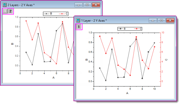
1 Layer, 2 Y Axes
It has long been possible to create "Double-Y" plots in Origin. Previously, "2 Y axes" meant "2 layers." Since Origin 2023, Origin introduces support for a new "1 layer, 2 Y axis" plotting mechanism. The new mechanism has general applications for 2D scatter, line, line + symbol (incl. variations such as the "Before-After" graph), column, box, histogram, and area charts. Using new GUI controls, the user can create such a graph using only the basic plot type templates.
Beginning with Origin 2023, the Multi-Panel/Axis category (Plot: Multi-Panel/Axis) has two rows of "Double-Y" templates with the new, single-layer on top and the older, two-layer templates below.
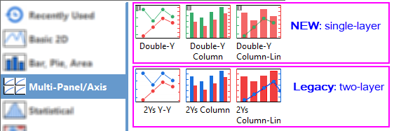
The new and the legacy templates will produce the same graph, the only difference being that the legacy template will create two layers while the new template will create only one. The plotting procedure is the same for both:
- In the worksheet, select 2 columns of "Y" data.
- Click Plot: Multi-Panel/Axis and choose the desired template.
Other controls that are added to support this new "1 layer, 2 Y axis" plotting mechanism:
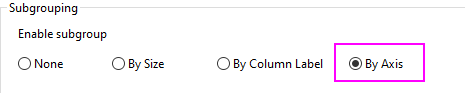
- The Plot Details Group tab now has a Subgrouping = By Axis option. In the graph above, we did not use this setting. Instead, we chose to use a single group and make use of line+symbol template's default increment lists for line color and symbol shape. However, we could just as well have split the left and right Y plots into two separate groups and thus, implement separate Plot Details Group tab behaviors for each group.
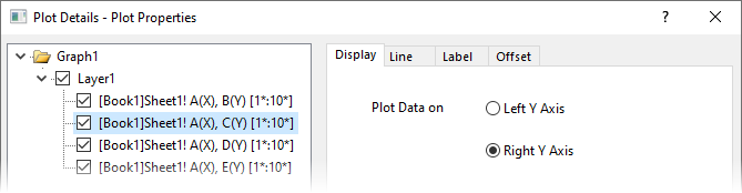
- The aforementioned plot types now include a Display tab at the plot level in Plot Details. Use radio buttons Plot Data on the Left Y Axis or Right Y Axis.
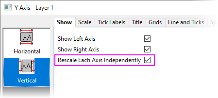
- The Axis dialog box now has a Rescale Each Axis Independently check box that should be enabled for a "double-Y" graph (If for some reason, your two vertical axes don't seem to want to scale independently, check on this setting).
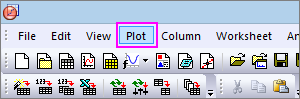
Statistical
Graphs, Listed by Type
| Graph Types
|
Notes
|
|
 Box Chart Box Chart
 Interval Plot Interval Plot
 Bar Chart Bar Chart
 Box Overlap Box Overlap
 Box Normal Box Normal
 Half Box Half Box
 Bar Overlap Bar Overlap
 Bar Normal Bar Normal
 Scatter Interval Scatter Interval
 Marginal Box Charts Marginal Box Charts
 Beeswarm Plot Beeswarm Plot
|
- Start with a Worksheet.
- Select at least one Y column or a range from at least one Y column.
- For specific data requirements, follow the link in the Graph Types column.
|
|
 Histogram Histogram
 Histogram + Rug Histogram + Rug
 Histogram + Probabilities Histogram + Probabilities
 Multi-Panel Histograms Multi-Panel Histograms
 Distribution Distribution
 Distribution + Rug Distribution + Rug
 Histogram with Labels Histogram with Labels
 Stacked Histograms Stacked Histograms
 Population Pyramid Population Pyramid
 Marginal Histograms Marginal Histograms
 Marginal Plots (Grouped Marginal Histogram) Marginal Plots (Grouped Marginal Histogram)
|
- Start with a Worksheet.
- Select at least one Y column or a range from at least one Y column.
- For specific data requirements, follow links in the Graph Types column.
|
|
 Scatter Matrix Scatter Matrix
|
- Start with a Worksheet.
- Select two Y columns or a range from two Y columns.
- For specific data requirements, follow the link in the Graph Types column.
|
|
 Violin Plot Violin Plot
 Violin with Box Violin with Box
 Violin with Point Violin with Point
 Violin with Quartile Violin with Quartile
 Violin with Stick Violin with Stick
 Split Plot Split Plot
 Half Violin Half Violin
 Ridgeline Chart Ridgeline Chart
|
- Start with a Worksheet.
- Select at least one Y column (or a range from at least one Y column).
- Split violin requires exactly 2 data columns, plus a third grouping column.
- For data requirements and other information on plot variations, see Violin Plot.
For data requirements and other information on Ridgeline Charts, follow the link in the Graph Types column.
|
|
 Pareto Chart - Binned Data Pareto Chart - Binned Data
 Pareto Chart - Raw Data Pareto Chart - Raw Data
|
- Start with a Worksheet.
- Select one Y columns or a range from one Y column (Raw), or a Y column of Binned results.
- For specific data requirements, follow the link in the Graph Types column.
|
|
 QC (X-bar R) Chart QC (X-bar R) Chart
|
- Start with a Worksheet.
- Select at least one Y column or a range from at least one Y column.
- For specific data requirements, follow the link in the Graph Types column.
|
|
 Bridge Chart Bridge Chart
 Stacked Bridge Chart Stacked Bridge Chart
 Stacked Total Bridge Chart Stacked Total Bridge Chart
 Horiz-Bridge Chart Horiz-Bridge Chart
 Double Y Box Double Y Box
|
- Start with a Worksheet.
- Select one or more Y columns (or a range of one or more Y columns). If there is an X column to the left of the Y column(s), this X column is treated as categorical data; otherwise, the worksheet's row indices will be used.
- Origin Bridge Charts are variants of one basic chart type. For more information, see Bridge Charts.
|
|
 Probability Plot Probability Plot
 Q-Q Plot Q-Q Plot
|
- Start with a Worksheet.
- Select one Y column or a range from one Y column.
- For specific data requirements, follow the link in the Graph Types column.
|
|
 Bland-Altman Plot Bland-Altman Plot
|
- Start with a Worksheet.
- Select two Method columns and one Subject column (optional).
|
|
 Correlation Plot Correlation Plot
|
- Correlation Plot is an APP tool. To use it, please make sure the app is installed.
- Start with a Worksheet.
- The data can be checked in the dialog.
|
|
 Paired Comparison Plot Paired Comparison Plot
|
- Paired Comparison Plot is an APP tool. To use it, please make sure the app is installed.
- Start with a Worksheet.
- Select one Data column, then select Group columns in the dialog.
|
Contour
Graphs, Listed by Type
| Graph Types
|
Notes
|
|
 Contour - Color Fill Contour - Color Fill
 Contour B/W Lines + Labels Contour B/W Lines + Labels
 Gray Scale Map Gray Scale Map
 Contour - Categorical Z Contour - Categorical Z
|
- Contour Color Fill, B/W Lines + Labels, Gray Scale Map, Contour Profiles: XYZ, Virtual Matrix, Matrix.
- Contour - Categorical Z: XYZ, Virtual Matrix.
- For specific data requirements, follow links in the Graph Types column.
|
|
 Heatmap Heatmap
 Heatmap with Labels Heatmap with Labels
 Split Heatmap Split Heatmap
|
- Heatmap and Heatmap with Labels start with a Worksheet (XY, XYZ), Virtual Matrix or Matrix.
- Split Heatmap starts from a Worksheet.
- For specific data requirements, follow links in the Graph Types column.
|
|
 Contour Profiles Contour Profiles
 Image Profiles Image Profiles
|
- Start with a Worksheet, Virtual Matrix or Matrix (Image Profiles, Matrix only).
- For specific data requirements, follow links in the Graph Types column.
|
|
 Polar Contour theta(X), r(Y) Polar Contour theta(X), r(Y)
 Polar Contour r(X), theta(Y) Polar Contour r(X), theta(Y)
|
|
|
 Ternary Contour Ternary Contour
|
- Start with a Worksheet.
- Columns should be designated as XYZZ.
- For specific data requirements, follow the link in the Graph Types column.
|
|
 2D Kernel Density 2D Kernel Density
|
- Start with a Worksheet.
- Select at least one Y column or a range from at least one Y column.
- For specific data requirements, follow the link in the Graph Types column.
|
|
 Image Plot Image Plot
|
- Start with a Matrix.
- Z values are from an imported raster image.
|
Specialized
Graphs, Listed by Type
| Graph Types
|
Notes
|
|
 Vector XYAM Vector XYAM
 Vector XYXY Vector XYXY
|
- Start with a Worksheet.
- For XYAM Vector, select three Y columns (or a range of the three Y columns).
- For XYXY Vector, select two X columns and 2 Y columns (or a range of two X and two Y columns).
- For specific data requirements, follow links in the Graph Types column.
|
|
 Streamline Vector Plot Streamline Vector Plot
|
- Start with a Matrixsheet with two matrix objects.
- The two matrix objects are the derivatives of the plotted curve in the (x,y) directions, respectively.
|
|
 Ternary Ternary
 Ternary, Line+Symbol Ternary, Line+Symbol
 Ternary, Line Ternary, Line
 Right-Triangle Ternary Right-Triangle Ternary
 Ternary Vector Ternary Vector
 Piper Piper
 Stiff Stiff
 Stiff Map Stiff Map
 Durov Durov
|
- Start with a Worksheet.
- For specific data requirements, follow links in the Graph Types column.
|
|
 Radar Radar
 Line Fill Line Fill
 Line Line
 Symbol Symbol
|
- Start with a Worksheet.
- Select at least one Y column (or a range from at least one Y column). The X column displays as the title of the radial axis around the chart. If there is an associated X column, X column supplies X values; otherwise, Y sampling interval or row number is used.
- Radar Charts are also known as "Spider Plots".
- For more information, see Radar Chart (Spider Plot).
|
|
 Polar theta(X) r(Y) Polar theta(X) r(Y)
 Polar r(X) theta(Y) Polar r(X) theta(Y)
 Bar theta, r Bar theta, r
 Bar r, theta Bar r, theta
 Line + Symbol theta, r Line + Symbol theta, r
 Line + Symbol r, theta Line + Symbol r, theta
 Symbol theta, r Symbol theta, r
 Symbol r, theta Symbol r, theta
 Wind Rose - Binned Data Wind Rose - Binned Data
 Wind Rose - Raw Data Wind Rose - Raw Data
|
- Start with a Worksheet.
- Select one or more Y columns or a range from one or more Y columns. If there is an associated X column, X column supplies X values; otherwise, Y sampling interval or row number is used.
- For data requirements and other information on polar graphs, see Polar Graph.
|
|
 Stacked Radial Stacked Radial
 Radial Bar Plot Radial Bar Plot
 Radial Stacked Bar Radial Stacked Bar
|
- Start with a Worksheet.
- Select at least one Y column of values (or a range from at least one column). If there is an associated X column, X column supplies X values; otherwise, Y sampling interval or row number is used.
- For more information, see Radial Bar and Radial Stacked Bar Plot
|
|
 Polar Vector θr θr] Polar Vector θr θr]
 Compass Plot Compass Plot
|
- Start with a Worksheet.
- For Compass, Select at least one Y column of values (or a range from at least one column). If there is an associated X column, X column supplies X values; otherwise, Y sampling interval or row number is used.
- For Polar Vector θr θr, select two pairs of XY columns in the order θr θr.
|
|
 Smith Chart Smith Chart
|
- Start with a Worksheet.
- Select at least one Y column of values (or a range from at least one column). If there is an associated X column, X column supplies X values; otherwise, Y sampling interval or row number is used.
- For more information, follow the link in the Graph Types column.
|
|
 High-Low-Close High-Low-Close
 Japanese Candlestick Japanese Candlestick
 OHLC Bar Chart OHLC Bar Chart
 OHLC-Volume OHLC-Volume
 Line Line
|
- Start with a Worksheet.
- For specific data requirements, follow links in the Graph Types column.
|
|
 Bullet Chart Bullet Chart
 Vertical Bullet Chart Vertical Bullet Chart
 Normalized Bullet Chart Normalized Bullet Chart
|
- Start with a Worksheet.
- Select one X column and at least two Y columns.
- For more information, see Bullet Chart.
|
Categorical
Graphs, Listed by Type
| Graph Types
|
Notes
|
|
 Grouped Scatter - Indexed Data Grouped Scatter - Indexed Data
|
- Start with a Worksheet.
- Select at least one Y column as input data.
- One or more column(s) of categorical data provide grouping information.
- For more information, see the link in the Graph Types column.
|
|
Color Mapped
Bubble + Color Mapped
|
- Start with a Worksheet.
- If there is an associated X column, X column supplies X values; otherwise, Y sampling interval or row number is used.
- For specific data requirements, follow links in the Graph Types column.
|
|
 Grouped Columns - Indexed Data Grouped Columns - Indexed Data
 Grouped Floating Bar Grouped Floating Bar
|
- Start with a Worksheet.
- Select at least one Y column (Grouped Columns) or two Y columns (Grouped Floating Bar).
- If there is an associated X column, X column supplies X values; otherwise, Y sampling interval or row number is used.
- For Grouped Columns - Indexed Data, an additional column supplies the Group information.
- For Grouped Floating Bar Graphs, subgroup by size (i.e. number of columns) or by column label.
|
|
 Grouped Box Charts - Indexed Data Grouped Box Charts - Indexed Data
 Grouped Box Charts - Raw Data Grouped Box Charts - Raw Data
 Grouped Column Scatter - Indexed Data Grouped Column Scatter - Indexed Data
 Grouped Interval Plot - Indexed Data Grouped Interval Plot - Indexed Data
 Grouped Mean Bar - Indexed Data Grouped Mean Bar - Indexed Data
 Grouped Violin - Indexed Data Grouped Violin - Indexed Data
 Grouped Half Violin - Indexed Data Grouped Half Violin - Indexed Data
 Grouped Half Box - Indexed Data Grouped Half Box - Indexed Data
|
- Start with a Worksheet.
- Select at least one Y column (or a range from at least one Y column), plus a second column with grouping information. If there is an associated X column, X column supplies X values; otherwise, Y sampling interval or row number is used.
- Plots of Indexed Data are all style variations of the Grouped Box.
- For more information, follow the links in the Graph Types column.
|
|
 Trellis Plot Trellis Plot
|
- Start with a Worksheet.
- Select at least one Y column as input data. Optionally, you can have an additional associated Y error column for each Y column. Other column(s) generally contain grouping information.
- For more information, see the link in the Graph Types column.
|
|
 Double Y Trellis Plot Double Y Trellis Plot
|
- Start with a Worksheet.
- Select two Y columns as input data. Optionally, you can have an additional associated Y error column for each Y column. Other column(s) generally contain grouping information.
- For more information, see the link in the Graph Types column.
|
|
 Cluster Plot Cluster Plot
|
- Start with a Worksheet.
- You need at least two Y columns, one of which should contain grouping information.
- Grouping columns can be used to create separate panels in the horizontal and/or vertical directions and/or to modify plotted points (color, scatter point size, scatter point shape, etc.).
|
|
 Parallel Plot Parallel Plot
 Parallel Sets Parallel Sets
 Parallel Index Parallel Index
|
- Start with a Worksheet.
- Select at least one (ideally, two or more) column(s) or a range from one or more columns. Column designation does not matter. Each column will be treated as data on a single variable.
- Variables may be numeric (Parallel Plot or Parallel Index) or they may be categorical (Parallel Sets).
- Parallel Sets plots have a "curvature" option that is sometimes seen in plots termed "Alluvial Diagrams" (see next).
- For more information, follow links in the Graph Types column.
|
|
 Sankey Diagrams Sankey Diagrams
 Alluvial Diagrams Alluvial Diagrams
|
- Start with a Worksheet.
- For Sankey Diagrams, select exactly two columns of categorical data + 1 column of numeric data. Column designation is ignored
- For Alluvial Diagrams, select two or more columns of categorical data. Column designation is ignored.
- For more information, follow links in the Graph Types column.
|
|
 Chord Diagram Chord Diagram
 Chord Diagram with Ratio Layout Chord Diagram with Ratio Layout
|
- Start with a Worksheet or Virtual Matrix.
- Select at least three columns of values (worksheet) or a block of values (virtual matrix) from at least three columns.
- The first column will be treated as X and should be monotonic.
- For more information, see Chord Diagram and Chord Diagram with Ratio Layout.
|
|
 Ribbon Ribbon
 100% Ribbon 100% Ribbon
|
- Start with a Worksheet.
- Select at least two Y columns of values (or a range from at least two columns).
- If there is an associated X column, X column supplies X values; otherwise, sampling interval of the Y column or row number is used.
|
|
 Network Network
|
- Start with a Worksheet.
- The plot requires one of three data arrangements: Adjacency matrix, Incidence Matrix or Edge List.
- A dialog box is used to specify input and analysis parameters.
- Regardless of data arrangement, an intermediary worksheet will be created to tabulate node and link information.
|
|
 Sunburst Plot Sunburst Plot
 Circular Packing Graph Circular Packing Graph
|
- Start with a Worksheet.
- Select multiple categorical X columns and one Y column.
|
3D
Graphs, Listed by Type
| Graph Types
|
Notes
|
|
 3D Scatter 3D Scatter
 3D Scatter + Z Error Bar 3D Scatter + Z Error Bar
 3D Line 3D Line
 3D Trajectory 3D Trajectory
|
- Data requirements vary by plot type. See links in the Graph Types column.
|
|
 3D Vector XYZ XYZ 3D Vector XYZ XYZ
 3D Vector XYZ dXdYdZ 3D Vector XYZ dXdYdZ
|
- Start with a Worksheet.
- Select 6 worksheet columns, designated as XYZ XYZ.
- For more information, see links in the Graph Types column.
|
|
 3D Ribbons 3D Ribbons
|
- Start with a Worksheet.
- Select at least one Y column (or a range from at least one Y column). Ideally, select at least two Y columns (or a range of at least two Y columns). If there is an associated X column, X column supplies X values; otherwise, Y sampling interval or row number is used.
- For more information, see the link in the Graph Types column.
|
|
 3D Walls 3D Walls
 3D Stacked Walls 3D Stacked Walls
 3D 100% Stacked Walls 3D 100% Stacked Walls
|
- Start with a Worksheet.
- Select at least one Y column (or a range from at least one Y column). Ideally, select at least two Y columns (or a range of at least two Y columns). If there is an associated X column, X column supplies X values; otherwise, Y sampling interval or row number is used.
- For more information, see the link in the Graph Types column.
|
|
 Waterfall Waterfall
 Y Color Mapped Waterfall Y Color Mapped Waterfall
 Z Color Mapped Waterfall Z Color Mapped Waterfall
 3D Waterfall 3D Waterfall
 Y Color Mapped 3D Waterfall Y Color Mapped 3D Waterfall
 Z Color Mapped 3D Waterfall Z Color Mapped 3D Waterfall
|
- Start with a Worksheet.
- Select at least one Y column (or a range from at least one Y column). Ideally, select at least two Y columns (or a range of at least two Y columns). If there is an associated X column, X column supplies X values; otherwise, Y sampling interval or row number is used.
- For more information, see the links in the Graph Types column.
| Waterfall, Y Color Mapped Waterfall and Z Color Mapped Waterfall, are only available from the 2D Graphs toolbar.
|
|
|
 3D Color Fill Surface 3D Color Fill Surface
 3D X Constant with Base Surface 3D X Constant with Base Surface
 3D Y Constant with Base Surface 3D Y Constant with Base Surface
 3D Color Map Surface 3D Color Map Surface
 3D Color Map Surface with Projection 3D Color Map Surface with Projection
 3D Wire Frame 3D Wire Frame
 3D Wire Surface 3D Wire Surface
|
- Start with a Worksheet or Matrix.
- For specific data requirements, follow links in the Graph Types column.
|
|
 3D Color Fill Surface with Error Bar 3D Color Fill Surface with Error Bar
 3D Color Map Surface with Error Bar 3D Color Map Surface with Error Bar
 Multiple Color Fill Surfaces Multiple Color Fill Surfaces
 Multiple Color Map Surfaces Multiple Color Map Surfaces
|
- Start with a Matrix.
- For specific data requirements, follow links in the Graph Types column.
|
|
 3D Stacked Surfaces 3D Stacked Surfaces
 3D Stacked Heatmaps 3D Stacked Heatmaps
|
- Start with a Worksheet or Matrix.
- For specific data requirements, follow links in the Graph Types column.
|
|
 3D Bars 3D Bars
 3D Stacked Bars 3D Stacked Bars
 3D 100% Stacked Bars 3D 100% Stacked Bars
|
- Start with a Worksheet (XYZ) or a Virtual Matrix or Matrix of Z values.
- For specific data requirements, follow links in the Graph Types column.
|
|
 XYY 3D Bars XYY 3D Bars
 XYY 3D Side by Side Bars XYY 3D Side by Side Bars
 XYY 3D Stacked Bars XYY 3D Stacked Bars
 XYY 3D 100% Stacked Bars XYY 3D 100% Stacked Bars
|
- Start with a Worksheet.
- Select at least one Y column (or a range from at least one Y column). Ideally, select at least two Y columns (or a range of at least two Y columns). If there is an associated X column, X column supplies X values; otherwise, Y sampling interval or row number is used.
- For more information, see the links in the Graph Types column.
|
|
 3D Ternary Colormap Surface 3D Ternary Colormap Surface
 3D Ternary Symbol 3D Ternary Symbol
|
- Start with a Worksheet.
- Select two Z columns (XYZZ) or a range of data from two Z columns (Z columns may be multiples of 2).
- For more information, follow links in the Graph Types column.
|
|
 3D Tetrahedral 3D Tetrahedral
|
- Start with a Worksheet.
- Select two Z columns (XYZZ) or a range of data from two Z columns (Z columns may be multiples of 2).
- For more information, follow links in the Graph Types column.
|
|
 Parametric Surface Parametric Surface
|
- Start with a Matrix.
- The matrix should have, at minimum, 3 objects in the same matrixsheet.
- For more information, follow links in the Graph Types column.
|
For an overview of Origin's 3D graph types and their source data requirements, see these topics:
Browser Graph
Graphs, Browser
Graphs, Listed by Type
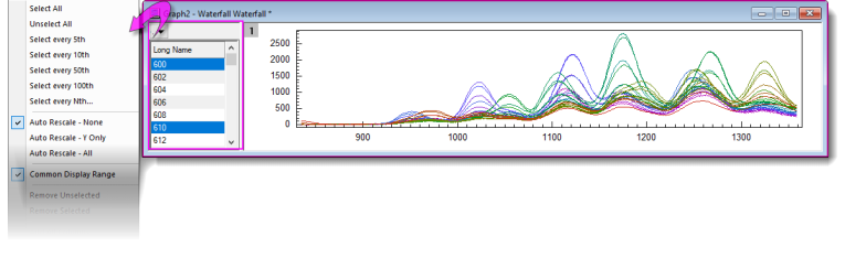
Browser graphs are useful for selectively plotting data from worksheets containing many columns (and rows), into a single graph layer:
- Select a single plot or every Nth column for plotting.
- Easily change column selection.
- Stretch the window in either dimension to obtain the best view.
- Specify automatic rescale and/or common display range for all plots.
- Works with other Origin tools including Gadgets.
- Plots can be further customized via Plot Details dialog box.
- You can export a Browser Graph as a video (GIF, TIFF, AVI):
- Click the menu button
 and choose Flip Through. and choose Flip Through.
- Click the Export button and set File Type = GIF, TIFF or AVI.
- Modify other settings as needed and click OK. Unless it has been turned off, export will dump a clickable link to the Messages Log.
| The page-level Mini Toolbar includes an Add Browser button so that you can add a Browser panel to a regular 2D line plot.
|
Function Plot
Graphs, Listed by Type
My Templates
Graphs, Listed by Type
Other Graphing Tools
Graphs, Listed by Type
| App
|
Notes
|
|
 Graph Maker App Graph Maker App
|
- The Graph Maker app is pre-installed in your Origin software.
- Launch the App from the Plot menu or from the Graph Maker app icon in the Apps Gallery to the right side of your Origin workspace.
- Use the Graph Maker app with Preview pane, to interactively plot grouped data.
- Choose from line, scatter, line+symbol, column, box and histogram chart types.
- Supports fitting for scatter plots.
- Drag-and-drop worksheet columns to set up the graph.
- Graph settings are saved and can be re-loaded.
|
|
 Template Library Template Library
|
- Use this dialog to organize your custom graphing templates.
|
|
 Template Center Template Center
|
- Use this dialog to search and download the online graph templates
|
Topics for Further Reading
|