5.8.1 Principal Component AnalysisPrincipal-Component-Analysis
Summary
Principal Component Analysis is useful for reducing and interpreting large multivariate data sets with underlying linear structures, and for discovering previously unsuspected relationships.
We will start with data measuring protein consumption in twenty-five European countries for nine food groups. Using Principal Component Analysis, we will examine the relationship between protein sources and these European countries.
Selecting Principal Methods
To determine the number of principal components to be retained, we should first run Principal Component Analysis and then proceed based on its result:
- Open a new project or a new workbook. Import the data file \samples\Statistics\Protein Consumption in Europe.dat
- Select the entire worksheet and then select Statistics: Multivariate Analysis: Principal Component Analysis.
- Accept the default settings in the open dialog box and click OK.
- Select sheet PCA Report.
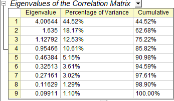
- In the Eigenvalues of the Correlation Matrix table, we can see that the first four principal components explain 86% of the variance and the remaining components each contribute 5% or less. We will keep four main components.
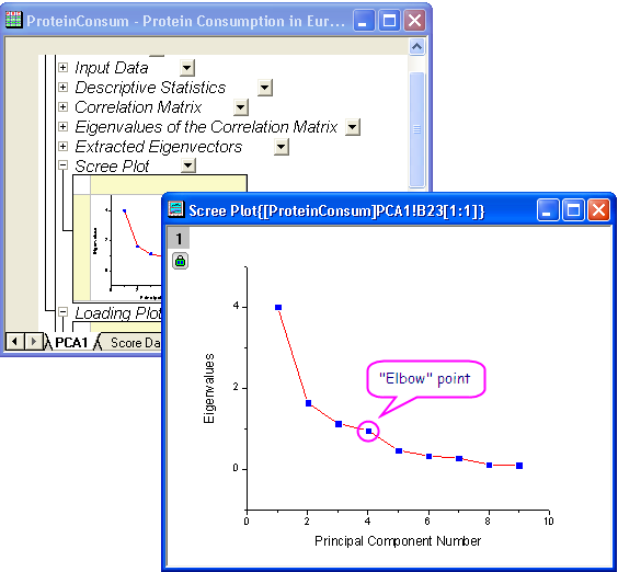
- A scree plot can be a useful visual aid for determining the appropriate number of principal components. The number of components depends on the "elbow" point at which the remaining eigenvalues are relatively small and all about the same size. This point is not very evident in the scree plot, but we can still say the fourth point is our "elbow" point.
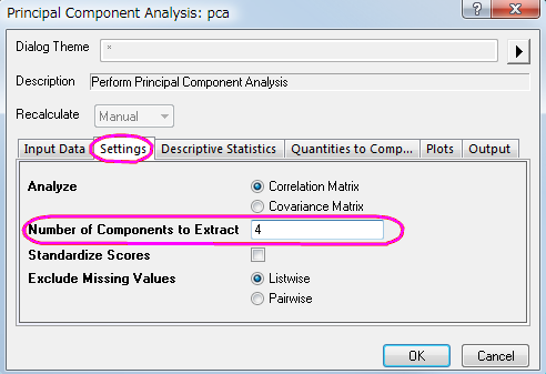
- Click the lock icon
 in the results tree and select Change Parameters in the context menu. In the Settings tab, set Number of Components to Extract to 4. Do not close the dialog; in the next steps, we will retrieve component diagrams. in the results tree and select Change Parameters in the context menu. In the Settings tab, set Number of Components to Extract to 4. Do not close the dialog; in the next steps, we will retrieve component diagrams.
Request Principal Component Plots
In the Plots tab of the dialog, users can choose whether they want to create a scree plot or a component diagram.
- Scree Plot
- The scree plot is a useful visual aid for determining an appropriate number of principal components.
- Component Plot
- Component plots show the component score of each observation or component loading of each variable for a pair of principal components. In the Select Principal Components to Plot group, users can specify which pair of components to plot. The component plots include:
- Loading Plot
- The loading plot is a plot of the relationship between the original variables and the subspace dimension. It is used to interpret relationships between variables.
- Score Plot
- The score plot is a projection of data onto subspace. It is used to interpret relationships between observations.
- BiPlot
- The biplot shows both the loadings and the scores for two selected components in parallel.
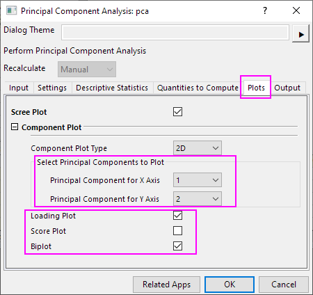
- In the dialog that was opened in the preceding steps, select the Plots tab. Make sure Scree Plot, Loading Plot, and Biplot are selected.
- The first two components are usually responsible for the bulk of the variance. This is why we are going to plot the component plot in the space of the first two principal components. In the Select Principal Components to Plot group, set Principal Component for X Axis to 1, and set Principal Component for Y Axis to 2. Click OK.
Interpreting The Results
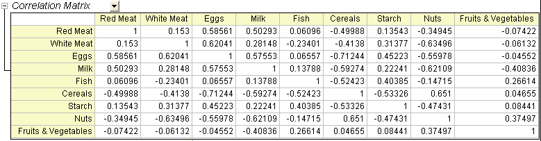
- In the Correlation Matrix, we can see that the variables are highly correlated. Many values are greater than 0.3. Principal Component Analysis is an appropriate tool for removing the collinearity.
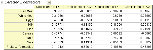
- The main component variables are defined as linear combinations of the original variables. The Extracted Eigenvectors table provides coefficients for equations.
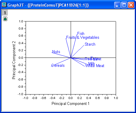
- The Loading Plot reveals the relationships between variables in the space of the first two components. In the loading plot, we can see that Red Meat, Eggs, Milk, and White Meat have similar heavy loadings for principal component 1. Fish, fruit, and vegetables, however, have similar heavy loadings for principal component 2.
- The biplot shows both the loadings and the score for two selected components in parallel. It can reveal the projection of an observation on the subspace with the score points. It can also find the ratio of observations and variables in the subspace of the first two components. (Note: Double-click the graph to open and customize.)
- We can use the Data Reader tool
 to open the Data Info window and examine the plot in greater detail. Click on a data point to read component scores for each country. We can see that Spain and Portugal's protein sources differ from those of other European countries. Spain and Portugal rely on fruits and vegetables, while eastern European countries such as Albania, Bulgaria, Yugoslavia, and Romania prefer cereals and nuts. to open the Data Info window and examine the plot in greater detail. Click on a data point to read component scores for each country. We can see that Spain and Portugal's protein sources differ from those of other European countries. Spain and Portugal rely on fruits and vegetables, while eastern European countries such as Albania, Bulgaria, Yugoslavia, and Romania prefer cereals and nuts.
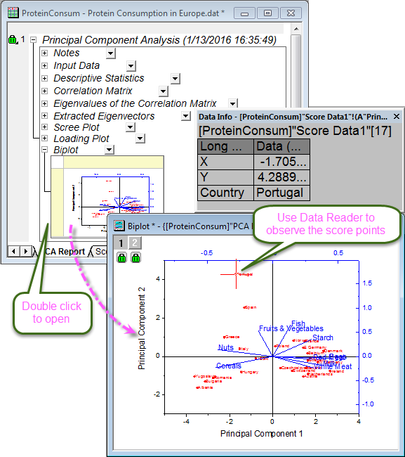
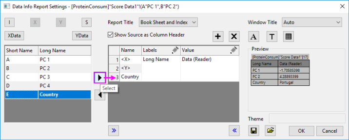
To display country information in the Data Info window, as in the image above:
- Right-click the Data Info window and select Preferences....
- Highlight Country in the left-panel, then click the Select button (the right-pointing arrow) to add Country to the Data Info display, then click OK.
Note: Since Origin 2019, you can simply hover on a data point to show a tooltip with data point coordinate information. Both the tooltip and the Data Info display are customizable. See The Data Info Window and Data Point Tooltip for more information.
|
Create 3D Components Plot
- Click the lock icon in the results tree and select Change Parameters in the context menu.
- In the Plots tab, set Components Plot Type to 3D. And enter 4 in the Principal Component for Z Axis.
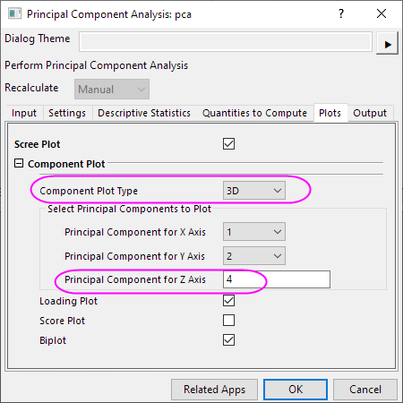
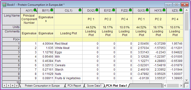
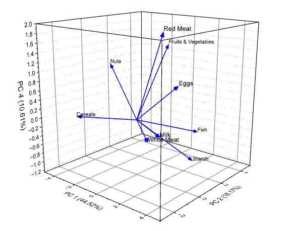
- Click OK to close the dialog. Then the PCA Plot Data and 3D loading plot will be created as follows.
|