9.3.8 Trellis PlotTrellis-Plot
Trellis plots, Trellis charts or Trellis graphs (also sometimes termed "Trellis displays" or simply "Trellis") are a means of graphing multivariate data, as an array of M X N panels. As a simple example, two "primary variables" might be chosen to represent a common set of axes (repeated in each panel), against which all combinations of two categorical variables (termed "conditioning variables") are plotted. Each combination of categorical values is plotted as a separate panel.
In Origin terms, when your data includes a column of categorical data, or multiple columns characterizing some sort of nested sub-grouping of data, you might gain from plotting the data as a Trellis. Trellis plots were introduced in Origin 2017.
Creating a trellis plot
- Highlight one or more Y worksheet columns (or a range from one or more Y columns).
- Select Plot: 2D: Trellis.
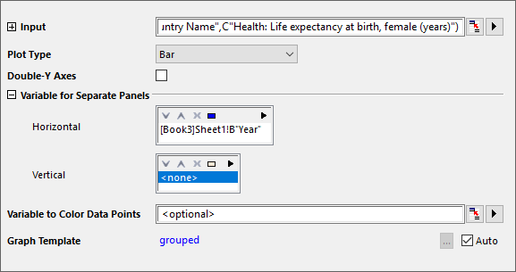
This will open the plot_group dialog
 | Since Origin 2018b, the Trellis plot supports more plot types: Stacked Column,Stacked Bar,100% Stacked Column and 100% Stacked Bar.
The Box Charts also supports a Trellis type arrangement. See Plotting Box Chart in Trellis, below.
|
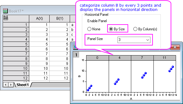
Controlling the arrangement of horizontal and vertical panels
Method 1. Use the plot_group dialog's Variable for Separate Panels controls to determine the horizontal and vertical arrangement of panels
Method 2. Use the Plot Details dialog Panel tab controls to re-arrange plots in panels after plotting
- In the left panel of Plot Details, highlight a data plot. The right panel will include a Panel tab.
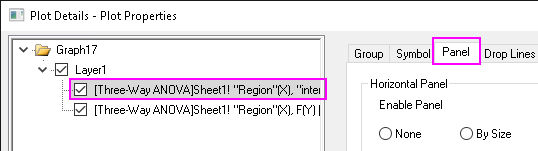
- On this tab, you can re-arrange panels by size or by grouping column(s).
- by size
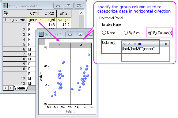
- by grouping column(s)

|
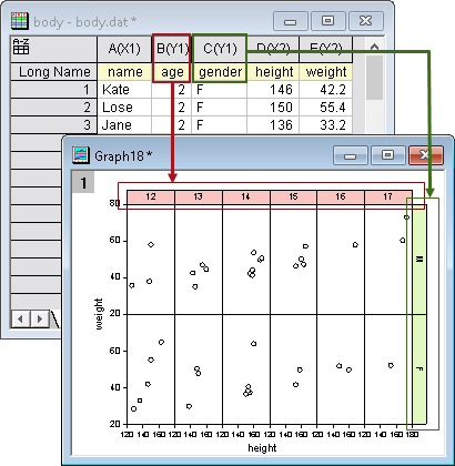
- Import the file <Origin exe folder>/Samples/Statistics/body.dat (Data: Import from File: Single ASCII) and accept default settings. We are going to plot height vs. weight data, categorizing by age and gender, respectively.</li>
- Set height column as X by right clicking on it and selecting Set As: X.
- Highlight height and weight columns, and select Plot: 2D: Trellis to open the plot_group dialog.
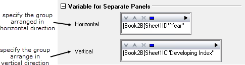
- Under the Variable for Separate Panels branch, select the age column for Horizontal and the gender column for Vertical.
Click OK to create your Trellis.
|
| There is a practical limit to the number of panels that the trellis plot will support, governed primarily by demands on system resources. By default, there is a 50 panel limit in both the horizontal and vertical directions -- a limit that most users will not run up against. The 50 panel limit is somewhat arbitrary and can be manipulated by changing the value of system variable @NOP. If you exceed the panel limit set by @NOP, the plot_group dialog will report that the number of panels exceeds what is allowable and the graph will fail. For information on changing the value of a system variable, see This FAQ on changing the value of a system variable.
|
Mapping color to data plots
Color-map plots to a specified column
- In the plot_group dialog, specify the mapped color column in Variable to Color Data Points.
Or
- In the Plot Details dialog, go to Symbol tab, set Symbol Color: By Points: Indexing/Color Mapping.
Color map plots to a color increment list
- In the Plot Details dialog, go to Symbol tab, set Symbol Color: By Points: Increment
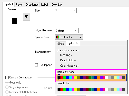
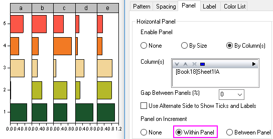
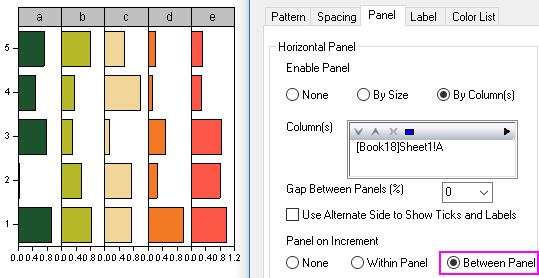
- Go to Panel tab, you can increment plot colors within a panel or between panels.
- within a panel
- between panels
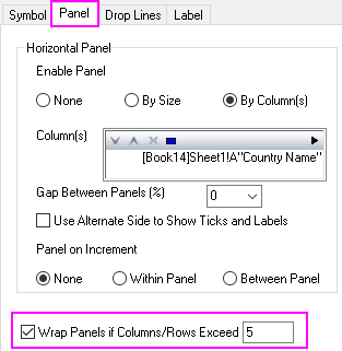
Wrapping panels
When you have many categories in a grouping column, the Trellis plot can become squeezed for space. The solution is to "wrap" panels, breaking a row or column of panels into multiple rows/columns.
- Double-click on a plot to open the Plot Details dialog.
- On the Panel tab, select the Wrap Panels if Columns/Rows Exceed checkbox and enter the desired number in the edit box.
|
|
The following quick example uses one of the Learning Center sample OPJs.
- Choose Help:Learning Center... to open the Learning Center dialog.
- Select the Graph Sample tab on the left, and on the right select Trellis Plot from Samples in drop-down list.
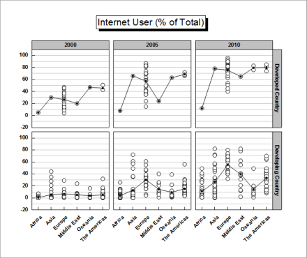
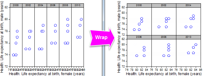
- Double-click on the first cell of the second row to open the OPJ. Activate the workbook Book9. We are going to create a female vs. male Trellis categorized by years, and then wrap it to 3 X 2 panels.
- Right-click on column C and select Set As: X.
- Highlight column C and D, select Plot: 2D: Trellis to open the plot_group dialog.
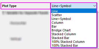
- Select Scatter for Plot Type.
- Select column B for Variable for Separate Panels: Horizontal. Click OK to create a Trellis.
- Double-click on the scatter plot to open the Plot Details dialog. On the Panel tab, select the Wrap Panels if Columns/Rows Exceed checkbox and enter 3 in the edit box.
|
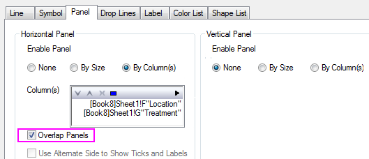
Combining multiple panels into a single panel
- Create a set of categorized plots in multiple panels by the plot_group dialog.
- Double-click on the Trellis to open the Plot Details dialog. On the Panel tab, check Overlap Panels in the Horizontal Panel or Vertical Panel group.
|
|
The following quick example uses one of the Learning Center OPJs.
- Select Help: Learning Center to open the Learning Center dialog. In this dialog, select Graph Sample in left panel, and then choose "Trellis Plot" from Samples in drop-down list.
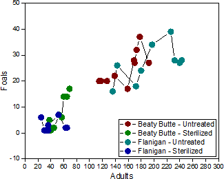
- Double-click on the graph in the lower right corner, "Trellis - Overlap Panels with Multiple Categories Combination".
- Activate workbook Book8. We are going to plot a set of Line+Scatter curves, grouped by columns Location and Treatment, in one panel.
- Highlight column C and select Plot: 2D: Trellis Plot to open the plot_group dialog.
- Select Line+Symbol for Plot Type.
- Select column F and G for Variable for Separate Panels: Horizontal. Click OK to create the Trellis.
- Double-click on the Trellis to open the Plot Details dialog. On the Panel tab, check Overlap Panels in the Horizontal Panel group.
- Go to Symbol tab, set Symbol Color: By Points: Increment from: to red color.
- Go to Panel tab. Select Between Panel from the Increment on Panel group.
|
Plotting box chart in trellis
- Create a box chart
- Double click on it to open the Plot Details dialog. Specify the categorical column(s) on the Panel tab to seperate the boxes into panels accordingly.
|
|
The following quick example uses one of the Learning Center OPJs.
- Select Help: Learning Center to open Learning Center. In the dialog that opens, select Graph Samples tab on the left, and then choose "Trellis Plots" from drop-down list on the top.
- Double-click on the graph to open sample "Trellis Plots - Box Charts".
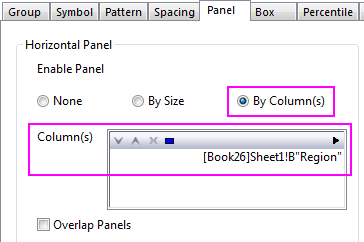
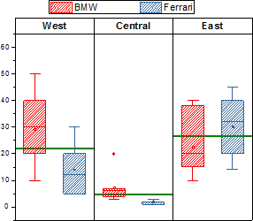
The workbook Trellis Plots - Box Charts contains sales data of two automobile brands: BMW and Ferrari. We are going to plot them as a box chart, seperated the boxes into different panels by their regions, and then show Mean line for each region.
- Create a box chart. Highlight col(C) and col(D) in Sheet1, and then select Plot: 2D> Box> Grouped Box Charts - Raw to create a box chart.
- Seperate boxes to 3 penals accroding to different regions. Double click on the box to open the Plot Details dialog. Activate Panel tab. Select By Column(s) for Horizontal Panel and select B(Y):Region for Column(s).
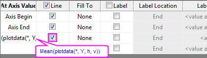
- Add a Mean line for each panel. Double click Y axis to open the Axis dialog. Activate Reference Lines tab. Add mean line as follow
|
Axis Display
Each panel in a Trellis plot shares a common set of axes with other panels in the Trellis. Note that these axes are not customized using the two dialog boxes that we have previously discussed: the plot_group dialog and Plot Details.
Axis customizations are made via the Axis dialog box. In this section, we will point out how a few small axis customizations might make your graph more readable.
To open the Axis dialog box:
- Double-click on the axis or axis tick labels.
or
- With the graph active, choose Format: Axes: X/Y/Z Axis, from the main menu.
Grid Lines
In the following example, we have barley varieties on the vertical axis and yields by location on the horizontal axis. Note how enabling grid lines for the vertical axis makes the plot easier to read.
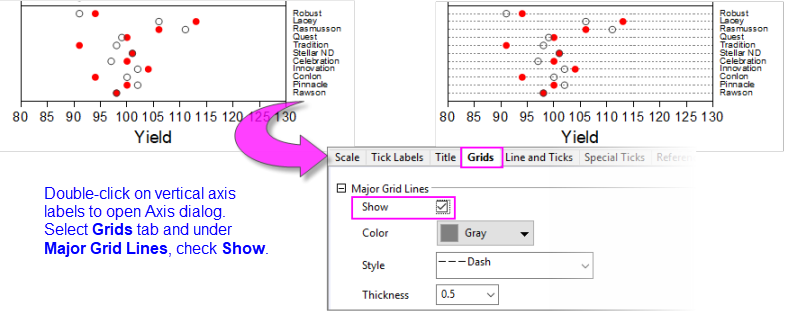
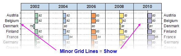
In the previous example, we enabled Major Grid Lines to connect tick labels to plotted data. In the next example, we enable Minor Grid Lines to separate tick labels and plotted points from adjacent labels and points.
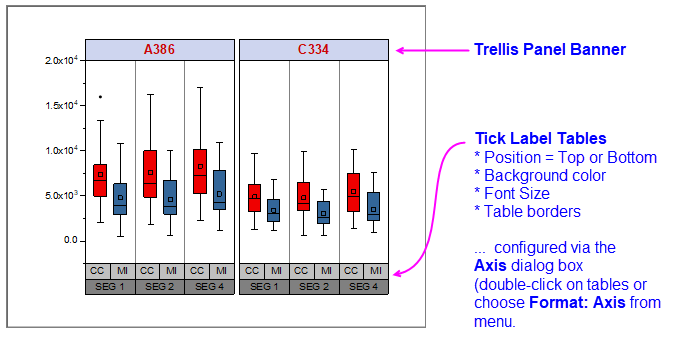
Tick Label Tables
Tick Label Tables offer a way to create multi-level labeling of graph axes, typically in plots of categorical data. Tick Label Tables are often used in box charts and column/bar charts and since Origin 2018b, have been available in Trellis plots.
To open the Axis dialog box to Tick Label Table controls:
- Double-click on the Tick Label Table or choose Format: Axes.
- Click on the Tick Labels tab and use Format and Table sub-tab controls to configure the tick tables.
For more information on using Axis dialog box controls to configure Tick Label Tables, see the Axis dialog Tick Labels tab.
Panel Banner String Customization
By default, the Trellis Panel Banner will display the categories of the associated categorical variable but you do have control over what is displayed in the banner. For instance, in the following example, you can see that the default banner display on the left shows an alphanumeric string (A386, C334).
This won't mean much to those who are not familiar with your data. One alternative, of course, is to add a graph legend or text label to explain but you can also modify the string that the banner displays. In this case, we change from the default option <Panel1> which displays just the category, to <Panel1, @LA>=<Panel1> which changes the string to the form "Column Long Name = Category".
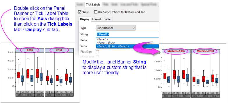
Note that clicking the arrow button  to the right of the String box produces a flyout menu with suggestions for building your string. to the right of the String box produces a flyout menu with suggestions for building your string.
For a complete list of string possibilities, see the Complete List of @Options in the LabTalk Help file.
| Note: In this section, we have talked about Tick Label Tables and Panel Banners. They are similar in appearance but note that Panel Banners are specific to Trellis plots, while tick label tables are more general and can be used in Box charts, Column/Bar charts, etc. Both can be customized via the graph's Axis dialog box.
|
Other Tick Label Customizations
Long text strings on tick labels necessitate some sort of adjustment and apart from changing font size, note that you can (a) wrap tick labels or you can (b) rotate tick labels. Both adjustments can be made using controls on the Format tab of the Axis dialog box.
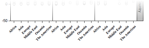
- Click on the Tick Labels tab and use Format sub-tab controls to set Font, Size, Rotate (deg.) or Wrap Text.
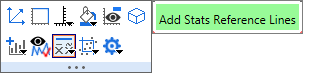
Adding Stats Reference Lines
You can add reference lines for key statistics to each Trellis panel. Labeling is optional.
- The easiest way to do this is using the layer-level Mini Toolbar Add Stats Reference Lines button. Click inside one of the panels to activate the Mini Toolbar, click the Add Stats... button, then choose a statistic from the flyout menu. The button automatically handles the syntax for each panel.
- Alternately -- though somewhat more difficult -- you can add lines and labels using controls in the Reference Lines dialog box.
|