6.1.2 Creating a GraphCreate-Graph
Summary
Origin provides templates library. You can create and modify templates by your own and add to the collection. Creating a graph in Origin is as simple as selecting the desired data and then selecting a template from a menu or from the graphing toolbars. The Plot Setup dialog offers more flexibility in creating plots, such as plotting data from multiple books or sheets.
Starting with Origin 2016, a more powerful "cloneable" template has been added. These templates are designed for "smart plotting", meaning you can clone a graph with a complicated layer hierarchy or with source data that cannot be specified by simple selection. See this tutorial on plotting from user-defined graph templates to learn how to save and use both standard and cloneable templates.
What you will learn
This tutorial will show you how to:
- Select data in a worksheet and quickly create a plot
- Change X/Y input of the data plot with context menu
- Add data to or remove it from an existing graph
- Use Plot Setup to plot data from multiple sheets
- Plot groups of plots by label
Create a Plot Quickly by Selecting Data
- Click the Connect Multiple Files button
 to open the connector dialog. To import multiple ASCII, select CSV for Data Connector. to open the connector dialog. To import multiple ASCII, select CSV for Data Connector.
- Click ... button next to File Names edit box. In the open dialog, select the files S15-125-03.dat, S21-235-07.dat and S32-014-04.dat from \Samples\Import and Export\ and click Add File(s) to add three files to the lower panel. Click OK to add them to File Names edit box.
- Check Same Book checkbox.
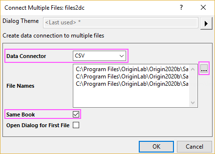
- Click OK. The imported results should appear as below:
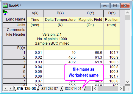
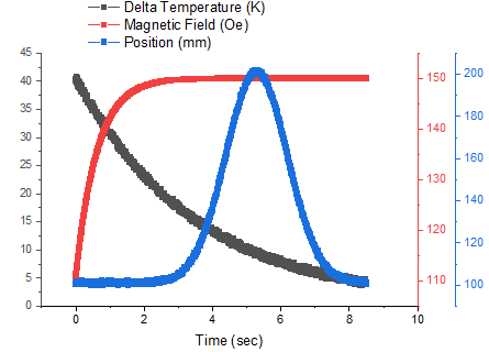
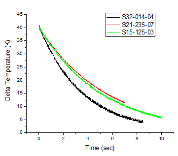
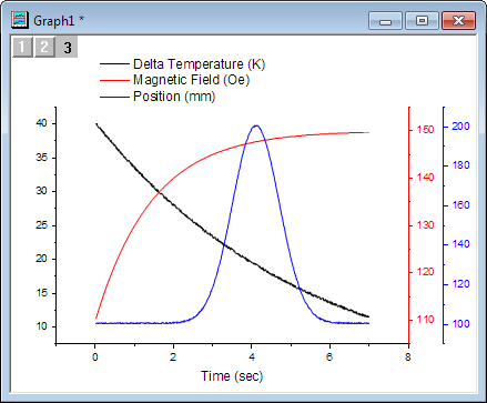
- Make the third worksheet, S32-014-4, active. To create a three layer graph, highlight the three Y columns, Delta Temperature, Magnetic Field, and Position, and then select Plot > Multi-Panel/Axis: 3Ys Y-YY. Note: There is no need to highlight the Time column, as Origin will automatically plot the Y columns against the associated X column in the worksheet.
Change X/Y Data of the Plot
Use the same worksheet from the previous example.
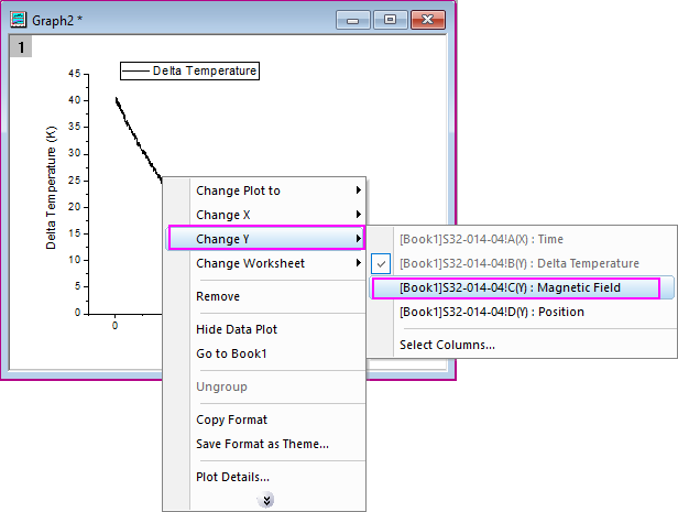
- Highlight column B and click the Line button
 to generate a line plot. to generate a line plot.
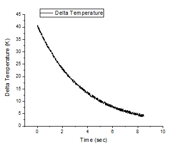
- Right click on the data plot and point to the Change Y context menu, then select column C (Magnetic Field) in the fly-out.
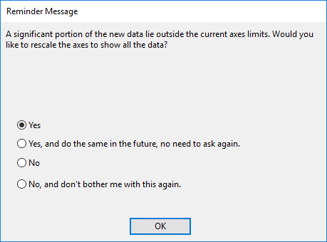
- You may see a reminder message about rescaling the graph to show all data. Choose Yes and click OK so that the updated plot will be auto-rescaled.
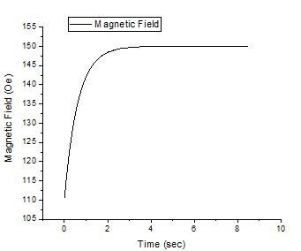
- The plot will update as shown below:
 | With this context menu, you can change the X or Y data of the current plot to be another column in the current project. This column will be any column other than the current X or Y data column, regardless of column designation. Choose Select Column menu item to specify column from current folder or current project.
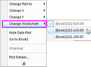
You are also allowed to use the Change Worksheet context menu to change the current X and Y data to be the columns with same column index in another worksheet of current workbook, regardless of column designation and column short name.
|
Note: You can also use the Layer Contents or Plot Setup dialog to change the input data.
Add Data to an Existing Graph and Update Legend
By Drag and Drop
- Go back to the book with the three sheets of data from the above example.
- Highlight the Delta Temperature column (Column B) from the first sheet and then select Plot > Basic 2D: Line to create a line plot.
- Go back to the workbook. For each of the remaining two sheets, select the Delta Temperature column and position the cursor at the edge of the column until you see the cursor change to
 . .
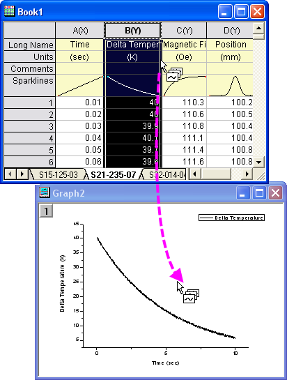
- Then you can drag-and-drop the column into the graph page. Another curve will be added to the current layer.
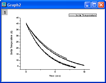
- After adding the other curves, expand the Object manager panel docked at the right-top corner of Origin workspace by default(you can use View: Object Manager menu to reload it if needed). Right-click on the last plot under Layer1 to select Set As Group End to group all these three curves together.
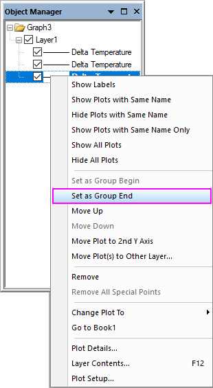
- Grouping the plots allows for quick creation of presentation-ready graphs, because each selection in the group is assigned a differentiating set of plot attributes (line color = black, red, green; symbol shape = square, circle, triangle; etc...).
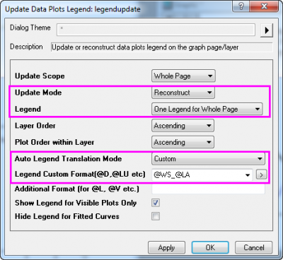
- Select Graph: Legend: Update Legend... to open the legendupdate X-Function dialog. Set the Auto Legend Translation Mode to Custom. Enter @WS for Legend Custom Format.
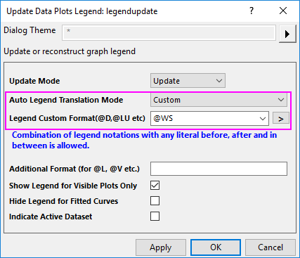
- Click OK and the legend will now contain the worksheet name for each data plot.
| The default plot type of the drag and drop plot is Current, which is the same as the current active plot. However you could change the default option. To do this, click Preference: Options and go to the Graph tab, and change the setting of Drag and drop plot drop-down menu.
|
By Copy for Plotting Mini Toolbar
In this section, we will use Copy for Plotting mini toolbar button to add new plots to an existing graph.
- Go back to the book with the three sheets of data from the above example.
- Highlight the Delta Temperature column (Column B) from the first sheet S15-125-03 and then select Plot > Basic 2D: Line to create a line plot.
- Go back to the workbook. and activate the second sheet S21-235-07. Select the Delta Temperature column and a mini toolbar will appear. Click Copy for Plotting button

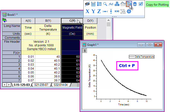
- Activate the graph window and press Ctrl+P to plot the copied column data as a line curve to the current layer.
- For the remaining sheet S32-014-04, repeat the process of copying and pasting dataset to the existing graph to add the new line of Delta Temperature from S32-014-04.
By Layer Contents Dialog
The Layer Contents dialog box is useful primarily for adding or removing data plots from the graph layer. Starting with Origin 2016, you can switch layers without closing the dialog box, making it easier to add plots to, or remove plots from, a multi-layer graph. To demonstrate, we will return to the 3-layer graph that we created in the first exercise in this tutorial:
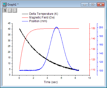
In the first exercise, we plotted data from sheet S32-014-04. In this exercise, we will swap the data from sheet S32-014-04 with data from sheet S21-235-07.
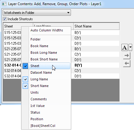
- Right-click on the layer 1 icon in the upper-left corner of the graph window and choose Layer Contents.
- In the dialog box that opens, click the drop-down list in the upper-left corner and select Worksheets in Folder.
- Right-click on the left-panel headings, clear Book Name and select Sheet (if not already displaying) so that you can see which worksheets contain which workbook datasets, then click on the Sheet heading to sort datasets by sheet name.
- In the right-hand panel of Layer Contents, select Delta Temperature from sheet S32-014-04 and click the Remove Plot button
 to remove the plot from graph layer 1. to remove the plot from graph layer 1.
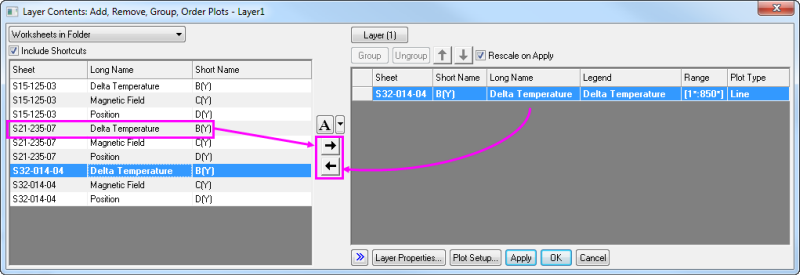
- In the left-hand panel, select Delta Temperature from sheet S21-235-07 and click the Add Plot button
 , then click Apply to add the new plot to layer 1. You have now swapped one dataset for another. , then click Apply to add the new plot to layer 1. You have now swapped one dataset for another.
- Click the Layer(1) button at the top of the dialog and choose Switch Layer > 2. Layer 2.
- Repeat the process of removing the existing Magnetic Field dataset from layer 2 and replacing it with the Magnetic Field dataset from sheet S21-235-07, then click Apply.
- Click the Layer (2) button and choose Switch Layer > 3.Layer 3 and repeat the process of swapping the Position dataset in sheet S32-014-04 with the Position dataset in sheet S21-235-07, then click Apply and close the dialog box.
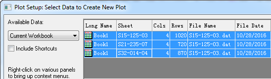
Create a Plot using Plot Setup
The Plot Setup dialog box is useful for a variety of plotting tasks, including creating graphs, modifying the plot type, adding plots to or removing plots from the graph, grouping or ungrouping plots, and editing the plot range.
- Return to your workbook and ensure that no data are selected. It doesn't matter which worksheet is active; what is important is that no columns are highlighted.
- Select Plot > Multi-Panel/Axis : 4 Panel from the menu. When no data are selected, Origin opens the Plot Setup dialog, allowing you to choose the data you wish to plot.
- Expand the top panel by clicking the
 button. Hold down Ctrl key to highlight the three worksheets. Alternatively, you can just click and drag your selection so that all three worksheets are highlighted. button. Hold down Ctrl key to highlight the three worksheets. Alternatively, you can just click and drag your selection so that all three worksheets are highlighted.
- In the middle panel, common columns in all three sheets are displayed. In this case, all three sheets have similar data with matching column names. Click the button
 at top-right of this panel to show the available plot columns listed with similar column long name. This mode is easier because you don't have to check the X and Y designation check boxes. at top-right of this panel to show the available plot columns listed with similar column long name. This mode is easier because you don't have to check the X and Y designation check boxes.
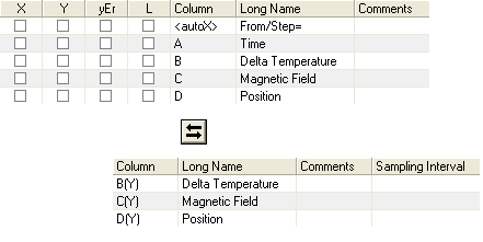
- Open the bottom panel of the dialog, the Plot List, if it is not already visible. Layer 1 is highlighted. Select Delta Temperature in the middle panel, and then click the Add button. Since you already selected the three worksheets in Step 3, this will add all Delta Temperature columns from the selected worksheets to layer 1.
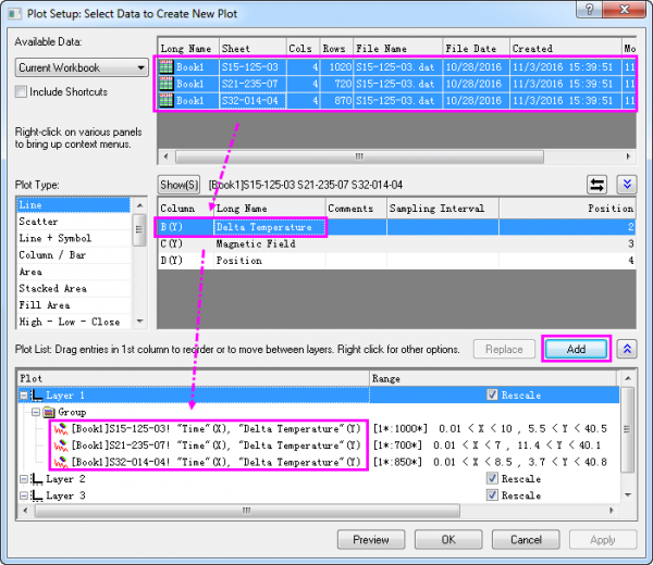
- Repeat these steps to add all Magnetic Field columns and all Position columns into Layer 2 and Layer 3, respectively.
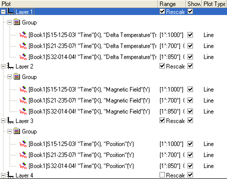
Note that in each layer, the three data plots are automatically grouped.
- Click the OK button to create the graph.
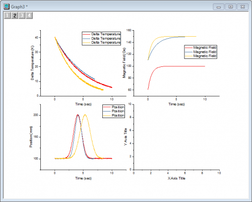
- You'll note that the default legend that is created for each layer is not particularly helpful. The Origin graph legend object is highly customizable, so before we go further, we will modify the default legend. Right-click on any of the legend objects and select Legend: Update Legend from the shortcut menu.
- In the dialog box that opens, do the same settings at step 8 of the section By Drag and Drop. Note that the Legend Custom Format syntax @WS is LabTalk Substitution Notation for the name of the worksheet containing the data for each line plot.
- We have one extra (empty) layer on the graph page. To delete that layer, click on it once to select it then press the Delete key on the keyboard. Take care not to delete the graph window as we will use it in the next section of this tutorial.
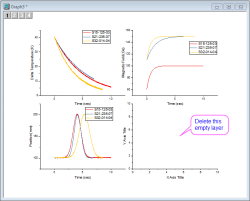
| In the graph above, the legend for each layer is same with each other. You can delete two of them. Or do settings below in the Legend Update dialog, to just show one legend for whole graph window.
Once the settings are applied, you can press Ctrl + double-click on the legend text to do further in-place edits; or you can right-click on the legend box to select Properties... from context menu and do further advanced editing in the Text Object dialog.
|
Plot Grouped Data As
When your data includes a column of categorical data, or multiple columns characterizing some sort of nested sub-grouping of data, just as the data below
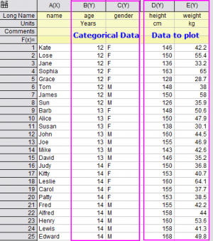
then you might want to plot your data as:
Trellis Plot
Beginning with Origin 2017, you have introduced the Trellis Plot which has one layer but with M X N panels.
- New a workbook.
- Start with an empty worksheet. Select Help: Open Folder: Sample Folder... to open the "Samples" folder. In this folder, open the Statistics subfolder and find the file 2010.dat. Drag-and-drop this file into the empty worksheet to import it.
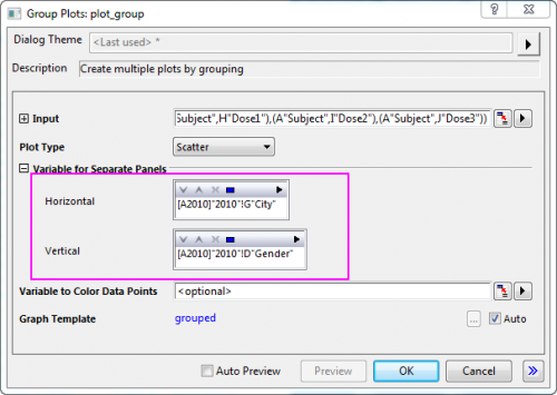
Highlight col(H)~col(J) to select Plot> Categorical : Trellis Plot menu. The dialog plot_group will pop up. Select col("City") as horizontal group variable and col("Gender") as vertical group variable for the panels.
 Click OK button to plot the graph. Click on the X axis and click Axis Scale button
  on the mini toolbar that appears. In the simple dialog that opens, set From and To for horizontal axis to -10 and 90
You will get the graph as below: on the mini toolbar that appears. In the simple dialog that opens, set From and To for horizontal axis to -10 and 90
You will get the graph as below:
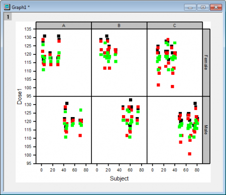
Just as you can see, this trellis plot has only one layer but with six panels(2×3):2 rows represent the variable "Gender", Female and Male; three columns represent the variable "City", A, B, and C.
Grouped Box Plot
Besides the trellis plot, you can also plot these kind of data as a grouped box/column plot.
- Active the source worksheet above again. Highlight col("Salary") to select Plot > Categorical : Grouped Box Charts - Indexed Data menu to open the dialog plot_gdoxindexed. Select col("Gender") and col("City") as Group Columns.
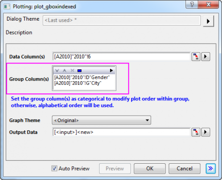
- Click OK button to plot the graph.
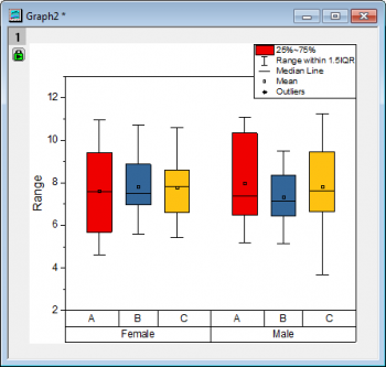
Just as you can see, the data col("Salary") has been plotted as a grouped box charts: Two groups by "Gender", Female and Male; within these two groups, three subgroups by "City" , A, B, and C.
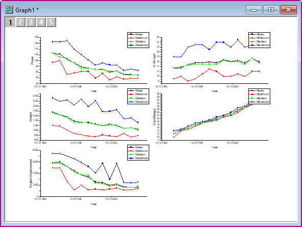
Plot Graphs by Label
Origin offers a plotting option, Multiple Panels by Label, that allows you to create a multilayer graph, each layer of which contains multiple plots, identified by the same label.
- Open the file Samples\Graphing\Automobile Data.ogw (Hint: Make sure that your Open files filter is set to Workbooks(*.ogw)).
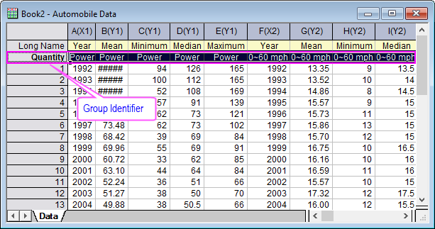
- Click on top left corner of the worksheet to select the entire sheet. Select Plot > Multi-Panel/Axis : Multiple Panels by Label to open the plotbylabel dialog.
- Set the dialog options as following, and click the OK button to create the graph.
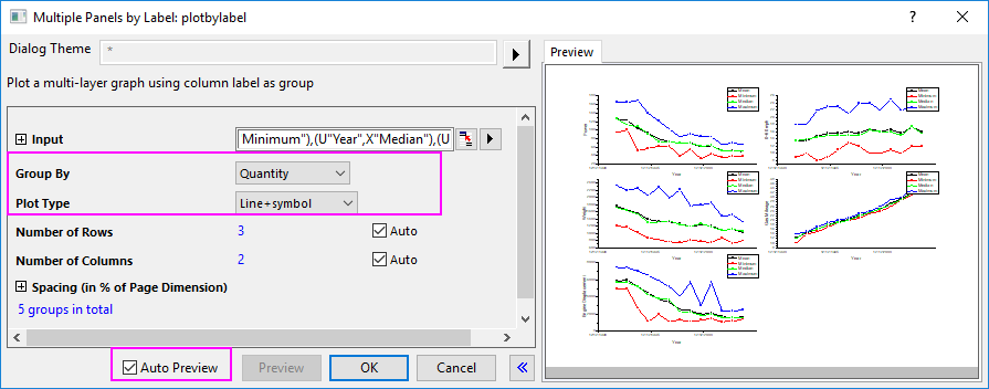
The graph should look like this:
|