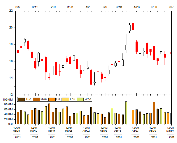
6.18 Open-High-Low-Close-Volume Stock ChartOHLCV-Stock-Chart
Summary
This tutorial will show you how to create a stock chart to display open, high, low, and close prices, along with trading volume.
Minimum Origin Version Required: Origin 2016 SR0
What you will learn
- Create a stock chart with open, high, low, and close prices, and trading volume
- Set axis Scale Type to skip market-closed days
- Set format for tick labels(Multi-Line label)
- Categorize the volume columns according to their weekday by filling differnt colors
- Create the Legend to annotate the columns with different fill color
Steps
You can refer to this graph in Origin Central. (Select Help: Origin Central menu or press F11 key , and then open Graph Sample: Financial Plots)
- Highlight Col(C)~Col(G) in the worksheet, and then choose Plot > Specialized : OHLC-Volume to create a graph.
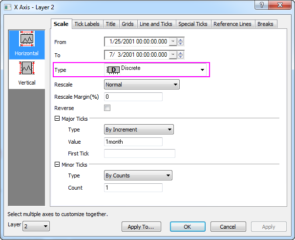
- Double click on the bottom X axis of Layer2 to open the X Axis dialog. Switch to the Scale tab. You can see the Type is set to Discrete by default. This is why the X axis skips all weekends and holidays automatically.
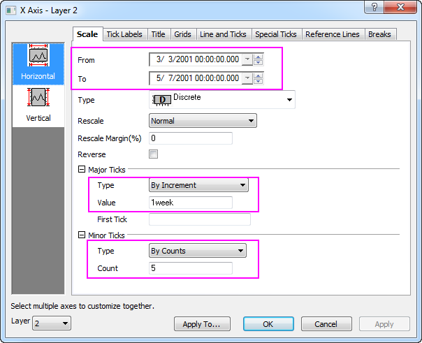
- Change the axis rang From 3/3/2001 To 5/7/2001. Under the Major Ticks branch, make sure Type is set to By Increment. Type 1week for Value. Under the Minor Ticks branch, make sure Type is set to By Counts. Type 5 for Count. Click Apply button. You can see weekend and holidays are skipped clearer.</br>
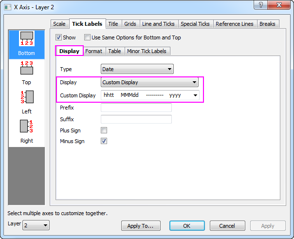
- To show bottom axis label as multiple lines, switch to the Tick Label tab. Activate the Dsiplay sub-tab. Select Custom Display for Display drop-down list. Enter the text below in Custom Display text box.
hhtt MMMdd --------- yyyy
Go to Format sub-tab, set Font Size to 10 and check Wrap Text check box.
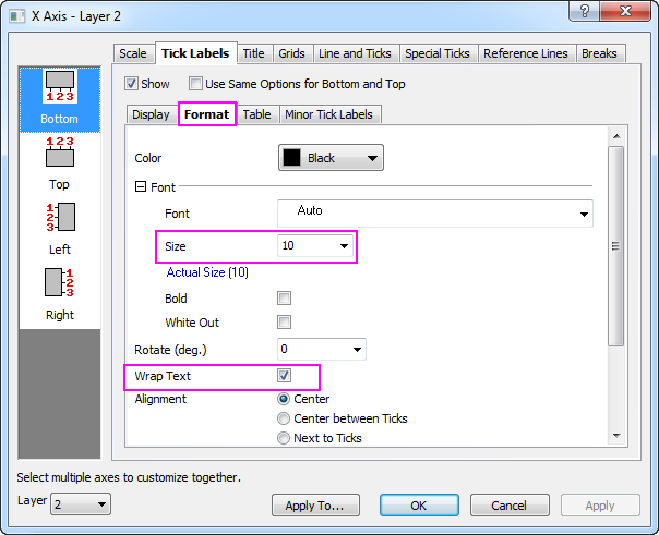
Click Apply button.
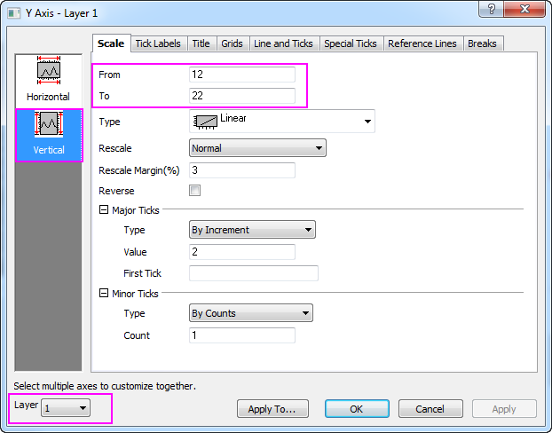
- Go back to Scale tab, select Vertical icon at the left panel, then set From and To to 0 and 120M. Click Apply button.
- Select 1 under the Layer drop-down list which locates at the left-bottom corner of the dialog to switch to Layer 1. Then with Vertical icon still chose, set From and To to 12 and 22. Click OK button to close the dialog.
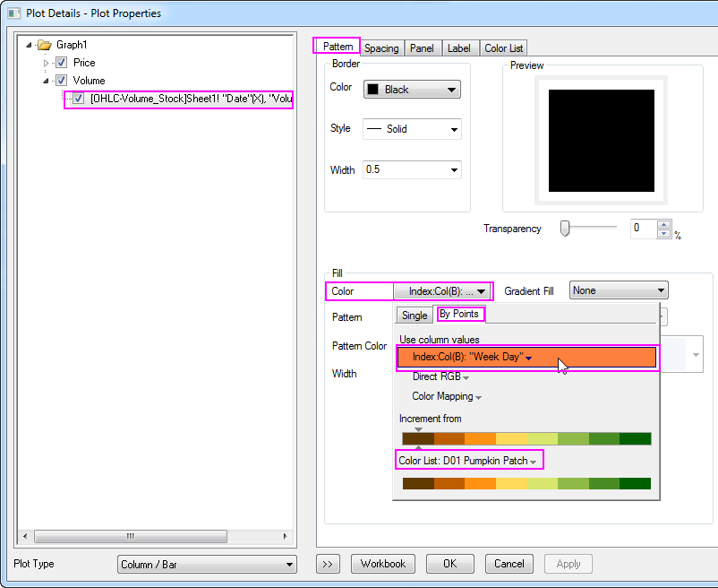
- Double-click on the column plot at Layer 2 to open the Plot Details dialog. In the Pattern tab, expand the Fill Color drop-down list, go to By Points sub-tab, under the Index list, select Col(B) : "Week Day", then select D01 Pumpkin Patch under Color List. Click OK button to close this dialog.
- With Layer 2 activated, select Graph: Legend : Categorical Values menu. In the dialog opened, keep the default settings, click OK button. A legend will be added onto graph. Select the legend to show up the legend border, press the Ctrl key to drag the legend border to make the legend items arranged in one line.
- Resize and re-position the legend box. The Final graph should appear as shown below:
|