6.15 2D Vector GraphVector-Graph
Summary
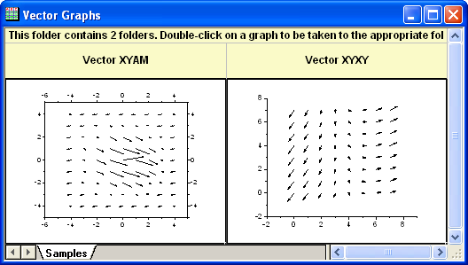
A vector plot is a multidimensional graph used in industries such as meteorology, aviation, research, and construction that illustrate flow patterns (e.g. of wind, water, magnetic fields, etc.). Both direction and magnitude are represented in a vector graph. Origin includes two types of vector plots:
- Vector XYAM - takes a starting XY location for the vector tail (by default), an angle and a magnitude.
- Vector XYXY - takes two XY positions and connects them with a vector.
What you will learn
This tutorial will show you how to:
- Use Two data organizing mode to plot a vector graph.
- Use Plot Setup to assign plot data
Steps
This tutorial is associated with <Origin EXE Folder>\Samples\Tutorial Data.opju.
Also, you can refer to these graphs in Learning Center. (Select Help: Learning Center menu or press F11 key , and then open Graph Sample: Specialized Graphs)
To create a vector plot, you need four data columns, and to organize your data into two modes:
Vector XYAM
XYAM stands for X, Y, Angle and Magnitude. Vectors will start from point (X, Y), and rotate a specified angle. The following example uses XYAM data mode to create a vector graph.
- Open Tutorial Data.opju and browse to the 2D Vector folder in Project Explorer (PE).
- Activate the data worksheet Book8E. Without highlighting any columns, select Plot: Specialized: Vector XYAM from the main menu to open the Plot Setup dialog. Assign columns A, B, D, C to X, Y, A, M as shown below, then click OK to plot the graph.
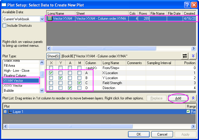
 | In order to show all three panels in Plot Setup dialog, please expand Plot Type panel by clicking  and expand Available Data panel by clicking again. and expand Available Data panel by clicking again.
Please refer to Plotting using Plot Setup for more information.
|
- Select Format:Plot... to pull up the plot level of the Plot Details dialog. In the Vector tab change the Magnitude Multiplier drop-down list to 75. Click the OK button to close Plot Details dialog.
- Click Left axis and click the Show Opposite Axis button in the Mini Toolbar. Click Bottom axis, and click the Show Opposite Axis button in the Mini Toolbar.
- Click Right Axis and click the Show Tick Lables button in the Mini Toolbar. Click Top Axis and click the Show Tick Lables button in the Mini Toolbar.
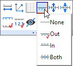
- Click Right Axis, then click the Tick Style button and select Out in the Mini Toolbar. Click Top Axis and click the Tick Style button and select Out in the Mini Toolbar.
- Right click on the legend box to bring up the context menu. Select Properties... to open the Object Properties dialog. Type \l(1) Field Strength in the text box and click OK.
- Use Text Tool button, and add title: Spot Write Effectiveness in this graph.
Vector XYXY
Another data organizing mode is XYXY; where the first X, Y is the vector starting point, while the last X, Y is the ending point.
To create such a vector graph,
- Activate workbook Book9E under the 2D Vector folder. Click C column, and then click Set as X button in the Mini toolbar.
- Highlight all of the four data columns in it, and select Plot: Specialized: Vector XYXY from the main menu.
|