6.1.10 Overview of CustomizationCustomizing-Graph
Summary
Editing your Origin graph is very easy. Any graph element can be selected and with its associated dialog, the properties can be modified. In fact, you can customize your graph right down to a single data point.
This tutorial will show you how to:
- Resize a Layer
- Add a Layer Title
- Customize and Save a Template
- Customize Axes
- Apply a Graph Theme
- Change Plotting Order in a Layer
- Customize a Point
- Customize a Grouped Plot
- Create a Color-mapped Waterfall Plot
Re-sizing Layer
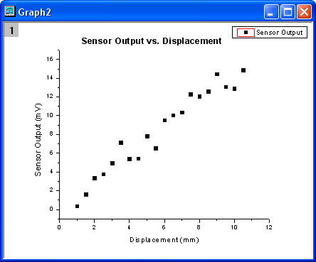
- Open Customizing Graphs.OPJ from the \Samples\Graphing folder and select the Resize Graph and Customize Symbol folder from the Project Explorer window.
- Make Graph2 active and right-click inside the layer, above the data points to select Add/Modify Layer Title from the context menu that opens. Add a title, as shown in the graph below:
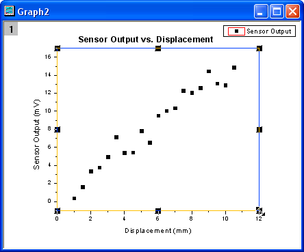
- The layer can easily be resized graphically by dragging the sizing handles. To resize it, single click inside the layer, but not on a data point. The layer will become selected as seen below, and then you can drag one of the 8 anchor points to resize the layer. Note: If you hold the CTRL key down while dragging, the aspect ratio will be maintained.
- You can also use the Plot Details dialog by specifying exact numbers to dictate the layer size more precisely. Double-click inside the layer to open the Plot Details dialog. On the Size/Speed tab, set the layer area to the values shown in the image below:
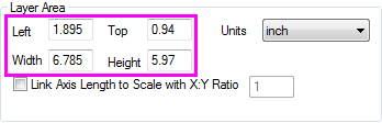
| Note: Check the Link Axis Length to Scale with X:Y Ratio check box to set the length ratio of X and Y axes (the Width and Height of the layer frame) to maintain the aspect ratio of the actual X and Y scales when the layer size is changed. You can set your own ratio value in the following box.
|
Customize Data Plot and Axes
In this section, we will show you how to change the color of a data plot, and customize the axes.
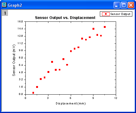
- Click on one of the data points of Graph2 to select the entire data plot, and change the color of the data points to red by using the Line/Border Color button
 in the Style toolbar. in the Style toolbar.
- Next use the Axis dialog to customize the axes. Double-click on the X-axis to open the dialog and set the controls as follows:
- Select the Horizontal icon in the Scale tab, select the Type under Major Ticks as By Counts and input 5 as the Count.
- Select the Vertical icon in the Scale tab, set the From as 0, To as 16, Type for Major Ticks as By Counts and enter 11 for Counts.
- Go to the Line and Ticks tab and select both Top and Right page with CTRL button pressing down. Check the Show Line and Ticks box to show the line and ticks for the top X and the right Y axis. Click OK to apply the settings and close the dialog. The graph should appear as shown below:
Save and Reuse a Template
In this section, we will show you how to save the graph above as a template and reuse it.
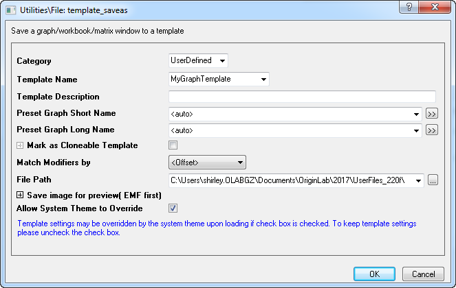
- In the menu, select File: Save Template As (alternatively, right-click on the graph window title bar and choose Save Template As from the context menu) and rename the template as MyGraphTemplate. Then click the OK button to save it.
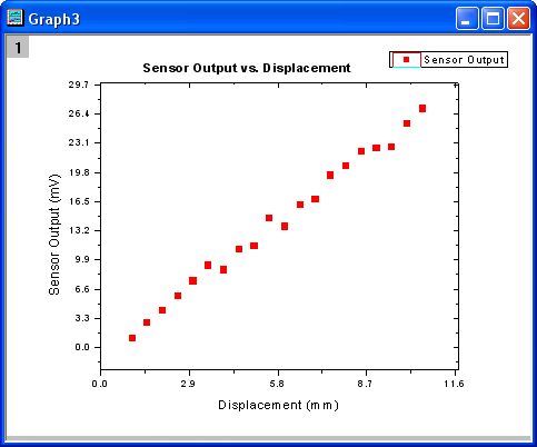
- Create a new workbook and import the data file \Samples\Curve Fitting\Sensor2.dat, by using Data: Connect to File: Text/CSV. Highlight column B and select Plot: My Templates: MyGraphTemplate to create a graph.
The graph should look like:
| Note, you can also use the batch plotting tool to create multiple graphs at once from different worksheets/workbooks with same data structure. You can learn how this tool work from this tutorial.
|
Changing graph using theme
Origin stores the properties of a graph in a theme file. In this section we will show you how to customize a graph by using a theme.
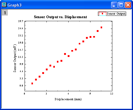
- With Graph3 active, select Preferences: Theme Organizer to open a dialog. Select the Times New Roman Font theme and click Apply Now. Select Ticks All In and click Apply Now, then click the Close button to close the dialog. The graph should resemble the following graph:
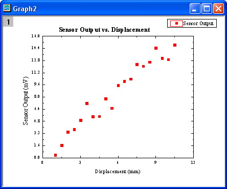
- The next step is to copy the formatting of the current graph and paste it to Graph2. Right-click to the right of the layer, anywhere on an empty white or grey space and select Copy Format: All Style Formats. Activate Graph2, right-click in a similar spot and select Paste Format. Graph2 should look like the image below:
Plotting Order
You can reorder the data plots either by the the Layer Contents dialog, Object Manager or the Plot Setup dialog.
Open Customizing Graphs.OPJ from the \Samples\Graphing folder and select the Plotting Order folder from the Project Explorer window.
By Layer Contents Dialog
- Activate Graph 1 window. Double-click on the Layer 1 icon on the top left corner of the graph to open the Layer Content dialog.
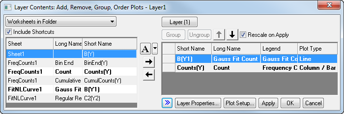
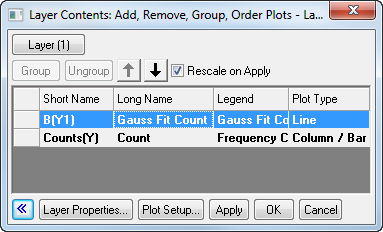
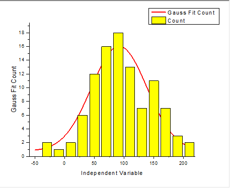
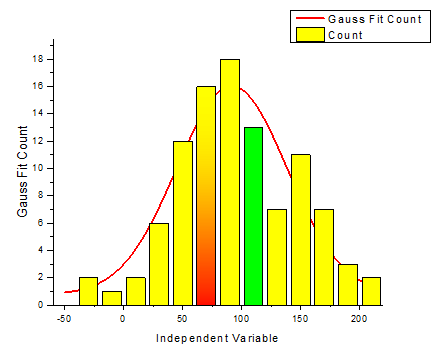
- Click the >> button to hide the left panel. In the right panel, select the Gauss Fit Count line plot. Click the downward pointing arrow button to move the line plot down in the plotting order.
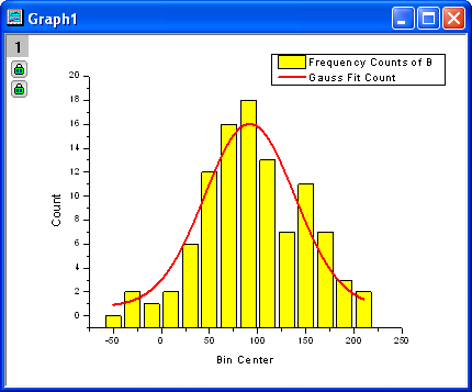
- Click the Apply button. The Gauss Fit Count line plot is now on top of the column plot. Click the Close button to close the dialog.
By Object Manager
- Activate Graph 1 again. Expand the Object Manager, which should be docked to the right edge of Origin workspace by default, by moving your mouse over to the Object Manager bar.
- Right-click on the Gauss Fit Count line to select Move Up from context menu to move this plot upward.
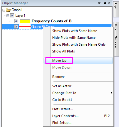
- Then, you will see the red line will be back of the histogram plot.
By Plot Setup Dialog
- Use the same data as the previous example. In the Plotting Order folder activate Graph 1. Select Graph: Plot Setup from the main menu to open the Plot Setup dialog (You can also right-click on layer 1 and select Plot Setup...).
- In the Plot List panel, drag the line plot and drop it beneath Column/Bar Plot Type.
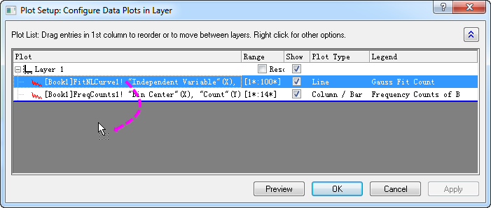
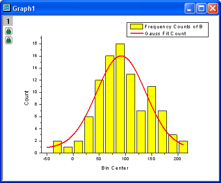
- Click the OK button and you will see that the red curve is now drawn on top. Notice the legend reflects the new plotting order as well.
Customize points
In this section, we will show you how to customize a single data point.
- We will continue to work in the Plotting Order folder. Make sure Graph 1 is active. Note that if you click to select one of the columns, all columns are selected. Click again to select just that one column. Change the color to green using the Fill Color button
 on the Style toolbar. on the Style toolbar.
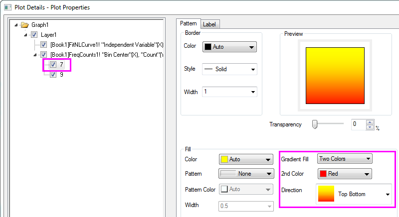
- You can also use the Plot Details dialog to customize single columns separately from the rest. Hold down the CTRL key while double-clicking on the columns to open the Plot Details dialog. The settings in this dialog will edit the properties of just that single data point. Note that the index number for that selected data point is highlighted in the left panel of the Plot Details dialog. Set the Gradient Fill group as follows, to fill the column with a yellow to red color gradient.
Your graph should resemble the following image:
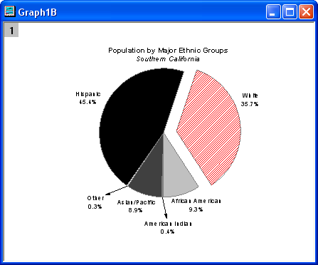
- You can customize a pie chart segment in the same way. In the Edit Single Data Point folder, activate the pie graph. Hold down the CTRL key and double-click on one of the slices to open the Plot Details dialog. Under the Pattern tab, set the Fill Pattern to Dense, and set Pattern Color to Red. (Alternatively, you could have clicked once and then clicked again on a slice to select just that one point, and then used the Style toolbar to customize that point.) The graph should appear as the image below:
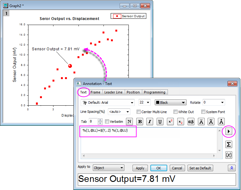
- You can customize a single data point and label it. Go back to the Resize Graph and Customize Symbol folder. Hold down the CTRL key and double-click on one of the scatter points to open the Plot Details dialog. Under the Symbol tab, click the triangular Preview button to open the symbol gallery, and select Sphere for the symbol type. Increase the Size to 18, and click the OK button to close the dialog.
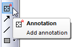
- Use the annotation tool to add the X and Y values that correspond to the customized data point. Select the Annotation button from the Tools toolbar (Hint: The Data Reader, Annotation and Data Cursor tools are grouped. If you don't see the Annotation tool, click the arrow to the lower-right of whichever tool is visible on the toolbar).
Move the annotation cursor to the customized data point and double-click on it. Origin will automatically add a text object. Hit the ESC key or click on the Pointer button to exit annotation mode. Single-click and drag to position the text object. A line will automatically be drawn connecting the point and the label.
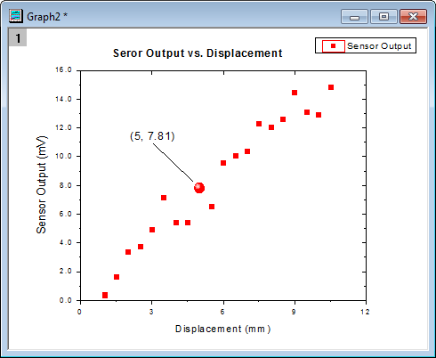
Right-click on the text object and select the Properties... to open the Annotation-Text dialog. Then you can customize the text label format in the this dialog. In the Text tab enter %(1,@LL)=$(Y,.2) %(1,@LU) in the edit box. And the button  to the right of the edit box provides some frequently used notations and example syntax. to the right of the edit box provides some frequently used notations and example syntax.
 | Beginning with Origin 2017, you can drag annotation labels from point to point. Click the Pointer  button, press the ALT key and use the cross-hairs to drag the label to another data point. button, press the ALT key and use the cross-hairs to drag the label to another data point.
|
Group plots
So far, we have been customizing data points in a single data plot. In this section, we will show you how to customize a grouped data plot.
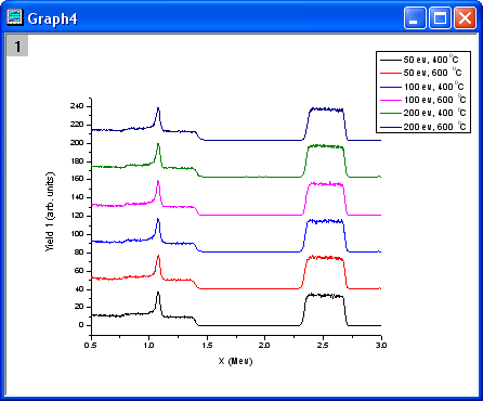
- Select the Grouped Data folder. Book3 will be active. Highlight the entire worksheet and click the line button
 on the 2D Graphs toolbar to create a line graph. on the 2D Graphs toolbar to create a line graph.
- Double-click on the X-axis to open the Axes dialog box. Set From as 0.5 and To as 3.0. Select Fixed from the Rescale drop-down list (you will need to scroll up in the list). This prevents the From and To values from changing while rescaling. Click OK to apply these settings.
- Double-click on a blank place above the line plots, to open the Plot Details dialog. On the Stack tab, select Auto in the Offset group. Click OK to close the dialog.
- Select Graph: Rescale to Show All. The Y scale of the graph automatically rescales, while the X scale doesn't change because the option was set to Fixed. Resize the layer and drag the legend to the desired spot.
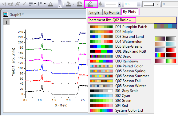
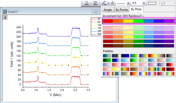
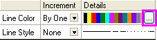
- Click on one of the data plots to select the entire group, and then use the Line/Border Color button on the Style toolbar to change the colors. Click on By Plots tab, select Q03 Rainbow7 from the Increment List as below.
- Then select the first increment list. The graph should look like this:
- Though these data plots have been grouped, you can also customize each of them individually by clicking on the data plot twice. For example, clicking the yellow data plot twice (click once, pause and click again) and then clicking the Line/Border Color button on the Style toolbar will change the color to another color, such as Olive.
- You can also customize the graph by double-clicking on one of the data plots to open the Plot Details dialog. Under the Group tab, you can click the browse button...
...to open the Increment Editor dialog. In this dialog, customize the graph as shown in the following image. Note that you can also drag the index of a row and move it to change the order of the color list.
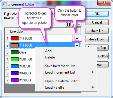
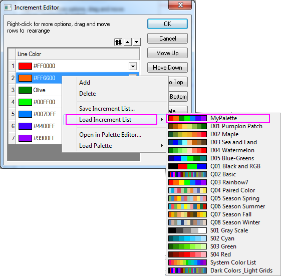
- Right-click on the inner position of this dialog and select Save Increment List to save it as MyPalette for future use. Right-click to get the context menu and select the Load Increment List option. You will find that MyPalette appears as the first entry in the fly-out menu, as the following image shows:
In the following section, we will show you how to use Palettes to set colors for a group of data plots.
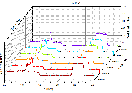
- Activate Book3 and highlight all the columns. Select Plot > 3D: Waterfall to create a graph. Double-click on the X-axis to open the Axis dialog, and set From as 0.5 and To as 3 in Scale tab. Select Y icon from the Selection list, and set the From, To, and Increment of Major ticks option to -10, 100 and 20, respectively in the Scale tab.
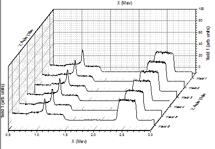
- Click on one of the data plots and use the Line/Border Color button on the Style toolbar to change the colors. You can select the Rainbow palette
 under Palettes list in the By Plots tab. The graph should resemble the image below: under Palettes list in the By Plots tab. The graph should resemble the image below:
- You can double-click on one of the plots to get the color list, as the following image shows:
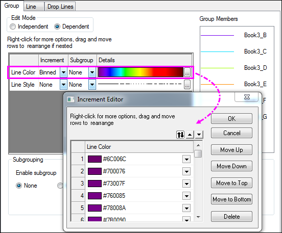
You can find that the Increment has been set to Binned, so colors are picked from the 256 available in the Rainbow palette.
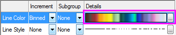
- We will change the palette to Reef by clicking on the browse button to open the Increment Editor dialog. Then right-click on the inner portion of this dialog and select Load Palette : Reef,then click OK. The color list in the Plot Details dialog should be set as shown below:
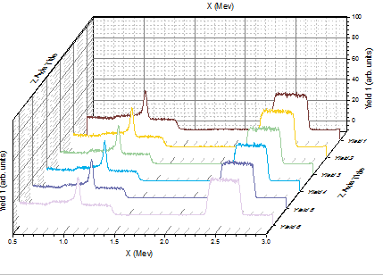
Click on Ok button to close the Plot Details dialog. The graph should appear as shown below:
|