6.12.11 3D Scatter with Colormap3D-Scatter-ColorMap
Summary
This tutorial will demonstrate how to create a 3D scatter plot with Z colormap from XYZ data in a worksheet, set scatter size proportional to the data in a specified column, and create projections of the data on all three axis planes.
What you will learn
This tutorial will show you how to:
- Generate a 3D scatter plot with Z colormap
- Set the symbol size proportional to data in a specified column
- Add and customize the scatter projections on axis planes
Steps
This tutorial is associated with <Origin EXE Folder>\Samples\Tutorial Data.opju.
Also, you can refer to this graph in Learning Center. (Select Help: Learning Center menu or press F11 key , and then open Graph Sample: 3D Symbol Bar and Wall)
- Open Tutorial Data.opju and browse to the 3D Scatter with Colormap folder in Project Explorer (PE).
- Activate the workbook A3DScatter, and highlight col(C). Select Plot > 3D: 3D Scatter to generate a scatter plot.
- A Reminder Message window like the one shown below will pop up, stating that the graph might not be correctly displayed if the OpenGL version is less than 2.1. The OpenGL version of your video card is listed on the Reminder Message window. Click OK to close the window.
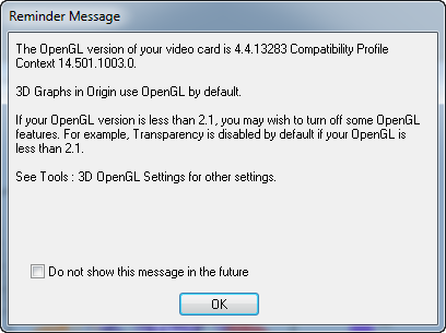 - Note: Speed Mode might be turned on if the OpenGL version is too low.
- Double click on the plot to open the Plot Detail dialog. If the left panel is not expanded use the
 button on the bottom left of the dialog to expand it. Expand the Layer1 option and select the Original level, this contains the original data. This dialog box is where the 3D scatter is customized. button on the bottom left of the dialog to expand it. Expand the Layer1 option and select the Original level, this contains the original data. This dialog box is where the 3D scatter is customized.
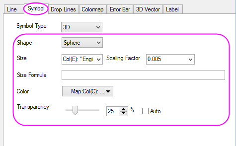
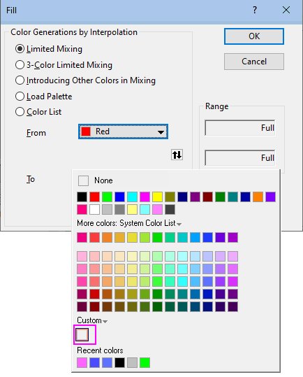
- In the Symbol tab, set Shape as Sphere. In order to use the sphere sizes to show the differences of Engine Displacement, select Size as Col(E): "Engine Displacement"), and set Scaling Factor as 0.005. Type manually into the edit box instead of using the drop down menu. For Color, click the drop-down menu, then choose the By Points tab of the Color Chooser. Click on Color Mapping and choose Col(C): "Power" to introduce a Z-value colormap. Set Transparency to 25%.
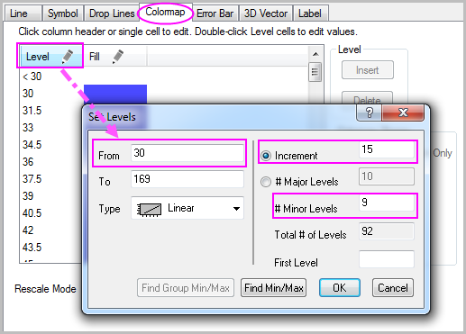
- Select the Colormap tab. Click the Level... title to open the Set Levels dialog. Set From as 30. Select Increment, and set it as 15. Set # Minor Levels as 9. Click OK.
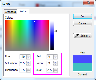
- Click the Fill... title to open the Fill dialog. Select Limited Mixing. Click the default color of From and then click the square box under Custom section in the color setting panel to open the Colors dialog. In the Colors dialog, set the Red, Green and Blue option in the bottom right as 74, 74, 255. Do the same thing for To color and set the Red, Green and Blue option as 255, 100, 255. Click OK.
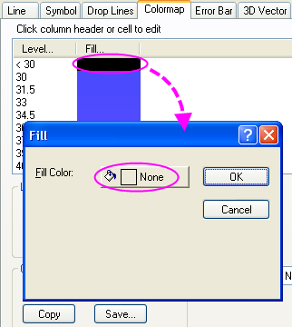
- Click on the fill color of <30 level to open the Fill dialog. Set Fill Color as None. Click OK. Repeat the this step to set fill color of >168 level as None. This will ensure that there is no color for levels above and below the specified range.
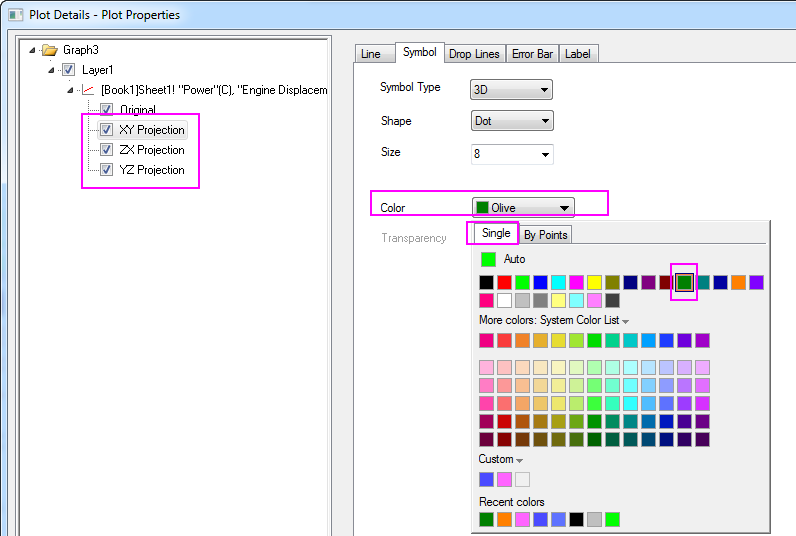
- The next step is to add the data projections. In the left panel of the Plot Details dialog, select the option above Original, and select the Fully Independent radio button. This will ensure that when the projections have been enabled, each can be customized separately. Check the boxes for XY Projection, ZX Projection and YZ Projection to enable the scatter projections on all three planes.
- To customize the colors of the projections, in the XY Projection level Symbol tab, set its color as Olive(the 12th common color). Set the symbol color of ZX Projection and YZ Projection as Red (the second common color) and Orange (the 15th common color) respectively. Click OK.
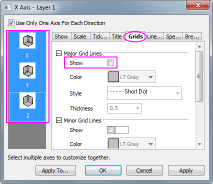
- In order to remove the grid lines, double click on the X axis to open the Axes dialog. Select the Grids tab on the right panel, hold the CTRL key and select Y and Z axes to customize the settings together, then deselect the Show box under Major Grid Lines to hide the major grid lines of all axes.
- The next step is to change the scale for the axes. On the Scale tab for each axis set the following; for X Axis, change the From, To value and the increment Value of major ticks to 5, 30, 5 respectively, and then check the Reverse check box; for Y Axis, to 5, 40 and 10, and then check the Reverse check box; and for Z Axis, to 20, 180 and 20. Click OK.
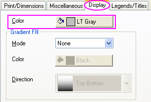
- To designate the color for the background of the entire window, open the Plot Details dialog again. In the left panel, select the Graph. Select the Display tab. Set Color as LT Gray. Click OK.
- Delete the legend object created by default, we are going to add a color scale legend instead.
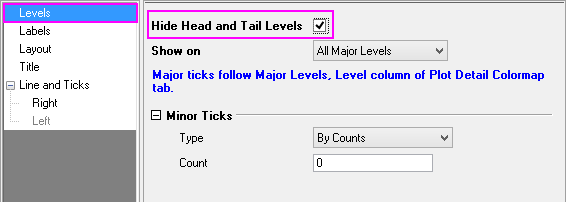
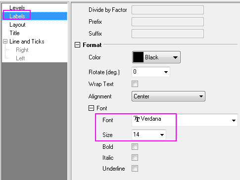
- In order to add a color scale legend, click the Add Color Scale
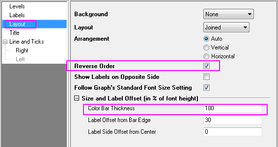
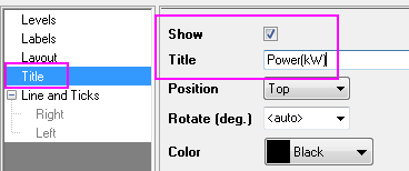
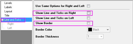
 button in the Add Object to Graph toolbar. Double click on the color scale to bring up the Color Scale Control dialog. Set the color scale format according to the screenshots below: button in the Add Object to Graph toolbar. Double click on the color scale to bring up the Color Scale Control dialog. Set the color scale format according to the screenshots below:
- Right click on the page layer to bring out the context menu. Select Add/Modify Layer Title and type Symbol Size proportional to Engine Displacement in the text box that appears as the layer title.
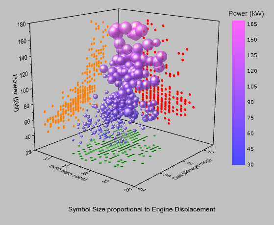
- The graph should appear as shown below. Rotate to explore all sides:
|