6.12.4 3D Bar and Symbol3D-Bar-Symbol
Summary
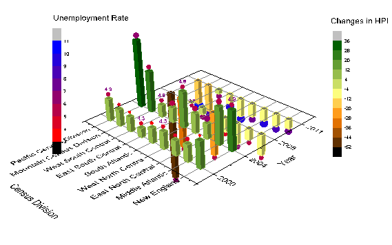
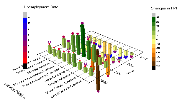
This graph is a combination of a 3D bar plot showing the changes in HPI (Home Price Index) and a 3D scatter plot showing the Unemployment Rate. The data is of several Census Divisions during different years. Colormapping is introduced to both plots based on the Z values.
Minimum Origin Version Required: Origin 2015 SR0
What you will learn
This tutorial will show you how to:
- Plot a 3D bar graph.
- Add a scatter plot to a 3D bar graph.
Steps
- Open the Home Price Index Changes & Unemployment Rate.opj file by selecting File: Open and navigate to <origin exe folder>
\Samples\Graphing
- Activate book Home Price Index Changes & Unemployment Rate, highlight columns A(X), B(Y), and C(Z), and then select Plot > 3D :3D Bars to plot a 3D bar graph.
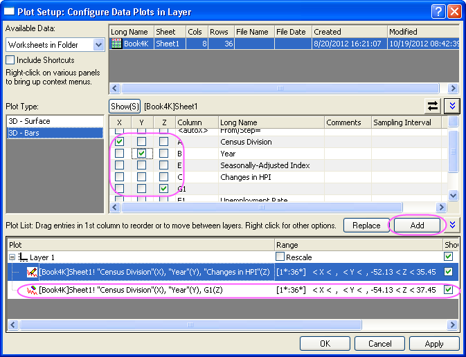
- Right-click on the layer icon and choose Plot Setup from the context menu. In the Plot Setup dialog, set columns A, B, and G1 as X, Y, and Z respectively. Then click the Add button to add this plot to the current layer. After that, click the OK button to close the Plot Setup dialog.
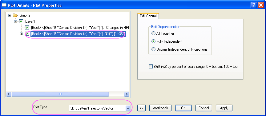
- Double-click on the plot to open the Plot Details dialog. In this dialog, select the second plot in the left panel and set the Plot Type as 3D Scatter/Trajectory/Vector.
 | In order to show all three panels in Plot Setup dialog, please expand Plot Type panel by clicking  and expand Available Data panel by clicking again. and expand Available Data panel by clicking again.
Please refer to using Plot Setup for more information.
|
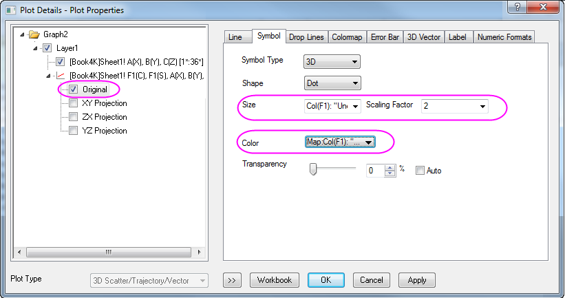
- Select Original in the left panel, then go to the Symbol tab in the right panel, select Col("Unemployment rate") for both Size and Color, and set the Scaling Factor of size as 2.
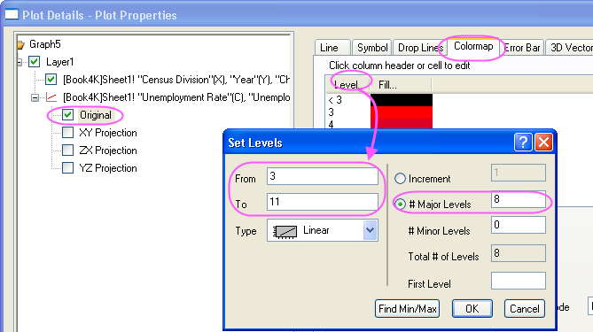
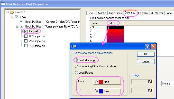
- Go to the Colormap tab, set Level and Fill as shown below.
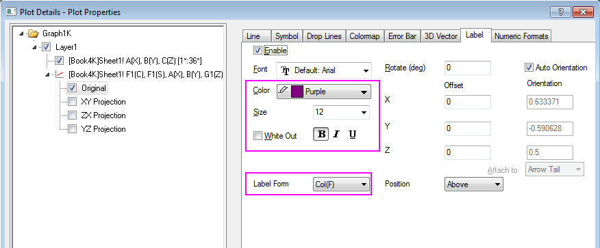
- Go to the Label tab, check the Enable check box, set Label From as Col(F) and Position as above.
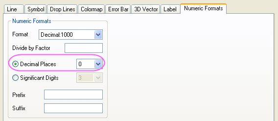
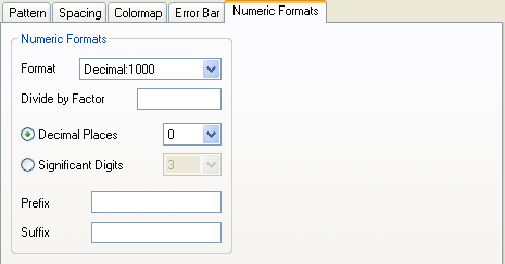
- Go to the Numeric Format tab, select Decimal Places and set it to 0.
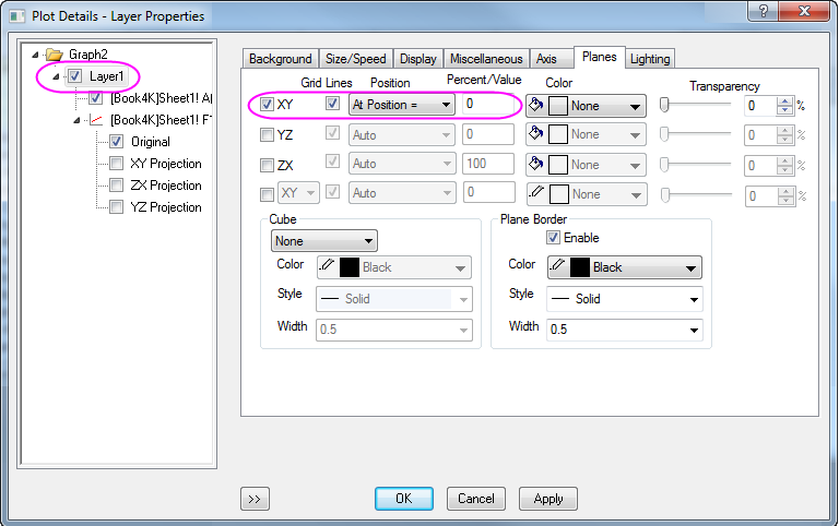
- Select Layer1 in the left panel. In the right panel, go to the Planes tab, uncheck YZ and ZX, select At Position= for the Position dropdown list and enter 0 for the Percent/Value blank box.
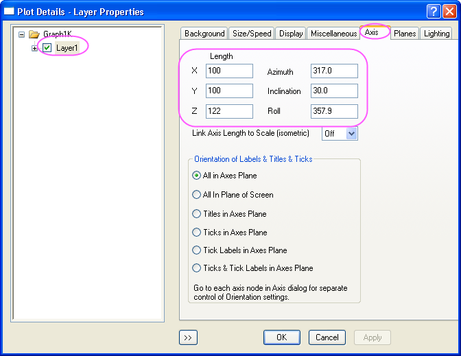
- Go to the Axis tab in the right panel, do settings as below:
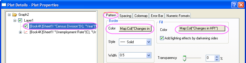
- Select the first plot under Layer1 in the left panel, go to the Pattern tab, use Col("Changes in HPI") as the colormapping for both bar border and shape fill.
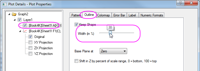
- Go to the Outline tab, set the Width(in%) to 30 as below.
- Go to the Numeric Format tab, select Decimal Places and set it to 0.
- Go to the Colormap tab, click Level... header to open the Set Levels dialog. Do settings as below.
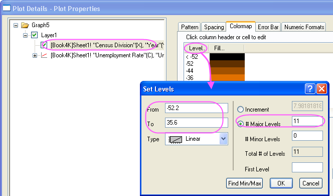
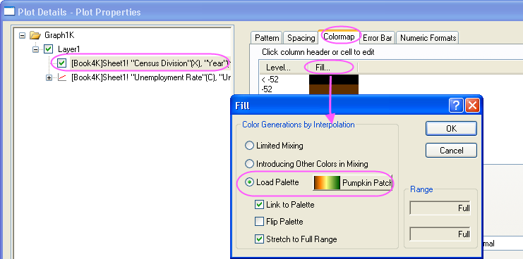
- Click OK button to close the Set Levels dialog. Click Fill... and select the Pumpkin Patch as the palette. Click OK to close the Fill dialog.
- Click the OK button to close the Plot Details dialog.
- With the graph window active, select Insert: Color Scale from the main menu to add a color scale for the first plot. Double-click on the color scale to open the Color Scale Control dialog. In this dialog, apply settings below.
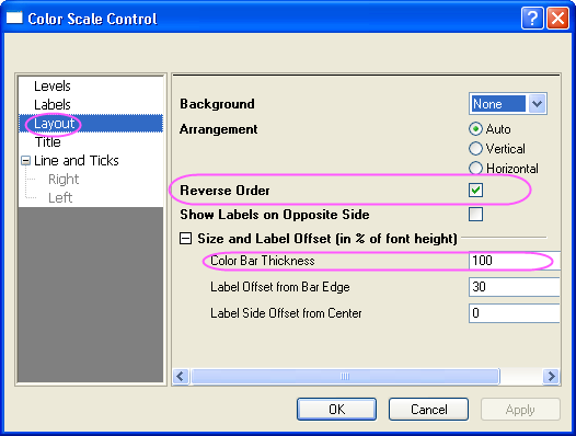
- Click OK button to close the Color Scale Control dialog. Then right-click the layer icon to activate the other plot from the context menu, then select Insert: Color Scale from the main menu to add another color scale. Double-click on this color scale to open the Color Scale Control dialog. In this dialog, do the settings as the previous step does.
- Add titles Changes in HPI and Unemployment Rate for these two color scales. Finally, you will get the graph given below.
Controlling the Categorical Values
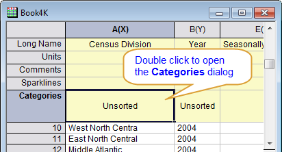
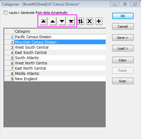
- In the following steps, we want to customize the order of values shown in the graph but not change the source data. Right click on window title of source data book, select View: Categories, a new column label named Categories will be added to the head of the worksheet. Double click the "unsorted" to open the Categories dialog:
- Uncheck the <auto> checkbox, then you can specify the order of the items by using
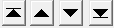 buttons based on the order of census division shown in graph below: buttons based on the order of census division shown in graph below:
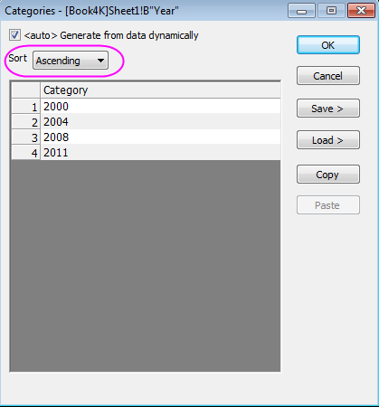
- Double click the Categories cell of column B,"Unsorted", to open the Categories dialog. Select Ascending in the Sort list, click OK to close the dialog.
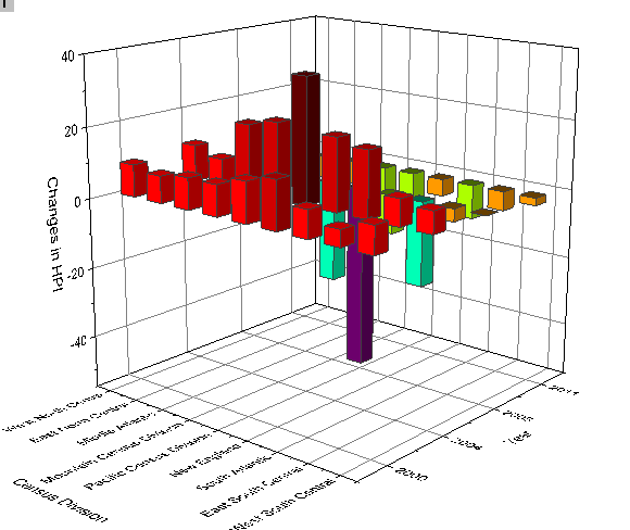
- The 3D bar graph will be updated automatically with the new order of Categorical data.
|