9.6.7 The (Plot Details) Distribution TabPD-Dialog-Distribution-Tab
| Distribution tab for Box plot and Violin plot
|
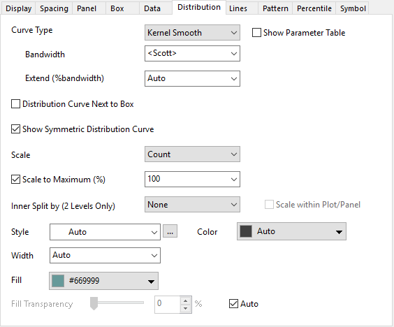
|
| Distribution tab for Histogram plot
|

|
| Distribution tab for Column Scatter plot
|

|
| Distribution tab for Ridgeline Chart
|
|
Curve Type
Overlay a distribution curve on the binned data or histogram by selecting Normal, Lognormal, Weibull, Exponential, Gamma, Laplace, Lorentz, Kernel Smooth, Poisson or Binomial from the Type drop-down list. The Preview window displays your selection.
Curves selected from the Type drop-down list are not "fitted" to your data. Instead, Origin estimates the data mean, then overlays the curve so that means coincide. If it is a two parameter curve, Origin takes into account the standard deviation of your data.
You are also allowed to adjust the parameter values to create the curve overlayed on the histogram.
| Curve Functions
|
Parameters
|
| Normal
|
Mean(mu), SD(sigma)
|
| Lognormal
|
Location(mu), Scale(sigma)
|
| Weibull
|
Shape(k), Scale(lambda)
|
| Exponential
|
Mean(sigma)
|
| Gamma
|
Shape(a), Scale(b)
|
| Laplace
|
Location(mu), Scale(b)
|
| Lorentz
|
Location(x0), Scale(gamma)
|
| Kernel Smooth
|
Bandwidth, Extend
|
| Passion
|
lambda
|
| Binomial
|
Number of Trials, P
|
Note: You can check the information of functions and parameters in this page.
For example, when you plot a Violin Plot or Ridgeline Chart, Kernel Smooth is selected as Curve Type by default. And these following parameters will be shown:
| Bandwidth
|
- <Scott>:

- where n is number of point and
- A is
, \ IQR/1.349)") , and IQR is the interquartile range of X , and IQR is the interquartile range of X
- It is the same as the kernelwidth function in Origin
- <Silverman>:

- Enter a number in the following box:

- Enter a custom value into the following box.
|
| Extend(%bandwidth)
|
Extend the density vertically in units of bandwidth size. The end points are -/+ Extend/100*bandwidth* {mix(X) or max(X)}
|
Show Parameter Table
Specify whether show the parameter table for all distribution curves in current plot layer, once you have chosen a Curve Type. By default, the parameter table will be added to the top-right corner of current layer, and show the parameter values of current distribution curve type for all plots row by row.

In this mini table, the plot label will follow the legend translation mode. For multi-panel graph, another panel column will be added after the plot label column to show the grouping info. And, different Layer will have separate parameter table.
Distribution Curve Next to Box
When select these options in Box tab, Box(Right) + Data(Left), Box(Left) + Data(Right), Half Box(Right) + Data(Left) or Half Box(Left + Data(Right) to show both Box and Data but without overlap, this option is available (violin plot only).
Specify whether to show the distribution curve next to Box plot.
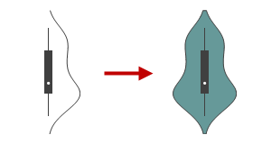
Show Symmetric Distribution Curve
Specify whether to show the symmetric distribution curve.
When show the symmetric distribution curve, it is similar as as plotting Violin Plot.
Scale
The method used to scale the width of each violin.
| Count
|
The width of the violins will be scaled by the number of observations in that bin
|
| Width
|
Each violin will have the same width.
|
| Area
|
Each violin will have the same area
|
Scale to Maximum(%)
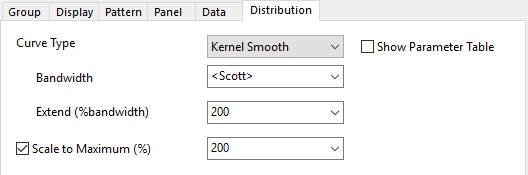
Check the Scale to Maximum(%) check box to control the amplitude of the distribution curve. For example, if you set 200, the amplitude of the curve would be doubled compared to the Maximum value of histogram. The distribution curve is normalized when the option is selected.
Note: In addition to selecting values from the drop-down list, you can also manually enter a value in the box.
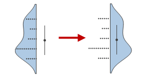
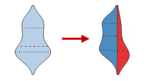
Inner Split by (2 Levels Only)
Available only when Show Symmetric Distribution Curve is selected.
In this list the columns in the same worksheet. Select a column with two levels, then it will draw half of a violin for each level. This can make it easier to directly compare the distributions.
To fill different color for two levels inner of the distribution curve, select the same column as Index in Fill: By Point option.
It is similar as plotting Split Violin graph.
Scale within Plot/Panel
Available only when Inner Split by (2 Levels Only) is selected.
By default, this option is uncheck. It means scale across all plots in this plots group. When there are multiple plots in the graph, and each plot is splitted to left and right two levels. Then the scaling width is computed across each level in all violin plots.
Checking this option means the scaling is just computed inner the two levels on a violin plot.
Style
Select the style for the distribution curves from this drop-down list.
Width
Select or type the width for the distribution curves in this combination box. The line width is measured in points, where 1 point=1/72 inch.
Color
Specify the distribution curves color. When Auto is selected, Origin uses a darker version of the Fill Color of histogram plot for the distribution curve. If plot fill color is set to None or Auto, it follow border color.
When there are panels specified in the Panel tab, for the distribution curves matching to panels, the By Points tab in the Color Chooser will show up to let you control the color of curves.
Fill
Available only when Show Symmetric Distribution Curve is selected.
Specify the inner color of the distribution curves.
Fill to Base
Available only for the Histogram plot with distribution curves overlapped.
Specify the area color under the distribution curves.
Fill Transparency
This controls fill area transparency. Move the slider or enter an integer from 0 to 100 in the combination box. Note that 0 means the symbol is not transparent at all, and 100 means the symbol is fully transparent.
When Follow Line Transparency is checked, the transparency of the fill area will be the same as that of the Transparency option in Lines tab. For Violin Plots, Auto (default) follows the transparency settings on the Pattern tab.
|