29.10.4 Grouped Box Charts-Indexed DataGroupedBoxCharts-IndexedData 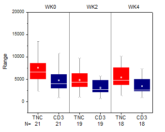
Data Requirements
Select at least one column as input data, and prepare at least one categorical column to create grouped box charts.
Creating the Graph
Select required data.
From the menu, select .
or
Click the Grouped Box Charts - Indexed Data button  on the 2D Graphs toolbar. on the 2D Graphs toolbar.
In the dialog that opens, select the group range, split panels/pages and choose graph theme to create the grouped box chart.
Please see more details on creating and customizing box charts in the Creating Box Charts page.
The plot_gboxindexed Dialog Box
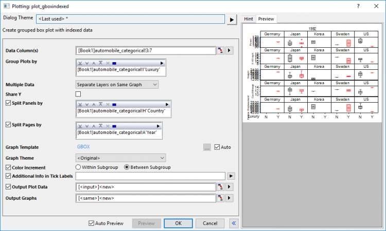
| Data Column(s)
|
This branch is used to specify the input data.
|
| Group Plots by
|
This part includes a display box and a toolbar with five buttons  : :
- Display Box
- The selected group range(s) will display in this box. To plot, you must select something other than <none>. The sequence of data ranges determines the grouping order, with the first range supplying the primary groups, the second range supplying the secondary groups within the primary groups, and so forth.
- Add button

- Click this button then choose a column from menu; or click Select Columns to open the Column Browser and add column(s) to the Display Box as grouping range(s). You can add up to 5 grouping ranges.
- Remove button

- Remove the selected data range(s) from the Display Box. This button is available when you select one or more data ranges in the Group Column(s) box.
- Move Up button

- Move the selected data range(s) up in the Display Box. This changes the grouping sequence.
- Move Down button

- Move the selected data range(s) down in the Display Box. This changes the grouping sequence.
- Select All button

- Select all data range(s) down in the Group Column(s).
|
| Multiple Data
|
When there are multiple input columns selected in Data Colulmn(s), you can use this option to decide how to arrange these data:
- Overlay on Same Graph: Plot all data on same graph page as overlayed plots.
- Separate Layers on Same Graph:Plot these data seperately into different layers on same graph page
- Separate Graphs:Plot these data seperately into different graph pages
|
| Share Y
|
This option only shows when Multiple Data has been set to Separate Layers on Same Graph. It is used to make the Y scale shared between different layers.
|
| Split Panels by
|
Once this check box has been checked, you can select another grouping column to enable horizontal panels which show a grouped box chart for each grouping value seperately. Wrap Panels will be enabled, ticks and labels will be shown on alternate sides by default.
When there are multiple columns selected, only one panel info label row will be shown on top, panel banner string will include all factors and separated by comma.
|
| Split Pages by
|
Once this check box has been checked, you can select another grouping column to split the input data and created gouped chart boxes in different graph pages. Each page only plots the columns within the same page related group. Page related group info will be shown in layer title, separated by comma if there are multiple factors. Report graph sheet will list all pages.
|
| Graph Template
|
Select a template to apply the formats and settings on the graph. By default, the built-in template gbox.optu is selected by Auto box checked.
|
| Graph Theme
|
Choose from a list of built-in graph theme for the grouped box plot
|
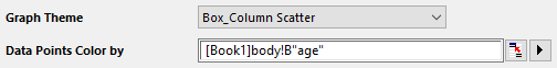
| Data Points Color by
|
When Graph Theme includes data point display (e.g. Box_Column_Scatter), add a Data Points Color by control for coloring of individual points using worksheet column values. Optional.
|
| Color Increment
|
Specify how to color the grouped boxes with the color increment list, within subgroup or between subgroup.
|
| Additional Info in Tick Labels
|
"; each notation will be shown in different table rows. All these info will be shown after group info table rows.
|
| Output Plot Data
|
Specify where to output the calculated data.
|
| Output Graphs
|
Specify which sheet to output the result graphs.
|
In addition, you can preview the final graph in this dialog.
Note: The recalculate option in this dialog is set to Auto by default.
| Note: When the selected grouping column(s) will result in the creation of more than 200 groups, the plot_gboxindexed dialog displays an attention message warning that the calculation might be slow and prompting the user to confirm that the calculation should proceed (graph previews are also disabled). This threshold value of 200 groups is modified by changing the value of LabTalk System Variable @NC.
|
Example

|
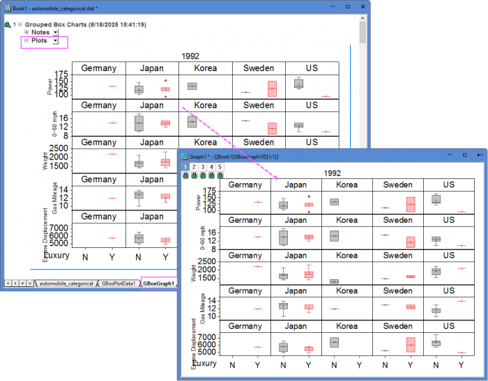
- Create a new workbook.
- Click the
 button to import the automobile_categorical.dat file under <Origin EXE Folder>\Samples\Statistics path. button to import the automobile_categorical.dat file under <Origin EXE Folder>\Samples\Statistics path.
- Highlight column C~G and select Plot: Categorical: Grouped Box Charts - Indexed Data from top menu to open the plot_gboxindexed dialog.
- In the Group Plots by section, click the triangle button at the top right corner and select Col(I).
- Select Seperate Layers On Same Graph from the Multiple Data drop-down list.
- Check the check box before Split Panels by option, in the following box, click the triangle button at the top right corner and select Col(H).
- Check the check box before Split Pages by option, in the following box, click the triangle button at the top right corner and select Col(A).
- Select <Original> for Graph Theme. Please note, if you have already saved a graph template and wants to use them on your graph, you can uncheck Auto box and click ... button to browse and select the template in the Graph Template option.
- Select Between Subgroup radio box for Color Increment option.
- Make sure the Output Plot Data and Output Graph are set to [<input>]<new> and [<same>]<new>.
- Click OK to create the plot. You will get two new sheets: One for plot data and another one for result graphs by years. You can double-click on the graph in sheet "GBoxGraph1" to open the graph window.
|
Template
gBox.otp (installed to the EXE folder of Origin)
Notes
- If there are more than 1 grouping range selected for Group Plots by option, the X axis tick label will be by default displayed as tables, you can control this format in the Table tree node in the Tick Labels page of the Axis dialog. The information row added by Additional Info in Tick Labels option will also be shown as table row(s).
- By default Subgrouping will be turned on based on the calculation from grouping range selected for Group Plots by option, and you can control the gap between or within subgroups separately in the Spacing tab.
- If multiple columns have been selected as input Data Column(s), you can decide how to arrange these input data: Overlay on same graph; seperate these plots into different layers on same graph; or sepreate these plots into different graphs. You can check Share Y if the plots are in different layers on same graph.
- Split Panels by option will help you split the source data and plot them into different panels in same graph page by the selected grouping column(s). Panel banners will show the grouping info;
- Split Pages by option will help you split the source data and plot them into different graph pages by the selected grouping column(s). Grouping info will be shown as page titles. All pages will be output to result sheet "GBoxGraph#".
- You can create/customize the legend specified for box chart components by selecting Graph:Legend:Box Chart Components... menu items when the box chart graph is active.
- It is also possible to create grouped box chart from raw data.
- If you select Box_Column Scatter as Graph Theme, you can create a grouped column scatter plot.
- If you select Box_Connect Mean Line as Graph Theme, you can create a grouped box chart with a connect mean line.
- If you select Box_Interval Plot as Graph Theme, you can create a grouped interval plot.
- If you select Box_Mean Bar with SE as Graph Theme, you can create a statistical bar plot with SE error bar.
|