6.7.7 Panel Graph with Inset Plots of High-resolution Electron Energy-loss SpectraPanel-Graph-w-Inset-Plots
Summary
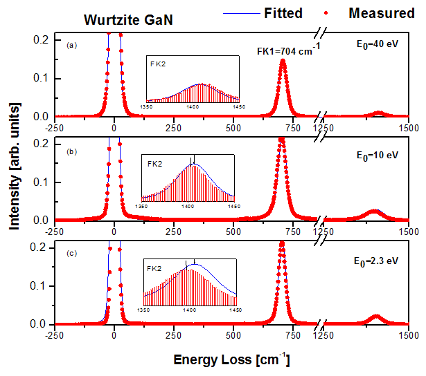
Origin can be used to create a three panel graph with inset plots similar to the image shown below:
Minimum Origin Version Required: 2015 SR0
What you will learn
This tutorial will demonstrate how to:
- Use the Plot Setup dialog to create curves on one graph using data from multiple workbooks.
- Add Inset Graphs.
- Copy and Paste Style formats.
- Use the Layer Management dialog to link axes.
Steps
Using the Plot Setup dialog
This tutorial is associated with <origin exe folder>\Samples\Tutorial Data.opj.
- Open the Tutorial Data.opj and
go to the folder Three Panel Graph with Inset Graphs.
- Activate the workbooks Measured and Original name: BOS".
- Ensure that nothing is selected in either workbook and click the line button
 on the 2D Graphing toolbar. on the 2D Graphing toolbar.
- This will bring up the Plot Setup dialog box.
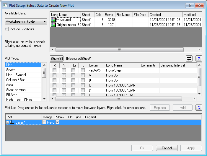
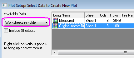
- Under Available Data select the Worksheets in Folder option from the drop-down list. This will ensure that in the panel to the right, data is available from all the workbooks in the current folder.
- Make sure that the Original name: BOS worksheet is selected as shown above. In the center panel enable the box corresponding to X and A4 and the second box corresponding to Y and B4.
- This will set col(A4) as the X values and col(B4) as the Y values regardless of column designation in the workbook. Select Add and a new curve will be created in the pre-existing Layer on the third panel:
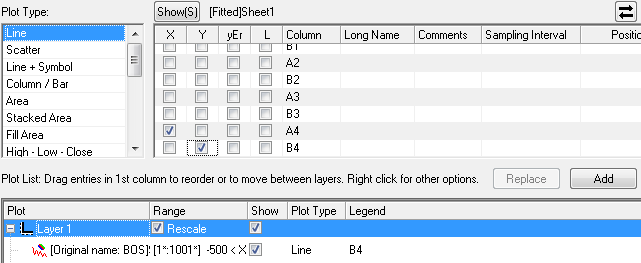
- On the first panel, change the highlighted workbook to Measured.
- On the left, set Plot Type to Scatter.
- On the second panel, select the check boxes as shown below:
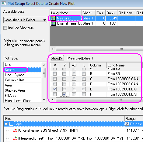
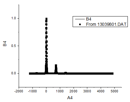
- Select Add and the plot will be added to the Layer in the third panel. Select OK to close the dialog box. Your graph should look like the one shown below:
- Activate one of the workbooks and follow the procedure above to create two more graphs using the following designations in the Plot Setup dialog (remember to change the plot type to Scatter for the data from Measured):
Graph 2
| Worksheet Name
|
Set X as
|
Set Y as
|
| Original name: BOS
|
A1
|
B1
|
| Measured
|
C
|
D
|
|
Graph 3
| Worksheet Name
|
Set X as
|
Set Y as
|
| Original name: BOS
|
A2
|
B2
|
| Measured
|
A
|
B
|
|
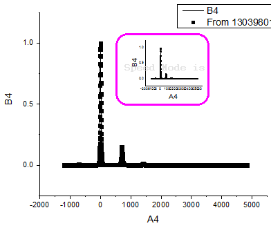
Adding Inset Graphs
- Select the Add Inset Graph With Data button
 on the Graph toolbar to add an inset graph to each graph. Each inset graph appears on its own layer and each graph can be customized, zoomed, panned and moved around like the full-size parent graph it was created from. on the Graph toolbar to add an inset graph to each graph. Each inset graph appears on its own layer and each graph can be customized, zoomed, panned and moved around like the full-size parent graph it was created from.
- Select and drag each graph to the center:
Merging Graphs
- From the Origin menu select Graph: Merge Graph Windows: Open Dialog. Alternatively select the
 button on the Graphs toolbar. button on the Graphs toolbar.
- In the Graph Manipulation: merge_graph dialog that opens, under Arrange Settings, set the Number of Rows as 3 and the Number of Columns to 1. The Preview will appear on a panel to the right.
- Enable the check box for Treat Each Source Graph as a Unit, to keep the graphs and the corresponding inset graphs linked.
- Enable Show Axes Frames to add frames around each graph:
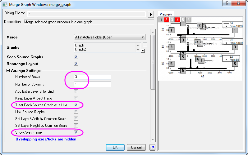
- Click OK to exit the dialog.
Customizing Plots and the Copy Format Feature
- Double-click the first graph to open the Plot Details dialog box.
- Use the
 button to expand the left panel. Click on the arrow next to the Layer1 icon to expand it and show the layer 1 contents. button to expand the left panel. Click on the arrow next to the Layer1 icon to expand it and show the layer 1 contents.
- Select the plot [ Measured ]Sheet1!E[ X ]... and on the Symbol tab, change the symbol to a circle, the Size as 5 and the Symbol Color to Red as shown below. Select Apply.
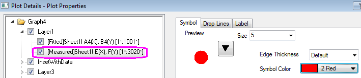
- Select the plot [ Fitted ]Sheet1!A4[ X ],B4... and on the Line tab set the line color as Blue.
- Click OK to exit the dialog box.
- The next step is to apply this color scheme to all the parent graphs and inset graphs to avoid manually changing them all. Right-click on the customized graph and from the context menu select Copy Format: All Style Format:
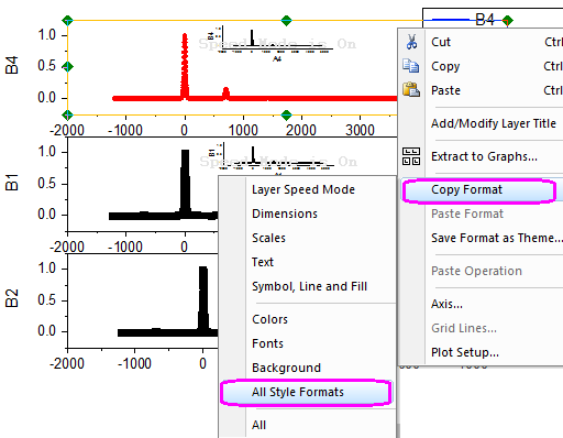
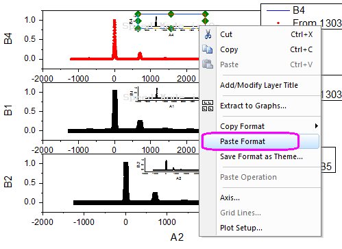
- Right-click on each remaining graph and select Paste Format from the context menu.
 | Beginning with Origin 2018b, you can use the Plot Details Common Display controls for simultaneous editing of layer, plot and axis properties in a multi-layer graph. For more information, see The (Plot Details) Layers tab controls.
|
Using the Layer Management Dialog Box to Link and Customize Axes
The next step is to set the scales on the axes and add axis breaks to show the important parts of the graphs.
- Select Graph: Layer Management. In the dialog box that opens there will be a panel named Layer Selection on the left. It lists all six of the layers in this graph - 3 for parent graphs and 3 for inset graphs.
- In order to customize one parent graph axis and have the changes implemented on the other two parent graphs, the axes are linked in the Link tab. The first Layer cannot be linked so it is the one that is customized and the other graphs are linked to it. Select Layer 3 and in the Link tab set Link to as 1 and set X Axis Link and Y Axis Link as Straight[1 to 1] as shown below:
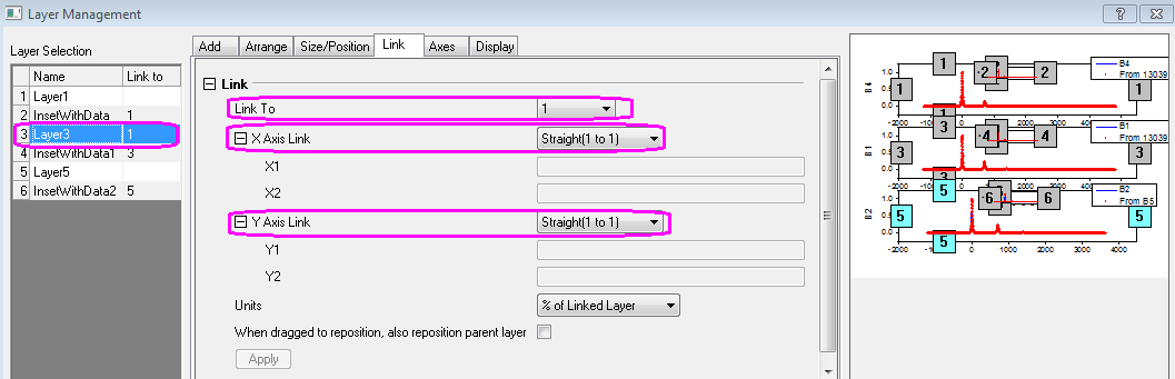
- Click Apply.
- Do the same for Layer 5 and click Apply.
- Click OK to exit the dialog box.
- Double-click any axis on the first graph to open the Axis Dialog.
- Go to Horizontal icon in Scale tab, set From and To to -250 and 1500. Set the Increment Value on the Major Ticks section as 250.
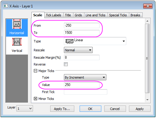
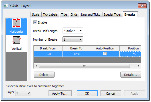
- Go to Horizontal icon in the Breaks tab, set Number of Breaks to 1.
- Select Break 1 under the Breaks node and create a break From: 850, To: 1250.
- On the same page, clear the Auto check box for Position (% of Axis Length) and set it as 75.
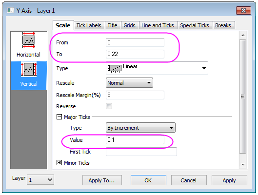
- Go to Vertical icon in Scale tab, set the scale as From: 0, To: 0.22 with increments of 0.1.
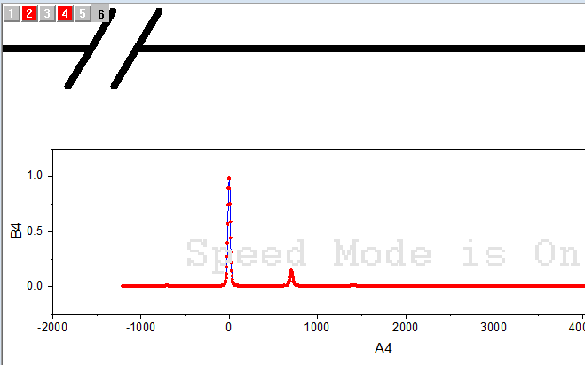
- Select OK. All three graphs will now reflect your changes.
- To customize the Inset Graphs, zoom into the first one on Layer2 using the Zoom Pan button
 on the Tools toolbar. Use the mouse wheel to zoom in. on the Tools toolbar. Use the mouse wheel to zoom in.
- Once zoomed in, select the Pointer button
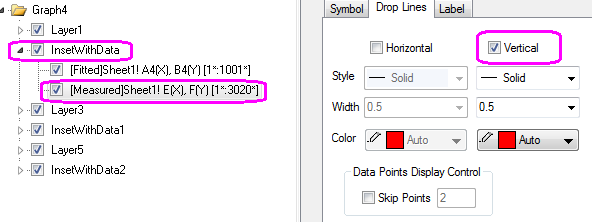
 on the Tools toolbar to exit the zoom mode. Double-click on the Inset Graph to open the Plot Details dialog. Select the [Measured]Sheet1!E[X]... graph and on the Drop Lines tab, check the Vertical box. Click OK. on the Tools toolbar to exit the zoom mode. Double-click on the Inset Graph to open the Plot Details dialog. Select the [Measured]Sheet1!E[X]... graph and on the Drop Lines tab, check the Vertical box. Click OK.
- Double-click on any axis.
- In the Axis Dialog that opens, set the scale for the X Axis on the Scale tab From: 1350, To: 1450, with increments of 50.
- Under the Vertical icon, set the scale From: 0, To: 0.03. Go to Lines and Ticks tab and on the left icon, set the Major Ticks to None and the Minor Ticks to None.
- Select OK to exit the dialog box. Select the tick labels on the left Y axis and press Delete to remove them. Do the same with axis labels.
- Press CTRL+W to zoom out and return to normal graph size.
- Select the customized Inset Graph, right-click and choose Copy Format: All Style Formats from the context menu.
- Select, right-click and Paste Format to the other two Inset Graphs, to duplicate the drop lines settings.
- Repeat the last two steps, this time selecting Copy Format: Scales to duplicate the axis settings.
Adding Titles, Legend and Text Objects
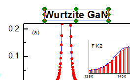
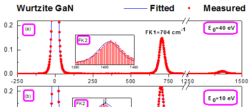
- Activate the first Layer by clicking the layer icon on the top left corner of the graph. Right-click on the graph and from the context menu choose Add/Modify Layer Titles. Type Wurtzite GaN in the box that opens, change the font size and type face as desired and drag to an appropriate position:
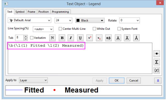
- Select the legend objects for the second and third graphs and press DELETE.
- Select the remaining legend, right-click and choose Properties. In the Text tab of Object Properties dialog box, type Fitted in place of %(1) and Measured in place of %(2). Place both on the same line. Set the font size as desired. Go to Frame tab, and set the Frame to None. Click OK and drag the legend object to an appropriate place.
- Delete the first and third Y-axis titles. Double-click the second one and type Intensity [arb. units]. Do the same for the single X-Axis title, labeling it Energy Loss [cm-1].
- Right-click on the graph and choose Add Text from the context menu or choose the
 button on the Tools tool bar. Add text objects as shown below. Use the button on the Tools tool bar. Add text objects as shown below. Use the  button for writing subscripts: button for writing subscripts:
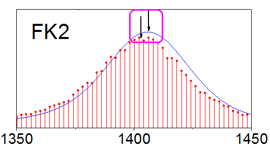
- Select each of the inset graphs and change size or position as desired. Use the
 button on the Tools toolbar to create arrows where desired on the Inset Graphs: button on the Tools toolbar to create arrows where desired on the Inset Graphs:
- The final graph should appear as shown below:
|