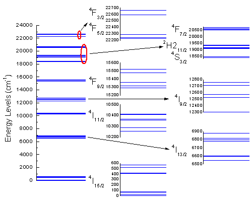
6.7.6 Energy-Level Structure of the Er3+ Ion in A YAG CrystalMultiPanel-EnergyLevel
Summary
This tutorial will demonstrate how to create a graph showing the energy-level structure of the Er3+ ion in a YAG crystal.
Minimum Origin Version Required: 2015 SR0
What you will learn
This tutorial will demonstrate how to:
- Create a graph by selecting part of the data from a column
- Set symbol properties
- Merge graphs
- Change the size and position of a layer
Steps
- Start with an empty worksheet. Select Help: Open Folder: Sample Folder... to open the "Samples" folder. In this folder, open the Graphing subfolder and find the file Van_Rudd_Er_Energy_Levels.txt. Drag-and-drop this file into the empty worksheet to import it.
- Highlight column B and create a symbol plot by selecting menu Plot > Basic 2D : Scatter.
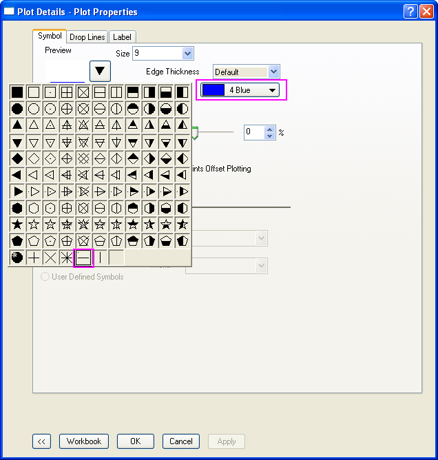
- Double click the data points scatter to open the Plot Details dialog. In the Symbol tab of the right panel, change the symbol and symbol color as shown below:
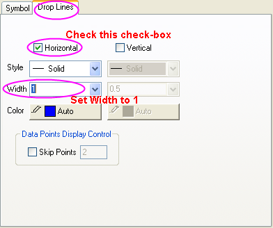
- In the Drop Lines tab, check the Horizontal box and set Width to 1. Click OK to apply the changes.
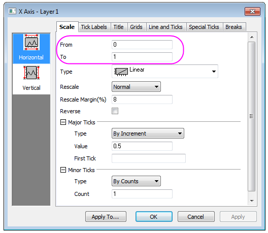
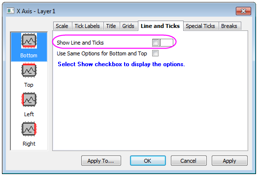
- Double click on the X axis to open the Axis dialog. Set the X axis scale from 0 to 1 in the Horizontal icon in Scale tab :
- Go to the Line and Ticks tab, Tick Labels tab, and Title tab respectively, make sure Bottom icon is selected and deselect the Show Line and Ticks or Show box to hide all elements in the bottom X axis including line & ticks, labels and title:
- In the Vertical icon in Scale tab, set the following for the Y axis scale: From: 0, To: 24000, Value(in Major Ticks Group): 2000.
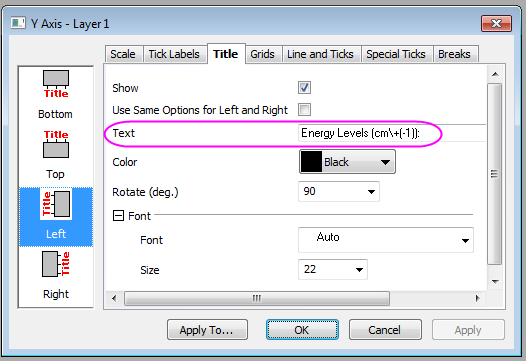
- Go to Left icon in Title tab, change the Text for the Y axis title to Energy Levels (cm\+(-1)):
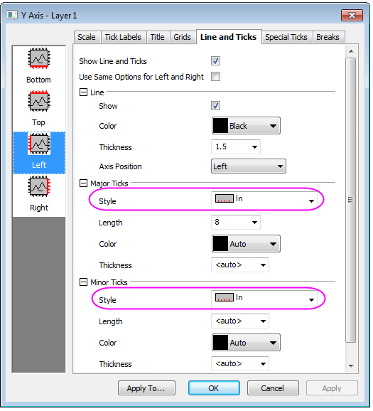
- Go to the the Left icon in Line and Ticks tab, select In from the drop down menu for Major Ticks and Minor Ticks:
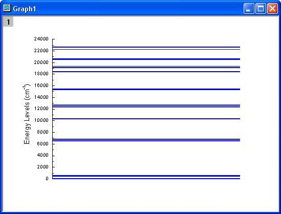
- Use OK to save the axis settings. Delete the legend object in the graph by selecting it, right-clicking and choosing delete from the drop down menu. The graph should appear as shown below:
- Highlight cell 1-8, cell 9-15, cell 16-21, cell 22-26, cell 27-31, cell 32-43, and cell 44-48 respectively, to plot scatter graphs by selecting menu Plot > Basic 2D : Scatter and then repeat step 3 through step 11 to make another 7 graphs. Set the increment value of the Y axis (step 7) to 100, and the From and To values as 0 to 600, 6500 to 6900, 10200 to 10500, 12300 to 12800, 15200 to 15600, 18300 to 20800, 22200 to 22700, respectively. The Title in Y axis (step 8) are also different and should be set as \+(4)I\-(15/2), \+(4)I\-(13/2), \+(4)I\-(11/2), \+(4)I\-(9/2), \+(4)F\-(9/2), \+(4)F\-(7/2) \+(2)H2\-(11/2) \+(4)S\-(3/2), and \+(4)F\-(3/2) \+(4)F\-(5/2), respectively. Then set the Y axis Major Ticks and Minor Ticks to None.
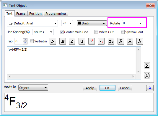
- In order to change the rotation angle of the Y title created in step 9, select the Y title, choose Properties from the right-click menu and set the Rotate(deg.) to 0 in the Object Properties dialog that opens.
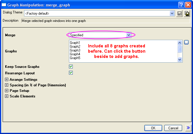
- Activate one of the graphs and select menu Graph: Merge Graph Window. Change the settings as shown below and click the OK button to merge the 8 graphs previously created.
- Double click on the merged graph to open the Plot Details dialog. In the Size/Speed tab of Layer 1, change the Layer Area as shown below:
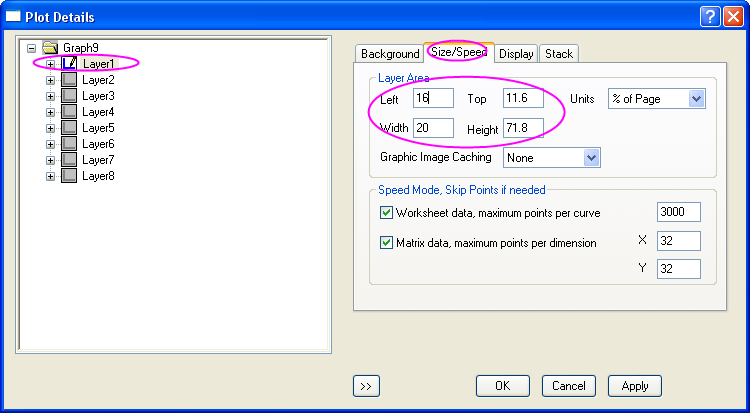
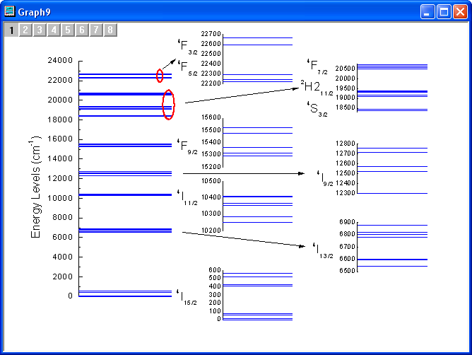
- Set the other layers' sizes to 15 x 15 (Width and Height in step 15), and move them to the desired position. Adjust the size of the Y axis label and add the corresponding arrows and circles. The graph should appear as shown below:
|