6.7.2 3Ys Y-YY3Y-Y-YY-Graph
Summary
This tutorial will show how to create a graph with three Y axes; one left Y axis and double right Y axes.
What you will learn
- Create a graph with three Y axes; one left Y axis and double right Y axes.
- Customize scatter plots.
- Change axis scale, type, title, etc.
- Add an axis to an existing graph.
- Update the graph legend.
Steps
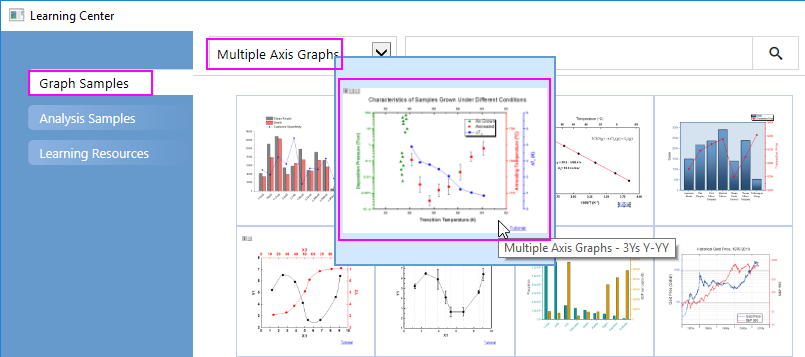
- Select Help: Learning Center menu or press F11 key to open Learning Center. Select Graph Sample tab and then select Multiple Axis Graphs from the "Category" drop-down list. Double-click on the graph sample below to open the sample "Multiple Axis Graphs - 3Ys Y-YY".
Note: This tutorial is associated with the folder 3Ys Y-YY of the "Tutorial Data" project:<Origin EXE Folder>\Samples\Tutorial Data.opj.
- Highlight all data columns in the workbook "Book4", select Plot > Multi-Panel/Axis : 3Ys Y-YY main menu to create a graph with three Y axes - one left Y and two right Y.
- Customize the data plots:
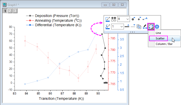
- Click the black plot in Layer1, and in popup mini toolbar, click Change Plot to button
 to change the plot type to Scatter. to change the plot type to Scatter.
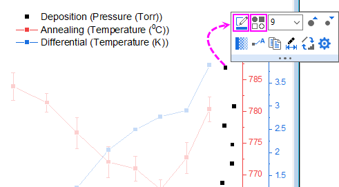
- Click this plot again, and in the popup mini toolbar, click Symbol Edge Color button
 to set the symbol color to Olive; and click Plot Symbol button to set the symbol color to Olive; and click Plot Symbol button  to change the symbol to Triangle. to change the symbol to Triangle.
- Click the data plot(on the symbol, not error bar) in Layer2, and in popup mini toolbar, click Change Plot to button to change the plot type to Scatter. Click on the error bar of this plot, and in popup mini toolbar, click Line/Border Color button to change the color to black.
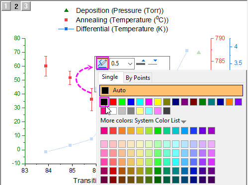
- Click the plot in Layer3, and in the popup mini toolbar, click Plot Symbol button to change the symbol to solid circle.
- Let's customize the X axes:
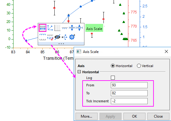
- Click on the bottom X axis, and in the pop up mini toolbar, click Axis Scale button
 to open the Axis Scale dialog to configure the X axis scale as shown in the following: to open the Axis Scale dialog to configure the X axis scale as shown in the following:
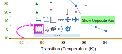
- Click on the bottom X axis again, and in the pop up mini toolbar, click Show Opposite Axis button
 to show the top X axis. to show the top X axis.
- Click on the top axis we just added, and in the pop up mini toolbar, click Show Tick Labels button
 to add tick labels for top x axis. to add tick labels for top x axis.
- Let's customize the Y axes:
- Click on the left green Y axis, and in the popup mini toolbar, click Axis Scale button to open the Axis Scale dialog to configure the left Y axis scale as below:
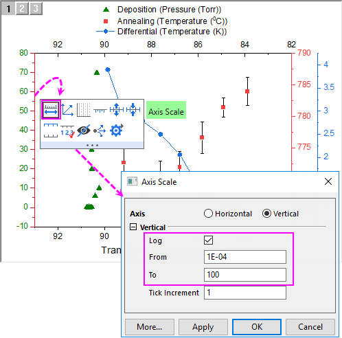
- Click on the right green Y axis(the 1st one), and in the popup mini toolbar, click Axis Scale button to open the Axis Scale dialog to set From = 765 and To = 795, and set the Major Ticks increment Value to 10.
- Click on the right blue Y axis(the 2nd one), and in the popup mini toolbar, click Axis Scale button to open the Axis Scale dialog to set the axis scale to read from 0 to 6 with a major tick increment Value = 1.
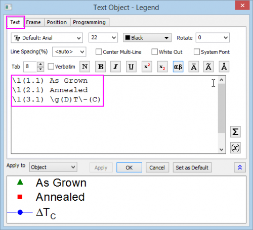
- On the graph, right-click the legend object and choose Properties from the shortcut menu. This opens the Object Properties dialog box. Go to Frame tab, and change Frame to Shadow. Go to Text tab, and enter the text shown below, then click OK to close the dialog box. Reposition the legend object, as needed.
\l(1.1) As Grown
\l(2.1) Annealed
\l(3.1) \g(D)T\-(C)
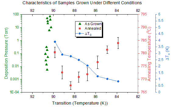
- Add a graph title by creating a text object and typing Characteristics of Samples Grown Under Different Conditions. Reposition as needed.
- Double-click on the left Y axis to open the Axis dialog. Go to Title tab, check Show check box and enter Deposition Pressure (Torr) into the Text box to add the axis title for left Y axis for Layer1.
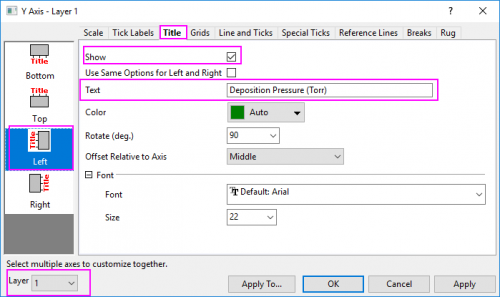 - Click Apply button. Switch to Layer2 and Layer3 separately using the Layer drop-down list at the left bottom of the Axis dialog, set Axis Title to Annealing Temperature (\+(0)C) and \g(D)T\-(c) (K) as above. Click OK button to close the dialog.
- Select Graph: Fit Page To Layers... to open the Fit Page to Layer dialog, accept the defaults and click OK to adjust the page size to better fit the graph layers.
- To the right side of the graph, click once to select the axis titles and the blue Y axis, then drag to reposition them so that they don't overlap one another. Your graph should now look something like this:
|