2.10.29 plotbylabel
Menu Information
Plot > Multi-Panel, Multi-Axis : Multiple Panels....
Brief Information
Plot a multi-layer graph using column label as group
Additional Information
Minimum Origin Version Required: 8.1 SR0, updated in 8.5.1 SR0
Hiding the graph is available starting with 9.0, controlling gaps between layers is available starting with 2016 SR0.
Specifying a graph template is available starting with 2021b.
Command Line Usage
plotbylabel iy:=[book1]1!((1,2),(1,3),(1,4)) group:=U plottype:=2 rows:=3 cols:=1;
plotbylabel iy:=[Book1]1!((1,2),(3,4),(5,6),(7,8),(9,10),(11,12),(13,14),(15,16)) group:=L plottype:=1 rows:=4 cols:=2 hgap:=10 vgap:=10 tmg:=5 bmg:=5;
plotbylabel group:=C plottype:=linesymb template:=C:\Users\shirley\Documents\OriginLab\UserFiles202002\MyTest.otpu;
X-Function Execution Options
Please refer to the page for additional option switches when accessing the x-function from script
Variables
Display
Name
|
Variable
Name
|
I/O
and
Type
|
Default
Value
|
Description
|
| Input
|
iy
|
Input
XYRange
|
<active>
|
Specify the input data ranges.
|
| Group By
|
group
|
Input
string
|
<unassigned>
|
Specify the group identifiers for plotting the input data ranges; Or, use the X columns as separators to plot the Y columns into multiple layers; Or, use the specified number of groups to divide the input ranges and plot them into multiple layers.
- For an column label row selected, data with the same group identifier will be plotted into the same layer. When scripting, please refer to Column Label Row Characters for the single character to specify a label row.
- For X column selected, X columns will used as separators to divide the Y columns as multiple groups, and then this groups will be plotted into multiple panels against the adjacent X data.
- For Number of Plots selected, you can specify the group size to divide the input ranges and plot them into the multiple layers.
|
| Plot Type
|
plottype
|
Input
int
|
0
|
Specify a plot type.
Option list:
- line:Line {0}
- Line plot.
- scatter:Scatter {1}
- Scatter plot.
- linesymb:Line+symbol {2}
- Line and Symbol plot.
- column:Column {3}
- Column plot.
|
| Graph Template
|
template
|
Input
int
|
<auto>
|
Specify a plot template to apply formats and settings on the panels. Auto means applying the default template mgroups.optu; Uncheck Auto box to select a template file by clicking the ... button.
|
| Number of Rows
|
rows
|
Input
int
|
<auto>
|
The layers will be arranged in an N by M grid. This variable specifies M, the number of rows in the grid.
|
| Number of Columns
|
cols
|
Input
int
|
<auto>
|
The layers will be arranged in an N by M grid. This variable specifies N, the number of columns in the grid.
|
| Horizontal Gap
|
hgap
|
Input
int
|
5
|
Specifies the horizontal gap in % of page size between adjacent layers.
|
| Vertical Gap
|
vgap
|
Input
int
|
5
|
Specifies the vertical gap in % of page size between adjacent layers.
|
| Left Margin
|
lmg
|
Input
int
|
12
|
Specifies the left margin in % of page size to the new graph page.
|
| Right Margin
|
rmg
|
Input
int
|
10
|
Specifies the right margin in % of page size to the new graph page.
|
| Top Margin
|
tmg
|
Input
int
|
10
|
Specifies the top margin in % of page size to the new graph page.
|
| Bottom Margin
|
bmg
|
Input
int
|
12
|
Specifies the bottom margin in % of page size to the new graph page.
|
| Hide Newly Created Graph
|
hide
|
Input
int
|
0
|
Specify whether to hide the newly created graph. Note that this option is hidden in the dialog. One can only assign its value through Labtalk script.
|
Description
This X-Function plots multiple XY ranges into different layers according to group identifiers, X column separators or group size. The group identifiers can be specified by Long Name, Units, Comments or any other customized headers.
Examples
This example is going to plot the unstacked data ranges. First of all, we need to generate the unstacked data by using the wunstackcol X-Function.
- Import the data <Origin Installation Directory>\Samples\Statistics\nitrogen.txt. (Change the file type in the ASCII dialog to Text File (*.txt) or All Files (*.*) to be sure to get the TXT file and not the DAT file of the same name.)
- Highlight column B, and then select menu Restructure: Unstack Columns.
- In the pop-up dialog, select column A for Group Columns, and the Put Grouping Info. to will use the User Defined Parameters, and set From Group Columns to Long Name.
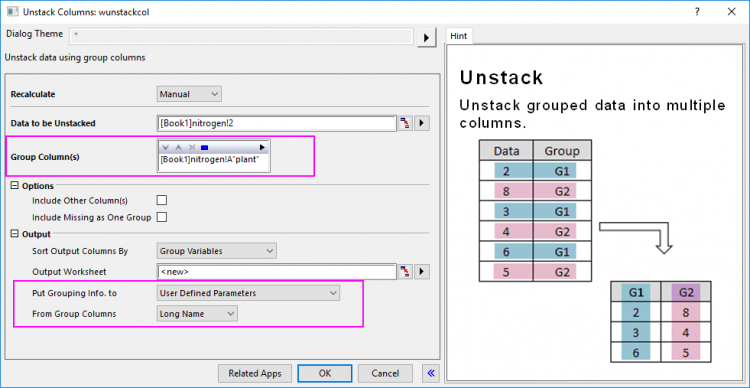
- Click OK to generate the data.
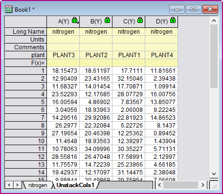
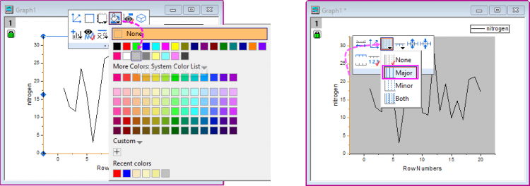
- Highlight first column in the UnstackCols1 worksheet to plot a Line plot by selecting Plot > Basic 2D : Line menu. In this graph, we can change the Layer Backgroup as LT Gray and add major gridlines for Y axis with the mini toolbars.
-
- Right-click on the window title bar to select Save Template as from the context menu to save the graph window as a template which will be reused to plot the Multiple Panels graph, named as MyLine.optu.
-

- Go back to the worksheet UnstackCols1, highlight all columns and then select Origin main menu Plot > Multi-Panel, Multi-Axis : Multiple Panels.... to bring up the plotbylabel dialog.
- In the dialog, set Group By as plant, Plot Type as Line+symbol and select the template you saved above for Graph Template. And keep the Number of Rows and the Number of Columns as default (Auto).

- Click the OK button to plot a graph with four layers, which identified on their Y Axes by the group identifiers -- PLANT1, PLANT2, etc.. As you can see the Layer Background and major gridlines for Y axis have been applied to all panels.

Related X-Functions
plotgroup, plotmyaxes
|