25.5.1 Data Analysis in Origin with R ConsoleAnalysis-Origin-Rconsole
Data Analysis in Origin with R Console
R Console and Rserve Console tools have been added to Origin 2016. By using them you can easily transfer data to Origin from R and make use of advanced graphic feature in Origin. In addition, you can access a wide range of statistical functions or packages from R to help you analysis the data in your Origin OPJ file with the usable R Console dialog and Command.
Here we provide some visualized example to show the flexible applications of R Console for statistic data analysis and simulation.
Install packages
To run these examples, you need to have R installed on you computer and download the boot and GenSA R packages, please open your R main window (not R console in Origin) and Run the Script to installand load:
install.packages("boot")
install.packages("GenSA")
library(boot)
library(GenSA)
Calculating the Correlation Coefficient by Using Bootstrap
The R package boot allows a user to easily generate bootstrap samples and perform statistic analysis, in this example we will introduce how to calculating the correlation coefficient by using bootstrap with this package in R Console.
- Create a new Workbook, click Import Single ASCII
 to import the LogRegData.dat from \OriginLab\Origin2016\Samples\Statistics to import the LogRegData.dat from \OriginLab\Origin2016\Samples\Statistics
- Select Connectivity: R Console in Origin menu to open the R Console dialog.
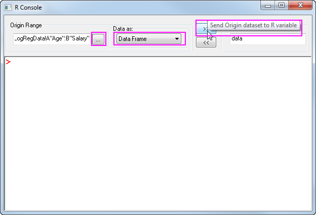
- Click the
 button and Select the first two column in worksheet, Select Data as Data Frame, enter the object name data in R Object box, click button and Select the first two column in worksheet, Select Data as Data Frame, enter the object name data in R Object box, click  to pass the data from origin to R space. to pass the data from origin to R space.
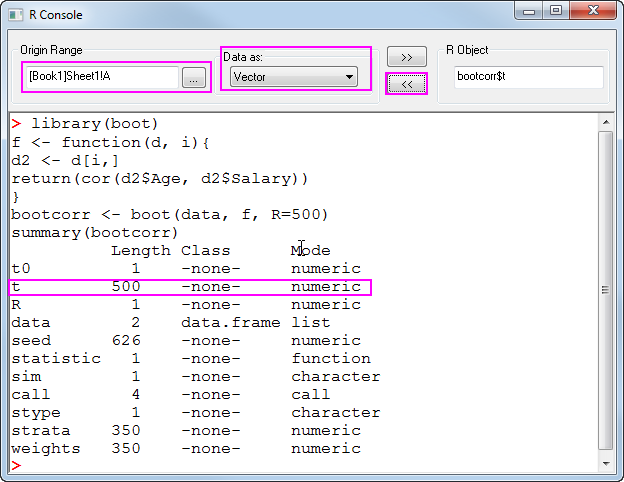
- Then we need to run the Script below in the R console Script inbox, please paste the data into the box, click Enter to run:
library(boot)
f <- function(d, i){
d2 <- d[i,]
return(cor(d2$Age, d2$Salary))
}
bootcorr <- boot(data, f, R=500)
summary(bootcorr)
5. The result is save in the R object bootcorr, the Correlation for each bootstrap is save in bootcorr$t, now we create a new workbook, click  to get the R object bootcorr$t to column A as vector. now you will see column A has results data with 500 rows. to get the R object bootcorr$t to column A as vector. now you will see column A has results data with 500 rows.
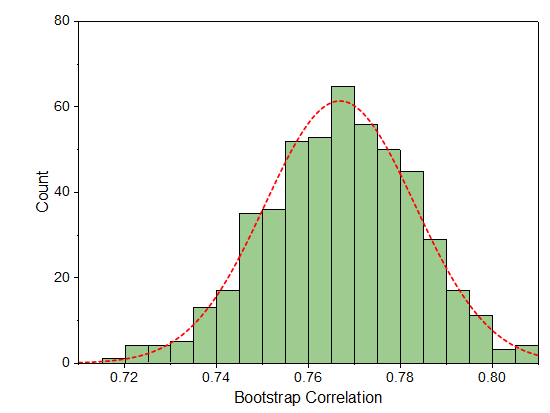
6. Select Column A, click Plot: Statistic: Histogram to make a histogram plot, then you can plot the distribution curve and customize the color, you will have a result similar to the graph below:
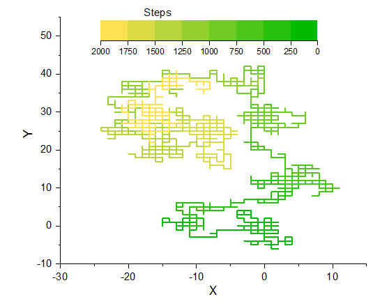
Simulate Random Walk in 2D Lattice
R provide efficiency function for random samples and matrix manipulation, here we demonstrate a example of Simulate Random Walk in 2D lattice, which generate random walk data in R and show the route in with a colored line plot in Origin.
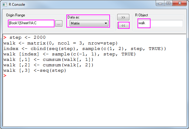
- Create a new workbook with 3 columns
- Click Connectivity: R Console in Origin menu to open the dialog, run the Script below to generate the random walk data:
step <- 2000
walk <- matrix(0, ncol = 3, nrow=step)
index <- cbind(seq(step), sample(c(1, 2), step, TRUE))
walk [index] <- sample(c(-1, 1), step, TRUE)
walk [,1] <- cumsum(walk[, 1])
walk [,2] <- cumsum(walk[, 2])
walk [,3] <-seq(step)
Click enter to run.
3. Send the R object walk to [Book1]Sheet1!A:C as Matrix
4. Select Column B in Book1_sheet1 to make a line plot, use data in Column C to control line plot color and customize the color scale and color hue.
Simulated Annealing to find the global minima
Please install GenSA package before running example.
Simulated Annealing is a method for finding global minima solution for nonlinear problems. Here we use the GenSA package in R to perform the Simulated Annealing process with our testing function, to find the grobal minima of z in range
![X,Y\in [-10,10]](//d2mvzyuse3lwjc.cloudfront.net/doc/en/UserGuide/images/Data_Analysis_in_Origin_with_R_Console/math-63752bebb1d7e5b20e33c4d11a17865a.png?v=0 "X,Y\in [-10,10]")
-0.48xy")
After calculating in R, we send the data results to Origin, and make contour plot to visualize the results, and make line plot to depict the minimum value obtained at each iteration step.
1. Select Connectivity: R Console in Origin menu, paste the script below into the script input box, click Enter to run.
fr <- function(vx){
x <- vx[1]
y <- vx[2]
0.26*(x^2+y^2)-0.48*x*y}

set.seed(25)

dimension <-2
global.min <- 0
tol <- 1e-13
lower <- c(-10,-10)
upper <- c(10,10)

out <- GenSA(lower = lower, upper = upper, fn = fr,
control=list(temperature=200,threshold.stop=global.min+tol,verbose=TRUE,max.call=1E3))
#output the results
sprintf("Global minima for the function is: %.3f at (%.3f, %.3f)", out$value, out$par[1],out$par[2])
The results output will be:
[1] "Global minima for the function is: 0.000 at (0.000, 0.000)"
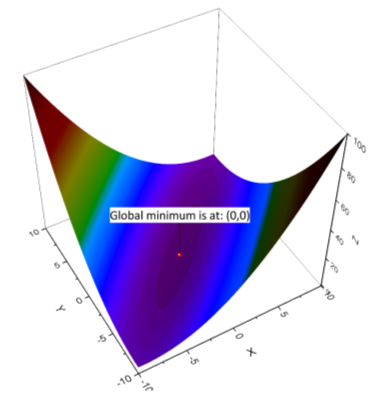
To create a contour plot display together with the minimum point, please:
2. Click the New 3D Plot button  in Standard Tool bar, set the function as the graph shown below: in Standard Tool bar, set the function as the graph shown below:
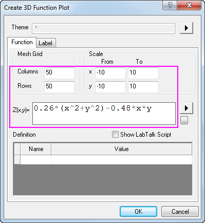
3. Click OK to get the 3D surface plot, you can specify the colormap in Plot Details: Colormap dialog tab.
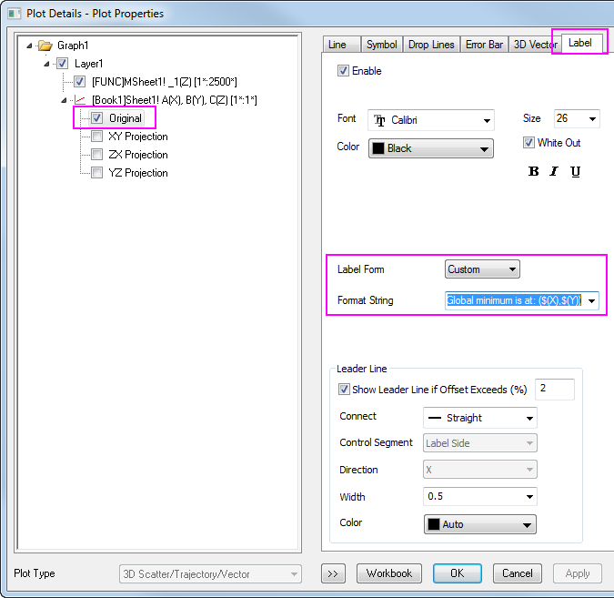
4. Create a new workbook with 3 columns designated as XYZ, enter the data (0,0,0) in the first row, drag the dataset into the 3D graph, then a scatter will be added on the graph, you can further edit the label text for the scatter in Plot Details: Label dialog tab.
The finished graph will be similar to graph below:
Manova analysis
This example will peform a multivariate analysis on the Cost of Labor on a group of Nursing House.
There are 2 predictors which are: Ownership and Certification, and 3 response variables: Cost of Nursing Labor, Cost of Housekeeping Labor,and Cost of Maintenance Labor. To learn about whether the Cost of Labor will be different for different Ownership and Certification, we perform a MANOVA on data with R Console.
- Download the data from LaborCost.zip, and unzip the package to get the LaborCost.dat, then create a new workbook in Origin, and import the data by drag and drop.
- Click the button and Select the all 5 columns in worksheet, Select Data as Data Frame, enter the object name CostData in R Object box, click to pass the data from Origin to R space.
- Run the R script in the input box:
Cost<-data.matrix(CostData[,3:5])
Ownership<-CostData[,1]
Certification<-CostData[,2]
fit <- manova(Cost ~ Ownership*Certification)
summary(fit, test="Pillai")
We can convert the results into a Data Frame, then pass the df to Origin worksheet as Data Frame
sum<-summary(fit, test="Pillai")
df<-as.data.frame(sum$stats)
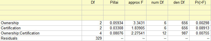
Because the P value for Ownership is less than 0.01, so there are no ownership effects in average cost of labor.
However, the P value for Certification is 0.089, which means that the result is near-significant, and there could be
difference in average cost of labor among the 3 type of certifications.
|