6.10.8 Scatter MatrixScatterMatrix
Summary
A scatter matrix consists of several pair-wise scatter plots of variables presented in a matrix format. It can be used to determine whether the variables are correlated and whether the correlation is positive or negative. This tutorial will show you how to create a Scatter Matrix plot.
What you will learn
- How to create a Scatter Matrix plot with a histogram
- How to customize Scatter Matrix plot
- How to set a grouping range for showing the color index
- How to specify to hide scatter plots on the bottom/top of the diagonal
Steps
Creating Scatter Matrix plot
- Start with an empty worksheet. Select Help: Open Folder: Sample Folder... to open the "Samples" folder. In this folder, open the Statistics subfolder and find the file Fisher's Iris Data.dat. Drag-and-drop this file into the empty worksheet to import it.
- Highlight columns (A) to (D) but not col(E), and select Plot > Statistical : Scatter Matrix from the main menu.
- In the dialog, select Histogram from the Show in Diagonal Cells drop-down list, and select Alternate from Show Tick and Label drop-down list.
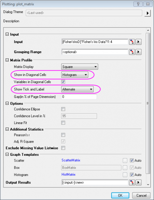
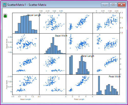
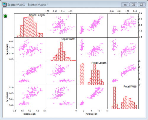
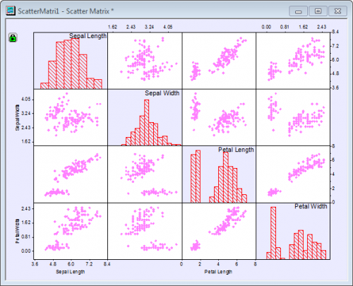
- Click OK to close the dialog. The PlotData1 sheet for the scatter matrix plot is generated in the same workbook as the original data. It contains the data for the different graphs in the scatter matrix and can be accessed by clicking on the second tab labelled PlotData1 at the bottom of the workbook. The graph should appear as below:
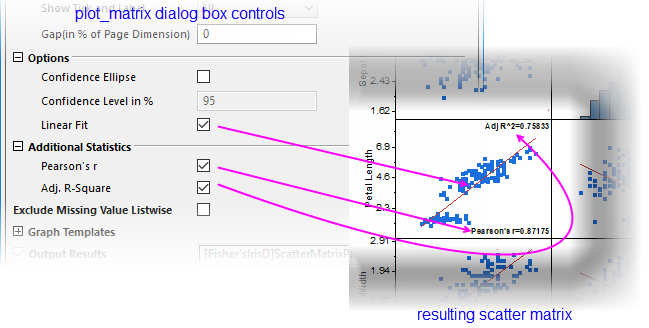
 | You have the option of performing a linear fit on each scatter plot and calculating adjusted R-squared and, additionally, Pearson's correlation coefficient (Pearson's r). Beginning with Origin 2019, these statistics are outputted to a sheet in the active book and named as ScatterMatrixStatsN.
Label each plot in the scatter matrix with Adj. R-Square and/or Pearson's r values by checking the boxes under Additional Statistics.
|
Customizing Scatter Matrix plot
There are multiple layers in the Scatter Matrix graph. This section will explain how to customize the background color, the type and color of the data plots and the axis tick labels of the scatter matrix. Starting with Origin 2016, by default, if you change the plot style or axis setting of one layer, all other layers will follow (for independent editing, see the tip at the end of this section).
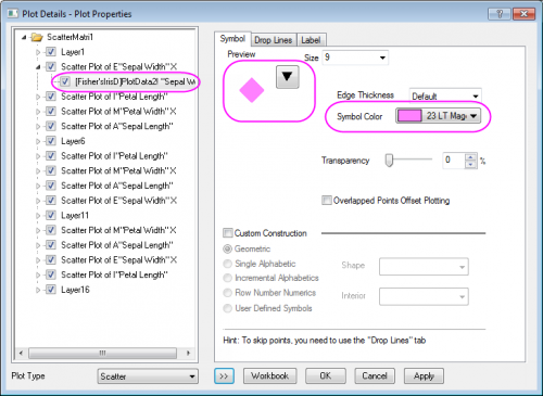
- Double click on the scatter data to open the Plot Details dialog. To change the symbol color click on the Symbol Color drop-down menu and select a color from the Individual Color option. Specify the type and color of the symbol as shown in the following image.
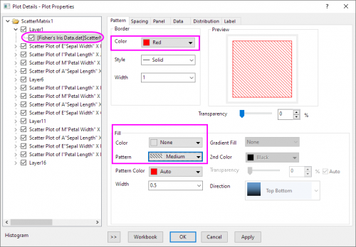
- To custom the pattern style of the histogram, go to the plot level under Layer1 and select the Pattern tab. Set the Border Color to Red, Fill Color to None and Pattern to Medium as shown in the following image. Click OK button.
This change will be applied to all scatter data plots in this graph.
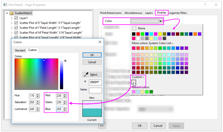
- To change the background color of the entire window, select Format: Page to open the Plot Details dialog. This dialog can also be accessed by double-clicking inside the Scatter Matrix window. In the Display tab, click on the Color drop-down and click on an empty color well beneath Custom. This opens the Colors dialog box where you can define custom colors.
- In the Colors dialog, specify the color as Red=235, Green=235, Blue=255 and click OK.
- To change the background color of the scatter plot layers without changing the background color of the histograms or the rest of the graph,
double-click on a scatter plot to open the Plot Details dialog. Click the Background tab, and set Color to White.
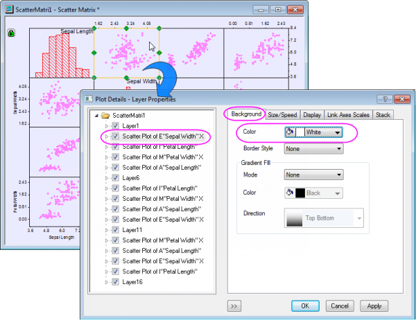
Then click OK in the dialog. This change will be applied to all layers with scatter data plots.
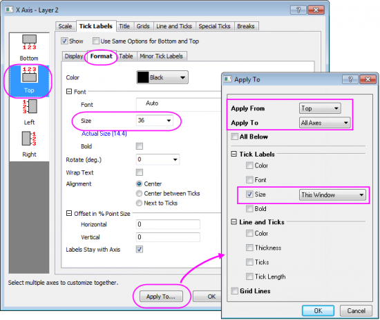
- Double-click on any tick label in the graph to open the Axis dialog for that layer. Go to the Tick Labels tab, then the Format tab, specify Size to 36 for the Top axis. Click Apply.
- Click the Apply To... button to open the Apply To dialog, set the following to apply the previous customization of tick label size to all the other axes in this window. Click OK, then OK to close the Plot Details dialog box.
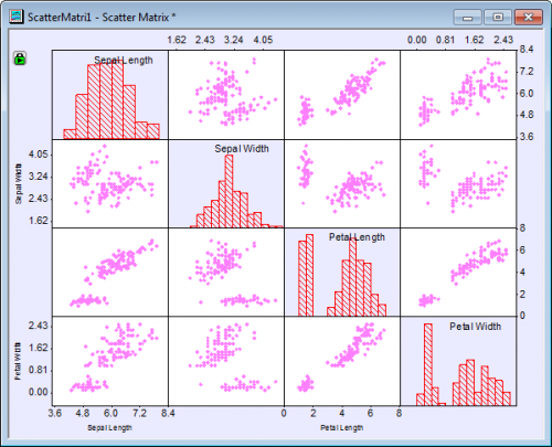
- The graph will appear as shown below:
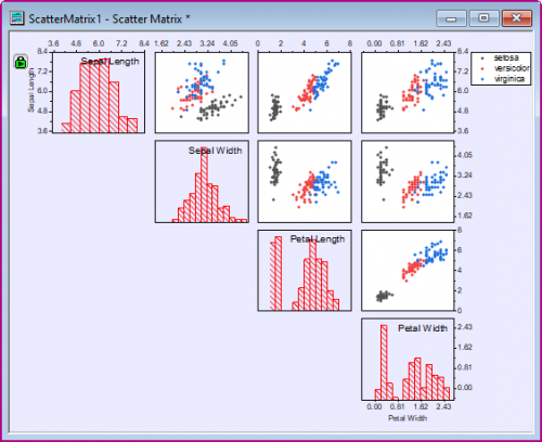
Add Grouping Range
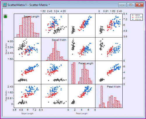
Currently, our scatter plots show pair-wise comparisons of variables Sepal Length, Sepal Width, etc. What is not apparent from our scatter plots is that measurements were made on three species of iris. Since all scatter points look the same, we cannot distinguish between species. What we will do is to use the Species column in our original worksheet -- the column that we left out when making the graph -- to color each scatter point so that we can see the effect of species in our pairwise comparisons.
- To add species information to our plot, click on the green lock icon on the upper-left corner of the graph window. Select Change Parameters to bring up the Plotting: plot_matrix dialog.
- Click the triangular button
 beside Grouping Range and choose E(Y): Species, then click OK. beside Grouping Range and choose E(Y): Species, then click OK.
- Click the OK button in the Plotting: plot_matrix dialog. The graph will appear as shown below:
Customizing Matrix Display
One Scatter Matrix display option is to hide half of the scatter plots (since they merely repeat the same information shown by the other half of the scatter plots).
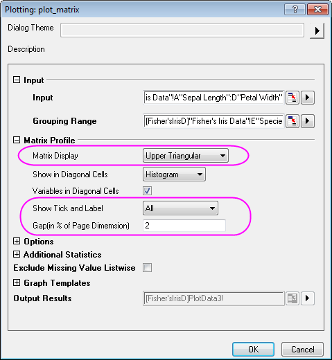
- To hide the layers below the diagonal in the Scatter Matrix graph, click on the green lock icon on the upper-left corner. Select Change Parameters to bring up the Plotting: plot_matrix dialog.
- Under the Matrix Profile branch of the dialog:
- Select Upper Triangular from the Matrix Display drop-down list
- Select All from Show Tick and Label drop-down list
- Enter 2 in the Gap (in % of Page Dimension) text box
The complete graph should appear as shown below:
|