4.1.6 Cluster GadgetCluster-Gadget
Summary
Origin supports the Cluster Gadget to perform simple statistics on a region of interest (ROI) in a graph. The gadget can also be used to edit, clear, mask, or categorize data points. The statistics results are dynamically updated as the ROI object is moved or resized.
Minimum Origin Version Required: Origin 2016 SR0 (Pro only)
What you will learn
- How to perform simple statistics on a region of interest (ROI) in a graph.
- How to edit the data points such as clear, or mask points in graph using menu options or buttons.
- How to view or output the statistic for points inside and outside of the ROI.
- How to categorize data points and color map points with the categorical data
Perform basic statistics
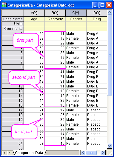
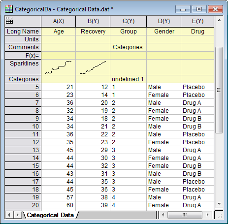
- Start with a new workbook and import the Origin sample data Categorical Data.dat which is located in <Origin Program Folder> \Samples\Graphing.
Right-click on Col(D) and select Sort Worksheet: Ascending.
Then you will see the worksheet is sorted by the category of Drug.
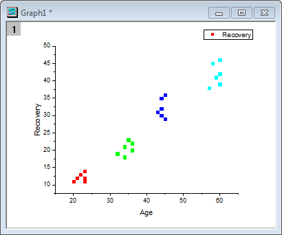
- Pressing Ctrl key, highlight three parts of the Col(B) separately.
- Select Plot: Basic 2D: Scatter from the main menu to create a graph. The graph with three plots display the recovery for each drug.
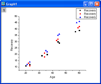
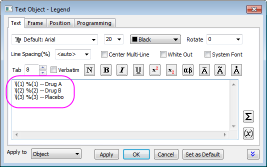
- Right-click on the graph legend and select Properties to open Object Properties dialog. Then edit the legend as shown below. Click OK button.
- Select Gadgets: Cluster from the Origin menu to bring up the Cluster: addtool_cluster dialog box. Choose Circle in the Shape drop-down list of the ROI Box tab.
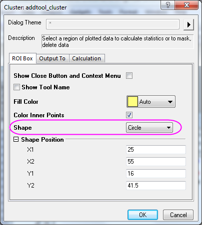
- Click OK button. It will add a yellow circle for ROI on the plot and bring up the Cluster Gadget dialog.
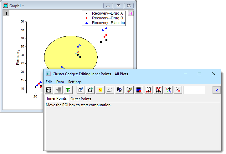
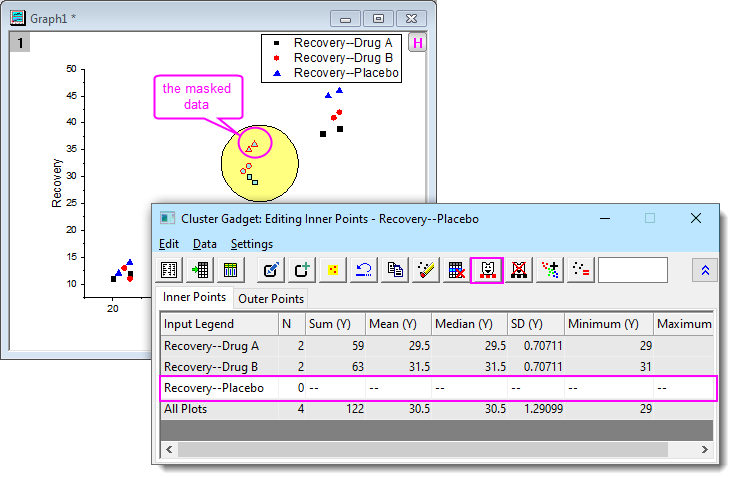
- Move the yellow circle to the region for which you want to get statistics and see the results shown on the Inner Points tab of the dialog.
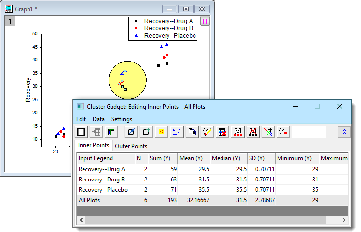
- Click the Output Statistics Report button
 .
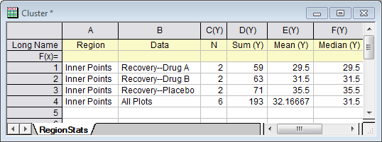
The results are output to the Result Log, Script Window, and the Cluster workbook. .
The results are output to the Result Log, Script Window, and the Cluster workbook.
- Click the Go to Report Worksheet button
 , then the Cluster workbook will be shown. , then the Cluster workbook will be shown.
 | If you have Origin 2021b or later, you have more options for the ROI shape. In the addtool_cluster dialog, set Shape to Arbitrary Shape. When you click OK, a small Create ROI dialog opens in which you can click on a shape button and -- without closing the Create ROI dialog -- drag out a shape on your graph. Keep this dialog open until you get the ROI that you want and then click Done. That will open the Cluster Gadget.
Also note that the Cluster Gadget toolbar now has buttons to Modify ROI and Add New ROI (for adding multiple ROIs to the graph).
|
Exclude the data points in a cluster
In this section, we will show you how to exclude a specific plot from the cluster.
Based on the example above, we will do simple statistics on Recovery of Drug A and Recovery of Drug B, excluding Recovery of Placebo.
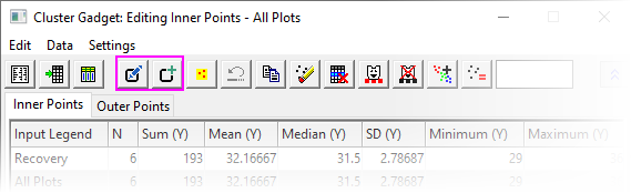
- Click the Data menu in the Cluster Gadget dialog and uncheck Plot(1) and Plot(2). The first and second rows become gray in the lower panel, and they can no longer be manipulated by the buttons in the dialog.
- Click Mask Data Points button
 .
The Recovery of Placebo data points in the ROI are masked and the color becomes red. At the same time the statistics results for Recovery of Placebo become missing values. .
The Recovery of Placebo data points in the ROI are masked and the color becomes red. At the same time the statistics results for Recovery of Placebo become missing values.
- Click the Output Statistics Report button.
The results are output to the Result Log, Script Window, and the Cluster workbook.
Get statistics results for points outside of the ROI
- Click Settings: Preferences from the Cluster Gadget dialog's menu to open the Cluster Manipulation Preferences dialog.
- Go to the Calculation tab. Check the Calculate Outer Points box.
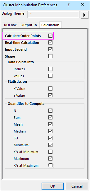
- Click the OK button, the statistics results for points out of the ROI are shown on the Outer Points tab of the dialog.
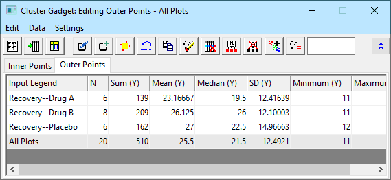
- Click the Output Statistics Report button.
The results for inner and outer points are shown in the Result Log, Script Window, and the Cluster workbook.
Color data points in different regions
You can categorize data points from graph directly and output the Categorical group column to the source worksheet, and further map symbol characters to the categorical group column.
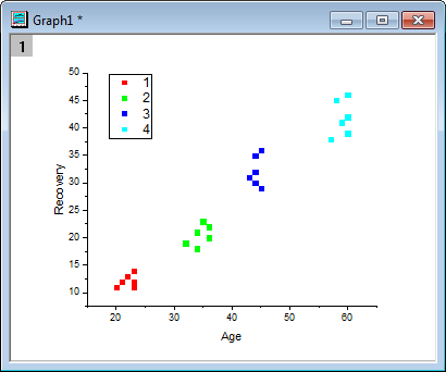
Create a new workbook and re-import the sample data <Origin Program Folder>\Samples\Graphing\Categorical Data.dat. Highlight Column(B) and plot a Scatter graph.
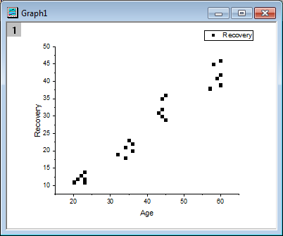
Data points cluster into 4 groups. We will use the Create Categories feature of Cluster Gadget to create a categorical column according to the cluster groups and map symbol color to this column.
- Select Gadgets: Cluster to bring up the Cluster: addtool_cluster dialog. Choose Circle in the Shape drop-down list of the ROI Box tab.
Click OK button to add a yellow circle for ROI on the plot and bring up the Cluster Gadget dialog.
- Move and adjust the size of the ROI box to circle only the first cluster of data points at the low-left corner.
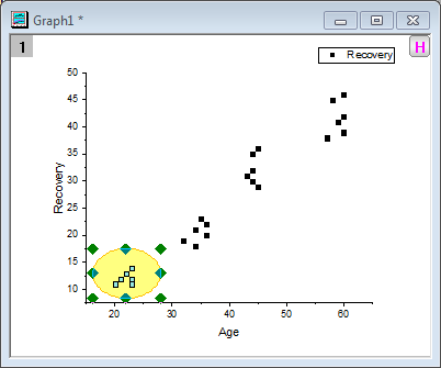
Click the Create Categories button  on the Cluster Gadget dialog to open the Create Categorical Value dialog. Enter Group for Category Group Name and 1 for Category. Select the Color Data by Category check box. on the Cluster Gadget dialog to open the Create Categorical Value dialog. Enter Group for Category Group Name and 1 for Category. Select the Color Data by Category check box.
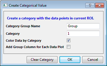
Click the OK button. A new categorical column named "Group" is added to the source data sheet and data points inside ROI are tagged as "1" in this column(Group). Also, scatter plot use this categorical column as the color index.
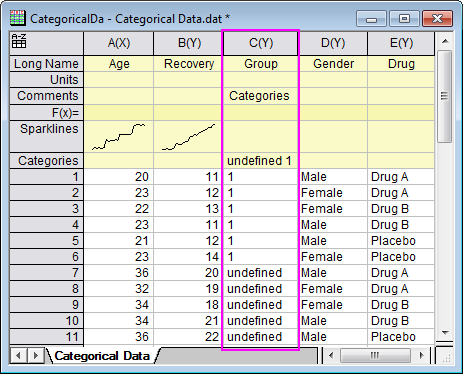
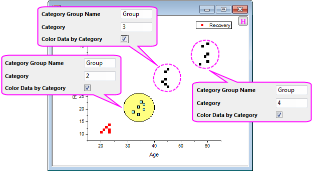
- Repeat step 2 for the rest of 3 clusters and tag them as 2, 3, 4 in sequence.
The source worksheet should look like the following.
Close the Cluster Gadget.
- Now you will find the graph shows as below:
- Delete the original legend. Select Graph: Legend: Categorical Values to bring up the legendcat dialog. Uncheck the Show All Categories checkbox. Click OK. The scatter plot with new legend should look like following.
|