6.8.6 Create Heatmap with Virtual Matrix and Colormap Bar PlotHeat-Map-Virtual
Summary
This tutorial create two kinds of graph, a Heatmap Plot based on a virtual matrix together with a Bar Plot with Color Map, and merged them together.
Minimum Origin Version Required: 2015 SR0
What you will learn
This tutorial will show you how to:
- Create Heatmap Plot based on an Virtual Matrix.
- Create Bar Plot with Colormap.
- Merge the Heatmap Plot and Bar Plot together.
Steps
Create Heatmap Plot from Virtual Matrix
This tutorial is associated with <Origin EXE Folder>\Samples\Tutorial Data.opj.
- Open the Tutorial Data.opj and browse to the folder Heatmap and Virtual Matrix Manager. Open workbook Electricity Usage with first sheet active.
- The XYZ mapping of workbook is shown in graph below, this will help you to understand how the Heatmap plot is created in next steps:
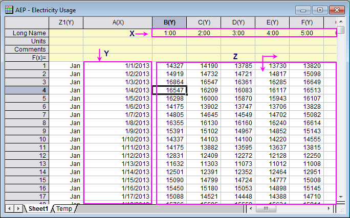
- Highlight all cells in Z region by selecting the Cell in Column(B)-Row 1, then pressing CTRL+SHIFT+END. Click Plot > Contour: Heatmap in main menu to open the plotvm dialog for Heatmap plot.
- Specified the X, Y ranges as shown in graph below.
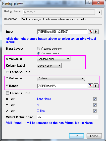
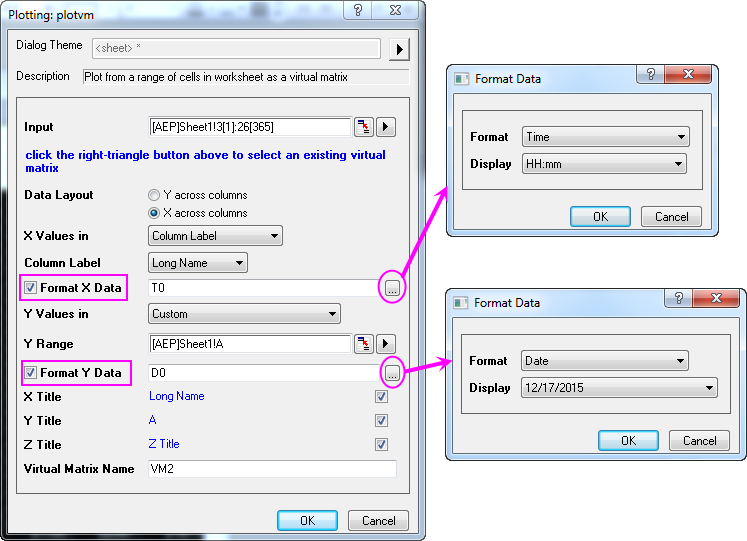
- In this dialog, check Format X Data and Format Y Data check boxes, click the button
 respectively to format X and Y data following the image below, then click OK to close the dialog. respectively to format X and Y data following the image below, then click OK to close the dialog.
- The tick labels in Y axis are too dense to be seen, so now we are going to change that. Double click the axis in the graph to open the Axis dialog:
- Select Left icon in Tick Labels tab, go to Display tab, select Date as the Type, and set Display drop-down list to Dec(Current Month), click Apply to save the setting.
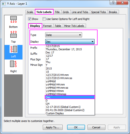
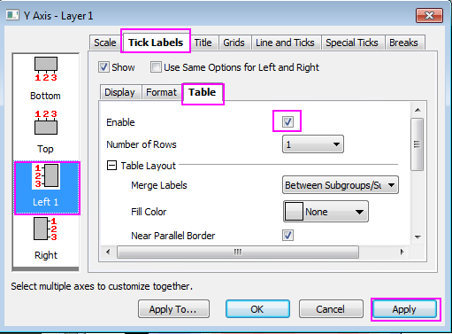
- Go to the Table tab, check on Enable box, click Apply to save. You will find that the month names are shown as tick labels for Y axis in the form of a table.
- Next, we will specify the scale and tick labels for X axis:
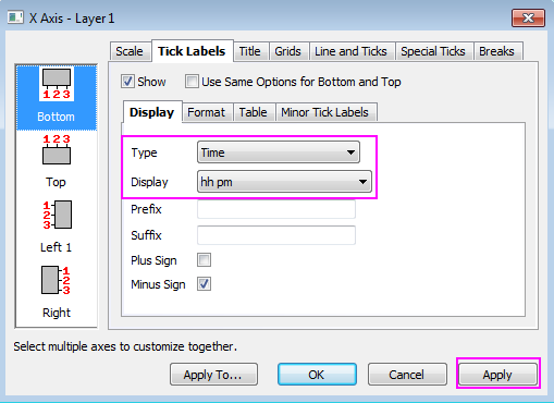
- Go to Bottom icon in Tick Labels tab, and make sure Time is selected as the Type in Display tab, change the Display to hh pm, click Apply to save the setting.
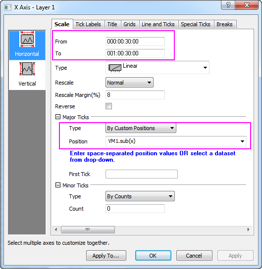
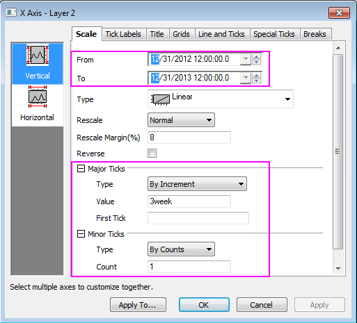
- Go to Horizontal icon in Scale tab, make sure the settings resemble the screenshot below, click Apply to save the setting. Click OK to close the dialog. Remove the title for X axis.
- Click the tick labels for both XY aixs in the graph, change the font size to 10 via Format Toolbar.
- Select Format: Plot in main menu with Heatmap graph active.
- Set the Level for Colormap follows the graph below:
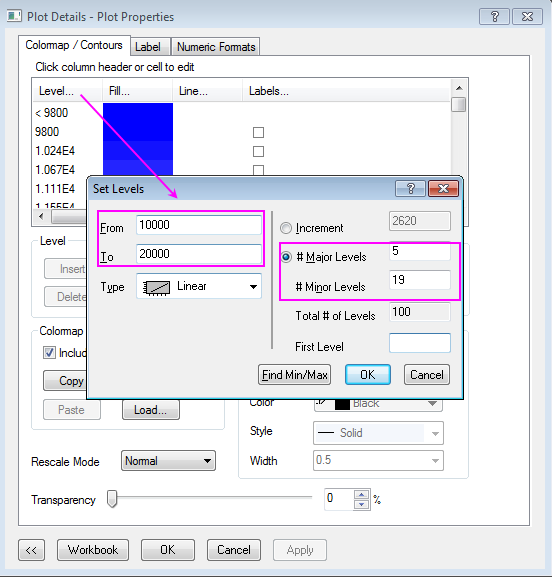 - Click OK to close the Set Levels dialog
- Click the Fill color of the Colormap on head cell(blue area) to set Fills follows the graph below:
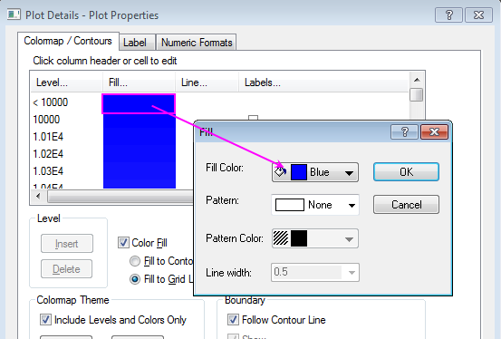
- Scroll down to the Colormap tail, set its fill color to red in the same way.
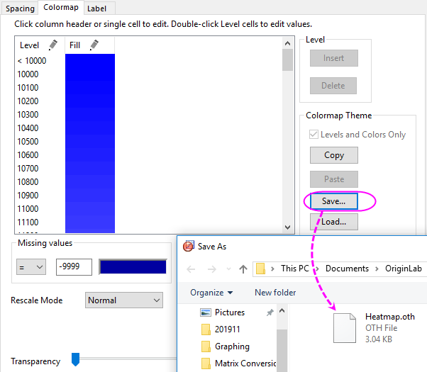
- Click Save in Colormap/Contours tab to save the pattern as heatmap.oth which will be used in the second parts of the graph.
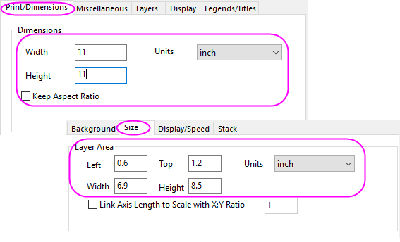
- In the Plot Details dialog, click the first tree node in left panel (should be Graph1 by default), change page size to 11*11 inch in Print/Dimensions tab, click Apply, then in the left panel, select the sub tree node for Layer1, go to the Size/Speed tab, change the Layer area follows graph below, click OK to apply the settings and exit the dialog:
- We will turn off the speed mode by click the
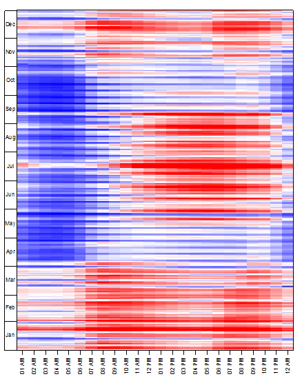
 in Graph Toolbox to view the graph with higher resolution. The finished graph for Heatmap should be similar to the graph below: in Graph Toolbox to view the graph with higher resolution. The finished graph for Heatmap should be similar to the graph below:
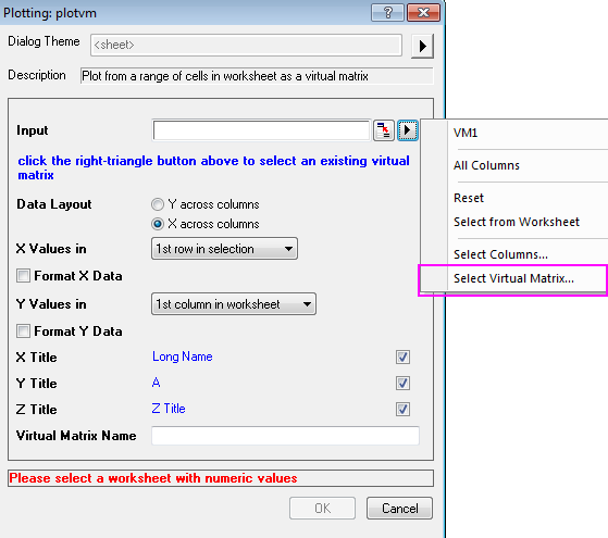
 | Once the Virtual Matrix were created, they will be saved internally. You can browse them in Virtual Matrix Manager. The saved Virtual Matrix can be used for Contour/Heatmap/3D surface plot directly, you can select the virtual matrix from the input box of the plot dialog as shown in graph below:
|
Create the Bar Plot with Colormap
- Go to the Temp sheet in Electricity Usage workbook, highlight the worksheet and select Plot > Basic 2D : Bar in main menu to create a Bar plot.
- Now, we will defined the style of axis:
- Double click the axis to open the Axis dialog, change the Scale of axis (X) follows the graphs below in Vertical page of the Scale tab.
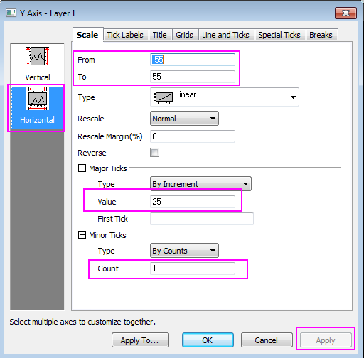
- Then, change the Scale for axis(Y) in Horizontal page from -55 to 55 with Major Ticks value 25 and Minor Ticks counts 1, then click Apply.
- We will also hide the line and ticks for X axis in Line and Ticks tab by uncheck the box of Show Line and Ticks. Besides, grids can be hide by using similar ways in Grids tab.
- Click OK to close the dialog.
- Change the Y axis title to CDD/HDD by double clicking on the Y title object and entering the in-place edit mode. Delete the ticks labels and axis title of X axis by select it and hit Delete key.
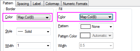
- Next, we will create the Colormap for the graph, the Colormap theme should be identical to the Heatmap created before. Click the Format: Plot in main menu to open the Plot Details dialog:
- Set the color for both Border and Fill as Map:Col(B).
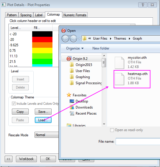
- Go to the Colormap tab, load the heatmap.oth as Colormap Theme.
- Click the Level of the Colormap to set Levels follows the graph below:
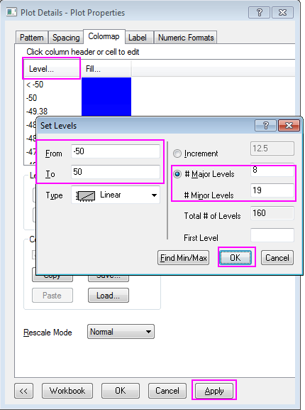 - Click OK to close the Set Level dialog and Click Apply in Plot Properties dialog to save the settings.
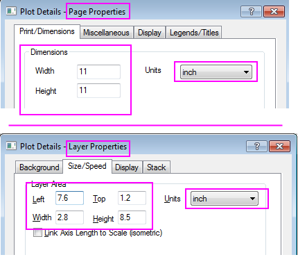
- In the left panel, select the first tree node (by default, Graph2), change page size to 11*11 inch in Print/Dimensions tab, click Apply, then switch to the Layer1 tree node and go to the Size/Speed tab, change the Layer area follows graph below, then,click OK to close dialog:
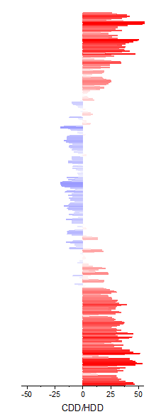
 - The finished bar plot is similar to the graph below:
Merge the Heatmap Plot with Bar Plot and More Customization Steps
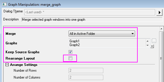
- Select Graph: Merge Graph Window in main menu with Heatmap graph active, merge Graph1 and Graph2 together, the Rearrange Layout should be unchecked, click OK to apply the setting.
 Then, you will resize the size of the merged graph (Graph3), click Format: Page >> Print/Dimensions tab, change the page size to 11*11 inch again, click OK. Click CTRL+W to adjust the graph view.
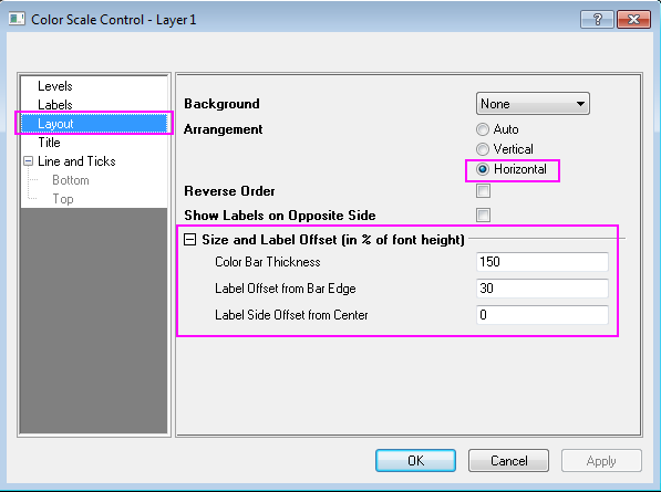
- Specify the style of the color scale:
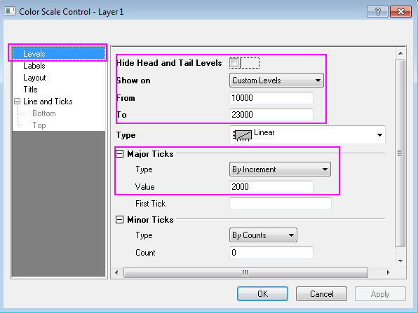
- Double click the color scale to open the Color Scale Control dialog, set the Levels page as shown in graph below:
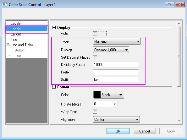
- Set the Labels page as shown in graph below:
- Set the Layout page as shown in graph below:
 - Click OK to apply the settings, drag the outline of the color scale in the graph to reach a proper size and location.
- Select the unwanted axis title or legend and delete them, add text object with graph information by using text tool.
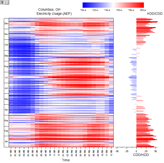
The finished graph is similar to the graph below:
|