Origin 2017 Feature Highlights

Ease of Use
Origin Central Startup Dialog
The Origin Central dialog helps users to get started with Origin. The dialog opens upon launching Origin 2017
Three sections are available in this dialog:
- Open
- View and open graph and analysis samples. Follow the instructions in the sample or replace with your own data to see graph and analysis results update
- Open blank workbook or matrix book tailored to your needs
- Open Existing Files
- Open existing Origin files (opj, ogw, otw, ogg)
- Resources
- Review Apps, tutorials, and videos
- Get new updates
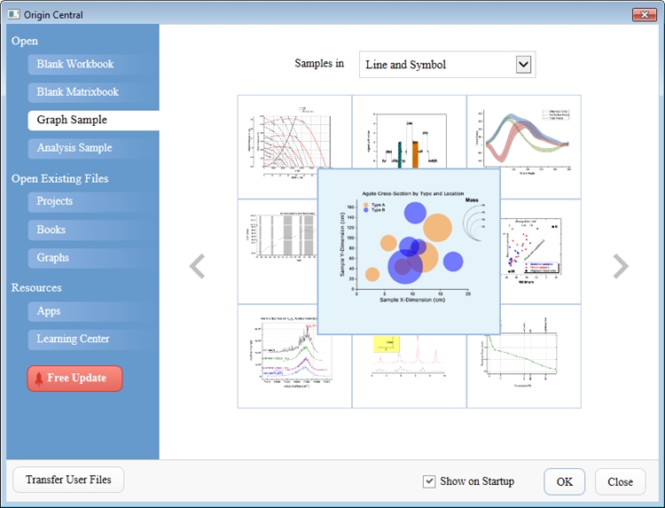
The Origin Central dialog opens upon launching Origin 2017. It provides a lot of graph and analysis samples, together with Apps, plus a list of Videos and Tutorials to help the user to get started with Origin.
New Plot Menu with Large Icons
Origin 2017 features a rearranged Plot menu with large icons, which helps users to quickly find the graph type they need.
Mouse over the group icon to view all graph types of the group
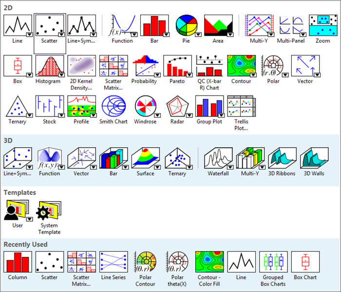
New Plot Menu with Large Icons
Simpler Column/Cell Notation for Column Formulas 
Origin 2017 introduces Excel-like spreadsheet cell notation to be used in defining column formulas.
- Auto- column short naming as columns are added, deleted or moved.
- Compatible with Origin’s older column formula notation.
- New column formula notation is similar to Excel or Google Sheets. For instance:
- B, C - column B and C
- B1 - 1st cell in column B
- 2!B - column B of sheet 2
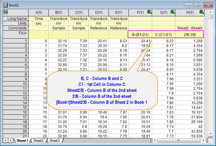
Excel-like spreadsheet cell notation to be used in defining column formulas. Whenever this notation system is turned on for a workbook, a small A to Z icon will appear in the upper left hand corner of the workbook. With this notation, the column short names follow alphabetic orders and are not renamable. Column Formulas have now been significantly shortened and can be written in a similar fashion to Excel and Google sheets
Graphing
Using grouped data, you can create various types of trellis plots in Origin 2017:
- Scatter
- Line and Symbol
- Bar
- Column
Flexible configuration and customization options include:
- Add, delete, or modify horizontal and vertical panel columns
- Wrap panels
- Overlap panels
- Add gap between panels
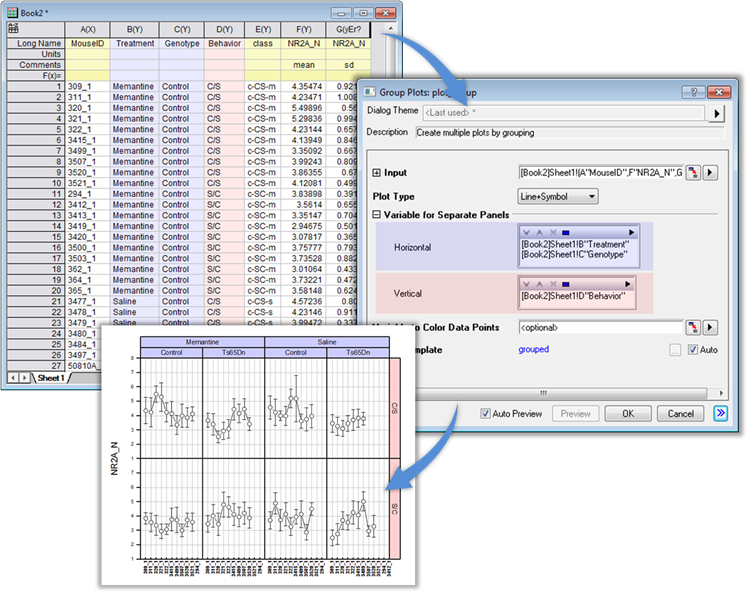
The user can easily create multi-panel graphs from grouped data with the new Trellis plot.
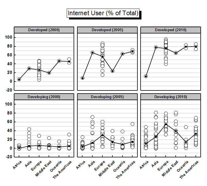
This example shows a trellis line + symbol plot of internet usage, with two variables -- development index and year -- defining the panel structure.
By default, this arrangement would be plotted as a single row with six panels. However, we can set options to wrap the panel if columns/rows exceed 3 and by doing so, the graph becomes a 3*2 panel trellis plot. Further, we used combined grouping information to generate the panel title.
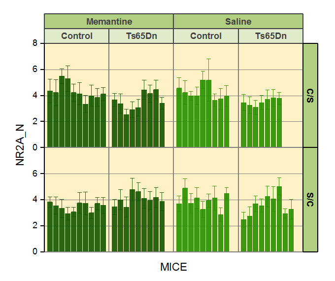
This is an example of a trellis column plot with error bars. In the trellis plot, the horizontal panels are defined by two grouping variables, treatment (Memantine v.s. Saline) and genotype (Control v.s. Ts65Dn), and the vertical panels by one grouping variable, behavior (C/S v.s. S/C).
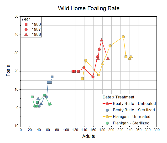
The example shows a trellis plot with the Overlap Panels option enabled. Two variables, Location and Treatment, are used to define the horizontal panels. This results in a four-panel horizontal array. By enabling the Overlap Panels option, we combine four panels into one while preserving the grouping information. Note that plot symbol color is indexed to the four Location x Treatment combinations and symbol shape is indexed to Year, as shown in the plot legends.
Origin 2017 supports 3D stacked bars and 100% stacked bars. In addition, different bar shapes are also supported for 3D bars.
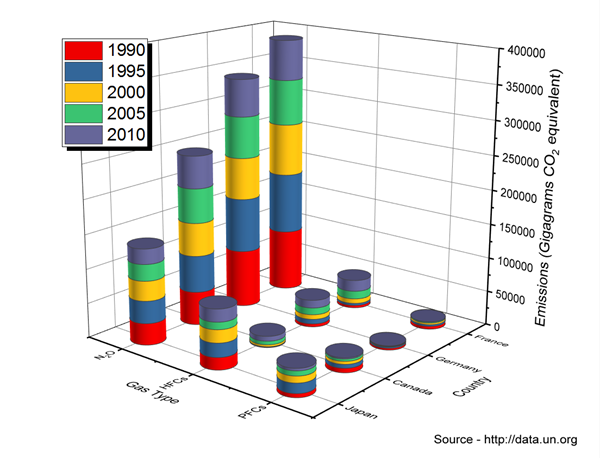
This is a 3D Stacked Bars plot, with bar shape set to Cylinder. The plot tracks emissions of three classes of greenhouse gases, in the countries of France, Germany, Canada and Japan, over the period from 1990 to 2010.
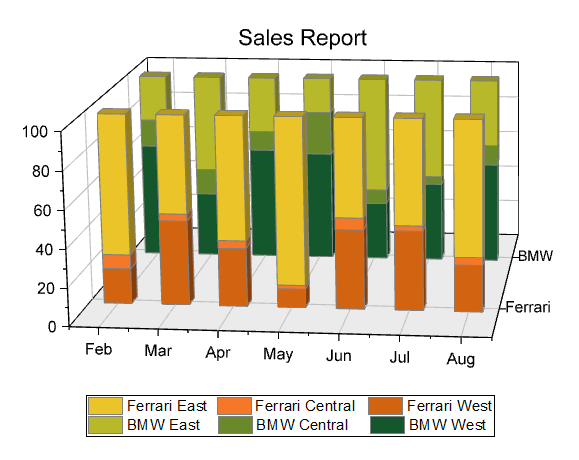
This is an XYY 3D 100% Stacked Bars plot comparing monthly regional sales, for two makes of automobile (BMW and Ferrari).
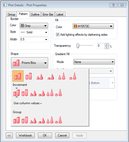
More shapes are supported for 3D bars in Origin 2017
Annotation Tool Improvements
- New Annotation dialog with more controls.
- ALT + drag a dynamic label object from point to point.
- Annotation Tool button is now easier to locate in the Tools toolbar.
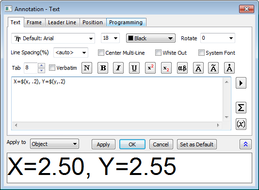
The new multiple-tab annotation dialog which provides more controls, Text, Frame, Leader line, Position and Programming.
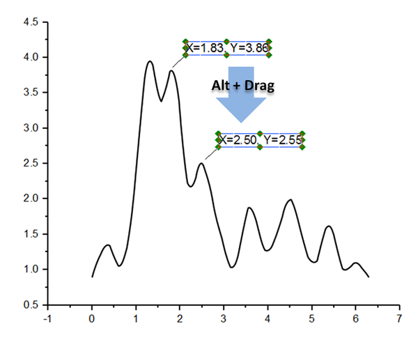
The user can hold the Alt key and drag the annotation object to another data point and the object will be automatically updated with the new coordinate information.
LaTeX Support in Graph and Worksheet
Requires installing the 2017 LaTeX App, available from the OriginLab File Exchange:
- Add LaTeX equations to worksheet metadata area (e.g. Long Name, Units, Comments, etc.), using a \q() escape sequence. LateX equation will appear in axis titles and legend
- Select the column label row and set Data Style to Rich Text to render LaTeX objects in worksheet cells
- Add fitting function equations to graphs using a button in the App
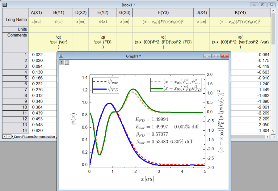
Worksheet column label row cells can display and store LaTeX strings. These strings can then be easily added to graph text objects, such as graph axis titles and legends.
In addition, an equation has been added using the free LaTeX App available from the OriginLab File Exchange. If you have MathType™ installed on your computer, you can use the Insert Equation button in the Tools toolbar to insert equations using MathType.
Box Plot Improvements
Origin 2017 adds two variations for box plots -- statistics bar and line series -- both with flexible customization options.
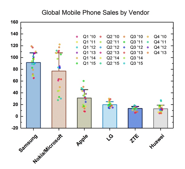
This graph displays a bar chart with data points overlapped. The bars represent the means of the datasets. Bars can be set to show other quantities (sum, median, max, etc.), using controls on the Box tab of the Plot Details dialog.
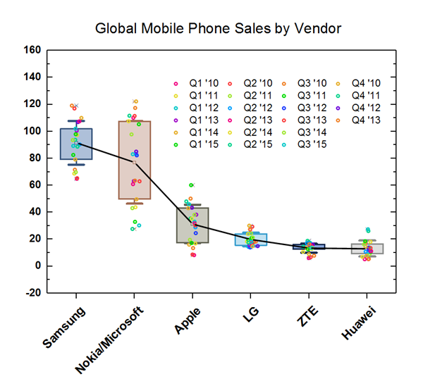
This is a box plot with mean points connected. The user can also connect median points, data points or other percentiles, using controls on the Connect Lines tab of the Plot Details dialog.
Line Series Plot Improvements
Origin 2017 adds a new template for Line Series which is based on box plot, with flexible customization options including setting plot attributes using other columns from the raw data sheet.
Line Series plot based on box chart with box turned off and connecting line added between points. The line color was indexed based on categorical value from another column in the raw data sheet.
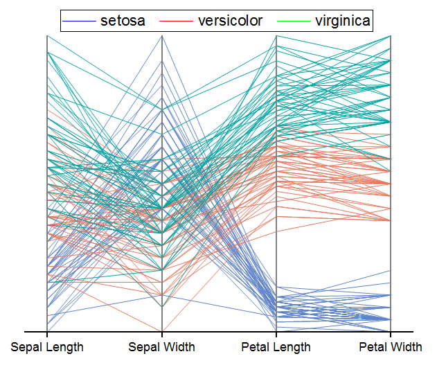
The parallel plot (a.k.a. parallel coordinates plot) is a Line Series plot. It provides an effective graphical summary of a multivariate data set. This particular plot uses Fisher's Iris data to depict size variation in four flower parts among three species. The plot shows that Sepal Length and Width are less characteristic of a particular species whereas Petal Length and Width are fairly characteristic.
More Hatch Patterns
More fill patterns are supported in Origin 2017, including Geology patterns.
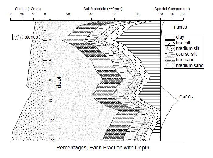
This graph displays the relative quantities of size fractions of unconsolidated sedimentary materials with depth below the ground surface. Hatch (Fill) pattern selection has been enhanced for Origin 2017, including the addition of entirely new "Geology" fill patterns.
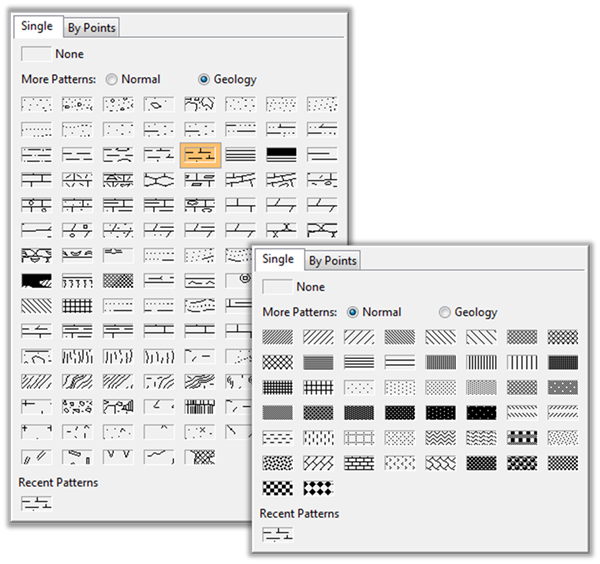
Origin 2017 provides more fill patterns for column, area, contour and box plots, including a large set of standard Geology patterns. In addition, users can add their own patterns as .emf images and those will appear at the bottom of the fill pattern gallery.
Axis Improvements
Origin 2017 introduces several improvements to axis customization.
- Multiple reference lines and shading between lines, in 2D graphs
- More rescale options
- Tick labels can be a combination of column labels
- Leader lines for special ticks
- Wrap tick labels for 3D plots
More Graphing Improvements
- Histograms: Label with bin counts, percentages, or both
- Grouped Plots: Unbalanced subgroups can display grid line separators, or set gaps by dataset
- Support for objects in 3D graphs: Table, image, drawn objects, bubble scale, OLE object
- Dropline direction control for 2D, 3D graphs
- New system colors give your graphs a fresh look
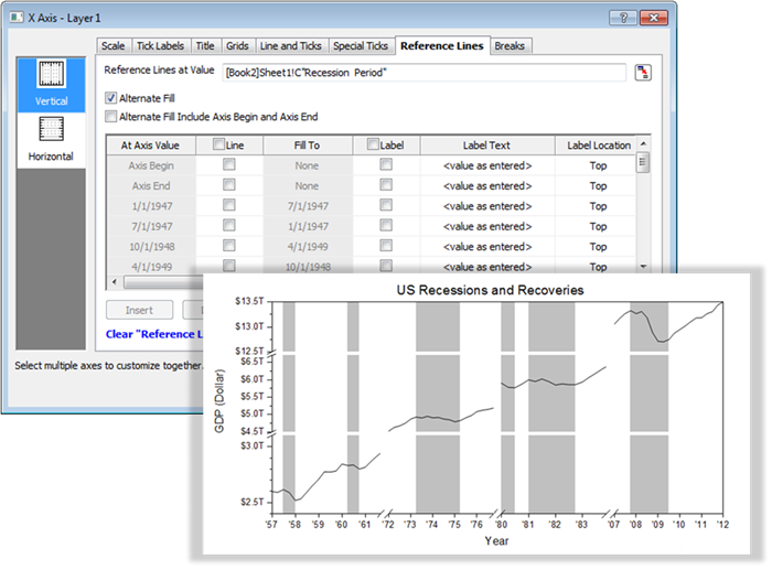
This is a graph of financial data that may be familiar to some Origin users. While this graph could be created with earlier versions, such plots are now much easier to construct thanks to Origin 2017's Multiple Reference Lines and Recession Bars features. A new tab has been added to the Axis dialog. Here, you can add lines at any axis position and then opt to shade the area between them.
Analysis
Curve Fitting
Origin 2017 includes these improvements to nonlinear linear curve fitting:
Statistics
- Two Way ANOVA support for Means Plot
Peak Analysis
- Sequential initialization of parameter values in batch peak analysis
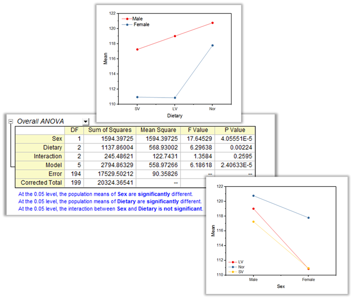
Two-way ANOVA support for Means Plot in Origin 2017. It helps user to visually compare the means.
Programming
Origin C now supports using HTML control for building a more flexible and sophisticated dialog box that interacts with Origin. Origin graphs can be placed on the HTML control with arbitrary positioning.
In order to access and control the elements in the HTML dialog, Origin provides methods for Origin C calling JavaScript and JavaScript calling Origin C.
Origin 2017 is able to directly communicate with an individual instance of the Mathematica application that has been launched directly.
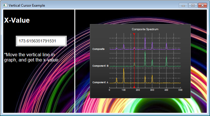
The example displays a dialog box created with HTML. In this example, the user moves a vertical line on an inset graph. The dialog then interacts with Origin, calling JavaScript to read the X coordinate of the plot where it intersects the vertical line.
Support Full NAG Mark 25 Library
Origin has includes all functions from NAG C LIBRARY since version 8. These functions can be easily accessed from your Origin C functions. In Origin 2017, the NAG library has been updated to the latest version, Mark 25. Over 500 new functions have been added.
For more details, please refer to the release notes: Origin 2017 NAG changes.
Apps
Apps Gallery Tabs
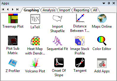
You can browse Apps in Origin File Exchange website and drag-and-drop the package into Origin workspace to install.
The Apps Gallery in Origin 2017 supports multiple tabs. The user can add, rename, arrange and delete tabs, as needed. Additionally, you can show installed Apps on any tab (incl. "All" tabs) by right-clicking on the App icon in the Apps Gallery and choosing Tab Views.
New Apps for 2017
*: Apps marked PRO require OriginPro.
Simple Time Series Analysis PRO
Perform simple time series analysis including autocorrelation, cross correlation, differencing and single exponential smoothing.
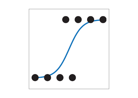
Logistic Regression PRO
Perform logistic regression analysis including binary logistic, multinominal logistic and ordinal logistic.
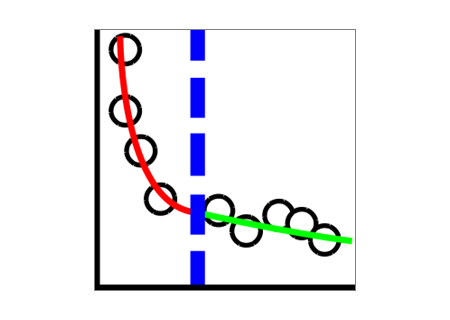
Piecewise Fit PRO
Perform fitting on 2 or 3 segments of a data plot with same or different fitting function for each segment.

SMILES to Image PRO
Generate images of molecules in a worksheet column based on SMILES or InChI strings.

LaTeX
For Origin 2017 the app is improved to support adding LaTeX fitting function equations to graphs.