Pareto-Diagramme erstellen
Create-Pareto-Chart
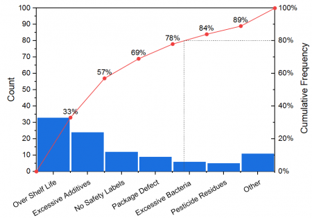
Das Pareto-Diagramm ist ein spezieller Typ des Balkendiagramms, das mit einem Punkt-Liniendiagramm kombiniert ist. Normalerweise sind die vertikalen Balken, deren Höhe durch die Häufigkeit oder den Einfluss der Probleme wiedergibt, in absteigender Reihenfolge nach Bedeutung geordnet und das Punkt-Liniendiagramm in monotonisch aufsteigender Reihenfolge.
Pareto-Diagramme können verwendet werden, um Faktoren zu identifizieren, die den größten kumulativen Effekt auf das System haben. Deshalb ist es hilfreich, die weniger signifikanten Faktoren in einer Analyse auszulesen.
Pareto-Diagramm aus eingeteilten Daten und Rohdaten erstellen
Entsprechend den unterschiedlichen Quelldaten unterstützt Origin das Erstellen dieser beiden Pareto-Diagramme:
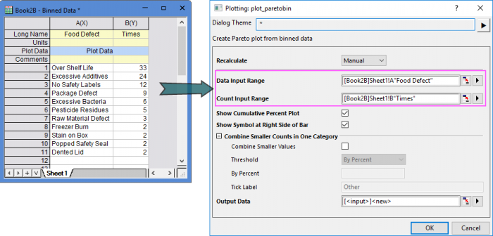
Eingabedaten: Eingeteilte Daten
Wenn Sie bereits eingeteilte Daten haben, können Sie ein Pareto-Diagramm aus ihnen erstellen, indem Sie im Menü Zeichnen: 2D: Pareto: Pareto-Diagramm - Eingeteilte Daten wählen oder auf die Schaltfläche Pareto-Diagramm - Eingeteilte Daten  auf der Symbolleiste 2D-Grafiken klicken. Der Dialog plot_paratobin wird geöffnet. auf der Symbolleiste 2D-Grafiken klicken. Der Dialog plot_paratobin wird geöffnet.
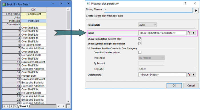
Eingabedaten: Rohdaten
Wenn Sie Rohdaten haben, können Sie ein Pareto-Diagramm erstellen, indem Sie im Menü Zeichnen: 2D: Pareto-Diagramm - Rohdaten wählen oder auf die Schaltfläche Pareto-Diagramm - Rohdaten  auf der Symbolleiste 2D-Grafiken klicken. Der Dialog plot_paratoraw wird geöffnet. auf der Symbolleiste 2D-Grafiken klicken. Der Dialog plot_paratoraw wird geöffnet.
Bedienelemente zum Zeichnen
Diagramm mit kumulativen Prozent zeigen
Legen Sie fest, ob die kumulativen Prozent als Punkt-Liniendiagramm auf dem Pareto-Diagramm gezeigt werden sollen.
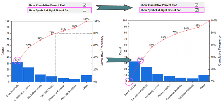
Symbol rechts vom Balken zeigen
Legen Sie fest, ob das Punktdsymbol rechts vom Balken gezeigt werden soll. Hinweis: Dieses Punkt-Liniendiagramm beginnt beim Ursprung (0,0). Der Punkt befindet sich auf der rechten Seite des Balkens, falls Sie das Kontrollkästchen aktiviert haben.
Kleinere Anzahlen in einer Kategorie kombinieren
Legen Sie fest, ob die Daten kombiniert werden sollen, deren Anzahlen unter einem Schwellenwert liegen.
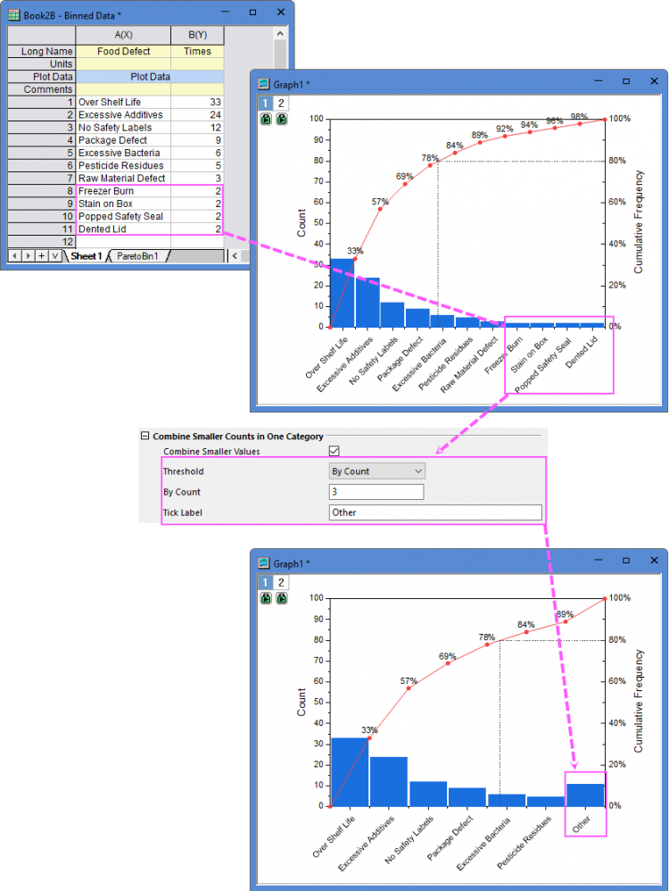
Kleinere Werte kombinieren
Aktivieren Sie die Kombination der festgelegten kleineren Werte der Anzahlen fest.
Schwellenwert
Legen Sie fest, wie der Schwellenwert definiert werden soll: Nach Prozent, Nach Anzahl oder Nach Balkenanzahl.
- Nach Prozent: Legen Sie einen Prozentwert als Schwellenwert fest, um die Daten zu kombinieren, deren Prozentsatz kleiner ist als dieser Wert.
- Nach Anzahl: Legen Sie einen Wert für die Anzahl als Schwellenwert fest, um die Daten zu kombinieren, deren Anzahl kleiner ist als dieser Wert.
- Nach Balkenanzahl: Geben Sie eine Balkenanzahl als Schwellenwert ein, um festzulegen, wie viele Balken in dieser Zeichnung enthalten sind.
Schwellenwert
Geben Sie den Schwellewert entsprechend der Auswahl in der Auswahlliste Schwellenwert ein.
Beschriftung der Hilfsstriche
Geben Sie einen Beschriftungstext für den Kombinationsbalken ein.
|