Origin 2018 Feature Highlights

App Center 
New dialog to manage Apps from within Origin:
Browse available Apps, search for Apps using keywords and phrases, and install or update Apps with a single click.
Preview Origin Graphs in Windows Explorer
Easily identify an Origin project visually in Windows Explorer:
- Large or Extra Large icons view will display image of last activated graph when project was saved
- Preview displays larger image of graph
- Preview has vertical scroll bar to view images of all graphs within the project
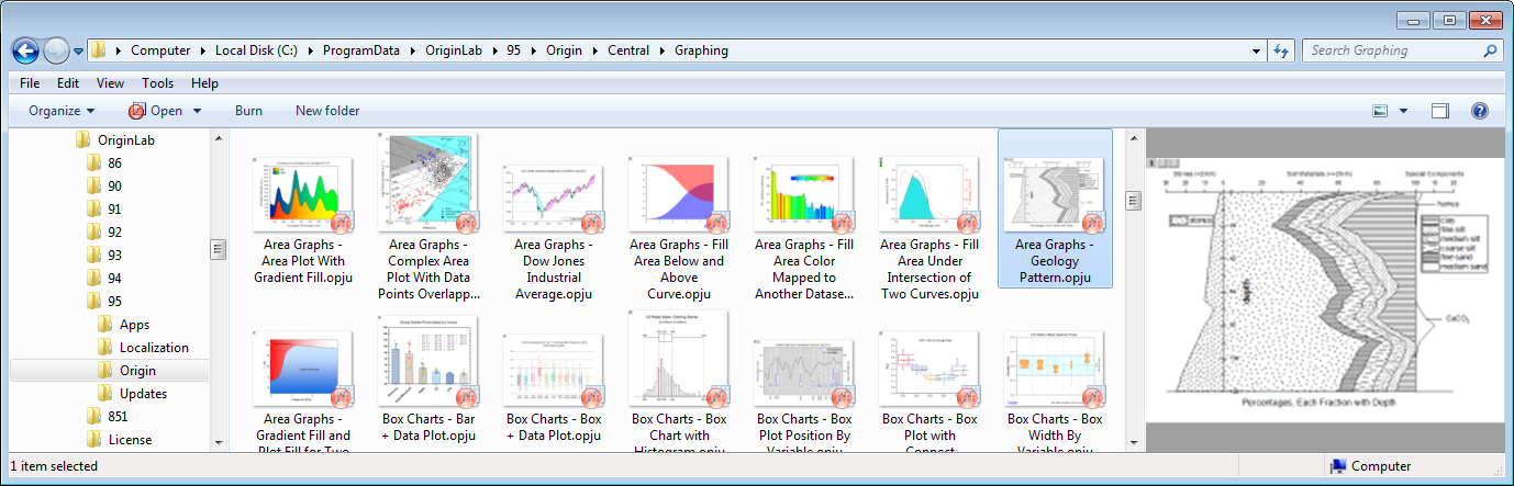
Origin Project files(OPJU) viewed in Windows Explorer. Middle panel shows large icons with image of last visited graph when project was saved. Right side panel shows larger image of graphs with vertical scroll bar to view all graphs contained in the project.
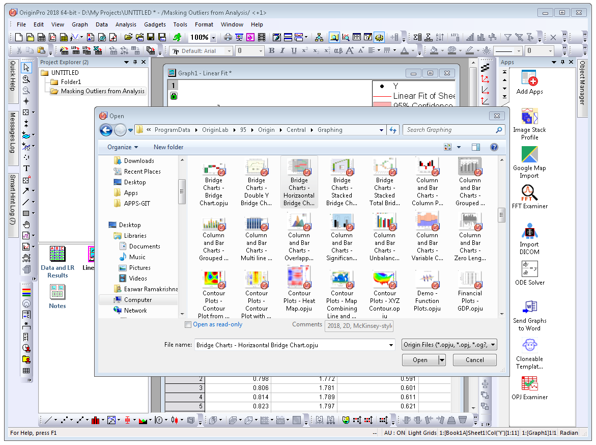
File Open dialog within Origin, where Origin projects are displayed as large icons.
Cell Formula
Set up relationship between cells:
- Works for both Data and User-defined Label Row Cells
- Stretch and extend formula vertically/horizontally
- Fixed cell referencing is supported
- Use script-accessible functions and/or custom expressions
- Results update when source cells change, or with other changes such as data filter
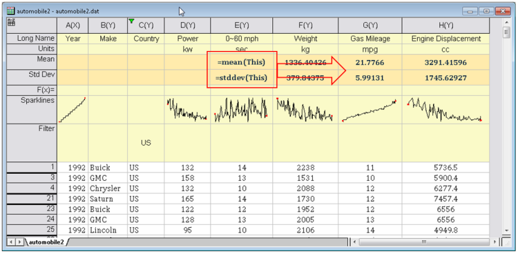
Assign formula to User-defined Parameter Rows to easily set up calculations such as calculating mean and std. deviation as in this example. Enter formula in one cell and drag-and-extend to the right to other cells in adjacent columns.
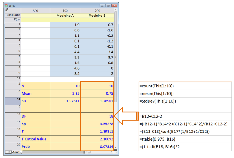
Cell formula in data area of worksheet.
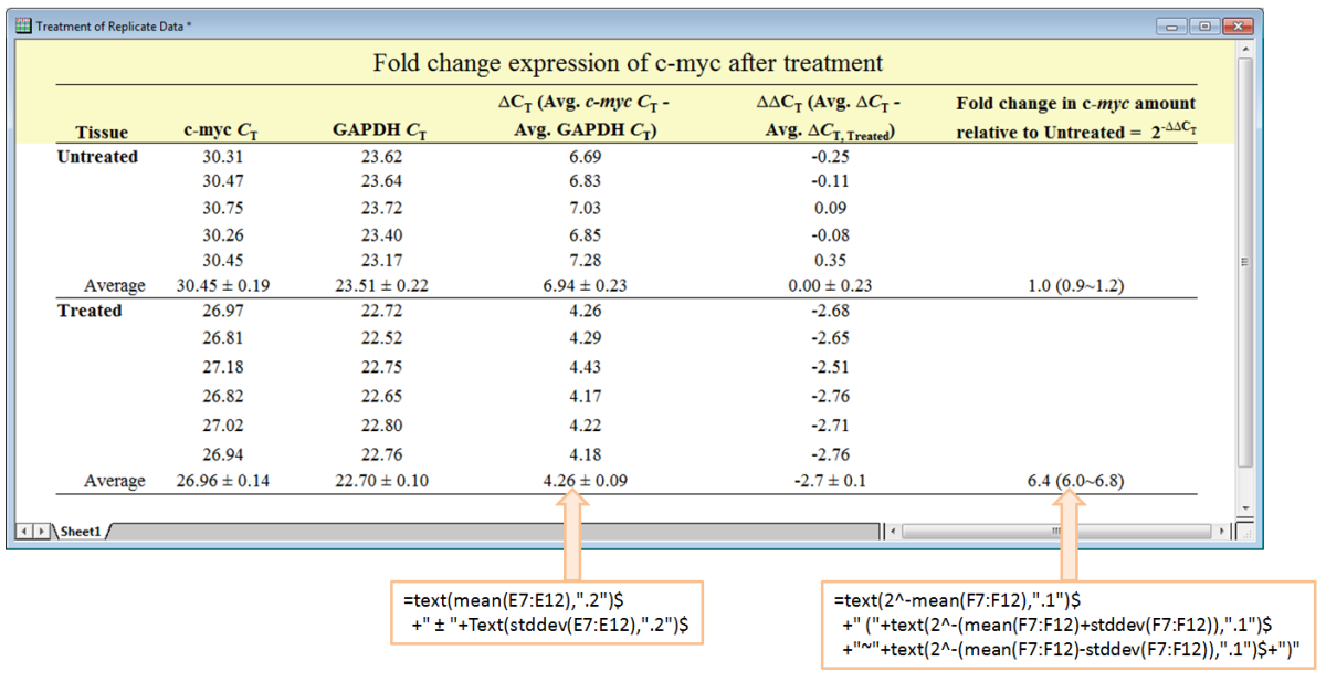
Cell formula supports cell ranges. It also allows combining multiple functions with literal strings or unicode characters to build a custom text expression.
Image Popup
Hover on Sparkline cells or on cells with embedded graphs or images to view a larger size image as pop up.
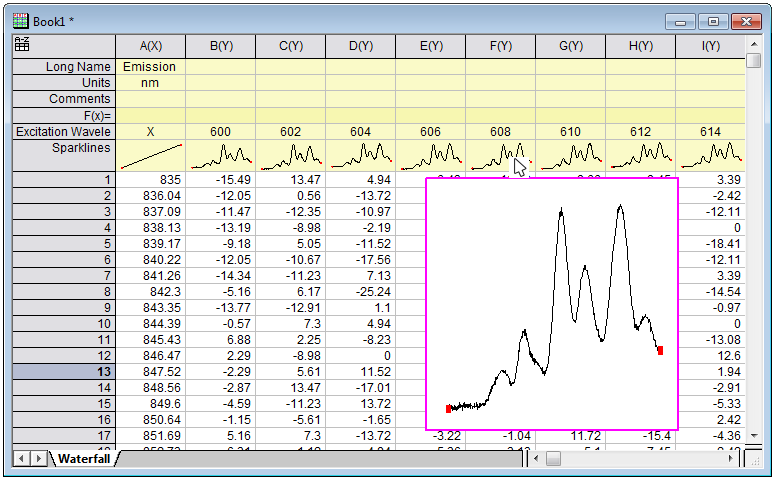
Place cursor over a Sparkline cell to view popup with larger image.
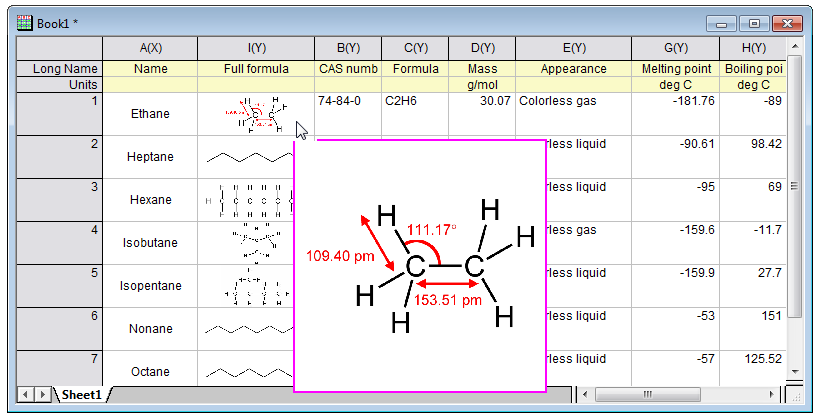
Place cursor over a cell with embedded image to view popup with larger size.
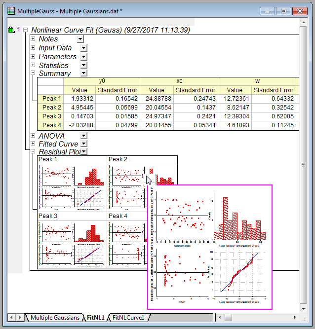
Place cursor over a cell with embedded graph, such as in an analysis report sheet, to view popup with larger size.
Origin Central Dialog Improvements
- An All Plot Types entry in drop-down so you can view mixed graph types
- Search box with support for keywords and phrases
- Unsaved files will be autosaved and accessible from Open Existing Files -> Projects tab.
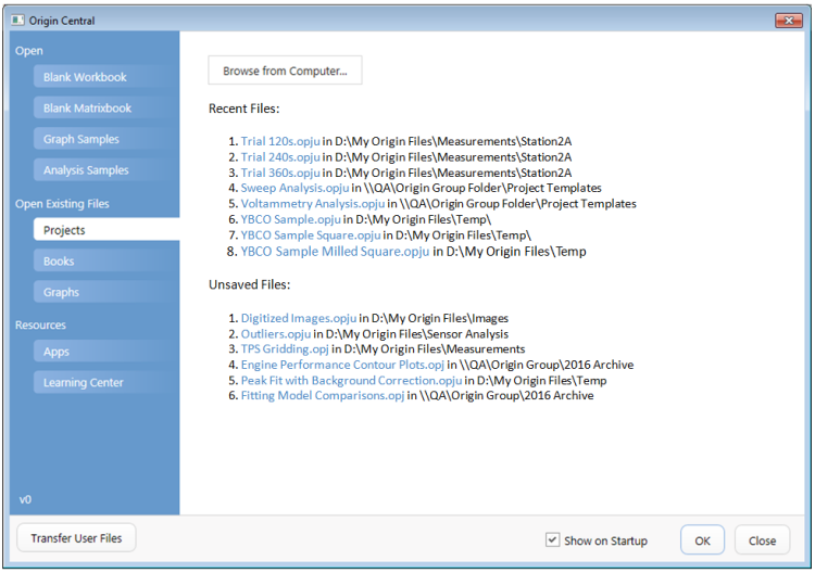
The Projects tab of Origin Central dialog gives you quick access to recently opened Origin projects. Also projects that you recently edited but did not save, are listed under Unsaved Files, allowing you to recover the edited version.
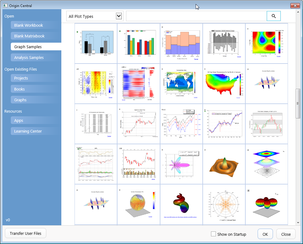
Improved Origin Central dialog allows you to view many more graph samples, as well as search with keywords and phrases.
Reference Lines
Add custom reference lines to your graph:
- Use statistical functions on plotted data, such as mean and standard deviation
- Functions can be combined, such as mean+1.5*sd
- Use custom equations or expressions to add lines based on axis scale values
- Lines are saved in graph template for repeated use
- Lines update when data changes
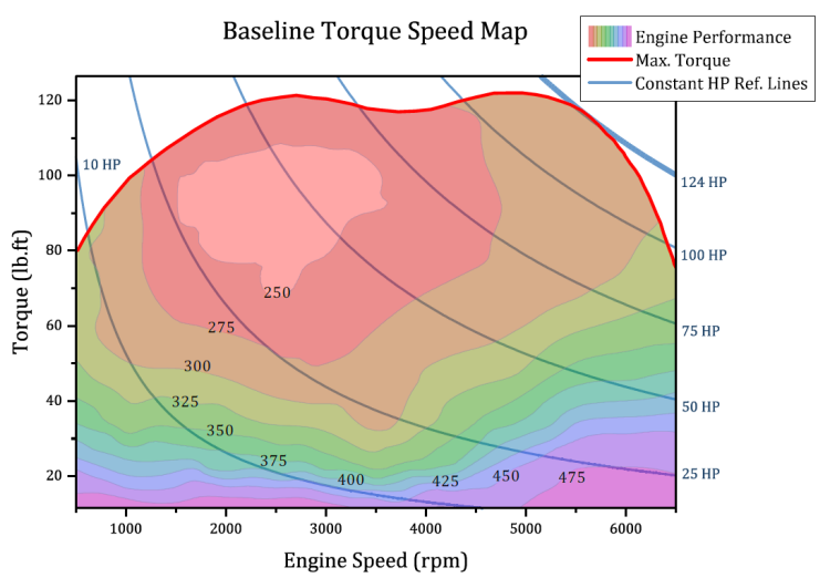
Engine torque speed map where performance is plotted as a contour plot with custom boundary defined by maximum torque line. Reference lines for various horse power values have been added using the expression: Torque=HP*5252/RPM
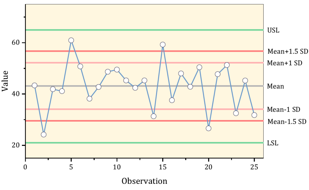
Add reference lines for Mean, +/- SD and other values using statistical functions. The lines are saved with the template, and will automatically update when data changes.
Add reference lines using equations. Graph can be saved as template along with these lines, for repeat use with other data.
This graph also displays arrows at end of axes, which can be added and customized from the Axis dialog.
Bridge Chart
Flexible configuration and customization options include:
- Connecting Lines
- Support for Total
- Assign bar colors based on increase/decrease of value
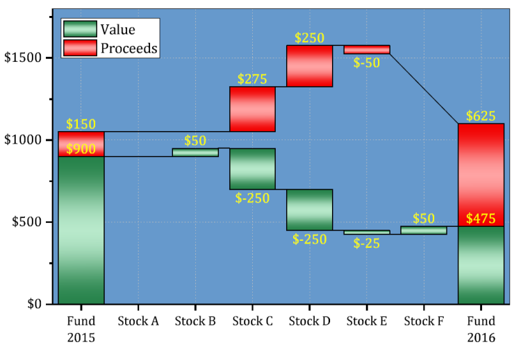
A stacked Bridge Chart displaying Value and Proceeds.
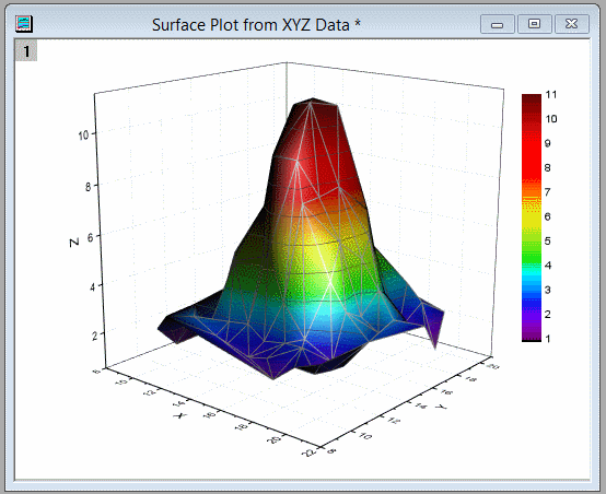
4D XYZ Plot with Custom Boundary
Plot surface data from XYZ columns and then apply color map based on another data column to represent a 4th dimension. The surface can also be limited to a custom XY boundary.
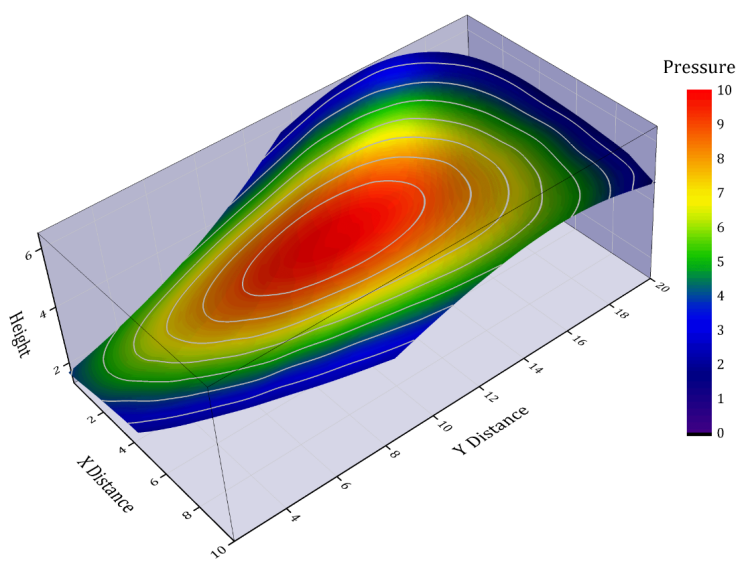
A surface plot created from XYZ data where the color map was based on a 4th data column. A custom XY boundary has also been applied to the plot.
Double Y Box Plot
A new Double Y Box chart type has been added to the Plot Menu making it easy to see data distributions in two variables, simultaneously. Variables share an X axis but each has its own Y scale.
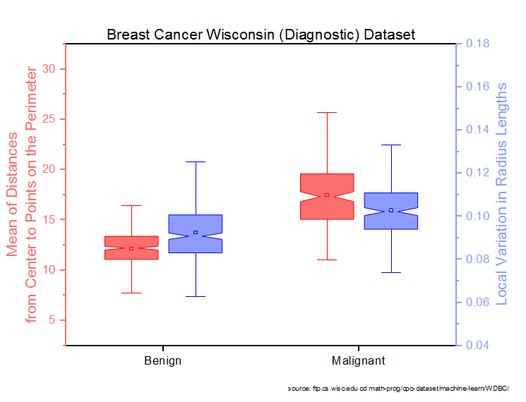
In a "Double-Y" chart, plot colors are matched to Y axis colors by default. The viewer quickly sees that the red plots pertain to "Distances from Center to ... the Perimeter" while the blue plots pertain to "Variation in Radius Lengths".
Legend Customization
Add custom legend entries to your graph:
- Interactive dialog to build a legend entry
- Add custom symbol and/or line
- Customize properties such as size and thickness
- Add optional literal text to complete your custom entry
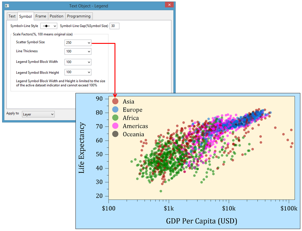
The symbol size in the legend has been set to 250% of the symbol size used in the plot.
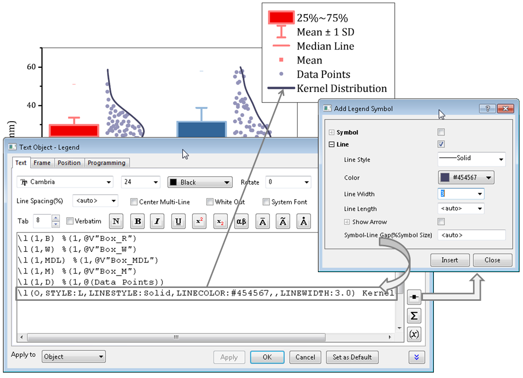
The Legend Properties dialog lets you add custom entries to your legend for symbols and lines, by building the desired syntax using a dialog. The dialog also has buttons to open Symbol Map dialog , and an Insert Variables dialog for inserting metadata information into the legend.
Evenly Distribute Graph Objects or Layers
- Works with graph layers and graph objects
- Distribute selected objects vertically or horizontally with equal spacing
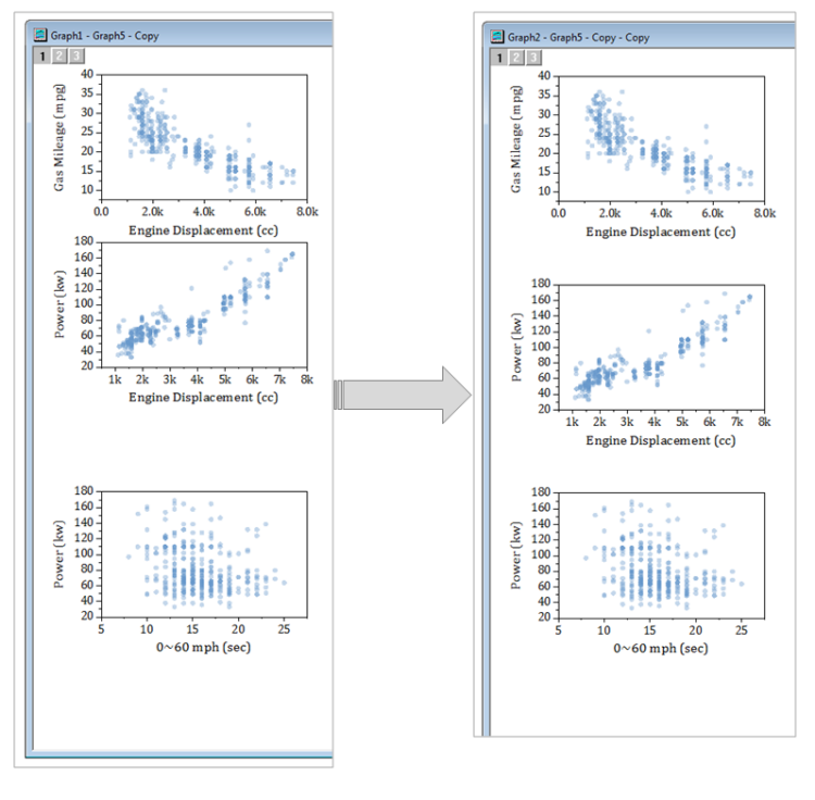
Evenly distribute objects vertically or horizontally. This image shows three vertical graph layers being distributed vertically with uniform spacing.
Graph Export Area
Interactively define a sub area of the graph to export or for copying to other applications:
- Drag and define export area on 2D graphs
- Margins apply on top of current copy page settings
- Settings are specific to each graph, and are saved with the graph
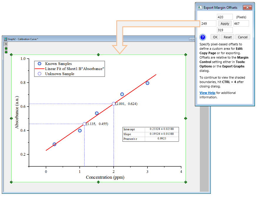
Interactively define a sub area of your graph page for exporting to file or copying and pasting to other applications such as Microsoft Word or PowerPoint.
Other Graphing Improvements
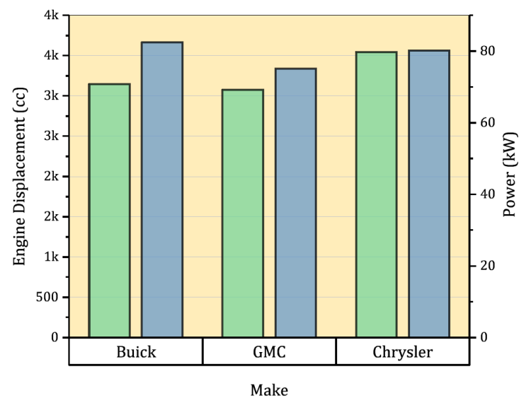
Separate controls for spacing between groups, and within group, for Double-Y Column plots.
Lighting effect is now supported for 3D Wall plots.
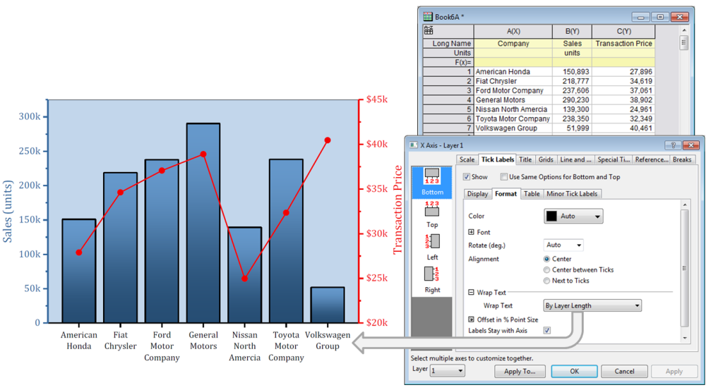
New options to wrap tick labels: By Layer Length, or By Number of Characters
- Column Gap control for Double Y Column plots
- Lighting effect for 3D Wall Plot
- Leader lines for Pie Chart
- Add arrows to ends of axes
- Plot multiple lines with colors mapped to a palette
- More options for wrapping tick labels
- Customize Numeric Separator at graph page level
- Label data plots at specific indices using another dataset
- Add Total label on Stacked Col/Bar plot
- Hotkey control of 3D openGL light source direction
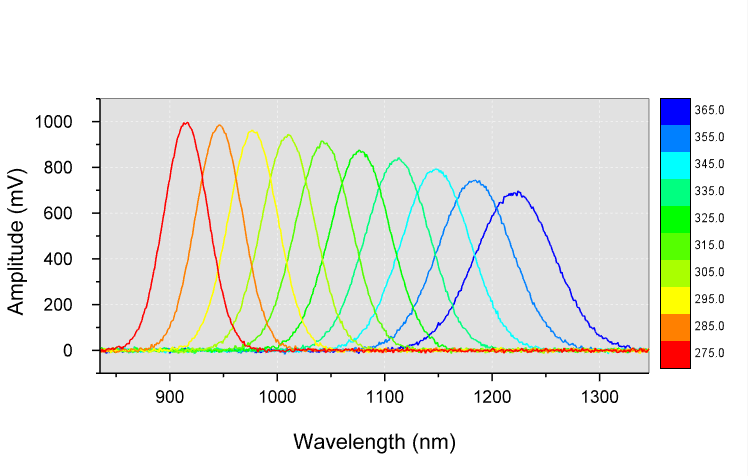
A new Multi-Y: ColorMap Line menu item has been added to Plot menu. The plot legend is a customizable palette-linked color scale. Palettes are easily changed.
Hover on the graph, press "S" and drag with your mouse to change the light source direction.
Unicode Support
Unicode support has been added to the GUI:
- Use Unicode characters in Long Names for worksheets, graph pages and other Origin window types
- Enter Unicode text in worksheet cells and metadata area
- Type code and press ALT+X to insert character
- Right-click in edit mode to bring up Character Map
- Unicode text will display everywhere including graph labels and legends, and also in dialogs such as Object Manager and Plot Details.
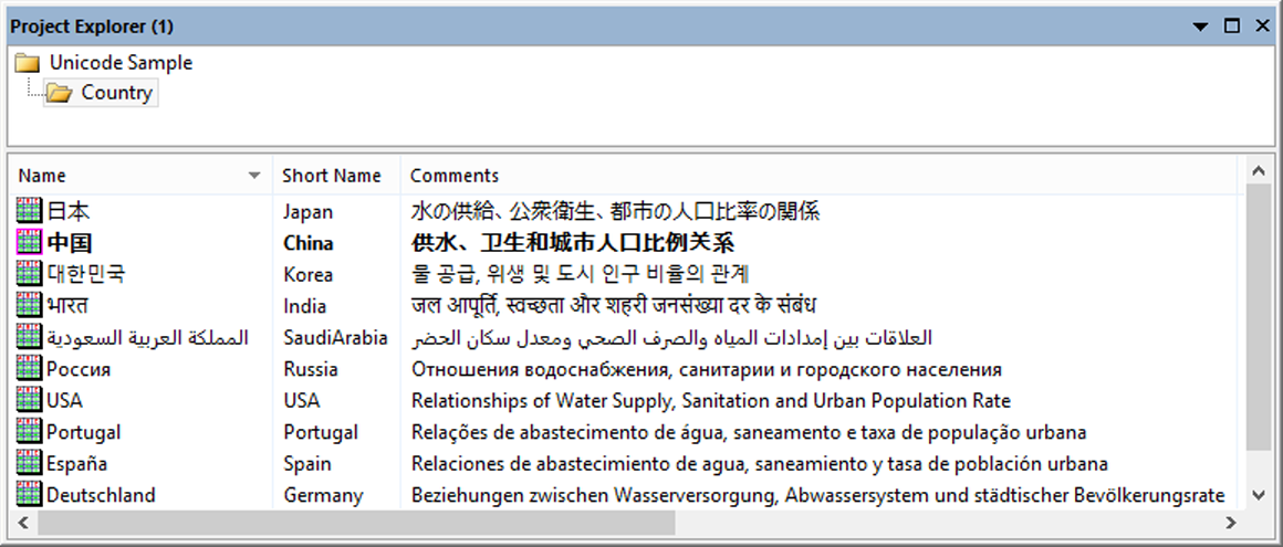
Properties such as Long Name in Project Explorer now support Unicode text.
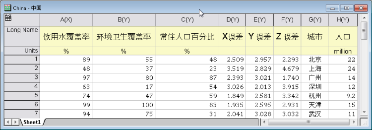
Worksheet with Unicode text in label rows and data cells.
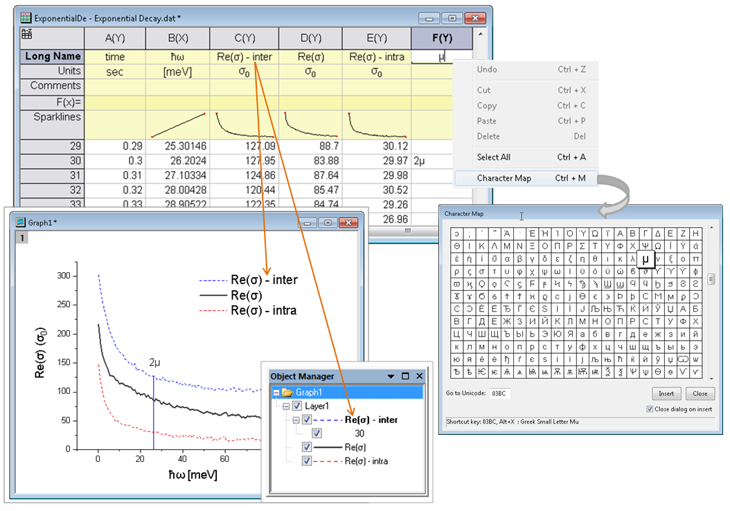
Directly type unicode characters into header rows such as Long Name or comments. Type the code and press ALT+X to insert the desired character, or right-click in edit mode to open Character Map to select character for insertion, Unicode characters will display everywhere including graph labels and legends, and also in dialog such as Object Manager, Layer Contents, and Plot Details.
Batch Processing
Improvements to Batch Processing:
- Include graph image for each file/row in report sheet
- Hover on image to view as larger size
- Select any row(s) and click the new Open Books button to open or regenerate report books
- Batch processing is now also supported for XYZ columns, worksheet, and data range.
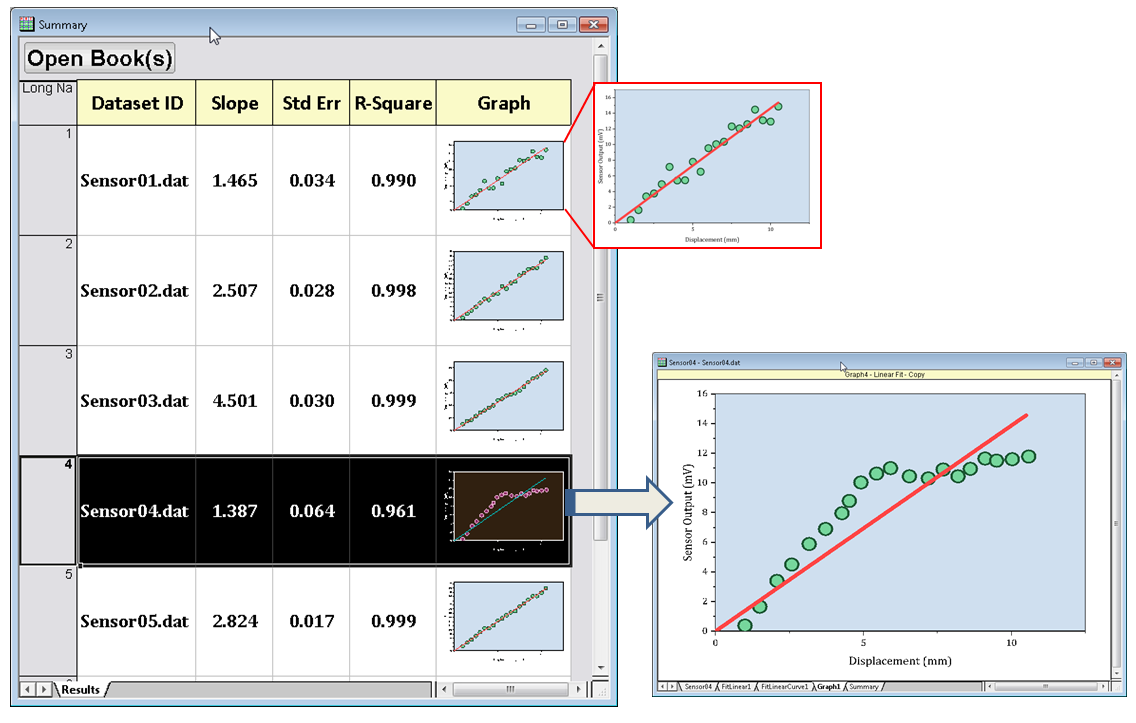
Batch reports can now include graph images. Hover on image cell to view as larger size. Select any row(s) and press Open Book(s) button to switch to, or recreate individual book reports.
License Management
The following key improvements have been made to Node-Locked (Fixed-Seat) licensing:
- Licenses are cross-version starting from 2018, making it easier to install multiple versions on same PC.
- If you install 2018 on same PC as 2017, you can activate the new version using the existing Product Key right from Origin, without having to register your serial number.
- For large groups, the administrator can install Origin 2018 on multiple PCs using a single Group Key.
- For large groups, the administrator can reset a group of product keys.
- All communication between Origin and the OriginLab website will use a secure connection using https.
Other Features
Data Analysis
- Default decimal digit control for different analysis
- Skip hidden columns and plots when analyzing data from a worksheet
- Auto bound setting for positive-only and negative-only peaks in Peak Analyzer
- Grouping support for Stats on Rows
Import
- Set Origin as default program to open data files
- Skip columns for CSV import
- Importing specified columns/rows for ASCII, Excel and CSV Import.
- New toolbar buttons to re-import files and for cloning active workbook when importing multiple files
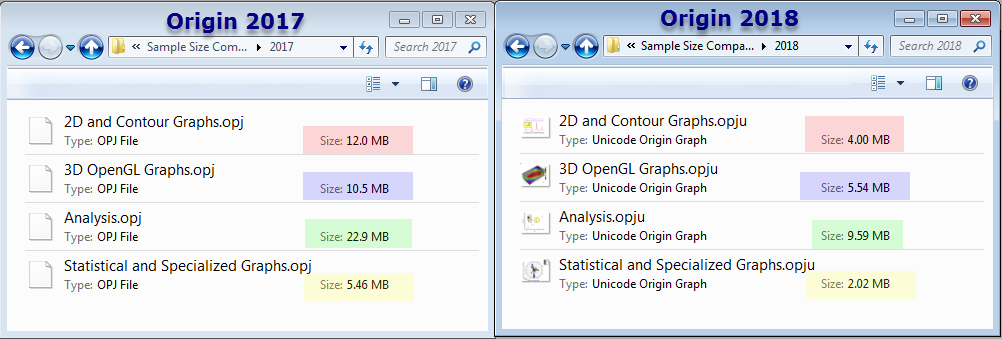
New Project structure in 2018 (*.OPJU) significantly reduce project file size
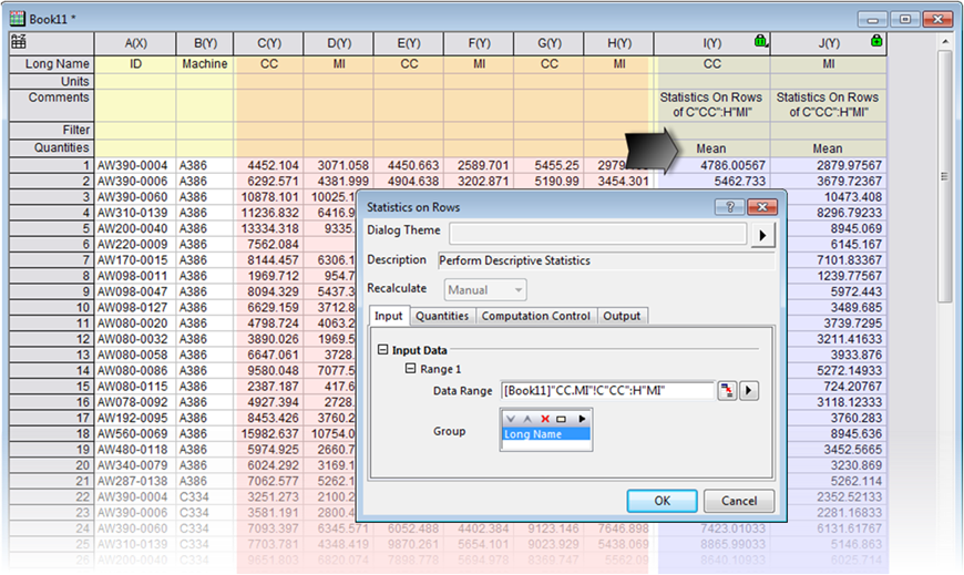
Statistics on Rows starts to support grouping data
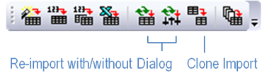
New toolbar buttons are added, for re-importing files and for cloning active workbook when importing multiple files
New Apps
- Simple Fit
- Global Peak Fit PRO
- OPJ Searcher
- FFT Examiner PRO
- Operations Manager
- Gage Study PRO
- Kernel Density for Polar and Ternary
- Paired Comparison Plot
- Composite Spectrum Regression PRO
- Equations Solver PRO