5.1.1 Descriptive StatisticsDescStats
Summary
Origin provides comprehensive Descriptive Statistics support including basic statistics (mean, median, variance, etc.), frequency counts, and correlation coefficients of your data sets. In addition to strong plotting features, Origin's statistical tools help you summarize and analyze your data.
What You Will Learn
This tutorial will show you how to:
- Use the Statistics on Column dialog to calculate descriptive statistics for grouped data.
- Copy statistical results to a new worksheet for further processing.
- Sort worksheet data by the attribute values in a designated column.
- Analyze data sets with the Correlation Coefficient Tool.
Minimum Origin Version Required: Origin 2015 SR0
Finding Frequency Information for Groups
We will use the Discrete Frequency tool to quickly obtain frequency information for groups of data.
- Open a new workbook. Select Data: Import from File: Single ASCII menu or click the Import Single ASCII button
 on main toolbar, and import the data file \Samples\Statistics\automobile.dat. on main toolbar, and import the data file \Samples\Statistics\automobile.dat.
- Highlight the first two columns in the automobile worksheet. From the Menu Bar, select Statistics: Descriptive Statistics: Discrete Frequency.
- Change the Recalculate mode to Auto. To make operation in the source data worksheet Controlling the Categorical Values section working, change the Sort Data By to Categorical Order. Then click OK.
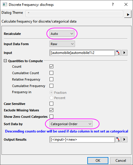
- The resultant worksheet DiscretFreq1 displays data and its counts for automobile Year and Make, respectively.
 | In spite of the fact that there are locks on the columns, the worksheet can be rearranged by highlighting the desired column, going to the Menu Bar, selecting Worksheet:Sort Worksheet, and selecting Ascending, Descending, or Custom from there.
|
Calculating Descriptive Statistics on Grouped Data
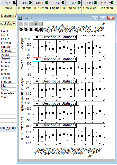
Basic statistical treatments can be performed on the data in individual columns using the Statistics on Columns tool.
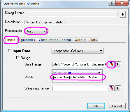
- Return to the automobile worksheet. From the Menu Bar, select Statistics: Descriptive Statistics: Statistics on Columns: Open Dialog....
- In the Statistics on Columns dialog box, in the Input tab, expand Range 1 and click the interactive button
 to the right of Data Range. Return to the worksheet, select column C and drag to column G. Click the interactive button again to restore the dialog box. In the dialog box, after adjusting Input Data under Range 1, click the arrow button at the top-right corner of the Group control box to select B(Y): Make as grouping data. Change the Recalculate mode to Auto. to the right of Data Range. Return to the worksheet, select column C and drag to column G. Click the interactive button again to restore the dialog box. In the dialog box, after adjusting Input Data under Range 1, click the arrow button at the top-right corner of the Group control box to select B(Y): Make as grouping data. Change the Recalculate mode to Auto.
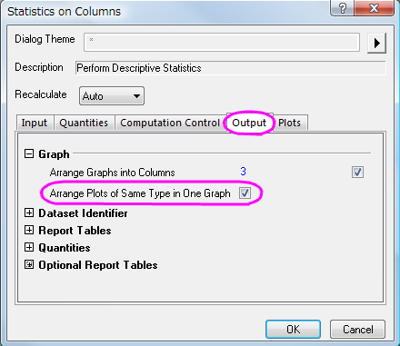
- In the Output tab, under the Graph branch, check the Arrange Plots of Same Type in One Graph box. Also, in the Plots tab, check the Box Charts check box.
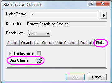
- Click OK to get the results in a report sheet.
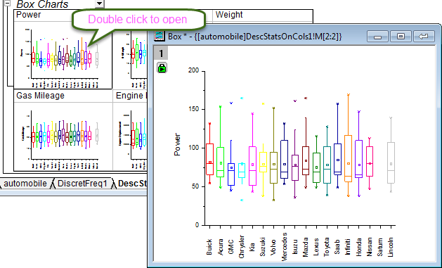
| In order to modify any embedded box plot in report sheet, double-click to open it, then customize the graph and click the Return button in the top right corner to restore the modified graph back to the report sheet.
|
Using Statistical Results for Further Operations
It is possible to perform further data analysis and to plot the statistical results.
For example, to obtain average attribute values (i.e. horsepower, 0-60 mph time, weight, mileage) by Vehicle Make from 1992 to 2004, perform the following:
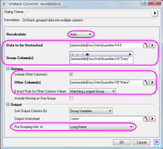
- Return to the automobile - automobile.dat workbook, and open the DescStatsQuantities1 worksheet. Highlight the D(Y2) and the E(yEr±) columns, go to the Menu Bar and select Worksheet: Unstack Columns: Open Dialog....
- In the wunstackcol dialog box, change the Recalculate mode to Auto, select Group Columns and click the context menu button
 and select A(X1) Data. and select A(X1) Data.
- Expand Options and check the Include Other Columns box. On Other Columns, click the context menu button and select B:(X2) Make. Set Matching Longest Group as Extract Rule for Other Columns Values, expand Output Settings, and from Put Grouping Info. to, select Long Name. Click OK.
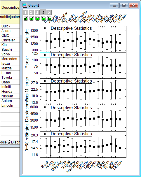
- To see the results, open worksheet UnstackCols1, highlight the worksheet, and from the Menu Bar, select Plot > Multi-Panel/Axis : Stack.
- In the Plotting:plotstack dialog box, set Plot Type to Scatter. Click OK.
- Now we are going to rotate the tick labels at top X axis for clarification. Double click on the top X axis tick labels to open the Axis dialog, and set the following in Top icon. Click OK.
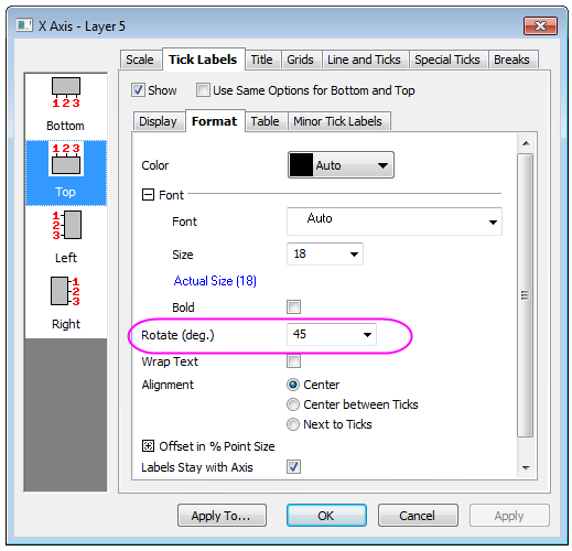
Rotate the Tick Labels for bottom in the same way.
- The report sheet and the graph will appear as shown below:
Analyzing the Relationship Between Different Indicators
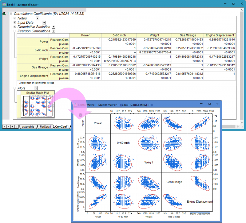
Use a correlation coefficient to explore the relationship between columns of the automobile data. Next, construct scatter plots with confidence ellipses to obtain graphical representations of the correlations.
- In the automobile - automobile.dat workbook, open the automobile worksheet, and highlight the last five columns.
- From the Menu Bar, select Statistics: Descriptive Statistics: Correlation Coefficient: Open Dialog.... In the corrcoef dialog box, expand Correlation Types and check the Pearson box.
- Expand Plots and check the Add Confidence Ellipse box. The Scatter Plot check box will be automatically selected. Click OK.
- The CorrCeof1 worksheet should appear as below; demonstrating the high positive correlation between Engine Displacement and Power, and the high negative correlation between Gas Mileage and Engine Displacement.
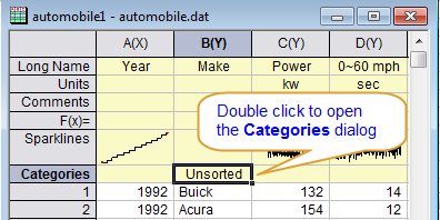
Controlling the Categorical Values
- In the following steps, we want to customized the order of values shown in the graph but not change the source data. Right click Column B in workbook, select Set As Categorical in the context menu, double click the Categories cell of the column, "Unsorted", to open the Categories dialog.
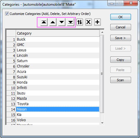
- Check Customize Categories checkbox, use
 to adjust position of each item to follow the image below, in this way we can sort the items by country of the manufacturers, which is U.S.->Japanese/Korea->Europe. Click OK to close the dialog. to adjust position of each item to follow the image below, in this way we can sort the items by country of the manufacturers, which is U.S.->Japanese/Korea->Europe. Click OK to close the dialog.
- You can go to the report sheet created in section above. Because Auto mode is used for recalculation, the report sheet of Discrete Frequencies and Statistics on Columns, including the box charts, are updated automatically with the specified order of the Categorical data.
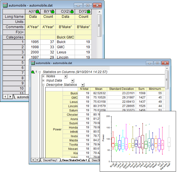
- The results of Unstacked Columns and the stacked graph are updated automatically as well.
Note: If the operation hasn't been auto-updated, you can also manually trigger the operations by clicking the Recalculate button  in the Standard toolbar. The button will turn green in the Standard toolbar. The button will turn green after recalculation is done after recalculation is done
|
|