8.1 Data Reader ToolDataReader
Summary
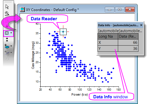
The Data Reader  is an exploratory tool that uses the Data Info window to display information about a selected data point in a graph. Essentially anything that is contained in the worksheet, in association with a plotted data point, can be shown in the Data Info window. This includes coordinate values, column headers, or even cell-embedded images. In addition, you can customize the window to display numeric values using a custom format (e.g. date-time, Lat/Lon, etc.), or to change window background color, add a window title, etc. is an exploratory tool that uses the Data Info window to display information about a selected data point in a graph. Essentially anything that is contained in the worksheet, in association with a plotted data point, can be shown in the Data Info window. This includes coordinate values, column headers, or even cell-embedded images. In addition, you can customize the window to display numeric values using a custom format (e.g. date-time, Lat/Lon, etc.), or to change window background color, add a window title, etc.
Minimum Origin Version Required: Origin 2019
 | Beginning with Origin 2019, you can read data point coordinates in a 2D graph by hovering on the data point. This Data Point Tooltip is highly customizable, mimicking Data Info window functionality. For more information, see Data Point Tooltips.
|
What you will learn
This tutorial will demonstrate how to:
- Use the Data Info window to view information for a selected data point in the graph.
- Customize Data Info window content, to include the display of images (Tutorial 1).
- Customize Data Info window content, to display numeric data using custom formatting (Tutorial 2).
Tutorial 1: Basic Usage
-
Select File: Open... to open the Alkanes.opj in the <Origin Folder>\Samples\Data Exploration folder.
- Highlight Column D in Book1 Sheet1, and select Plot > 2D: Scatter: Scatter to create a new graph.
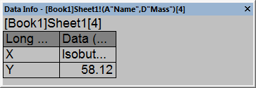
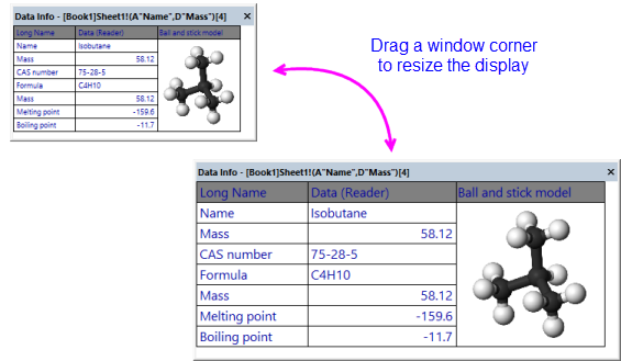
- Click the Data Reader button from the Tools toolbar, and click on the Isobutane data point on the new graph.
The Data Info window showing the X and Y coordinates of the data point selected will appear.
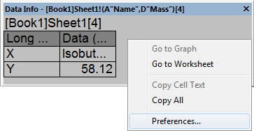
- Right-click on the Data Info window, and select Preferences from the context menu to open the Data Info Report Settings dialog.
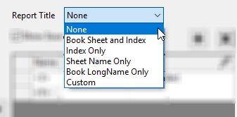
- To remove the book and sheet name from the Data Info window, set the Report Title drop-down to None.
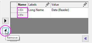
- In the center portion of the dialog, remove the X coordinate by clicking on <X>, then clicking the Remove button. Do the same for the Y coordinate (<Y>).
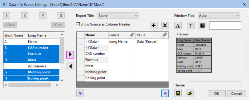
- In the upper-left corner of the dialog, click the X Data
 button, then the Y Data button, then the Y Data  button to add the X and Y data source. Note the use of dataset Long Names in the Preview. button to add the X and Y data source. Note the use of dataset Long Names in the Preview.
- All source worksheet columns that can be added to the Data Info window are listed in the left panel. Highlight the B, C, E, G, and H columns and add them to the center panel by clicking the Select button. Note that at this point, the Preview shows that our window has two columns.
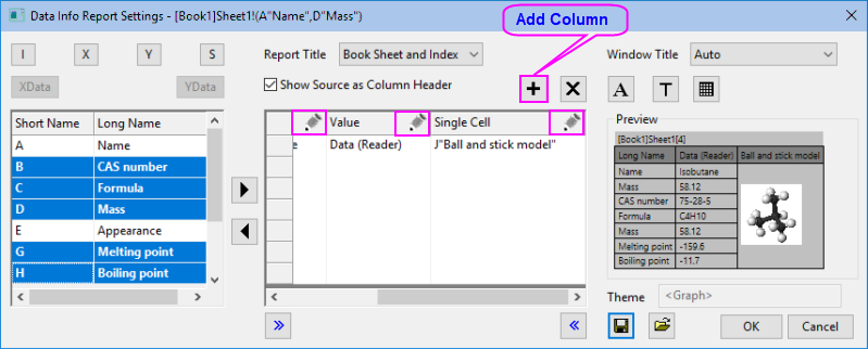
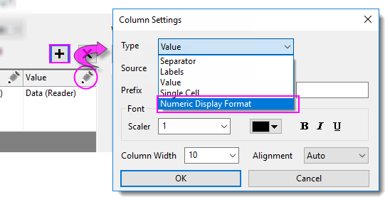
- Click the Add Column button to add a third column to our table. Click the pencil icon above the third column and in the Column Settings dialog, set Type = Single Cell and Source = J "Ball and stick model". Set Column Width = 20 and click OK. Click the pencil icon above the first and second columns and set Column Width = 15 and 20, respectively.
- Click the Font button to open the Tooltip Font dialog. Set Minimum Font Size and Maximum Font Size to 10 and 16 respectively. This will for text to automatically resize as the Data Info window is resized. Note that this limits the resizing of the Data Info table, as well. Set the Font Color to Royal and click OK. Click the Background button, set Background = White and click OK.
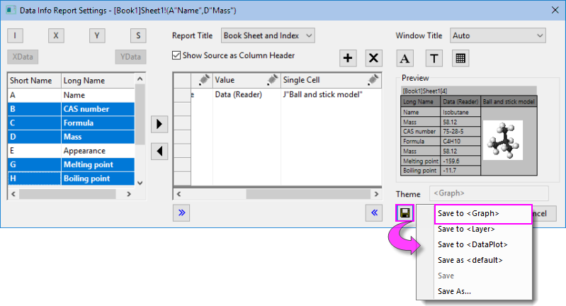
- Click on the Theme button and select Save to <Graph> in the fly-out menu. This ensures that your Data Info dialog settings will be saved to the active graph, then click OK to close the Data Info Report Settings dialog.
- Resize the Data Info window by dragging a window corner. Note that the font size range that we specified previously, set limits on window resizing.
Tutorial 2: Custom Numeric Display Format
In this tutorial, we'll learn how to apply a custom display format to numeric data shown in the Data Info window.
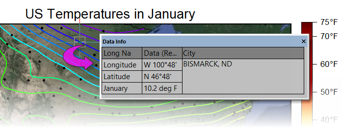
- Press F11 to open the Learning Center, click the Graph Samples tab and search on the phrase "Google Map Temperature". Double click on the sample to open this project file containing the following map of the continental US with a contour plot overlay of mean January temperatures.
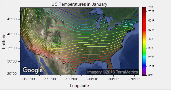
- Double-click on the map + contour plot to open the Plot Details dialog box. Click on the Colormap/Contours tab and enable Show Data Points and click OK. What you are now seeing are the US cities where the January temperature data in the map overlay, were recorded. Enlarge the size of the window so that you can get a comfortable view of all scatter points.
- Pick the Data Reader tool from the Tools toolbar (hint: it is on a split button with the Data Cursor
 and the Data Highlighter and the Data Highlighter  ), then click on one of the scatter points on the map. The Data Info window should open and look something like the following image. ), then click on one of the scatter points on the map. The Data Info window should open and look something like the following image.
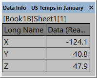
The information, as reported, is not very user-friendly so we will customize the Data Info window to report more useful information.
- Double-click on the Data Info window to open the Data Info Report Settings dialog box. Under the Name column in the center panel, click on and remove -- one by one -- the <X>, <Y> and <Z> coordinates from the center panel, using the Remove button
 . .
- Now click the , and
 buttons in the upper-left corner of the dialog to move the X, Y and Z source data, labeled with the column Long Name, to the center panel. You can see the result by looking at the Preview to the right side of the dialog box. buttons in the upper-left corner of the dialog to move the X, Y and Z source data, labeled with the column Long Name, to the center panel. You can see the result by looking at the Preview to the right side of the dialog box.
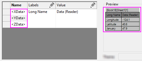
Currently, our Data Info displays two columns, one with column Long Names (Longitude, Latitude, January) and a second column with the numeric data associated with Longitude, Latitude, January. What we will do is to apply formatting to these numbers so that they do not simply display as generic decimal numbers.
- Click the Add Column button to add a third column to the Data Info table, then click the pencil icon in the newly-added column to open the Column Settings dialog box. Set the Type drop-down list to Numeric Display Format and click OK.
- Click into the first cell below the Numeric Display Format heading and you will see a list control that you can click to show a list of custom formatting options. Firstly, note that this list is not exhaustive but contains suggestions for custom formats. Secondly, you can type directly into this box to specify a custom format.
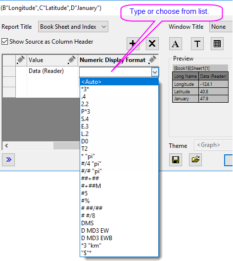
- In the first row list control, type the following (degrees-minutes east-west, with units before):
DM EWB
- In the second row list control, type the following (degrees-minutes north-south, with units before):
DM NSB
- In the third row list control, type the following (one decimal place + suffix string "deg F"):
.1 "deg F"
- Click the Add Column button to add a column to the Data Info table, then click the pencil icon in the newly-added column to open the Column Settings dialog box. Set the Type drop-down list to Single Cell, Source to A "City", Column Width to 30 and click OK.
- Click the Save Theme button and choose Save to <Graph> to save the current Data Info window configuration to the graph window. Click OK to close the dialog box.
|