Description:
This graph is a grouped stacked column plot with a subgroup size of 5.
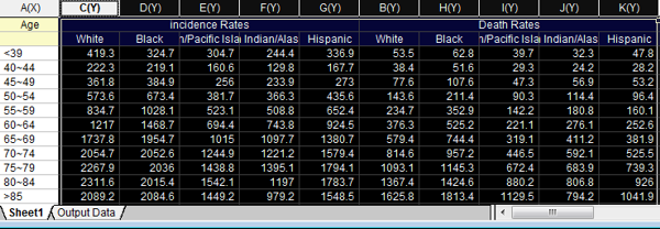
To create this graph using the sample data provided, select columns and click Plot:Column/Bar/Pie:Grouped Columns - Indexed Data... (main menu).
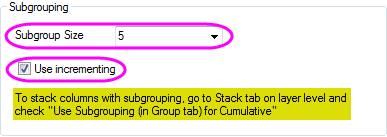
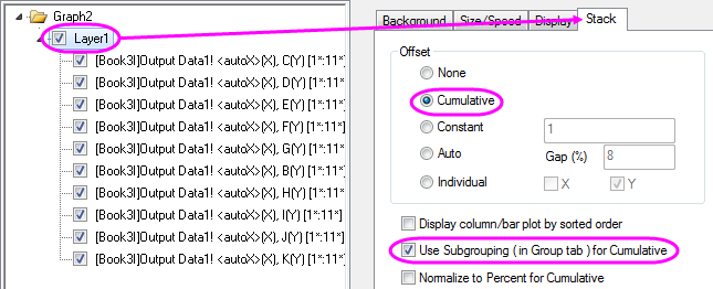
Subgroup size can be set in the Group tab of Plot Details (with the graph active, click Format:Plot Properties...), then enabled using controls on the Stack tab of Plot Details.
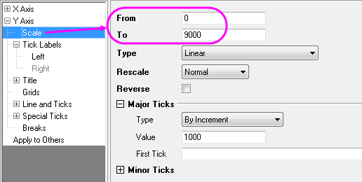
Axis customizations are made in the Axis Dialog box. Open the dialog box by double-clicking on one of the graph axes. From here, you can edit axis scale values, tick label font size, axis titles, add top X and right Y axes, add Y-axis grid lines, etc.
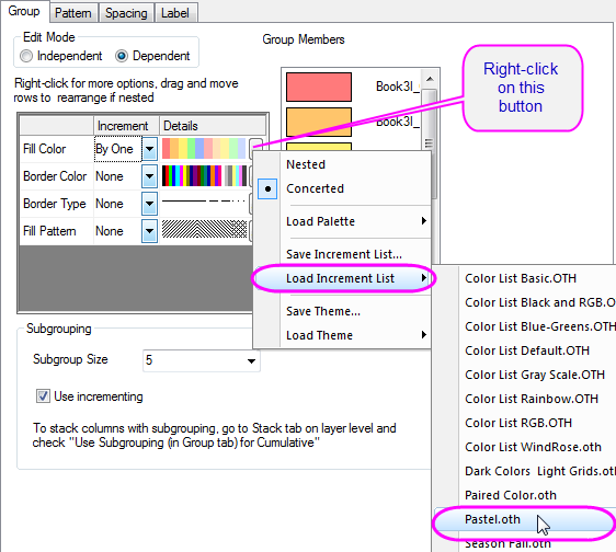
To change the plot color scheme, click Format:Plot Properties..., then duplicate the settings shown.
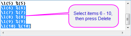
Finally, add a title and subtitle using the text tools on the Format toolbar. Edit your graph legend by right-clicking on the legend object and clicking Properties.... In the Object Properties dialog box, delete entries 6 through 10. Note that you can format other legend properties using this dialog box.