Description
This floating bar chart example illustrates the result of plotting two datasets. The datasets contain minimum and maximum concentration values, so the plot shows how each site has fluctuated over time.
|
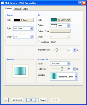
In Plot Details dialog, customize Gradient Fill color and set Fill Area transparency. |
|
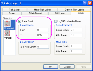
Use Axis dialog to add an axis break by specifying the range of values. An axis break is a gap inserted into an axis to indicate that a range of values is skipped (not displayed in the graph). |