Description:
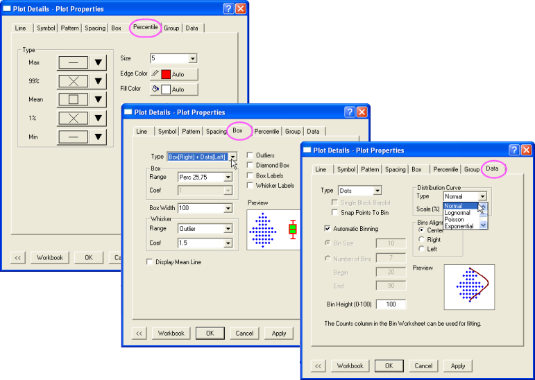
The box plot is a graphical representation of key values from summary statistics.
Each Y column of data is represented as a separate box.
By default, the box is determined by the 25th and 75th percentiles.The whiskers are determined by the 5th and 95th percentiles.
The data are plotting as scatter on the left of each box. A curve corresponding to normal distribution is also displayed on top of the scatter plot.
This graph showed monthly average high temperature of five cities.
The data are used to create this graph was obtained from the website: http://www.weather.com