View step-by-step instructions on how to create this graph
Submitted by:
Dr. Aaron Wiegand
Center for Instrumental & Develop. Chem.
"E" Block, Gardens Point Campus
Queensland University of Technology
GPO Box 2434, Brisbane 4001, AUSTRALIA
Description:
Windroses are used to present wind speed data and wind direction data that has been collected over some time, so that the dominant wind pattern for a particular area can be determined. Windroses are also useful as they project a large quantity of data in a simple graphical plot. In this case, we use wind rose plots to compare observed wind data against wind data that has been calculated from a computer model. The time period is one month and the data are hourly averages. The length of each "arm" is proportional to the fractional frequency at which that wind speed (and below) was observed from that direction. Different colors on each "arm" indicate the wind speed. For example, in the left windrose, most winds came from the south to southwest, but winds with higher wind speeds came from the west.
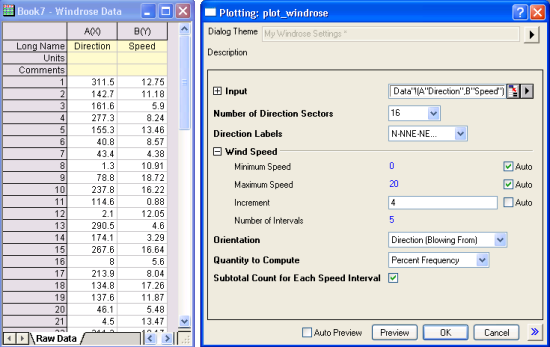
Origin supports plotting windroses from raw data (typically consists of a column of wind directions and a column of wind speeds). There is no need to perform binning prior to plotting. The Plot_Windrose function is capable of binning the raw data and creating the windrose plot from it. Auto settings in the dialog can be changed to customize quantities such as bin increment. Dialog settings can be saved as theme for repeat plotting of similar data.