Descriptions:
This graph consists of an overlay of two polar contours and one polar chart in two graph layers. The coastline of the Northern Hemisphere is plotted as a polar chart in the bottom layer. In the top layer, surface temperature is plotted as a color-filled contour, and sea level pressure is plotted as green contour lines. The data used to create this graph was obtained from the NCL website: http://www.ncl.ucar.edu/Applications/Data/
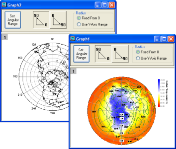
For both polar chart and polar contour, buttons and radio boxes at the top of the graph window provide basic control of coordinate settings.
After individually plotting the polar chart and the polar contour (smaller graphs, above), use the Merge Graph dialog to combine them in a single graph window with two layers (larger graph).
|
|
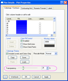
After merging the two graphs, apply transparency to both the color-filled contour and the green contour lines to make the bottom polar chart visible. |