This graph displays an overlay contour plot. The color-filled contour represents global sea level elevation data, and the dense pattern-filled contour represents the earth's icy areas. The data used to create this graph was obtained from the NCL website: http://www.ncl.ucar.edu/Applications/Data/
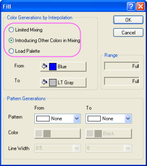
Origin offers multiple ways to generate fill color by interpolation:
- Limited Mixing
Fill the color levels with a linear mix of two selected colors.
- Introducing Other Colors in Mixing
Introduce complementary colors into the mix of two selected colors.
- Link to Palette
Link the fill color to the selected palette.
|
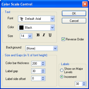
Open the Color Scale Control dialog by double-clicking the color scale in the graph. In this dialog, you can customize the format and style of the color scale and its labels. You can also set the levels and increments at which to display labels. |