|
Q: How do I set the number of significant digits shown in a worksheet, and set it to be default?
|
|
A: You can double-click the column header to show Column Properties dialog, then choose Digits: Significant Digits= and set the Then number of digits.
If you want to set the default significant digits for all newly created worksheets, please select Tool: Options to open the dialog and go to Numeric Format tab. There is a setting for Significant Digits.
|
|
Q: I do a non-linear curve fit to data and then plotted a simulated curve based upon the fit parameters. How can I add 95% confidence intervals on the simulated curve in Origin 8.6?
|
|
A: When you are in NLFit tool, choose Setting tab on top, and choose Fitted Curves in the left panel. There is a check box Confidence Bands. When you turn On this, you can also set the confidence level (95% is default)
To ease that inconvenience, you can save the specific set of options as a dialog theme for tour own.
|
|
Q: I have multiple x-y data sets I want to plot on the same chart. How can I do that in origin 8.5?
|
|
A: You can:
1. To set the columns Plot Designations as XYXYXY...., highlight all the columns, right-click and select Set as: XY XY in the context menu.
2. If Xs (or Ys) are in a same value range (they can fit in a same X (or Y) scale of: "From" and "To"), you can just highlight all columns, and choose Plot menu. All Ys would be plotted in a single graph.
|
|
Q: I'd like to have a comment function in the graphs, but the printing or exporting the graphs would not include the comments.
|
|
A: Maybe you can put a text box in the gray margin of the graph and in your export settings select Page or Tight in Page, then the text will not be exported (because the gray margin is technically not part of the page area).
|
|
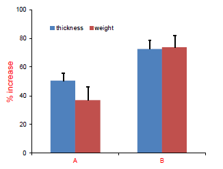
Q: I want to plot a graph as below in Origin. How can I do?
|
|
A: I assume your dataset include X, Y1, Y1 Error, Y2 and Y2 Error five columns.
You can plot the graph in the project as the steps below:
1. Copy or import your data to the Origin, then highlight Col(A)~Col(E) and right-click to select Set As: X Y YErr in the context menu. The five column Plot Designations will set to be X, Y, Y Error, Y, Y Error separately.
(About Plot Designations)
2. Highlight Col(A)~Col(E) and select Plot: Columns/Bars: Column in the menu to create the graph.
3. Add a column (Col (F)) in worksheet and type in A, B in it.
4. Double-click on the X axis in the graph to open the dialog, and go to Tick Labels tab. Choose Text from dataset in the Type drop-down list. Then select [Book1]Sheet1!F in the Dataset combo box. Then click OK button.
5. Double-clicking on the graph to open the Plot Detail dialog, you can further customize the fill color, error bar in it.
Please refer to these tutorial and video:
Column Graph with Error Bars
Adding Error Bars to a Graph (video)
Customizing a Graph (video)
|
|
Q: Why can I not to get the scale axis break? My first data point is at 0.1 but would like a break from 0-0.01 on a logarithmic scale.
|
|
A: According to your description, I assume you axis is set from 0. Because the axis beginning point can not to be the break beginning point, you can not get a break from 0 to 0.01 in your graph.
Additional the axis in your graph is set as logarithmic scale, so axis beginning point can not be less than 0.
I suggest you could use the workaround that setting the break from a very small value such as 1E-10, instead of 0.
|