Origin for High Resolution X-Ray Spectrometer Prototype Testing
|
"Whenever plotting something, I immediately think of Origin. It is very easy to use and yields excellent results."
As the Battaelle Inventor of the Year award recipient for 2014, Gianluigi De Geronimo has an impressive array of patents under his belt. An electrical engineer at Brookhaven National Laboratory Dr. De Geronimo leads a team that designs state of the art microelectronics, specifically application-specific integrated circuits (ASICs). Although he has a variety of software at his disposal, Dr. De Geronimo chooses Origin for analysis and specifically graphing. He finds that Origin includes comprehensive customization features for graphs and effortlessly provides a publishable end product. Dr. De Gernonimo remarks “Whenever plotting something, I immediately think of Origin. It is very easy to use and yields excellent results”.
One of his more recent projects involved creating an ASIC for high resolution X-Ray Spectrometers that will be used to image planetary surfaces during space exploration. A key part of these devices are the sensors that consist of varying numbers of pixels; prototypes can have between 16 and 64. The team aimed to improve the sensitivity of the sensors and thereby sharpen the resolution of the images they provide.
| |
| Organization Brookhaven National Laboratory
|
| Problem Gauge the effect of varying conditions on the sensitivity of the sensors on high resolution X Ray Spectrometers with the aim of increasing sensitivity for clearer image retrieval. These spectrometers are designed to map planetary surfaces during space exploration.
|
| Solution Dr. De Geronimo and his team used the fit functions to extract information from noisy or distorted curves. The Peak Analyzer allowed them to deconvolute overlapping pulses that lower image quality. They also used the many graph customization features to present their data.
| | Key Features
|
|

Figure 1. LEFT: Comparison of two spectra, the noise from electrons was lowered to distinguish peaks. RIGHT: The four curves represent different rates, a higher frequency results in a thinner line so the curves were fit with a Gaussian model in Origin.
They tested the devices, and data acquisition software collected the results that were then digitized before importing into Origin as events per second. Dr. De Geronimo appreciated the flexibility of the Origin import feature, including the options for partial import and the choice of which separators to use. The data was plotted in line and scatter plots with various customization including line and symbol types, color, axes frames and inlaid plots for better visual understanding of the results. Analysis such as curve fitting and peak analysis was then performed on the graphs to determine the effects of system parameters such as frequency, noise etc.
One example of this is portrayed by the left plot in Figure 1 which shows the comparison of two energy spectra. In order to distinguish the peaks, the team lowered the noise from the electrons. As the noise was lowered, the thickness of the line decreased, making it easier to find the peaks which were fit with a Gaussian model in Origin. By applying this function they could also extract the Gaussian sigma which allowed them to accurately measure the resolution of the system.
A similar analysis was done in the right plot of Figure 1 to evaluate the effect of the event rate. The four curves each represent different event rates from 1000 counts (or events) per second to 200,000 counts per second. As can be seen from the figure, a higher frequency results in a thinner line. It was difficult to distinguish between the excessively thick lines of the lower frequencies, so they fit the curves in Origin, to find exact measurements.
Fitting multiple curves globally and utilizing the Peak Analyzer for deconvolution was also useful for De Geronimo and his team when dealing with resolution related issues such as “Pile Up”. One of the problems with the imaging is a phenomenon known as “pile-up” which occurs when two events are so close together that they overlap and distort the image. An example is shown in the two images to the left of Figure 2 where the low amplitude pulse is lost and its contribution to the image is overshadowed by the larger pulse.
This is also illustrated in the graph on the lower right of Figure 2; the red curve and dotted curves overlap to produce the larger peak. The Peak Analyzer was used to pick out the peaks for the two different curves, Tpk1 and Tpk2, and deconvolute the large peak constituted of the two smaller events. The team was able to prevent pile up contributions by adding a Pile Up Rejector to the system that was set up to reject all pulses that do not have a certain peak and do not occur at a measured time after the last pulse was detected.
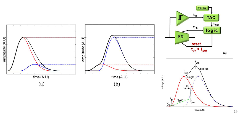
Figure 2. LEFT: Due to the pile up effect the impact of the small pulses is drowned out by the larger over lapping curves. RIGHT: The Pile Up effect can also lead to two average sized pulses overlapping to produce one large one thus distorting the image.
**Gianluigi De Geronimo, Pavel Rehak, Kim Ackley, Gabriella Carini, Wei Chen, Jack Fried, Jeffrey Keister, Shaorui Li, Zheng Li, Donald A. Pinelli, D. Peter Siddons, Emerson Vernon, Jessica A. Gaskin, Brian D. Ramsey, and Trevor A. Tyson. "ASIC for SDD-Based X-Ray Spectrometers." IEEE Transactions on Nuclear Science 57.3 (2010): 1654-663. Web.